By Design Bundles
Illustrator Tutorials14 min
Ribbon Text in Illustrator
For this tutorial, we will use the Free Font “Learning Curve” by Jess Latham as reference.
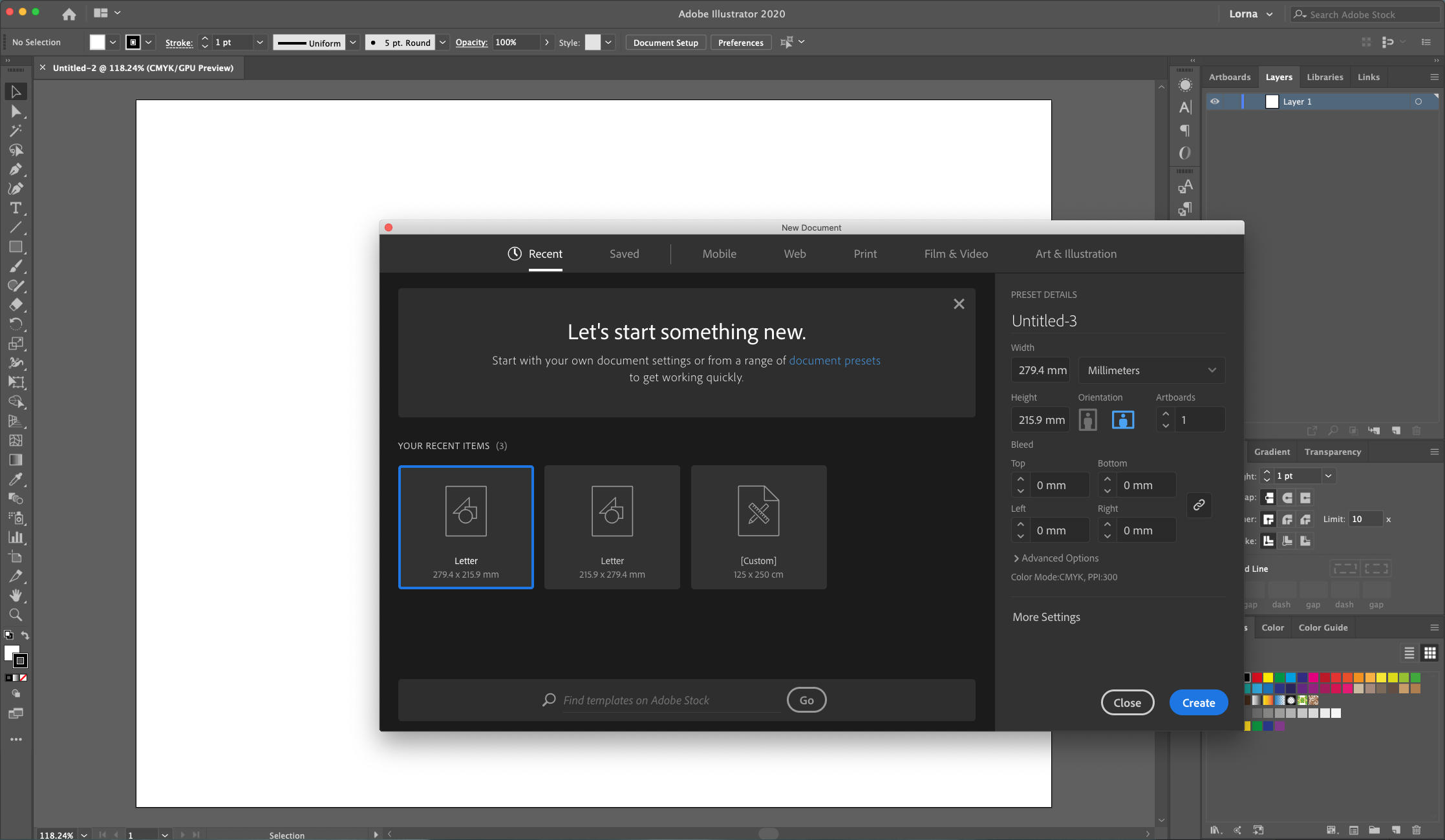
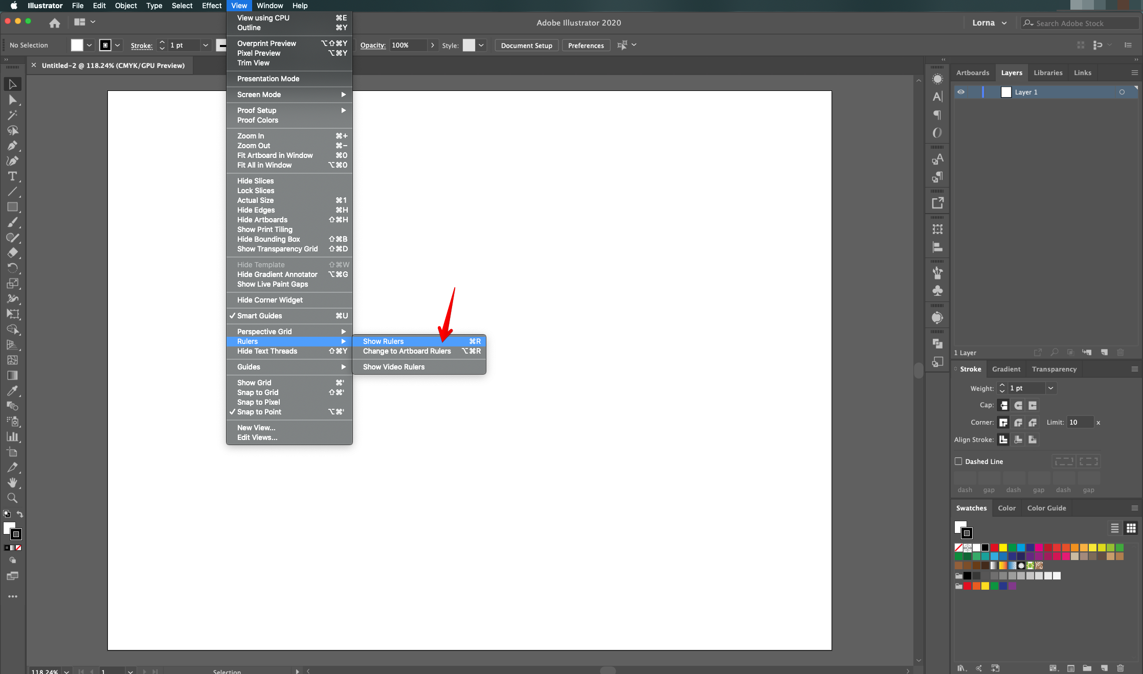
1 - In Illustrator, create a “New Document”. If the “Rulers” are not enabled, go to View > Rulers > Show Rulers (Command/Control + R) to turn them ON.
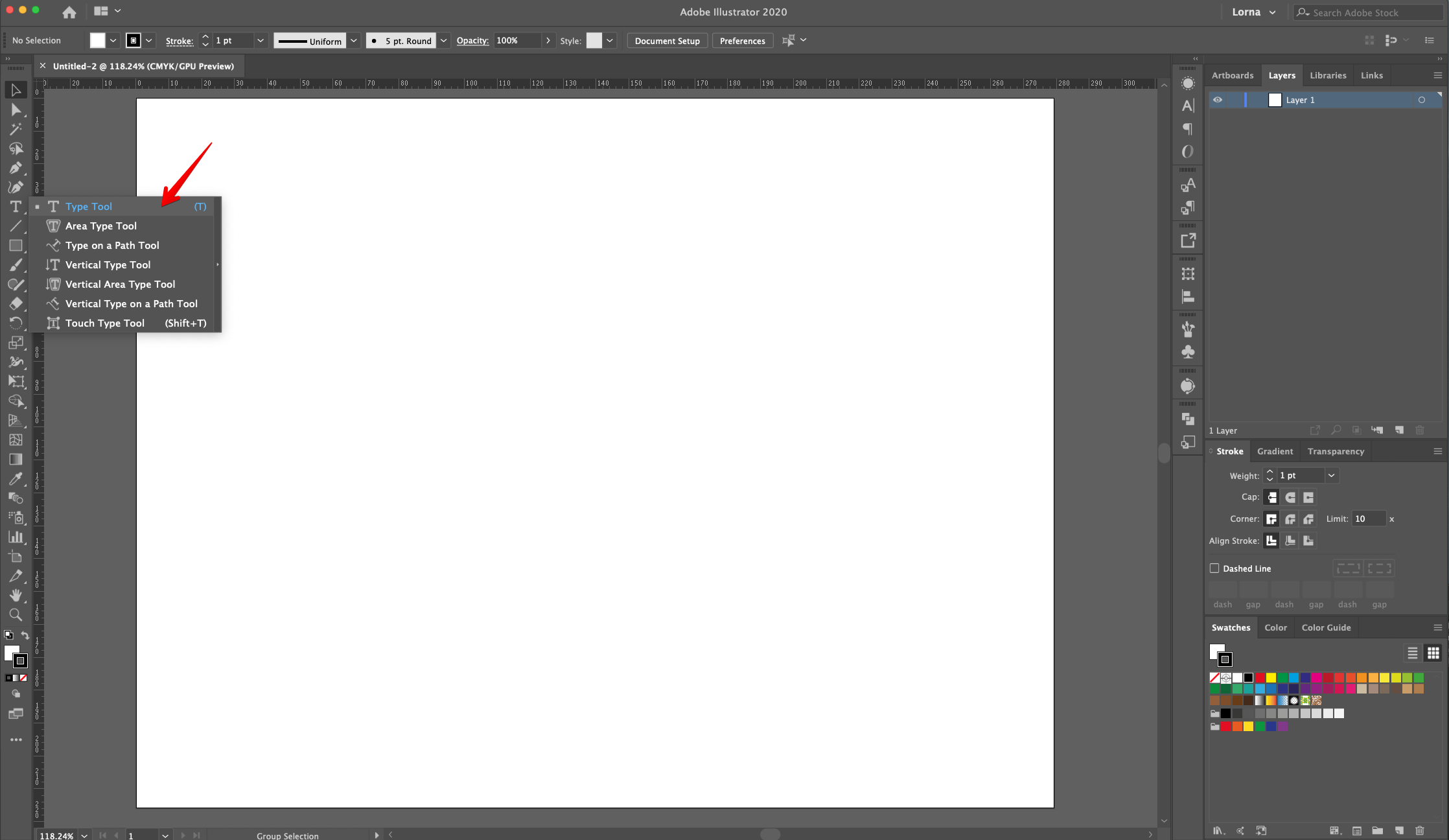
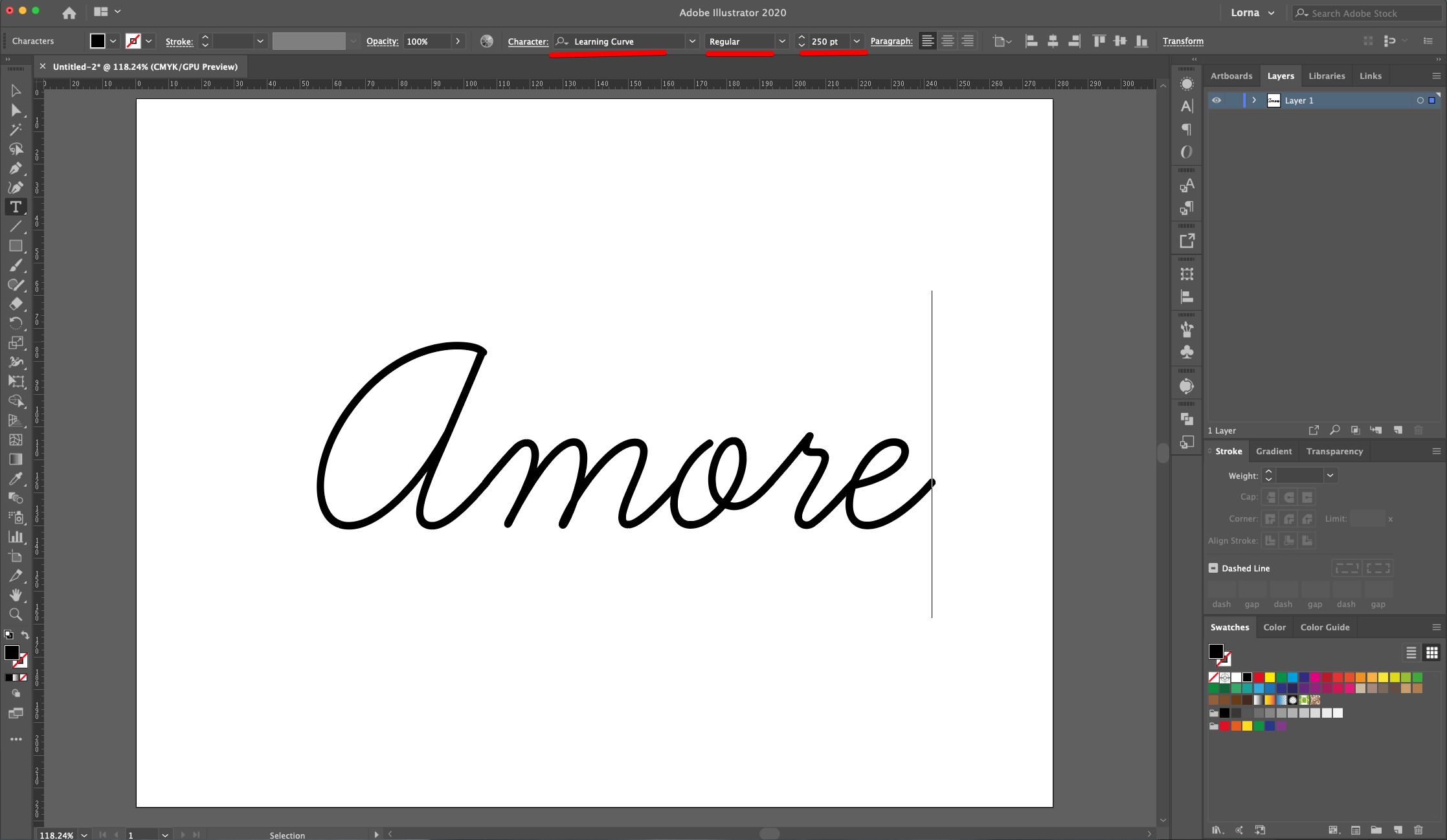
2 - Select the “Type Tool” (T), choose your font (we used “Learning Curve”) and type your text. The Size will depend on your font and document.
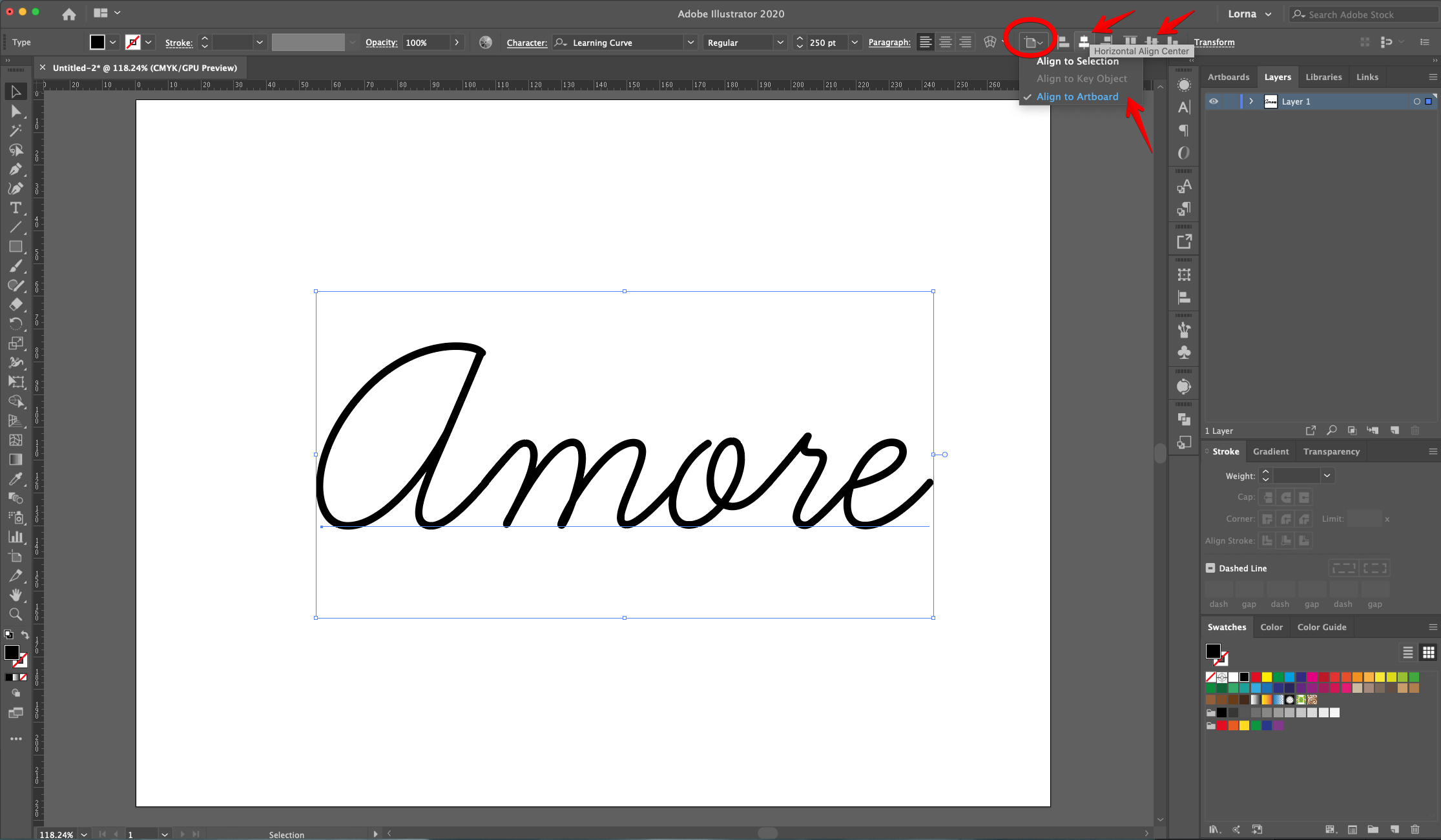
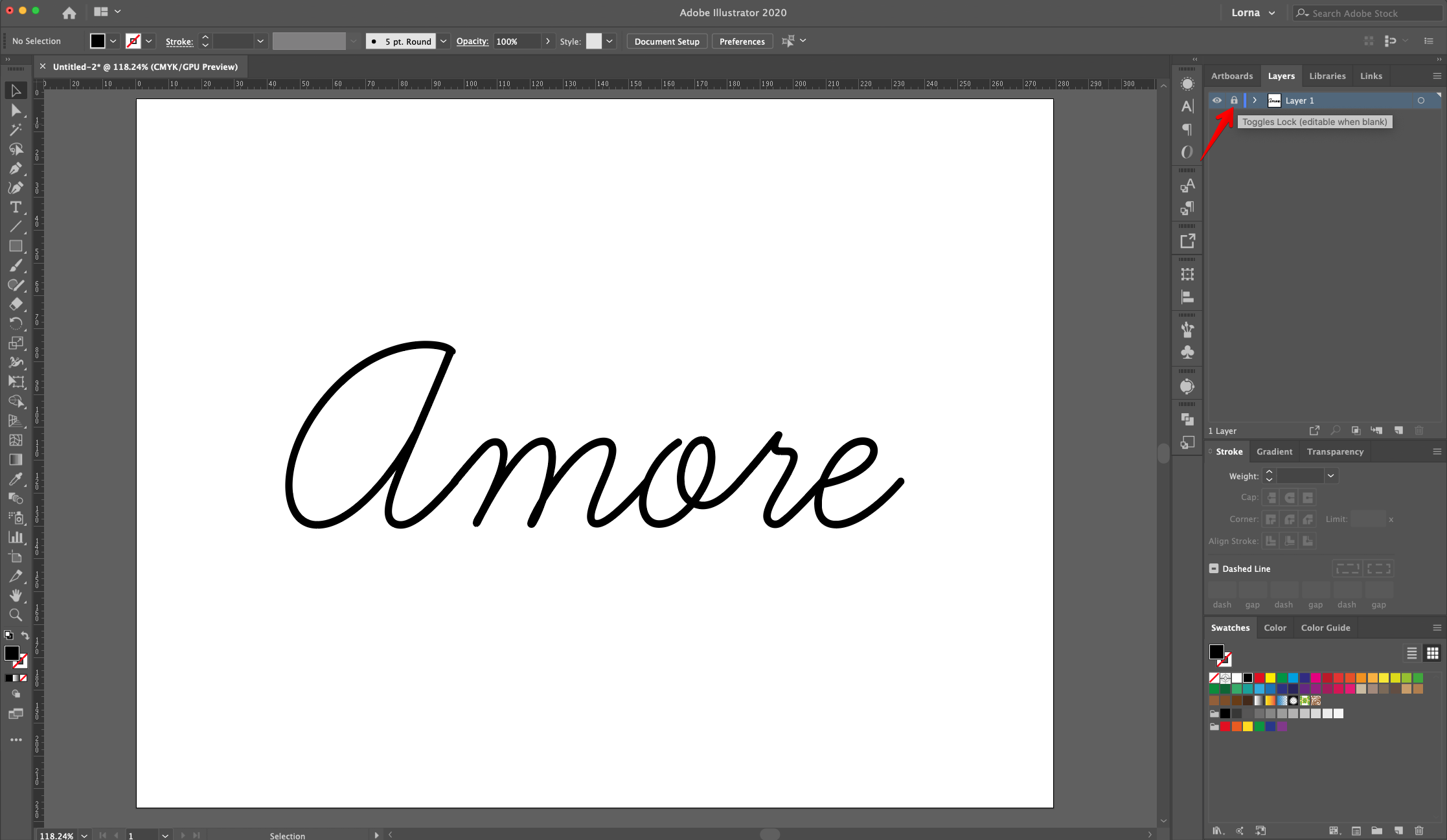
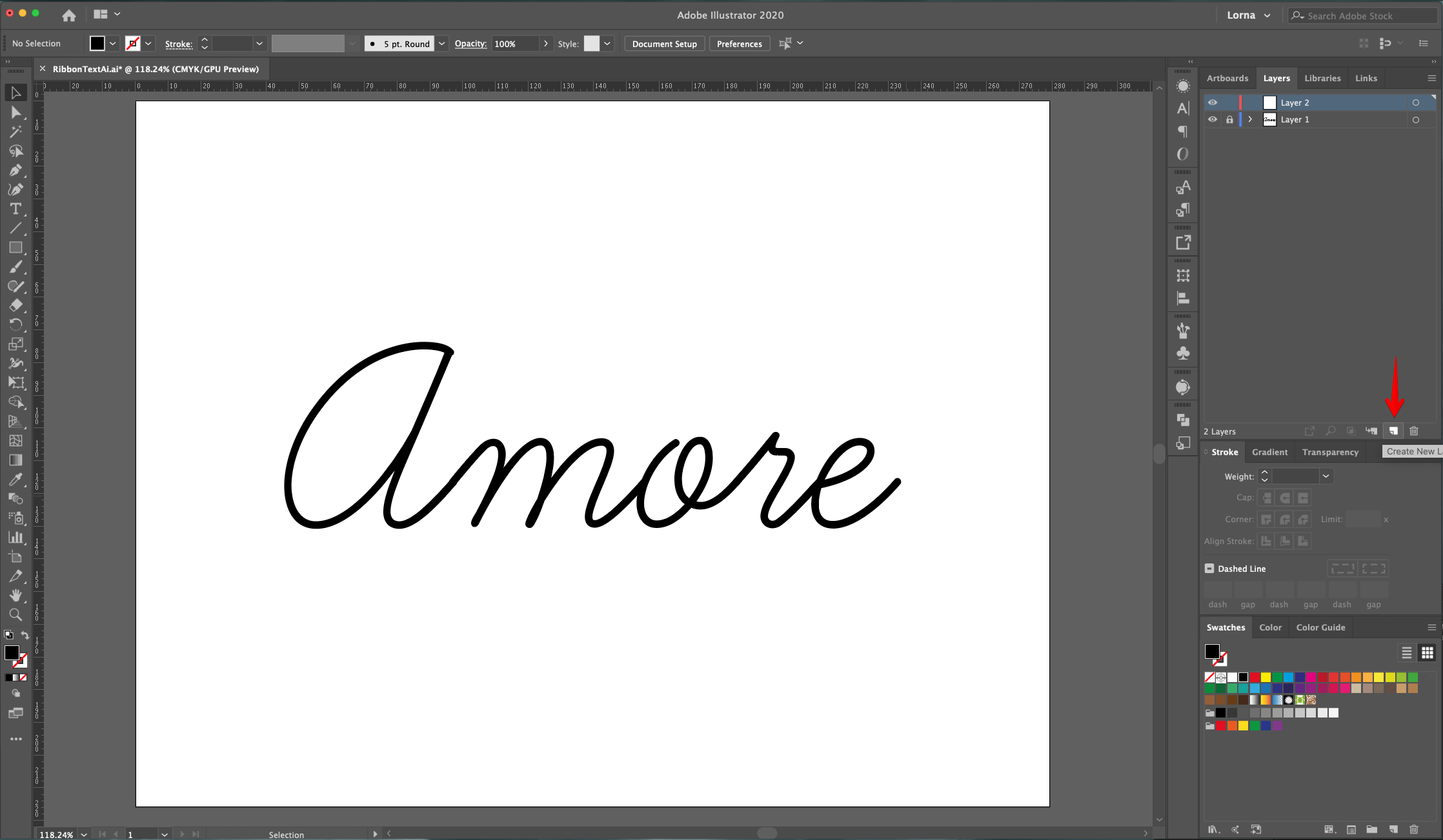
3 - Center it using the “Horizontal and Vertical Align Center” options on your Top Menu and make sure that “Align to Artboard” is selected. Or use the same options in the “Align Panel”. Lock this Layer by clicking to the left of its thumbnail and bringing out the small Padlock icon and “Create New Layer” by clicking on the button at the bottom of the “Layers Panel”.
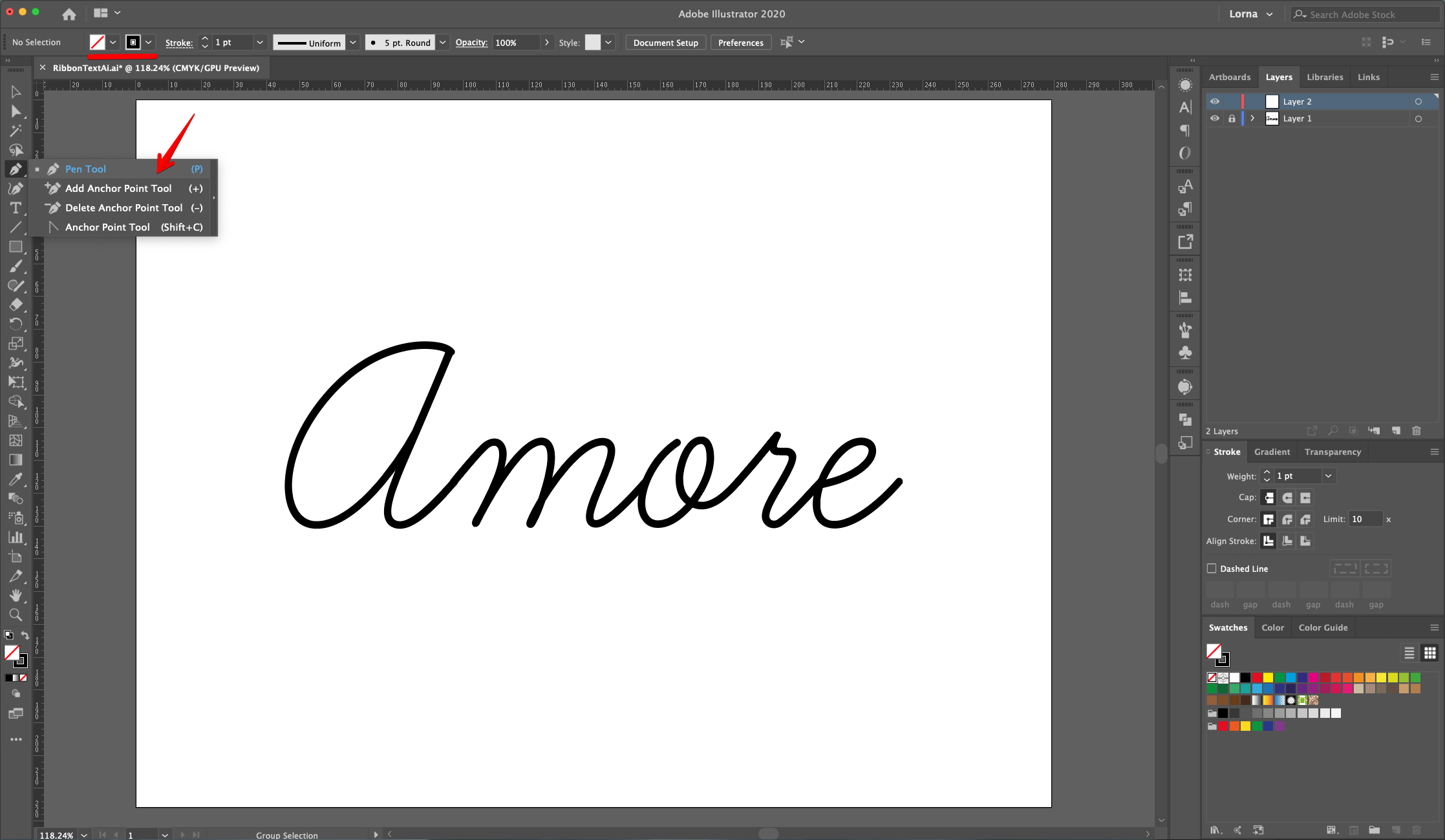
4 - Use the “pen Tool” (P) to “Trace” the text. Use a different color for the “Stroke” to make it more visible against the refence text.
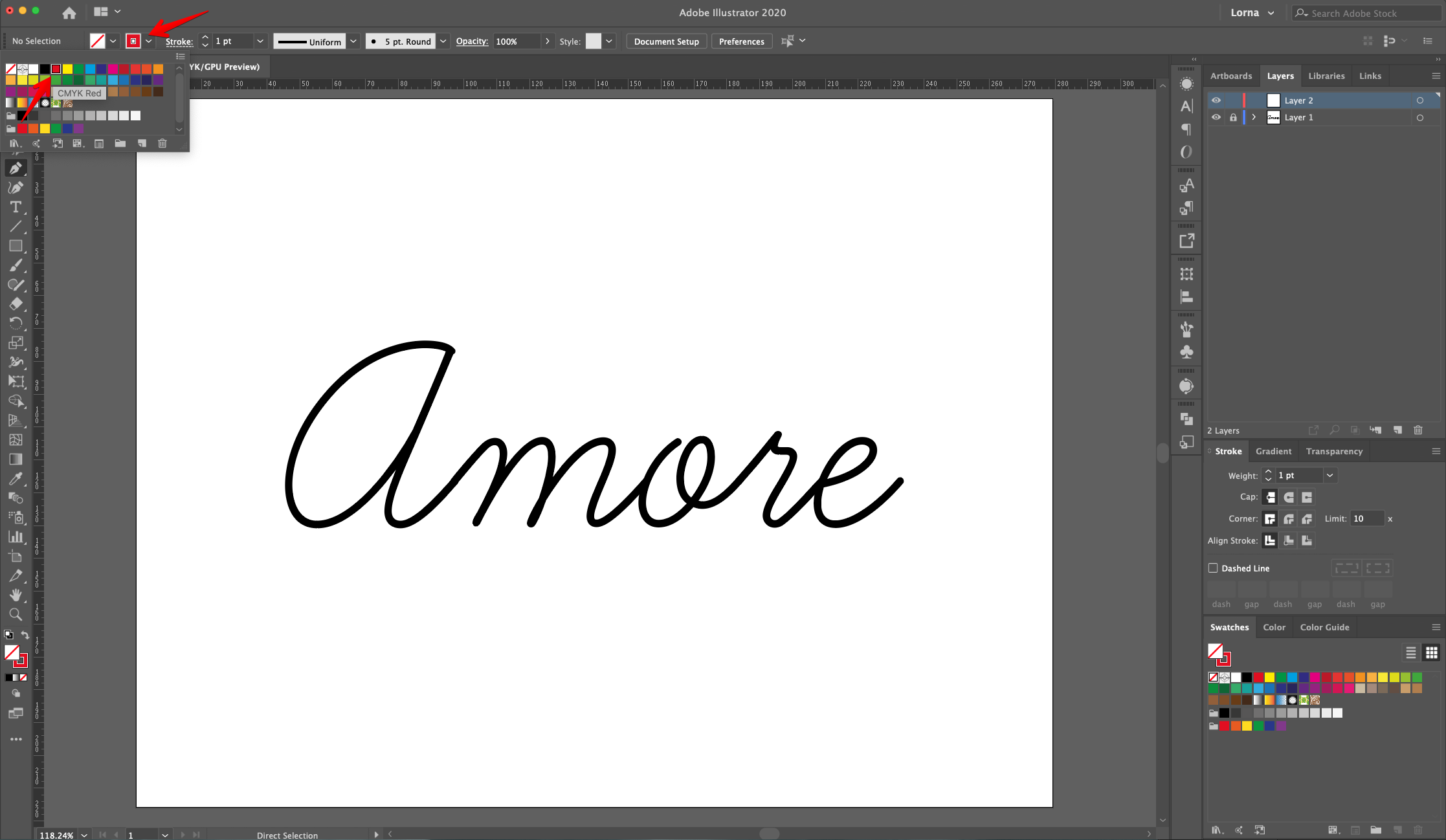
5 - Start from the left edge of the “Document” and create a small curve that connects to the first letter. If you need to “Close” the “Path” hit “Enter”.
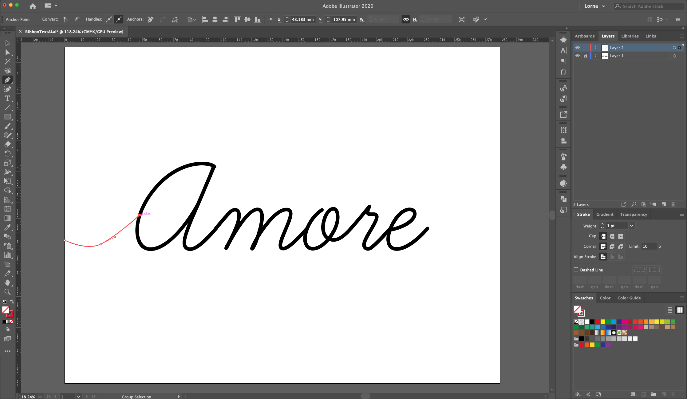
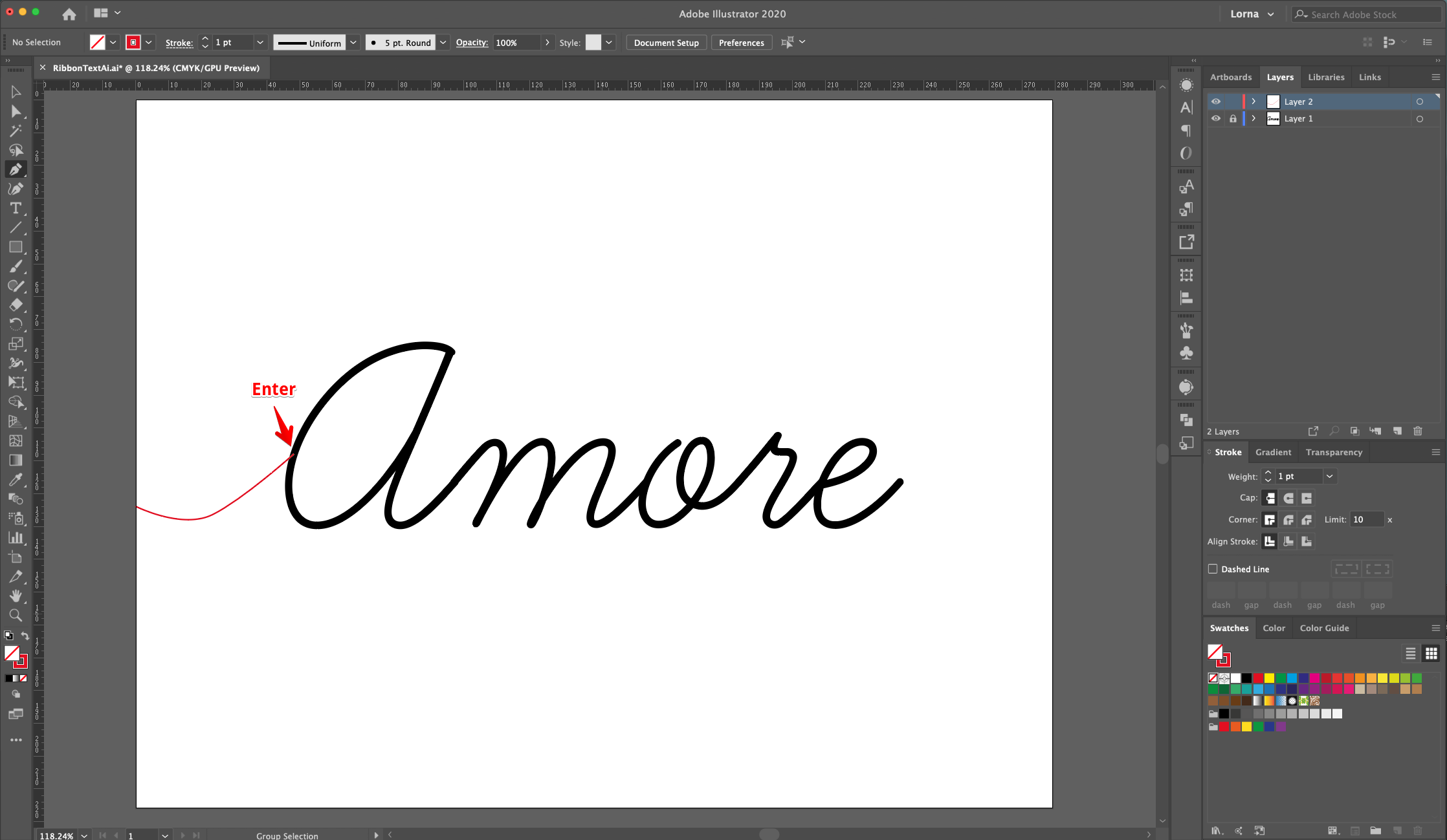
6 - Keep tracing the text and try to fit as much of it in a single “Path” making “Loops” and “Curves” and/or clicking again on top of a curved “End Point” to make it “Straight”.
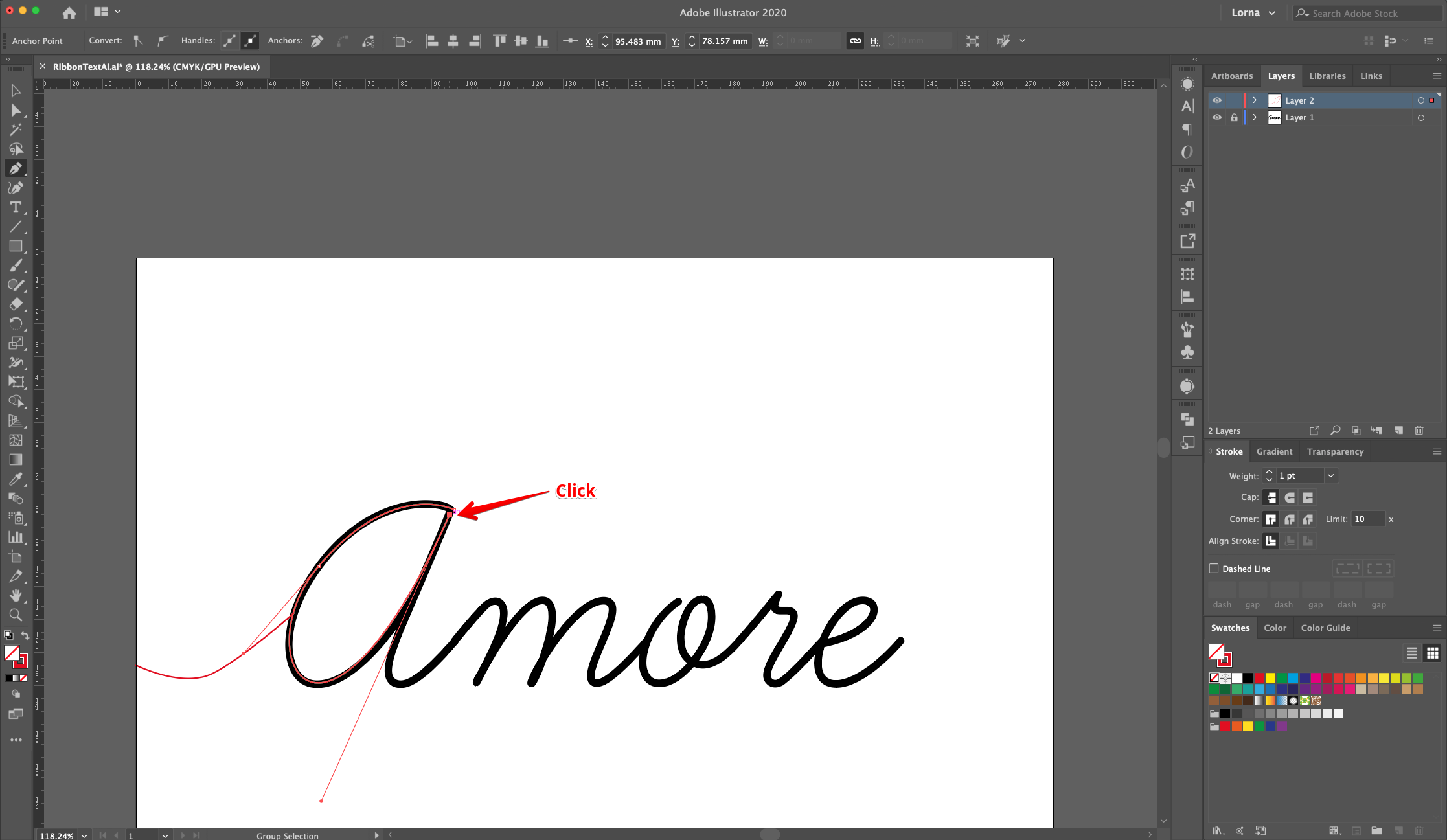
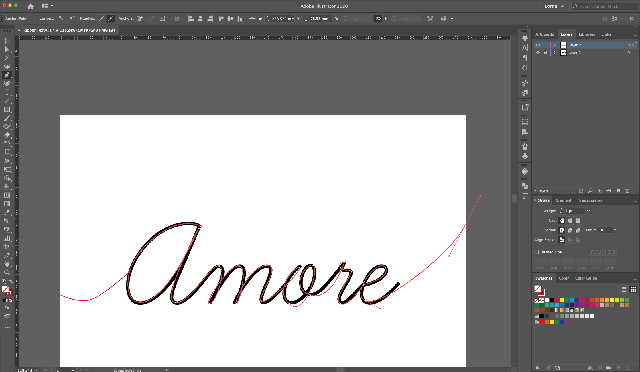
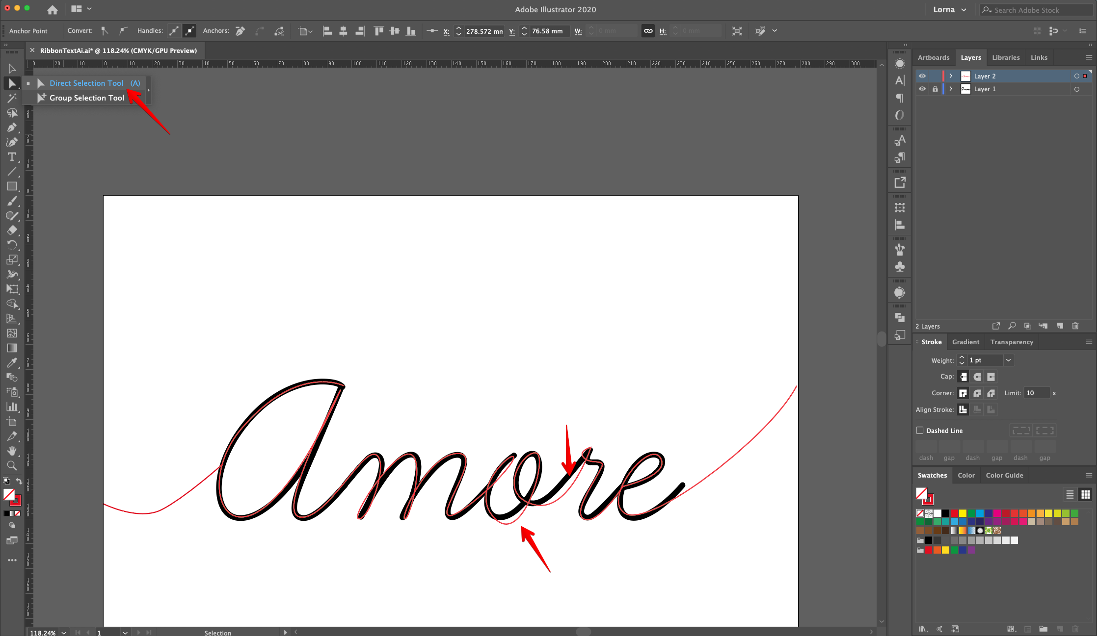
7 - Use the “Direct Selection Tool” (A) to click on the “End Points” that need some fixing.
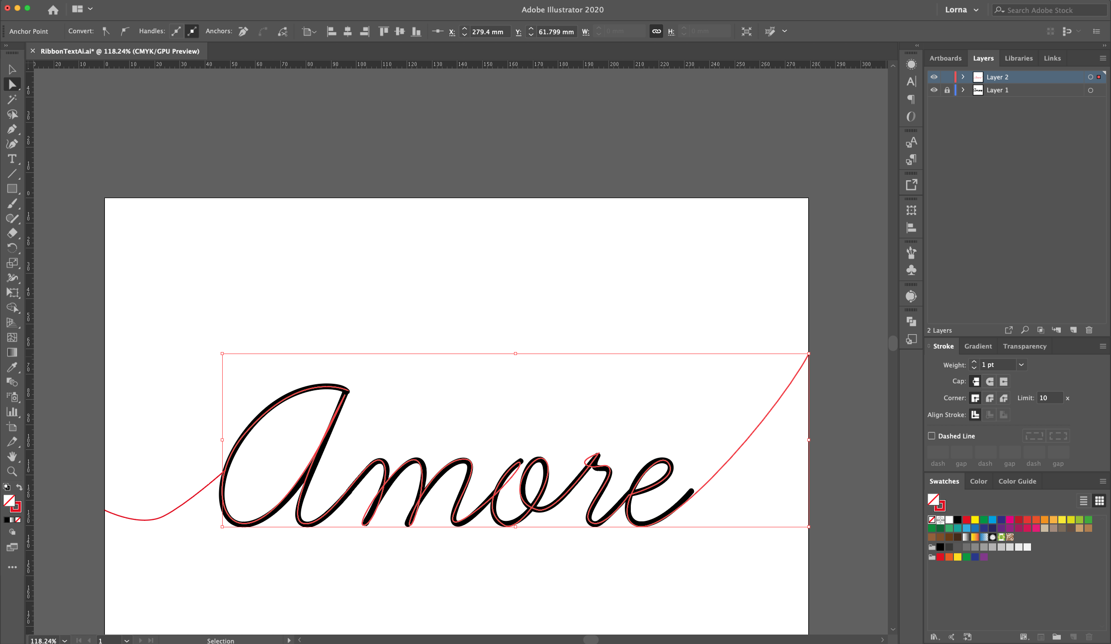
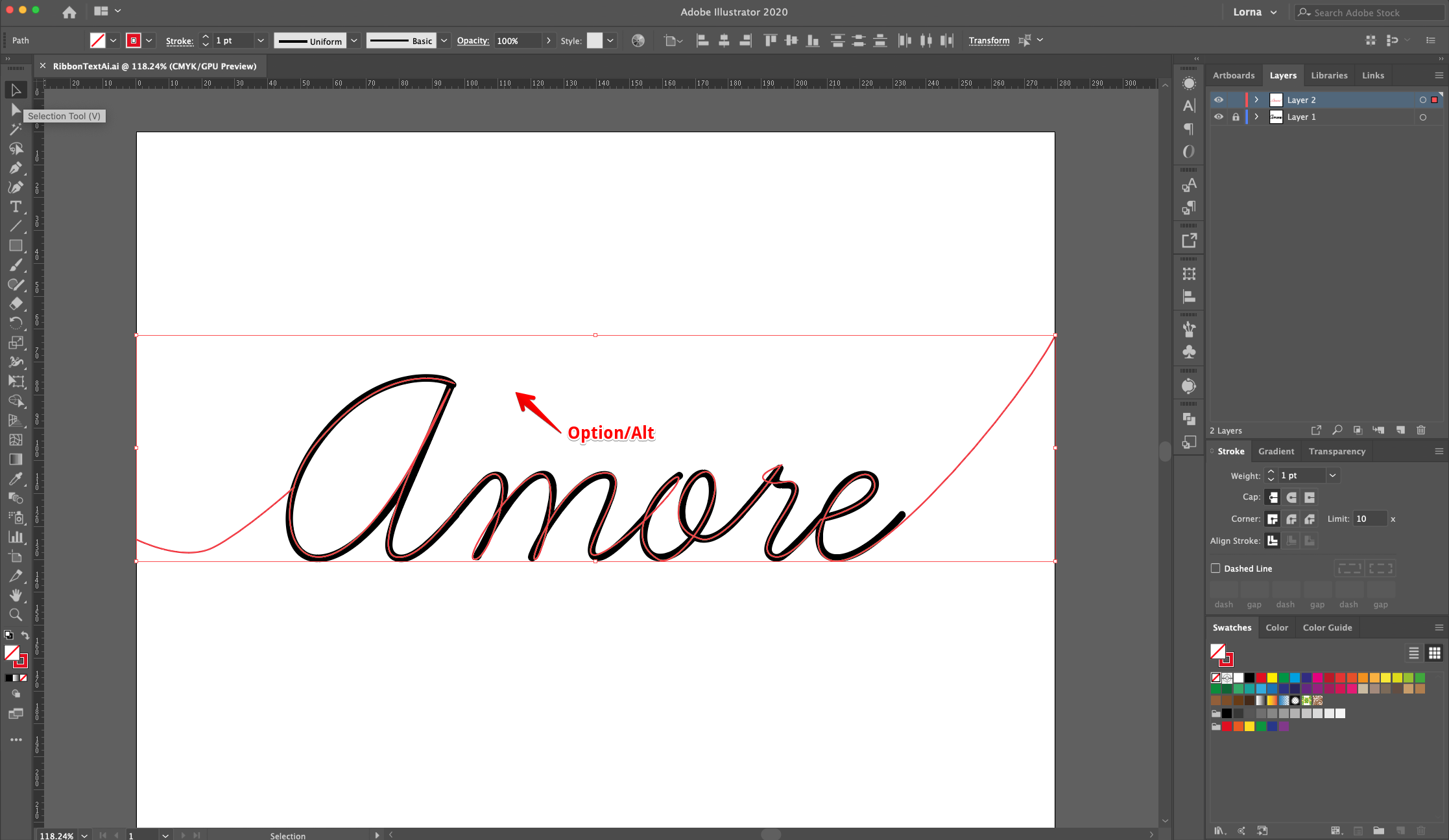
8 - Select all your “Paths” (Shift) and move the text “Up” and “Left” while holding the “Option/Alt” key to create a “Duplicate”. The idea is to create the “Thickness” of the “Ribbon”.
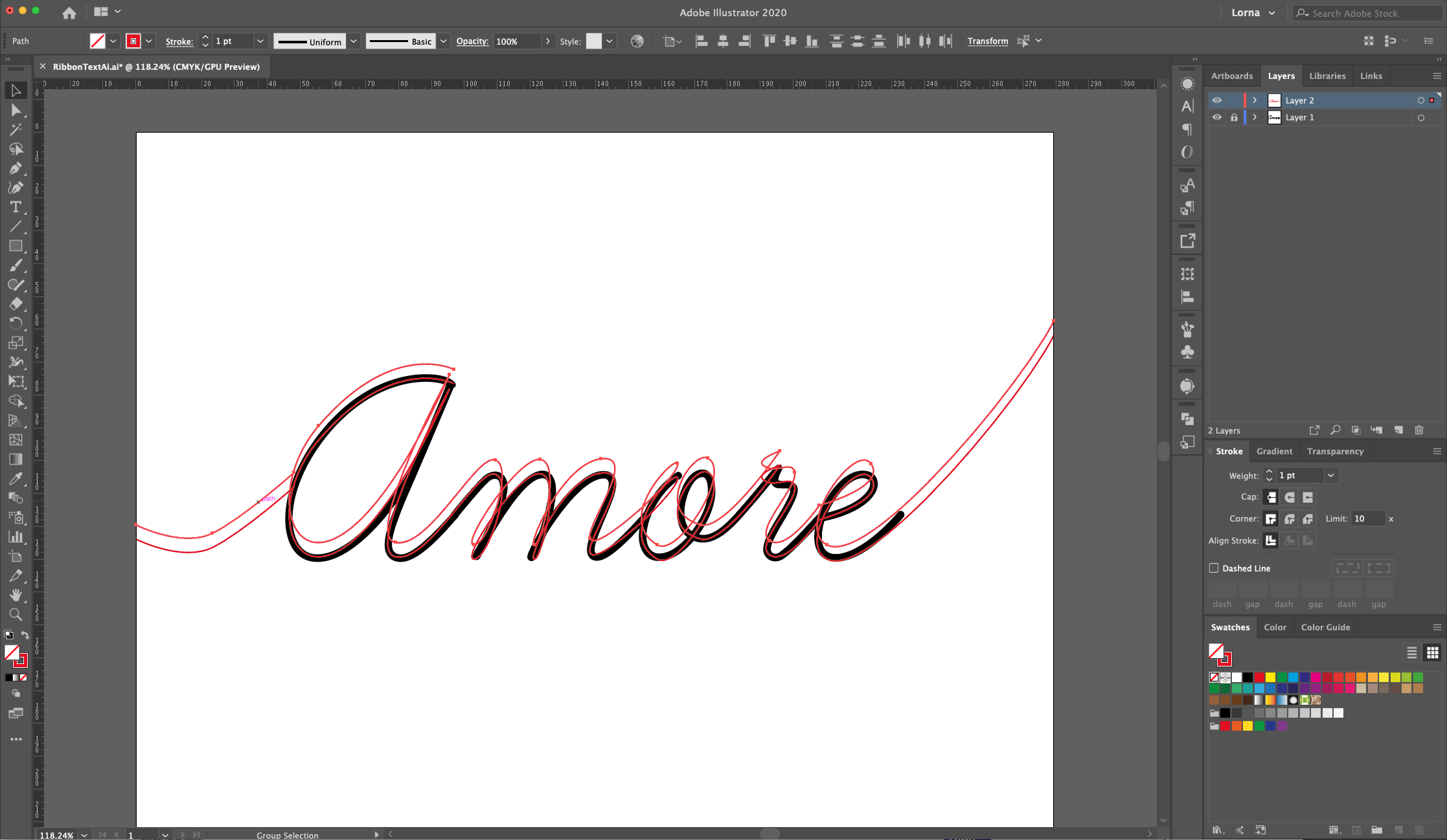
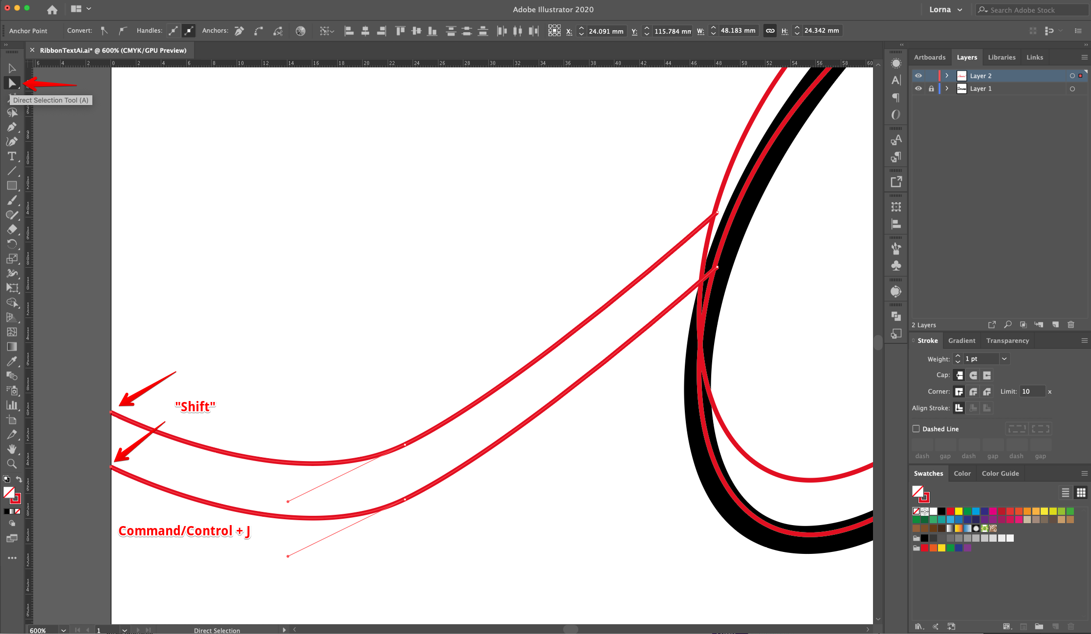
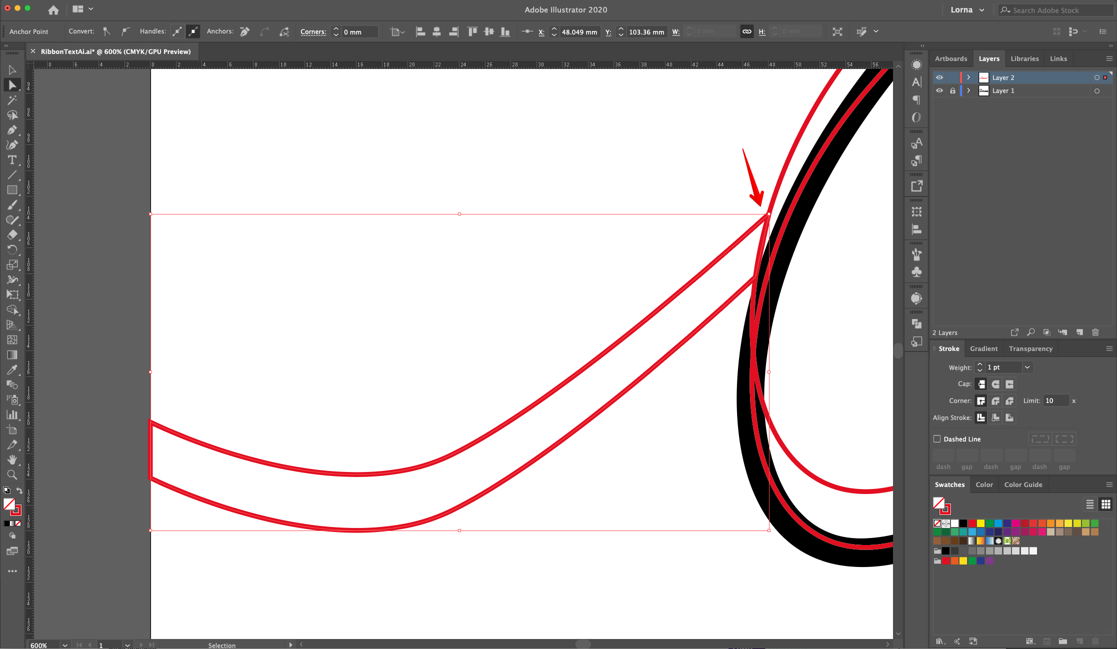
9 - Once you are happy with the placement, select the “Edges” of the first curved line with the “Direct Selection Tool” (A) (+ “Shift” key) and “Join” them together (Command/Control + J). Repeat with the other side.
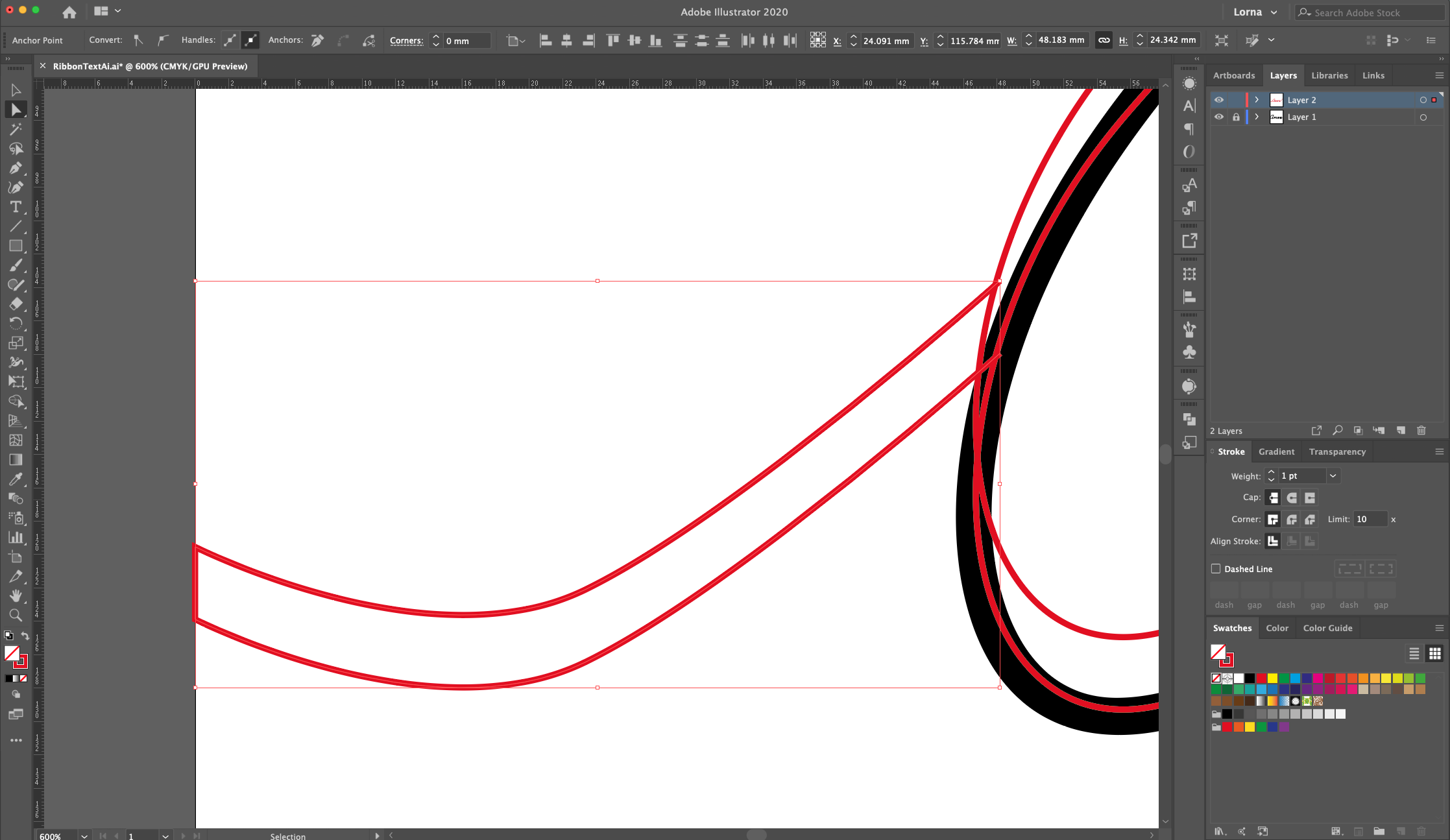
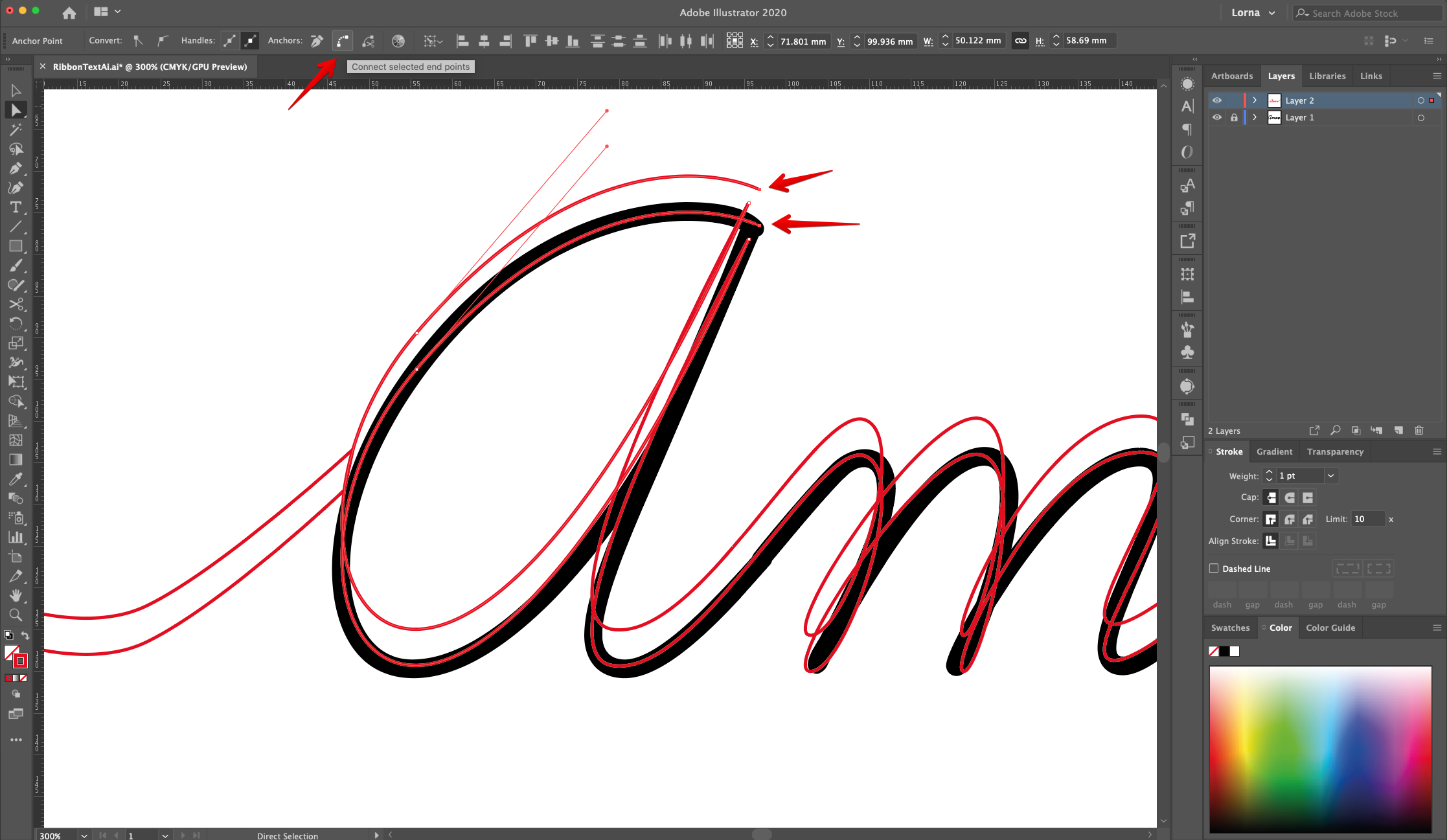
10 - Check the text and notice the spots where the “Ribbon” should overlap and where the “Curves” should be. We will use the “Scissors Tool” (C) to cut some spots in the overlapping paths and then “Join” some of them together to achieve the 3D effect. You can also use the “Connect Selected Endpoints” button on the Top Menu to join selected paths together.
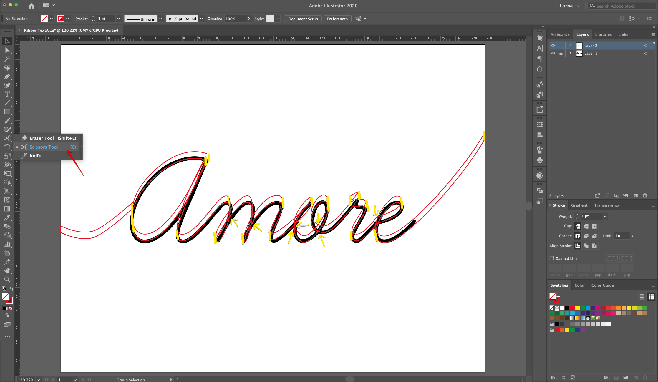
11 - Close the edges of the letters. Check out each one and see where the “Ribbon” should be facing “Up” or “Down” and cut some of the edges to create individual “Pieces” of ribbon that will be colored differently.
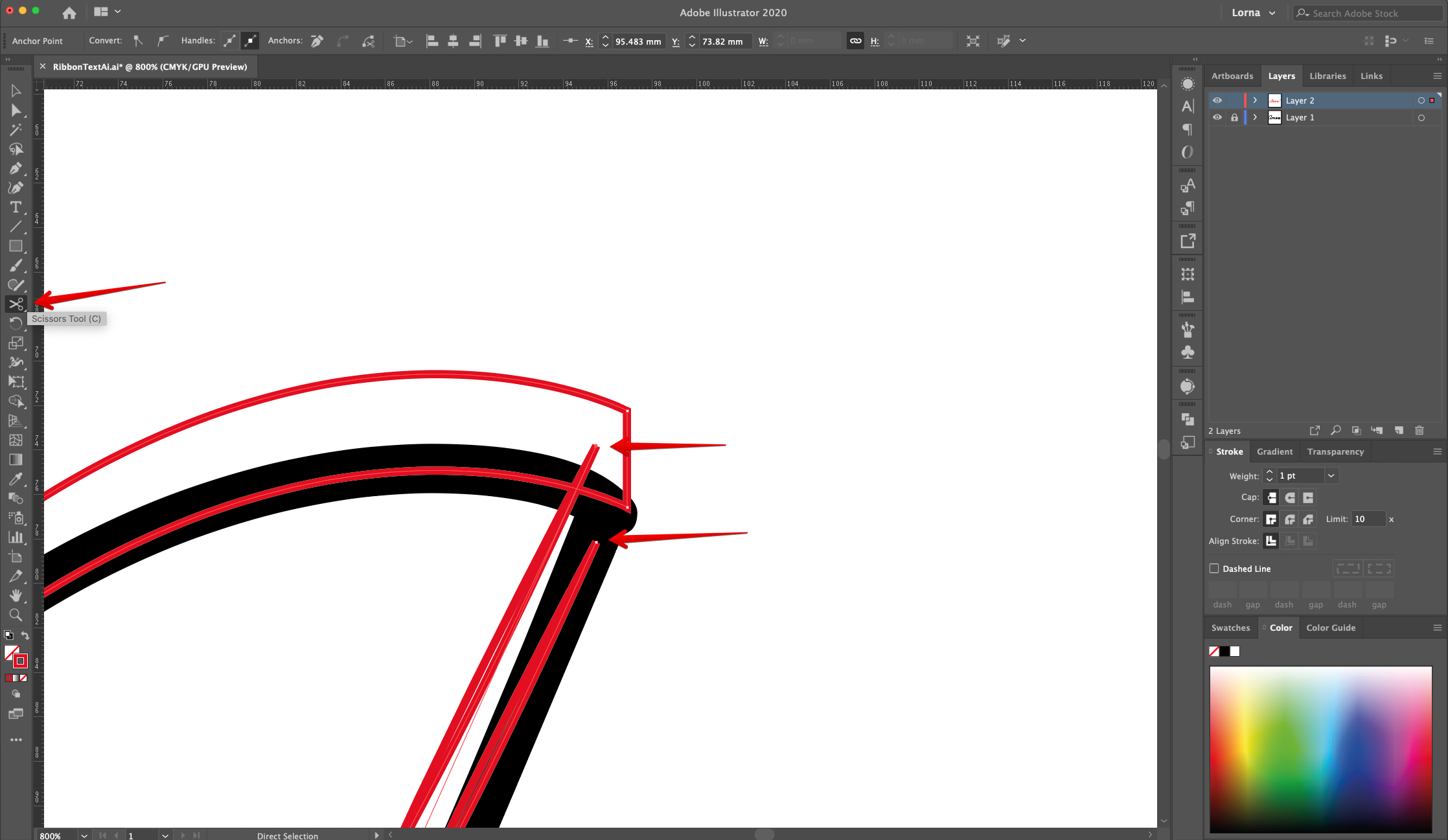
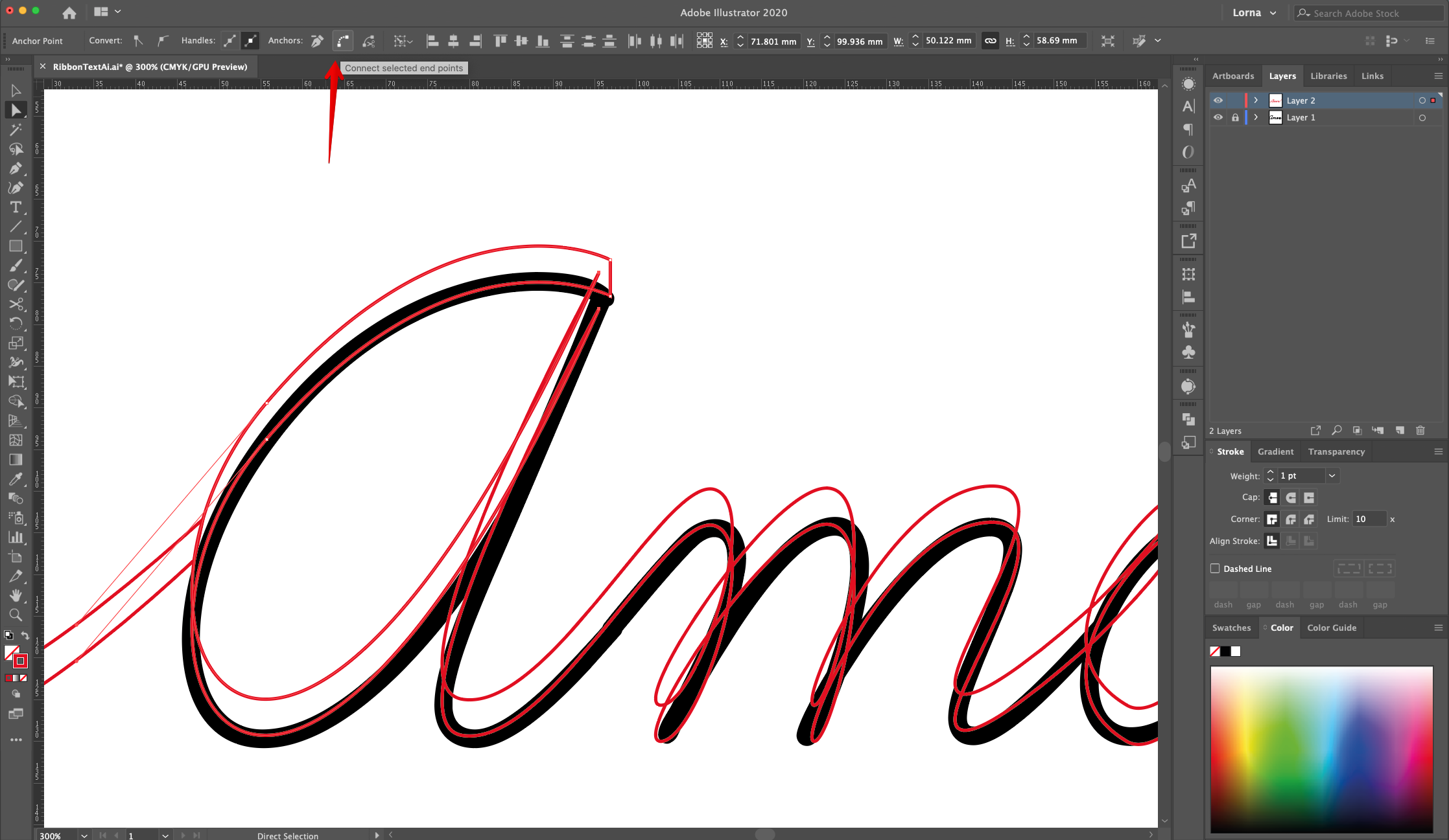
12 Where the curved parts of the letters are (where the two paths overlap) use the “Scissors Tool” (C) to make cuts on each side of the overlap. Use the “Selection Tool” (V) and “Shift” key to select the paths on each side of the letter and then use the “Direct Selection Tool” (A) to select just the “End Points” (one from each of the overlapping paths) and then “Join” them together. Repeat with the other “End Points” in order to divide the letter sections.
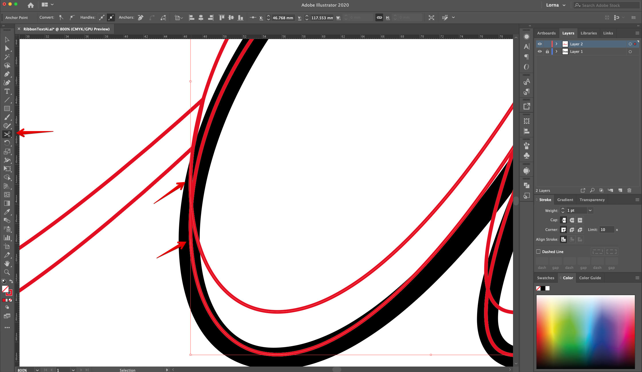
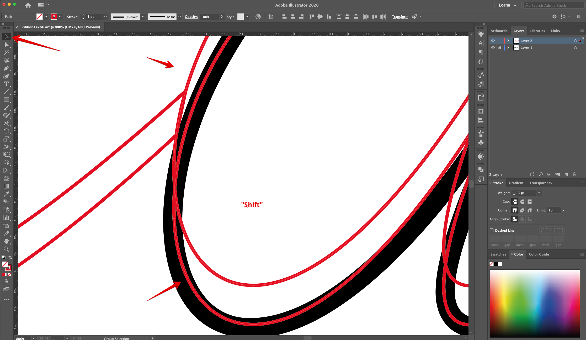
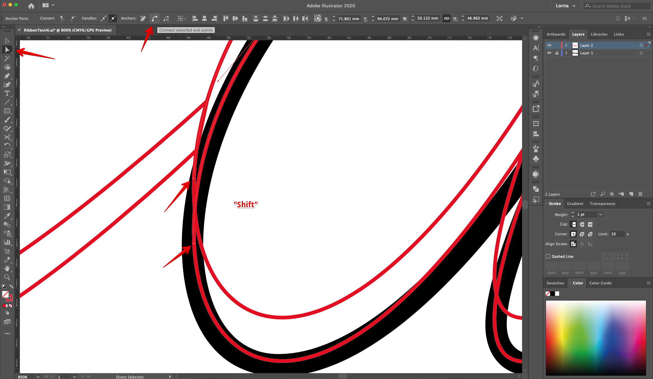
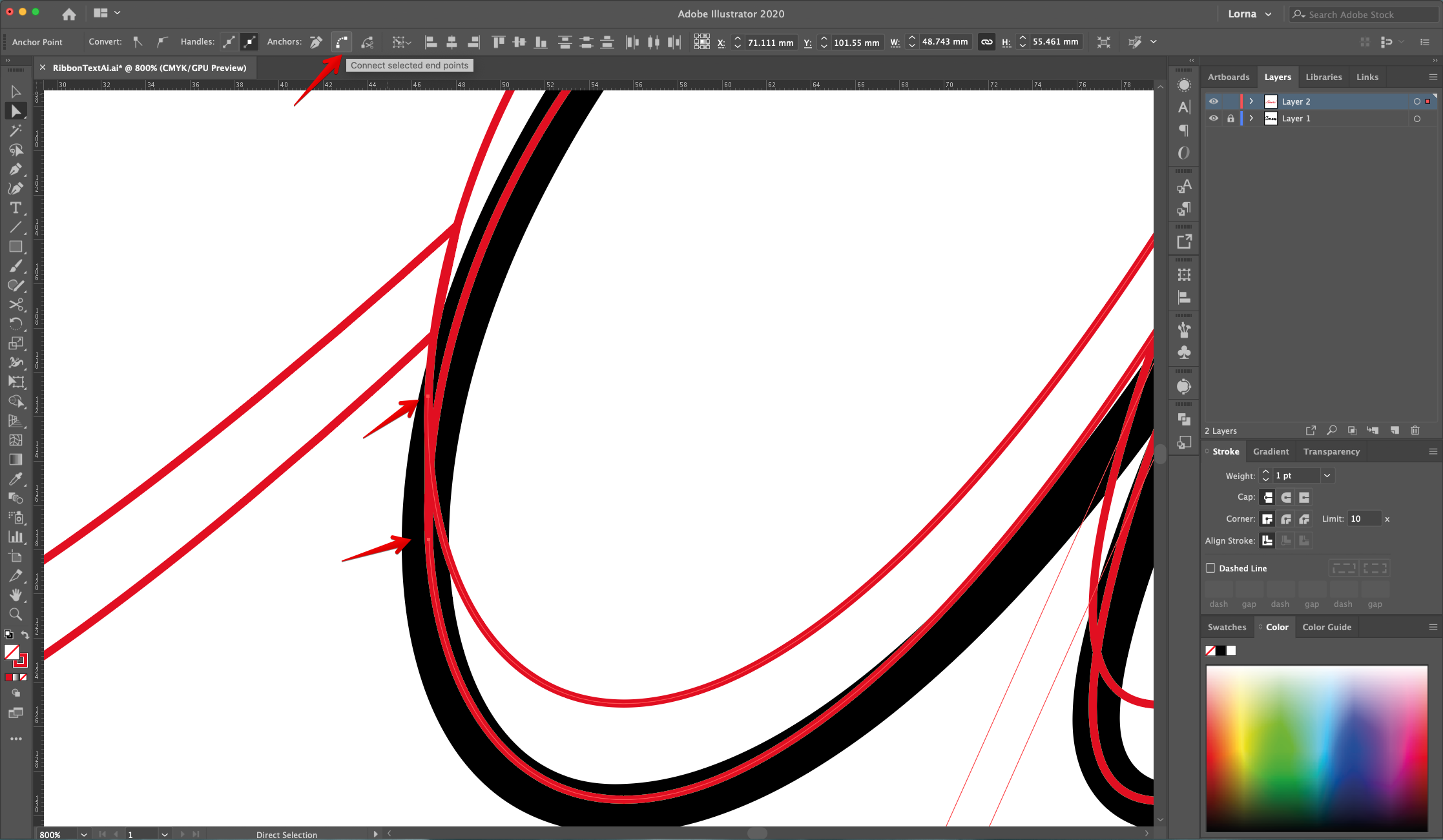
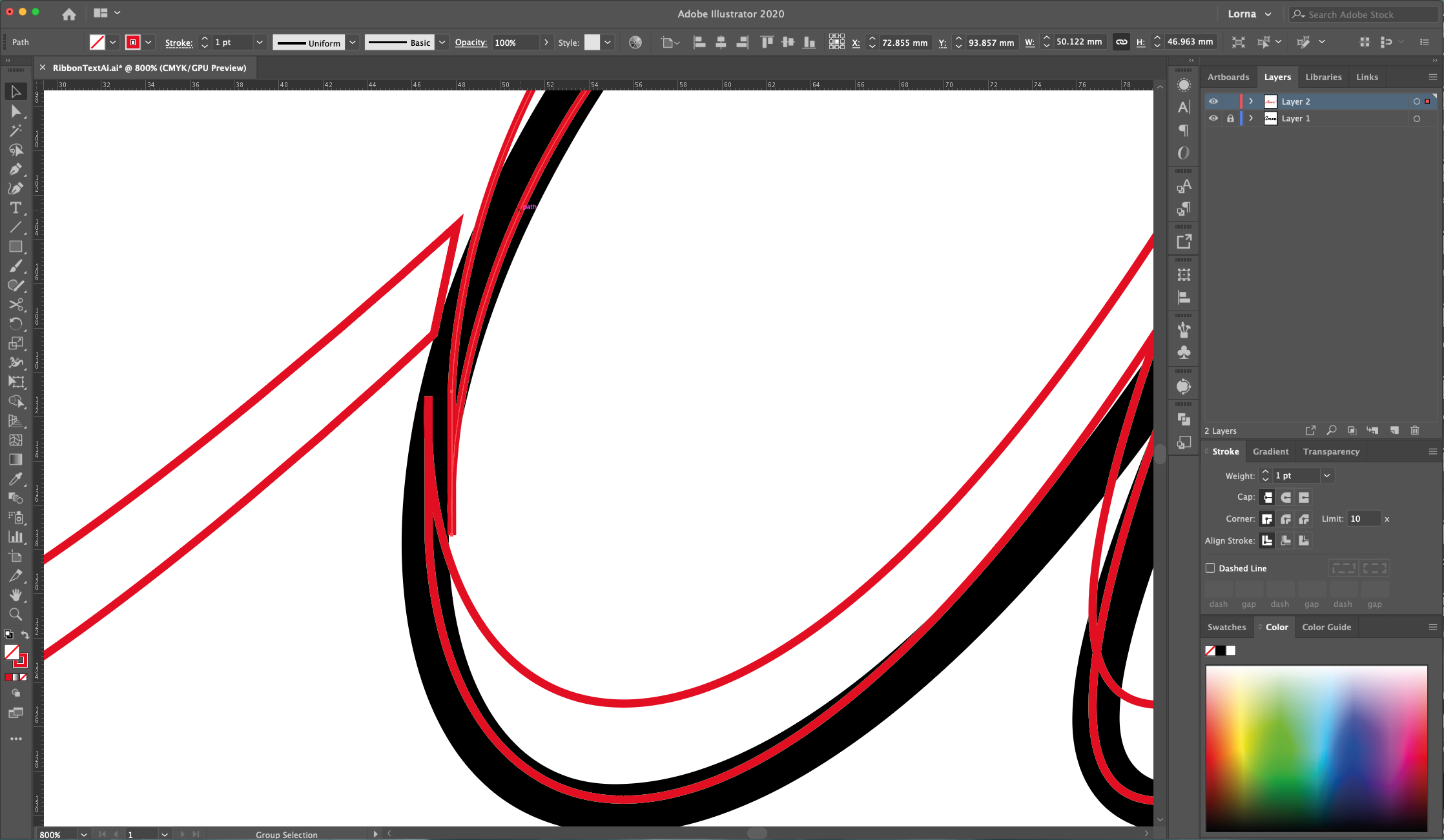
13 - Keep dividing the “Ribbon” text in sections by cutting and joining the paths together. At first it seems a bit complicated but once you get the hold of it it’s pretty intuitive.
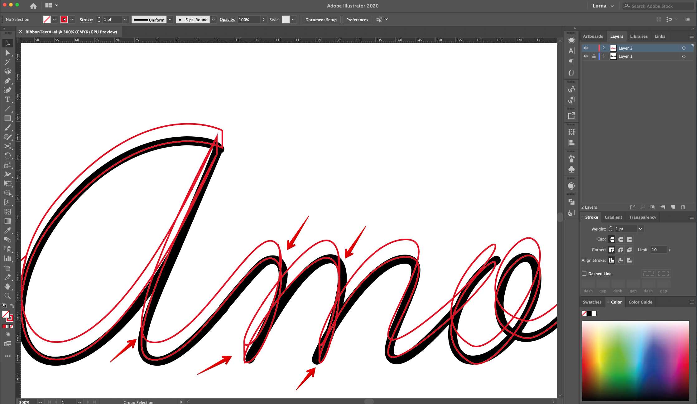
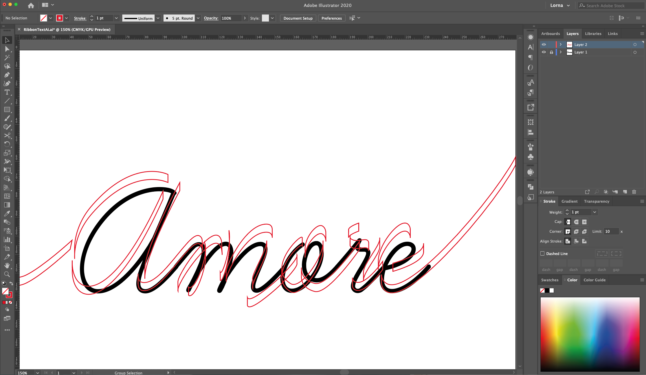
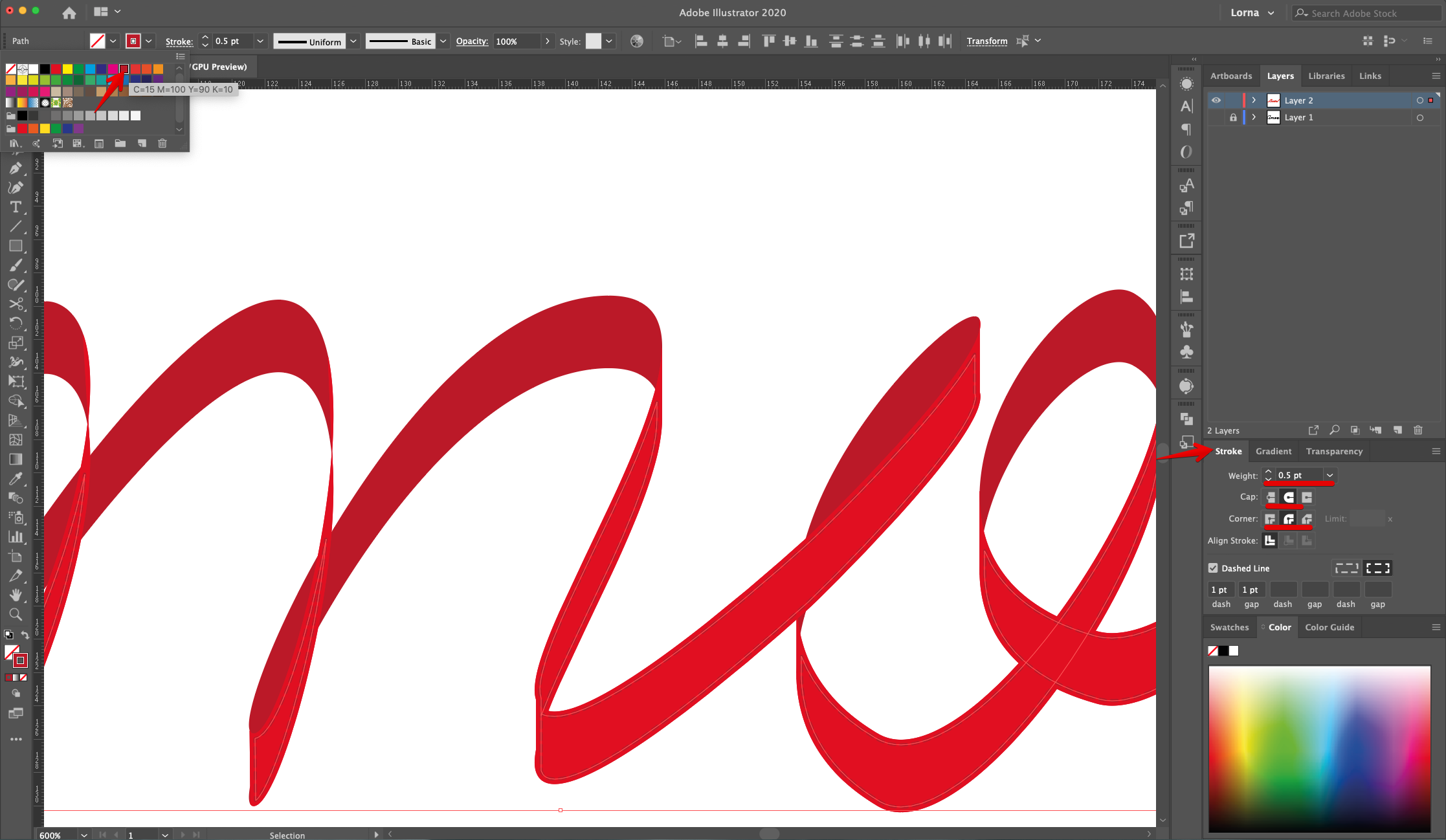
14 Once you are done with the sectioning of the “Ribbon”, select all the paths (Shift), head to the “Stroke Panel” and make the Stroke Cap and Corners “Rounded”.
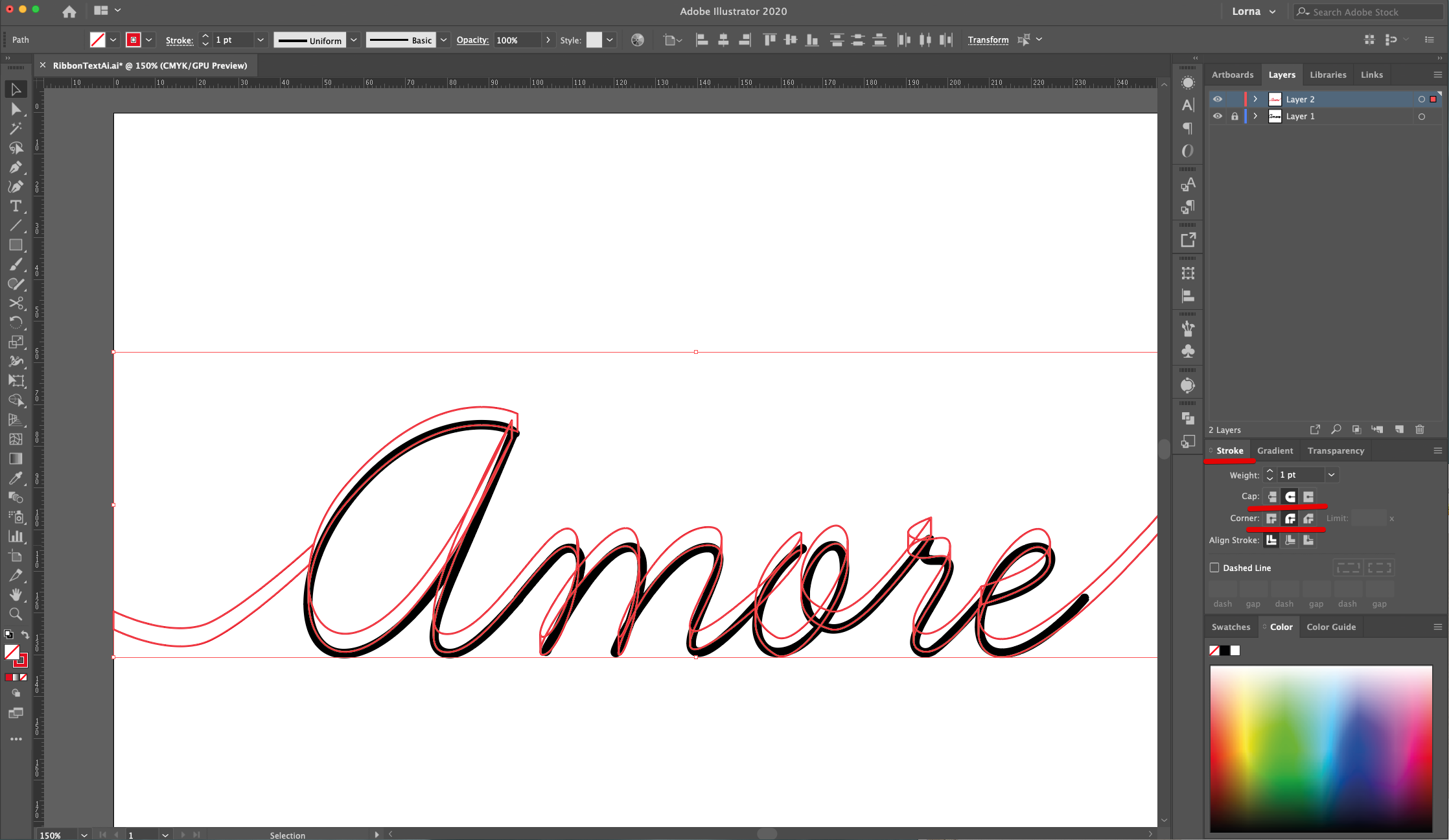
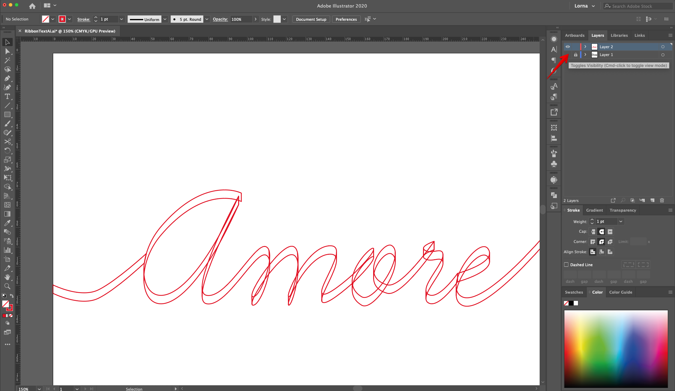
15 - Hide or Delete the original “Text” layer by clicking on the small eye on the left side of its Thumbnail. Then, select your “Ribbon” text and “Swap Fill and Stroke” colors (Shift + X).
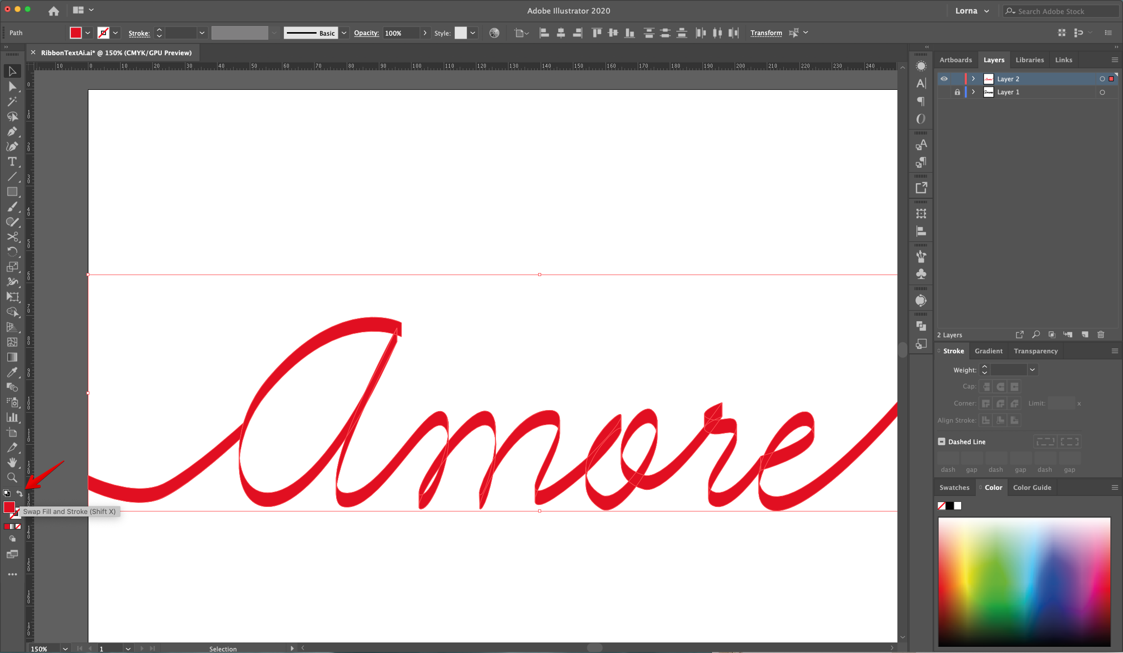
16 - Select the “Sections” that are “Inside” the folds and make them darker.
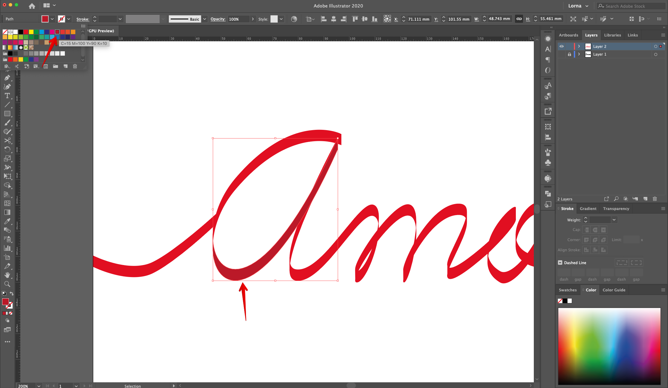
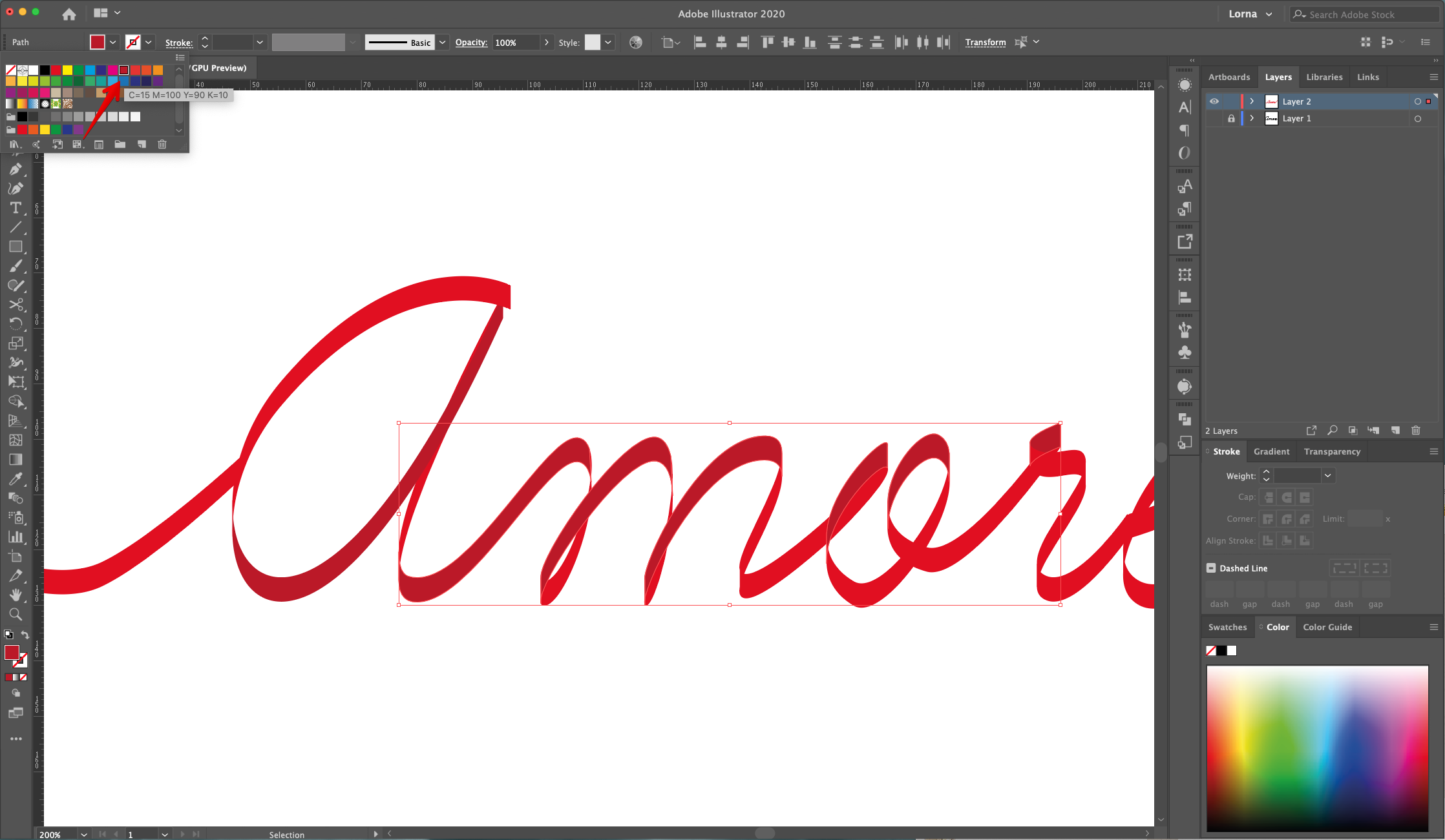
17 - In some cases you may need to select some portions of the text and place them on top of others to get the right folded look. Right-click on top and choose Arrange > Bring to Front”. Or “Send to Back” depending on what you need to do.

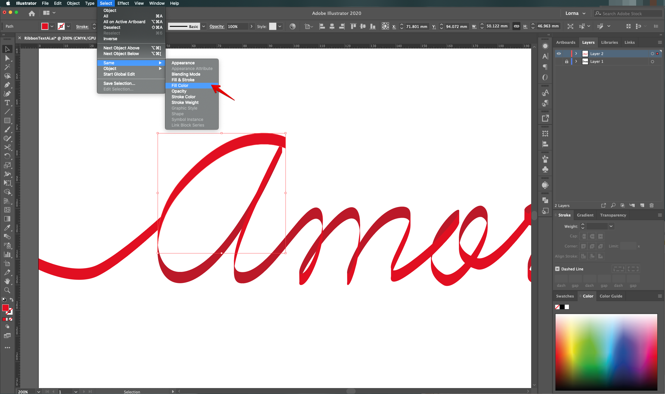
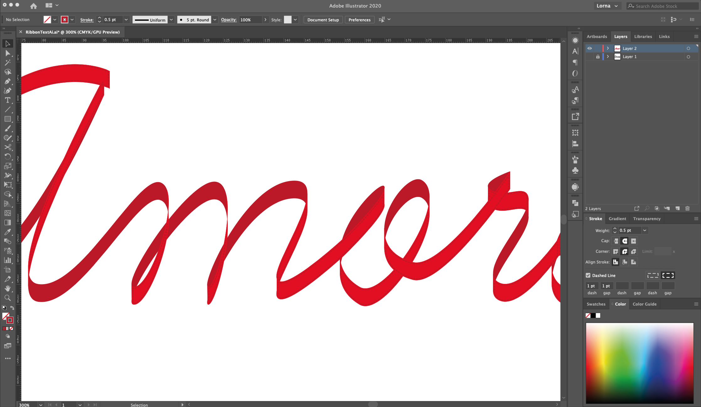
18 - To create some “Stitches” inside the “Ribbon” select one of the lighter “Sections” and go to Select > Same Fill Color, then “Paste in Front” (Command/Control + F).
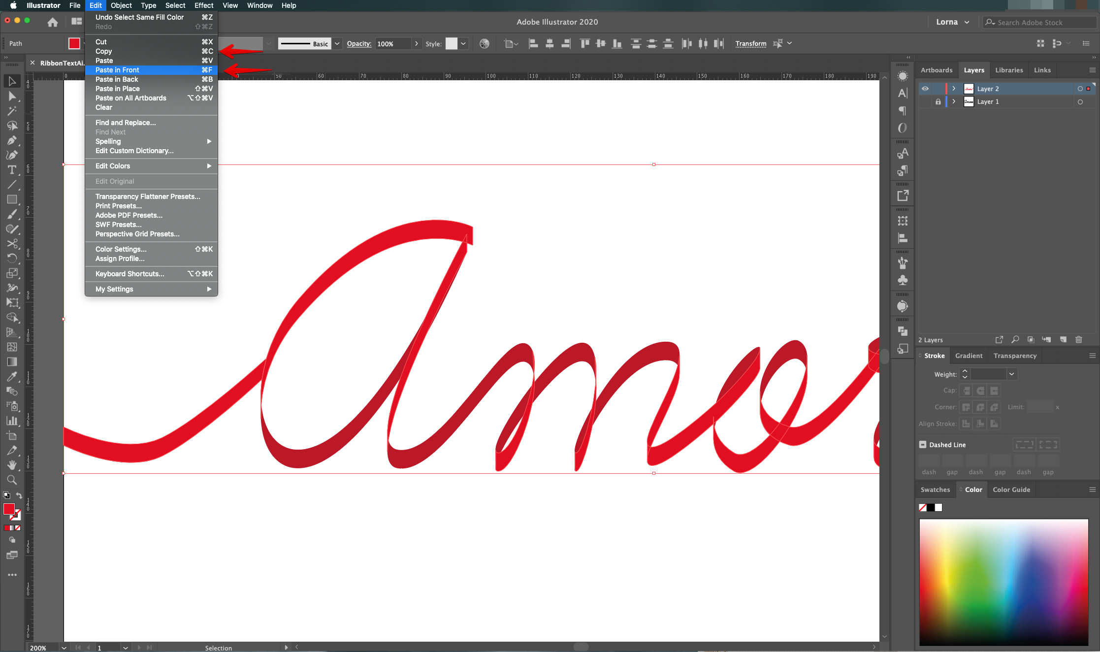
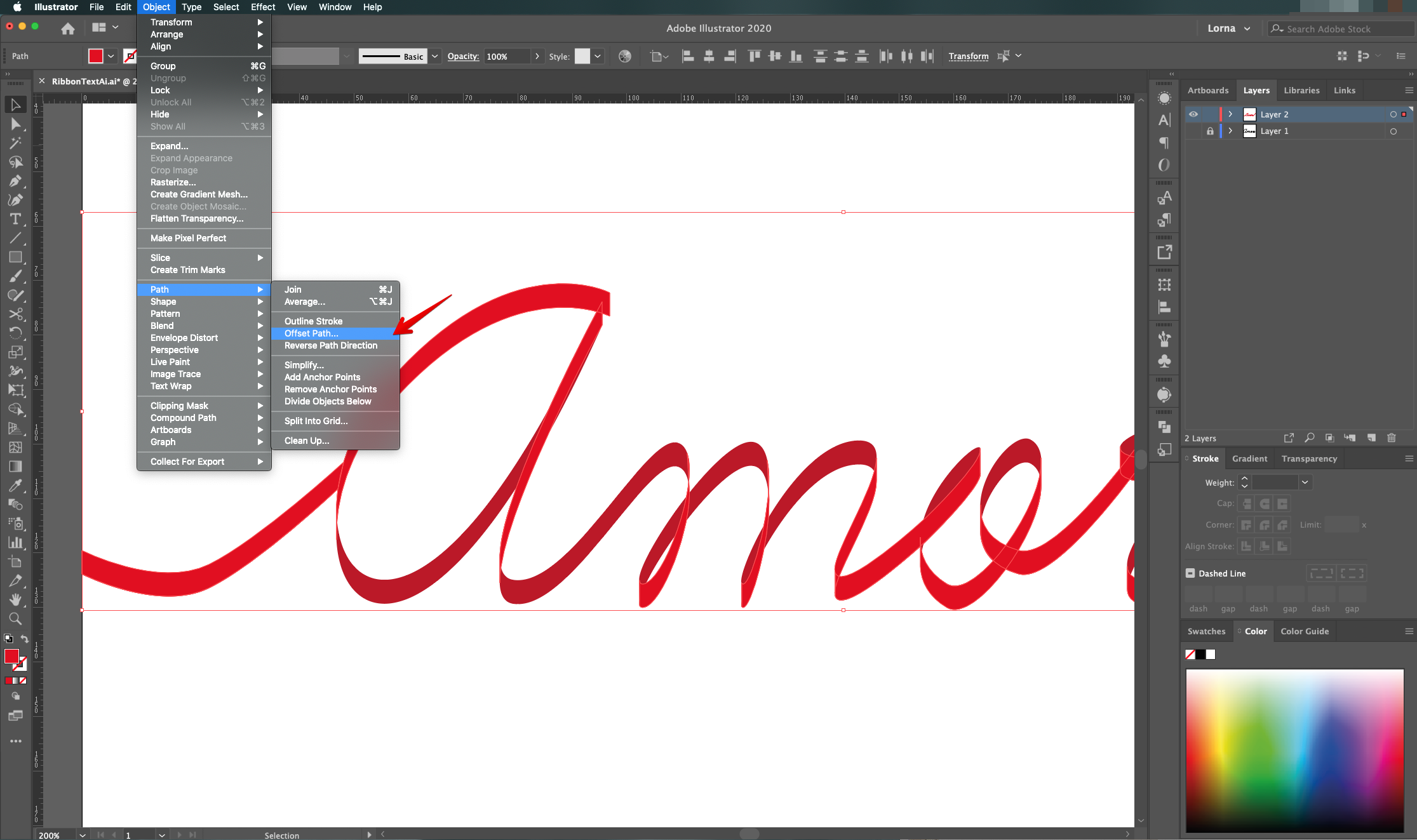
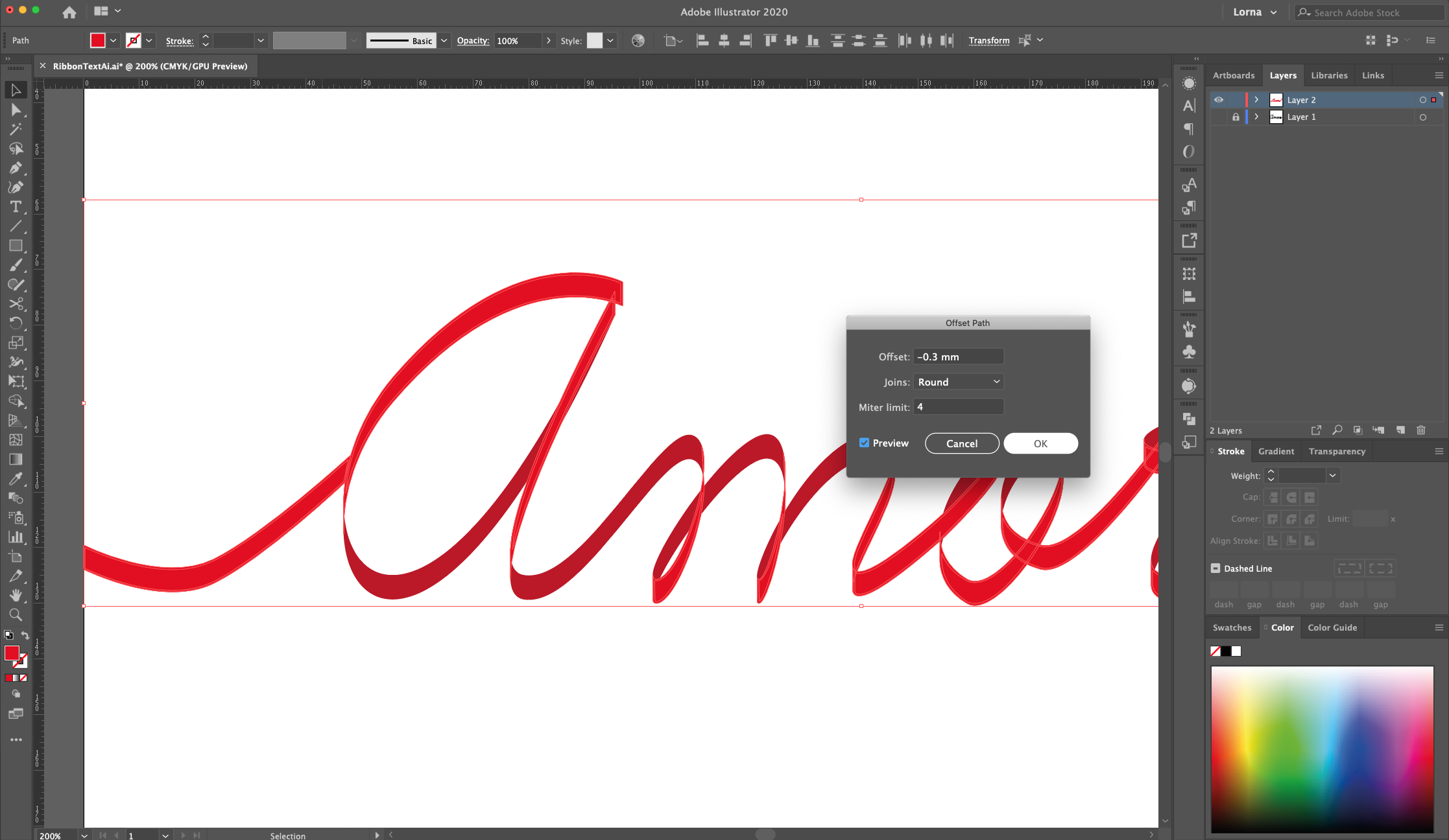
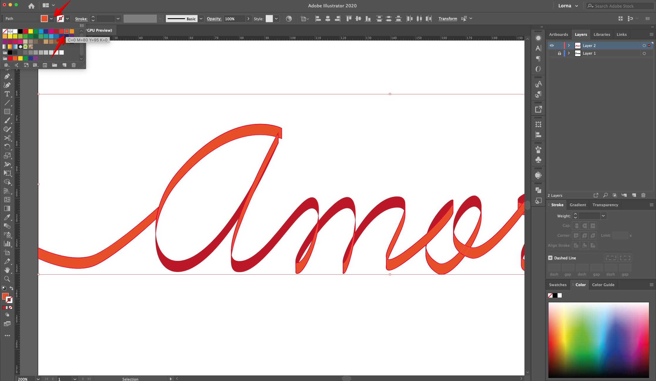
19 - Whit the selection still active, head to Object > Path > Offset Path and use an “Offset” of -0.3 mm, “Round Joins” and a “Miter Limit” of 4. Change the “Fill” color to a lighter shade for better visualization.
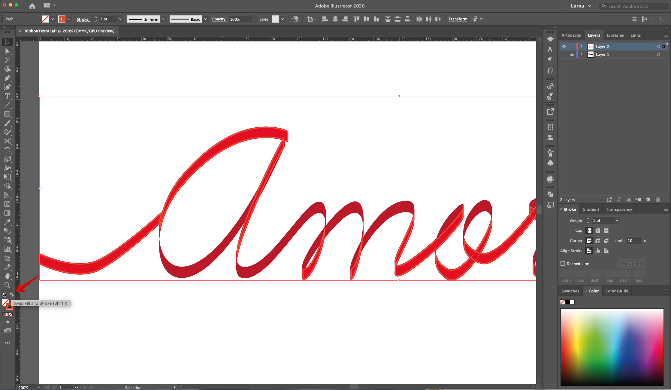
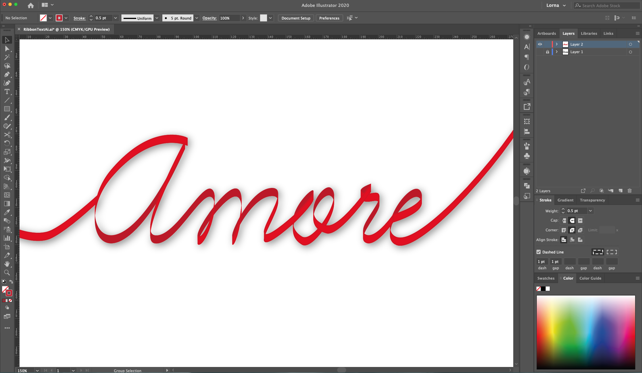
20 - “Swap Fill and Stroke” colors (Shift + X), head to the “Stroke Panel”, change the “Weight” to 0.5 pt and make the Stroke Cap and Corners “Rounded”. Check the “Dashed Line” box and use a 1 pt “Dash” and “Cap” values. You can change the “Stroke” color to a darker shade.
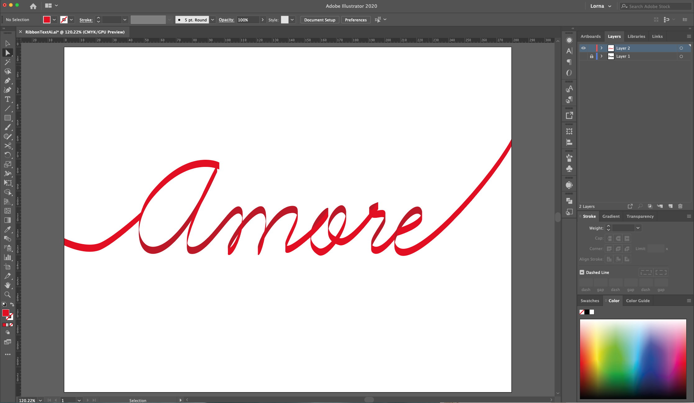
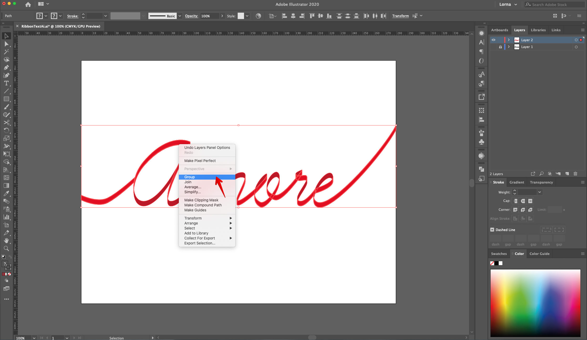
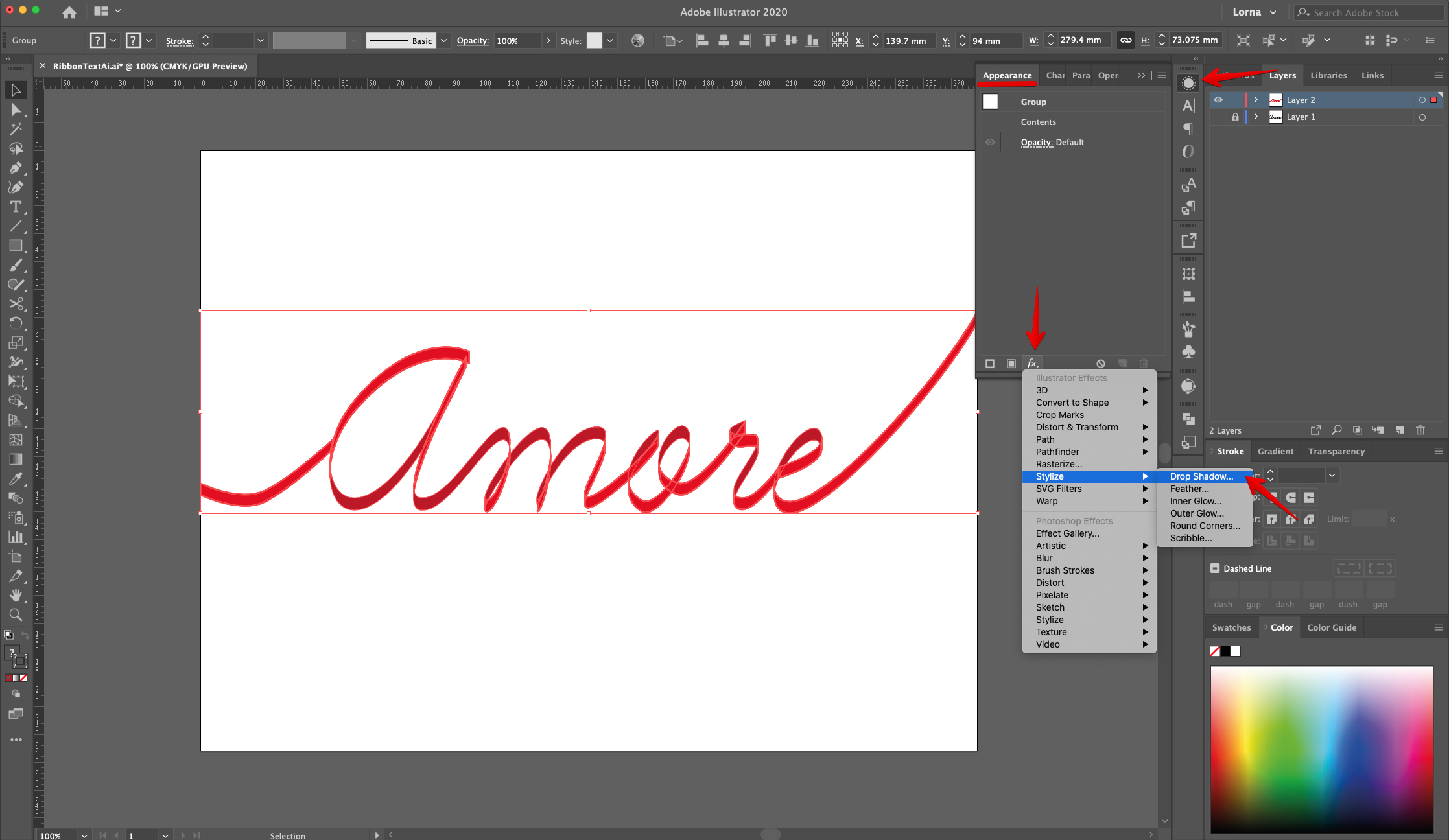
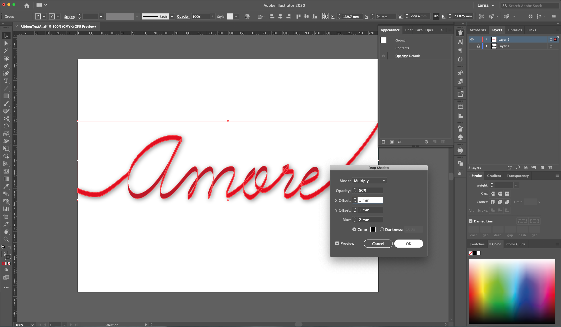
21 - Select everything and “Group” it together (Command/Control + G). Head to the “Appearance Panel”, click on the “Effects” Menu at the bottom and navigate to Stylize > Drop Shadow, use “Multiply”, 50% for “Opacity”, X and Y-Offset: 1 mm, Blur: 2 mm and Black (#000000) as “Color”, click “OK
22 - Check out your work!
1 - In Illustrator, create a “New Document”. If the “Rulers” are not enabled, go to View > Rulers > Show Rulers (Command/Control + R) to turn them ON.
2 - Select the “Type Tool” (T), choose your font (we used “Learning Curve”) and type your text. The Size will depend on your font and document.
3 - Center it using the “Horizontal and Vertical Align Center” options on your Top Menu and make sure that “Align to Artboard” is selected. Or use the same options in the “Align Panel”. Lock this Layer by clicking to the left of its thumbnail and bringing out the small Padlock icon and “Create New Layer” by clicking on the button at the bottom of the “Layers Panel”.
4 - Use the “pen Tool” (P) to “Trace” the text. Use a different color for the “Stroke” to make it more visible against the refence text.
5 - Start from the left edge of the “Document” and create a small curve that connects to the first letter. If you need to “Close” the “Path” hit “Enter”.
6 - Keep tracing the text and try to fit as much of it in a single “Path” making “Loops” and “Curves” and/or clicking again on top of a curved “End Point” to make it “Straight”.
7 - Use the “Direct Selection Tool” (A) to click on the “End Points” that need some fixing.
8 - Select all your “Paths” (Shift) and move the text “Up” and “Left” while holding the “Option/Alt” key to create a “Duplicate”. The idea is to create the “Thickness” of the “Ribbon”.
9 - Once you are happy with the placement, select the “Edges” of the first curved line with the “Direct Selection Tool” (A) (+ “Shift” key) and “Join” them together (Command/Control + J). Repeat with the other side.
10 - Check the text and notice the spots where the “Ribbon” should overlap and where the “Curves” should be. We will use the “Scissors Tool” (C) to cut some spots in the overlapping paths and then “Join” some of them together to achieve the 3D effect. You can also use the “Connect Selected Endpoints” button on the Top Menu to join selected paths together.
11 - Close the edges of the letters. Check out each one and see where the “Ribbon” should be facing “Up” or “Down” and cut some of the edges to create individual “Pieces” of ribbon that will be colored differently.
12 Where the curved parts of the letters are (where the two paths overlap) use the “Scissors Tool” (C) to make cuts on each side of the overlap. Use the “Selection Tool” (V) and “Shift” key to select the paths on each side of the letter and then use the “Direct Selection Tool” (A) to select just the “End Points” (one from each of the overlapping paths) and then “Join” them together. Repeat with the other “End Points” in order to divide the letter sections.
13 - Keep dividing the “Ribbon” text in sections by cutting and joining the paths together. At first it seems a bit complicated but once you get the hold of it it’s pretty intuitive.
14 Once you are done with the sectioning of the “Ribbon”, select all the paths (Shift), head to the “Stroke Panel” and make the Stroke Cap and Corners “Rounded”.
15 - Hide or Delete the original “Text” layer by clicking on the small eye on the left side of its Thumbnail. Then, select your “Ribbon” text and “Swap Fill and Stroke” colors (Shift + X).
16 - Select the “Sections” that are “Inside” the folds and make them darker.
17 - In some cases you may need to select some portions of the text and place them on top of others to get the right folded look. Right-click on top and choose Arrange > Bring to Front”. Or “Send to Back” depending on what you need to do.
18 - To create some “Stitches” inside the “Ribbon” select one of the lighter “Sections” and go to Select > Same Fill Color, then “Paste in Front” (Command/Control + F).
19 - Whit the selection still active, head to Object > Path > Offset Path and use an “Offset” of -0.3 mm, “Round Joins” and a “Miter Limit” of 4. Change the “Fill” color to a lighter shade for better visualization.
20 - “Swap Fill and Stroke” colors (Shift + X), head to the “Stroke Panel”, change the “Weight” to 0.5 pt and make the Stroke Cap and Corners “Rounded”. Check the “Dashed Line” box and use a 1 pt “Dash” and “Cap” values. You can change the “Stroke” color to a darker shade.
21 - Select everything and “Group” it together (Command/Control + G). Head to the “Appearance Panel”, click on the “Effects” Menu at the bottom and navigate to Stylize > Drop Shadow, use “Multiply”, 50% for “Opacity”, X and Y-Offset: 1 mm, Blur: 2 mm and Black (#000000) as “Color”, click “OK
22 - Check out your work!
by @lornacane
Related Tutorials
Illustrator Tutorials
Wavy Text in Illustrator
Learn how to create Wavy Text in Illustrator using two Methods in this tutorial.
Illustrator Tutorials
Place Images Inside Text in Adobe Illustrator
In this Adobe Illustrator tutorial, learn how to quickly place images inside text.
Illustrator Tutorials
How to Use Text Effects in Illustrator
Learn how to use Illustrator Text Effects in 1 click!
Illustrator Tutorials
How to Make a Ribbon Banner in Illustrator
Discover how to make a ribbon banner in Adobe Illustrator with this step by step tutorial.
Illustrator Tutorials
Editing Text in Adobe Illustrator
With this step by step tutorial we'll show you everything you need to know about editing text.
Illustrator Tutorials
Overlapping Text in Illustrator
Learn how to easily overlap text in this Adobe Illustrator tutorial.