
Hello, fellow designers! Andy tells me that he gets a lot of messages from designers that fall under two categories: How do I get an item picked for a bundle, and How can I increase my sales? So we’ve put our heads together with some ideas and thoughts and recommendations that can help with both of those things. While I can’t guarantee that following this advice will get you picked for a bundle, it will increase your chances of getting noticed and should boost your sales.
There are three primary aspects to all items sold through the marketplace: promotional images, descriptions, and the products themselves. I’m going to cover all three of these areas, and I have advice for both fonts and graphics. Ready? Let’s go!
Your promotional images are probably, as far as making more sales go, the most important part of a product listing. The main image is the first thing a customer sees, and it’s what will either draw the customer in to the full listing to see your other images and your description, or it will send them looking for a different product.
First and foremost, make sure your images are the right size for the site. Font Bundles and Design Bundles work best with images that are made at a 3-to-2 ratio. The preferred size is 1500 pixels wide and 1000 pixels tall, but if you have images made for another site that are larger (but still at that same ratio), you can absolutely use those.
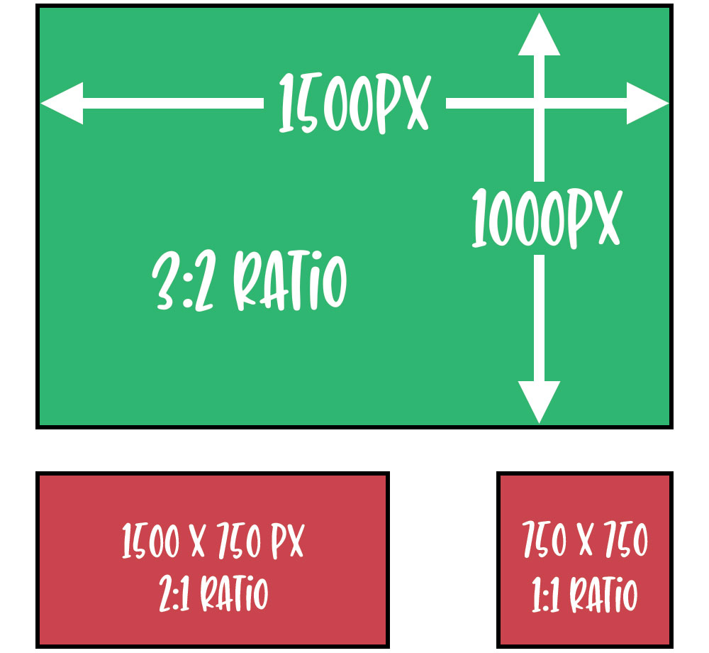
Some other shops out there require square images (1-to-1 ratio) or wider images (2-to-1 ratio). I don’t recommend using those images here, because either the sides or the top and bottom of your images will be cut off. I’ve seen a lot of square images in the Design Bundles marketplace with important parts of a design either completely cut off or half cut off; many customers don’t know that they can click on an image to expand it to full size, so all they see is that version with the missing top and bottom. And seeing an image with cut-off parts can make them suspicious about the quality of the product, which makes them leave the page to look for something else.
This does mean you may need to make different images for different marketplaces. Don't try to squash a square image down into a rectangle so that everything looks distorted; don't use a 3:2 rectangle on a site like Etsy, where 5:4 is the preferred size, since on your main page it will look like your images are cut off. It's possible to create a template that's flexible enough to work for a lot of different image sizes; then you can place the image in once, then crop different ways to get all of the sizes you need.
Fonts and graphics tend to have different main image styles, so we’ll cover the two product types separately. First up, let’s talk about fonts. There have been many, many times I’ve seen a font in the marketplace where the main image is just a solid color—usually a muted and unsaturated color—with the font written out in a different solid color. While in a perfect world the font should speak for itself, customers like to see something with a bit more flair.
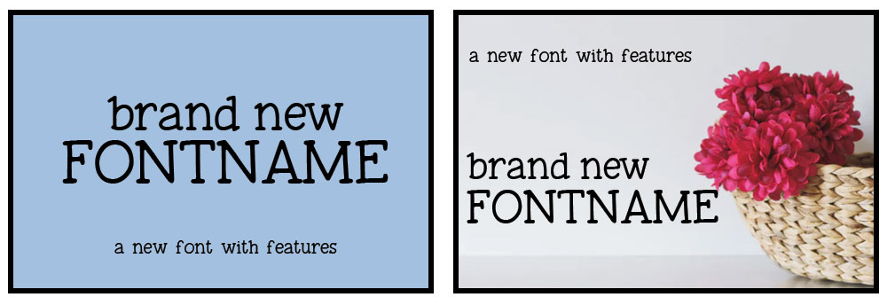
Here’s the same text in two different images. By moving the text so it’s left-justified, and putting it over a fairly simple image of a basket of flowers, we’ve created an image with interesting irregularities, and a pop of color to catch the eye, while still showing off the font.
You don’t need to spend a fortune for images—while you could invest in a paid stock image site like Adobe Stock, Shutterstock, or one of many others, there are tons of great free stock sites out there. One of my favorites is Unsplash, which allows full commercial use of their images, and has a great variety of options.
Your main image for graphics products should be different. With fonts, you want a main image that speaks to the feel of the font; you don’t want to use the same look for all of your main font images. Graphics are the other side of the coin—consistency in your images, combined with a simpler presentation, can really help with sales.
If you’re selling all graphics, I strongly advise creating a clear, clean, simple template to use for all of your products. A consistent look will get customers familiar with your brand, and you can always be sure you have the information you want on your main image. Here are two examples:

Andy commented about wood backgrounds in a recent email that went out to designers, and I wanted to clarify that a bit, so I’ve used wood backgrounds for both of these examples. The primary issue is that wood backgrounds are getting used a lot, by a lot of designers, so your work may not stand out as much and your brand may not be as easily identified. (Which I get—farmhouse is hot these days. But maybe you could make a gray concrete look your thing. Or a fabric texture.)
The other issue is that there’s a big difference between a pale washed wood like the left image, and a heavy textured wood on the right. One makes the design look sharp and clear, and the other makes the design hard to see.
Here’s also where a template comes in handy. Their image on the right doesn’t really tell a buyer much about the design—if I’m a customer who’s using a specific software program, and that program uses a specific file type, I have no idea whether this design comes in the format I need. On the left, however, it clearly shows the file types available.
The left also has a spot for the designer name, which can help with brand recognition and repeat customers. And if your image gets used in a blog post or pinned to Pinterest, having your shop name or logo on there will help customers find you!
It doesn’t matter if your file type markers are along the bottom or along the side, or if your logo is at the top or in a corner or at the bottom. But I advise keeping it consistent across your products, and always making the product itself the star of the show. I’ve seen images where the graphic for sale is the smallest part of the image; a customer shouldn't have to search the image for a while to figure out which part is the actual design for sale.
Once you have a good main image, it’s time to think about supplemental images. There’s a limit of 30 images total for a listing, but you don’t need anywhere near that many. For a font, around 4-8 additional images can really give buyers a chance to see how the font looks, and how it can be used on actual products if you create mockups. For graphics products, you may not have quite as many images, but I still advise at least two, with at least one of those being a mockup showing the design as it would appear on a product.

Here’s the sample font from earlier, with examples of how it could be used on a shirt and on a coffee mug. By using mockups like this, you help the customer visualize how the font or design could be used for their own products like shirts or mugs. Plus, they’re simple, clear, and colorful, which are all things that draw a customer’s eye.
For fonts, you can also create images that just show off the lettering:

Granted, these would be more exciting if this font had a bunch of alternates, swashes, or bonus items. If your font has features like those, show them off! I’ve seen designers who have some great alternates in their fonts, but those alternates don’t appear in any of the images, almost like the designer wants them to be a surprise for the customer. Don’t hide away your best bits—show the customer your favorite parts of a font, to get them as excited about those parts as you are.
Let’s also address watermarks here; which are used quite a bit for graphics and designs. There’s definitely a point where a watermark gets so heavy that it makes a design hard to see, and turns off buyers. There are some tricks that you can use to make your images hard to trace, but also easier to see:

Both of these images have the repeating “watermark” text in the same shade of gray. In the left example, the watermark text is covering the design, which makes it hard to read. This is something I’ve seen in the marketplace a lot, and sales suffer for it—the harder it is for the customer to see, the quicker they’ll move on to a different product that’s easier to look at. You only have seconds to catch that customer’s eye, so don’t waste those seconds making them figure out what they’re seeing.
On the right side, I’ve put the C in front of the watermark, but changed the color of the C so that it’s much closer to the gray color of the watermark. Despite there being much less contrast between the letter and the watermark (making it harder to trace), it’s much easier to see. Next to that, I’ve applied a sparkle overlay to the H. It’s still easier to see than the example on the left, but the texture of the sparkle will also make this a hard design to trace.
We won’t have a lot of images in this section, I’m afraid. I’m going to be all about the text, because your description is also all about the text. I’ll break this down into some description DOs and DON’Ts, but I’m going to start with the DON’Ts.
DON’T:
DO:
Let’s take a look at a couple of examples of descriptions. I’ve written these myself, but they’re inspired by others I’ve seen. These are written about the “Christmas Greetings” design I’ve used in the sample graphics images above:
Example 1:
Title: Christmas greeting Svg Jpg Png Christmas greetings winter holidays design graphic
Description: Christmas greeting, card, shirt, t-shirt, clothing, mug, glass, vinyl, holiday, winter, family, ornament
SVG JPG PNG - For personal or small business use.
Example 2:
Title: Christmas Greetings cut file design: SVG, JPG, PNG
Description: This Christmas Greetings design has a vintage feel with some elegant flourishes, but the letters keep a more casual style that keeps things from becoming too formal. It’s great for a ton of projects – put it on your Christmas cards, gifts like mugs and ornaments, or you could even cut it out of vinyl at a large size and stick it to your wall!
And don’t worry about ease of use – this design has been tested in both Cricut Design Space and Silhouette Studio, and it cuts like a dream in both. Plus with SVG, PNG, and JPG file formats included, you’ll have options no matter which design program you choose to use.
Your download contains the Christmas Greeting graphic in:
The second version is so much more approachable and friendly. It’s more like a conversation, but it still gets a number of key ideas in there: possible uses for the design, machines the design works on, and the file formats included, with complete information about the file sizes. And it doesn't include any licensing terms like the "small business use" from the first example.
The quality of your products is, of course, the most important thing of all from the marketplace’s perspective. You could have the most beautiful promotional images and a description that reads like poetry, but if there are issues in the product files, the end result is upset customers and refunds.
Thanks to the customer service team, I have a list of some of the most frequent issues with products:
Product Issues: Fonts
You may be looking at your font in your creation program, like on the left here, thinking you’re done and it’s ready to sell. (This image is from Font Creator.)
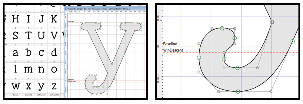
But let’s zoom in on the baseline of this lowercase y. The WinDescent line is just under the baseline, and cuts through the descender of the y. That means that users of certain programs like Microsoft Word will have the bottom of that y cut off. If your font isn’t exceptionally tall or long, there’s no reason to not set your WinDescent below the longest letters, and your WinAscent above the tallest letters, so that your font is accessible and ready for immediate use in all programs. There are a ton of fonts out there with the WinDescent set to zero, so it’s at the same height as the baseline, and it chops off anything below the baseline in Word, PowerPoint, Publisher, and a number of other programs. Take the moment to adjust those metrics, and you’ll reduce the number of customers who have to write in for support.
Here are a couple of other issues that get seen far too often in fonts:

On the left, you can see that the outline is crossing over itself. Font Creator has called it out with a little red X, and would catch that during font validation. (Which—if you have validation available in your font creation program, you should be using it every single time. You’ll catch so many small issues this way.) While this crossover wouldn’t be much of a problem for someone using this font in print, it would be a problem for someone cutting the font from vinyl or paper.
On the right, you can see that there are empty character slots. Some font creation programs will start you out with a specific set of characters it expects you to make. It’s perfectly okay to not create all of those characters (though you may be limiting your audience), but you shouldn’t leave the spots for them open like this. If you delete this character from your font, then design programs will know to replace them with the “.notdef” character. If you leave them in as empty slots like this, they’ll show up as blank spaces.
I’d like to address one more thing, especially for those who make handwriting-style fonts. If you’ve scanned in your letters and imported them to your font creation program, odds are they’re not as neat and clean as they could be. Take a look:

The scanned-in original of the trademark character is on the left; the cleaned-up version is on the right. By cleaning up the lines and removing extra nodes, you’ll make a font much easier to use. Of course, if your font is intentionally rough or you’re going for a dry-brushed look, you may not want to clean up too much. (But I bet there’s still some cleanup that can be done.) But for a font like this one, there’s no reason to leave all those extra nodes. The cleaned-up version still has the same feel and the same personality, but it’s a thousand times easier to use.
Not everyone includes the trademark character (Unicode 2122), I know. Many font designers create the bare basics: A-Z, a-z, 0-9, and some punctuation. But know that you’re limiting your audience by doing that. Whenever possible, create at the very least the full set of 95 Basic Latin characters, and the full set of 96 Latin-1 Supplement characters. You’ll cover a large number of languages, and open your work up to a much wider audience.
Product Issues: Graphics
If you’re a creator of graphics, especially if you’re either making designs from typed fonts, or scanning in your own hand-drawn work, be sure to back up and read through the paragraphs just above regarding fonts if you skipped them. Some of the same issues also apply to graphics. Crossed-over outlines and too many extra nodes can make designs just as hard to work with for your customers.
Here are a few graphics-specific issues items that you should avoid:

On the left is a font that hasn’t been expanded to vector or flattened to raster. If you send a design to your customer with the text still in its typable form, if the customer doesn’t have that font, their program will either not display the letters at all, or it will switch them to a default font. The last thing you want is to have a beautiful design in a gorgeous font, that a customer can only see in Cricut Sans.
On the right, the letters have been converted to vector, but there’s been a stroke applied in Illustrator. If you want your design to have an outline around the letters, and you create that using the stroke function, you still need to expand that stroke so it becomes a vector object of its own. Many programs just can’t read that stroke—it either won’t come through when the file is opened, or it will make the file un-openable.

Strokes aren’t the only things that will make a file unable to open in some programs. Here on the left is a gradient fill, and on the right, a clipping mask has been applied in Illustrator. Both of those things will make a file either not open at all, or not open correctly in a program like Cricut Design Space or Silhouette Studio.
When in doubt, especially when creating SVG files meant for cutting machines, keep your designs as simple as possible: nothing but vector shapes with solid fills and no strokes, styles, or patterns. I’d also advise that you not create compound paths; they make designs so that some programs can’t break the pieces apart. Group your items instead whenever possible, so that your customer can ungroup them if they like. The easier you make your files to use, the more customers will keep coming back to you for your easy-to-use products.
Product Issues: All Types
I have a couple of additional things that apply to all products.
The most important one is to include as many of the popular file types as you can; I know that not everyone is working in a program like Illustrator that lets you save to a thousand formats, but if you can save a graphic design in PNG and SVG and maybe DXF, you’re covering most of your buying audience. Same for fonts—almost every program will let you save to both OTF and TTF, and yet I see a ton of fonts only offered in one format or the other. There are programs out there that will only use one or the other, and customers also have their preferences. If a customer definitely wants OTF and you’re only selling TTF, they may very well pass by and find another font that comes in the format they prefer.
Only slightly less important is having well-organized and well-labeled items in your product folders. Fonts are easier—if your font is named “Font Name,” just be sure to name your files “Font-Name.otf” and “Font-Name.ttf” and you’re good to go. (But if your font is only named “Font Name” in the code, don’t name the file “Font-Name-Script.otf.” In a similar vein, if your font is “XX Font Name” in the code, with your initials or the initials of your foundry, include that in the file name too. And in the promo images and description. Keep things as consistent as possible to avoid any customer confusion.)
For graphics, you may have folders inside your ZIP file. Make sure your folders are clearly labeled and sorted. If it’s a set of 20 graphics, and you have 4 file formats for each graphic, you could go two ways: create 4 folders labeled with the file format, with 20 graphics in that format in each; or create 20 folders labeled with the name of each design, with the 4 file formats for each design in it. Either of those is preferable to one folder with all 80 files in it; sorting into folders just makes things easier for your customers to find. And be sure to not include ZIP files inside of ZIP files; some computers have a difficult time unpacking those. Everything inside of your ZIP file should be unpacked, with no additional unzipping needed.
On that note, I’d also advise naming your files in a way that lets the customer know what the file is without having to open it. A customer would always rather see “Christmas-Greetings.svg” instead of “design1.svg” in their download.
And a last reminder: you can only include your own work in your product files. There are some products out there that have free font files included, possibly because the creators don't know that they can't do that. Be aware that most fonts, even free ones, have a license that doesn’t allow others to redistribute those fonts. You can always include a text file or PDF with links to where the customer can get the free fonts on their own from an authorized source.
That’s it! Thanks for sticking with me through all of this. I know it’s a huge heap of information, but hopefully there are some tidbits in here that will help you take a look at your images, descriptions, and products and make some small changes that can result in big increases in sales.


Crafter's Calendar: A Guide to Inspire You All Year Long!

The Ultimate Dollar Deal Event: What You Need To Know

5 Cool Graffiti Font Styles That Are Trending