
Recently, I’ve seen people ask about how to get two specific text effects: a kind of “drop shadow” line, and a full outline. There are ways to achieve these effects in lots of software, but in the interest of making this tutorial something that anyone can do, I’m going to create these effects in Inkscape.
It’s a free vector editing program that has versions for Windows, Mac OS X, and Linux, so it’s a program that almost anyone can use. Our end product will be an SVG file, a vector format which can then be opened up in tons of other graphic programs. Handy!
I’m normally an Illustrator user, so while a lot of these concepts are ones that I normally use every day, I had to figure out how Inkscape accomplished the same actions. Fortunately, there are plenty of guides out there, so thanks to a lot of Google searches, here’s what I taught myself this week.
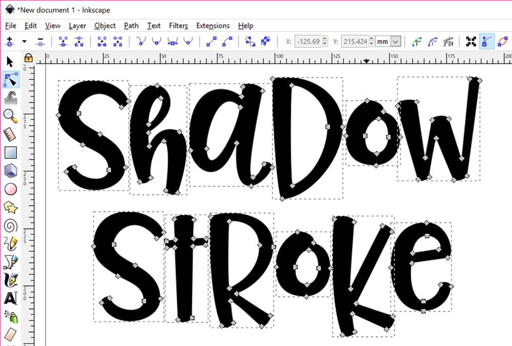
First off, let’s type out some text!
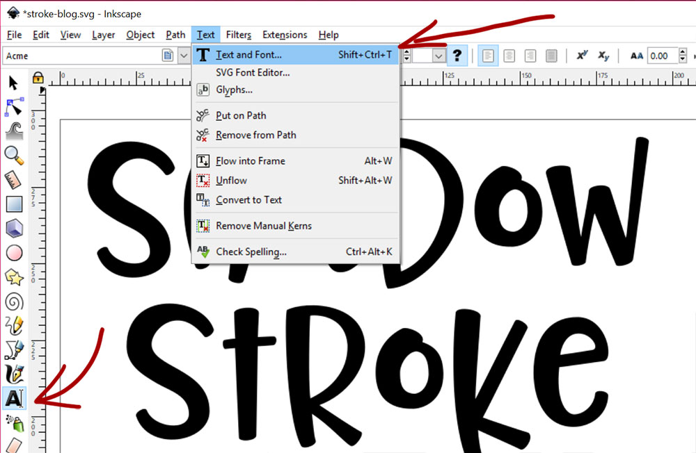
You can either just click on the text tool in the toolbar (the letter A near the bottom left), then click in your workspace and type, or you can go to Text > Text and Font via the menu. Going that way calls up a little text window that you can do your fiddling in.
I’ve typed out SHADOW for our shadow effect, and STROKE for our stroke effect. But you may find the letters a little too far apart. I decided I wanted to smoosh them together a little bit tighter.
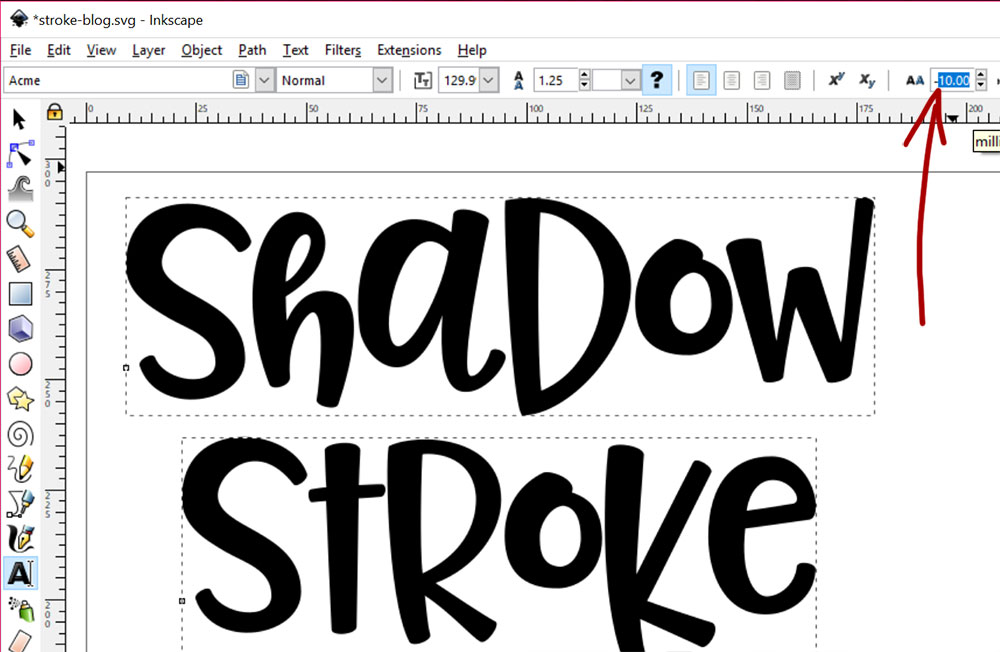
Here I selected both words with the selector tool (the black arrow at the top of the left-side toolbar), then clicked on the type tool (That letter A in the left-side toolbar). Up along the top, in the field next to the AA, I changed the number from zero to negative 10. You can see, the letters have scooted much closer to each other.
(Negative 10 what, you may be asking – pixels? Points? Some mysterious units of measurement? The answer is: I’m not sure.
I only learned what was absolutely necessary in Inkscape to make these screenshots. Because I’m a grade-A slacker.)
Now that we have our text spaced the way we want it, we need to turn it from text into vector shapes.

Once again, I’ve selected both words with my selection tool, then I’ve gone to Path > Object to Path in the menu. This takes the text objects and turns them into shapes made up of vector paths.
You could also use the Shift+Ctrl+C shortcut if you’re on a PC. I think on a Mac, you’d use the Command key instead of the Control key. I use shortcuts for some things, like copy and paste.
But despite the fact that I have the names of thousands of fonts in my head, in addition to 35 years’ worth of Duran Duran song lyrics, I don’t have a very good memory for keyboard shortcuts. The human brain is a weird, weird thing.
Now that we’ve converted the letters into vector objects, let’s ungroup them:
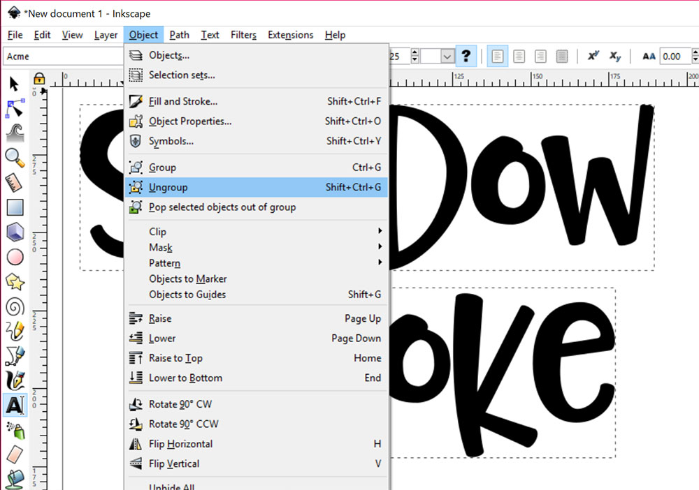
Ungroup by going to Object > Ungroup in your menu, or the shortcut as shown.
By ungrouping, we can now move the letters around individually. You could wait until this point to monkey with the spacing between letters if you were so inclined, and just select each one and scootch them over using your arrow keys. Up to you!
So now our words are made up of individual letters, each of which is a separate vector object:
Which means we’re ready to go! Let’s apply some text effects to these little fellas.
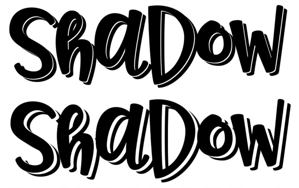
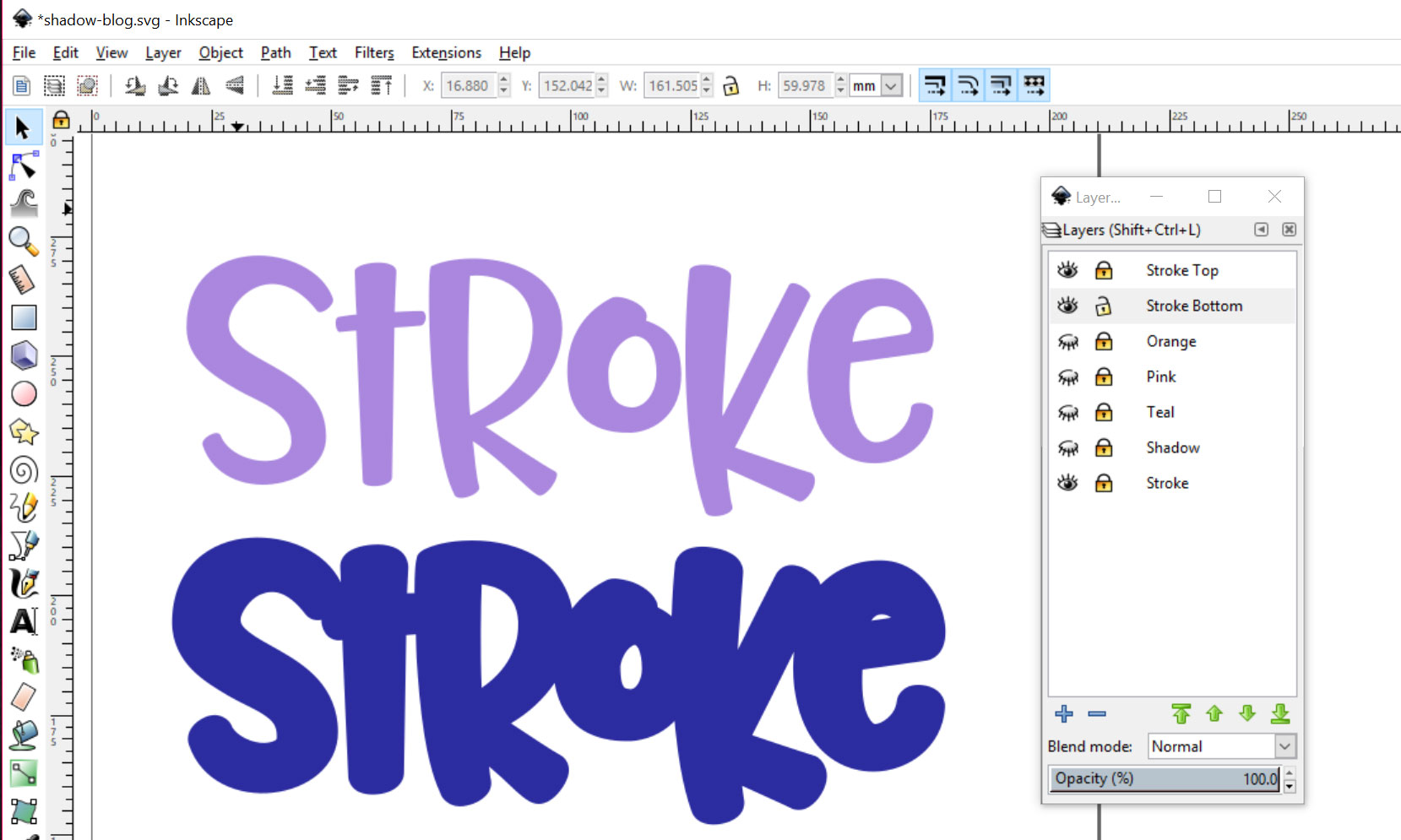
In order to do the shadow effect, we’re going to make three copies of the word SHADOW.
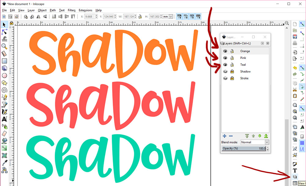
I’m putting each copy on its own layer, which will make things easy to stack. You can open up this layers panel by clicking on the layers button (that stack-of-paper looking thingy near the lower right).
Add a new layer by clicking on the blue plus sign near the bottom of the layers panel.
I’ve made each copy a different color, and named the layers with those colors, so it’s easy for me to work with.
You can see in the layers panel that those three layers are visible (the open eyeball) and unlocked (the open lock).
To make layers invisible, just click on the eye next to a layer; to lock them so they can’t be messed with, click on the lock. You can see that I have two hidden (closed eye) and locked layers in there: my original text.
If you’re a regular reader of my tutorials, you’ll be familiar with this. Keep your original tucked away, and always work with a copy. It’s guaranteed to save you some heartache later.
Now we’re going to stack all three of these colorful layers on top of each other.

You’re only seeing orange, of course, because it’s on the top.
Stacking things turned out to be pretty easy in Inkscape – they kind of had a “magnetic” effect, so when I put the layers on top of each other, they snapped right to where they needed to be.
Now, let’s nudge these layers around just a little bit.
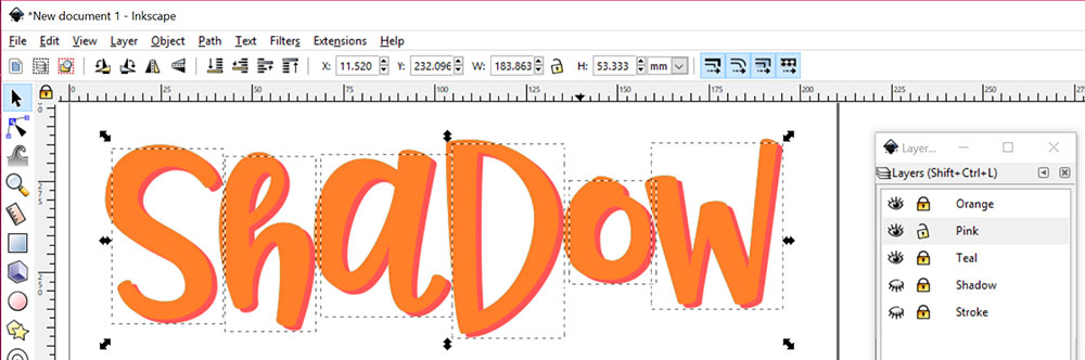
I’ve locked all of the other layers, so I know they won’t move around. I’ve selected all of the letters in the pink layer, and used the arrow keys on my keyboard to just gently move the pink letters down and to the right. I tapped the right arrow three times, and the down arrow three times.
Next, we move to teal:
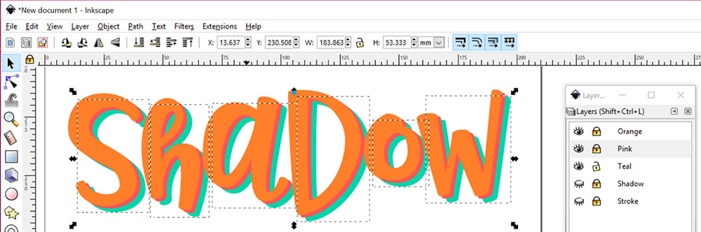
Same deal: I locked the pink layer and unlocked the teal, selected all the teal letters, and used the arrow keys. This time, I did 7 taps to the right, and 7 taps down.
You don’t need to use different colors for your layers here, of course. If your end product is going to be in black and white, you can just make the top and bottom layers black, and the middle layer white (or whatever color your background is set to, so it’ll look invisible).
That way you’ll be able to preview exactly how the finished product will look.
Now, to do some slicing and dicing.
I’ve turned off the orange layer to get it out of the way, because it’s the main textlayer that won’t be changing.
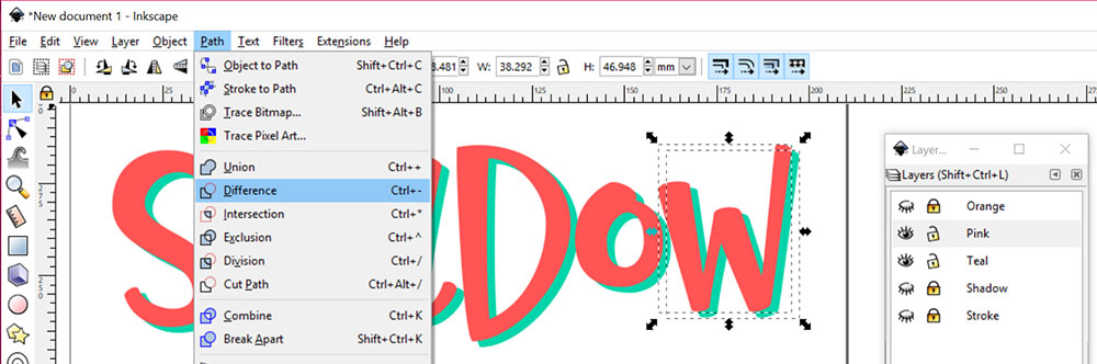
Here we just have the pink and teal layers. What we’re going to do is cut away any part of the teal letters that the pink is covering up; that way, only that sliver of teal we can see will be left behind. With the pink and teal layers unlocked, use the selector tool to select both the pink W and the teal W.
Go to Path > Difference in your menu. This will chop the top layer shape out of the bottom layer shape, like using a cookie cutter.
I tried doing the whole word at once, both grouped and ungrouped, and couldn’t get it to work. So I’m doing this one letter at a time. I’m sure there’s a way, though. There are so many more Inkscape features to learn!
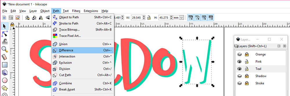
After doing the same thing to each letter, here’s what we have left behind. We can make the pink layer invisible, because we won’t need it anymore.
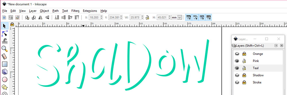
Make the orange layer visible again, and there we have it! A cool shadow effect the exact shape of the letters themselves.
With both the orange and teal layers unlocked, you can select everything and recolor it all a single color.
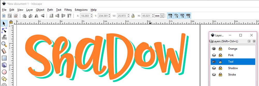
Also, if you just select the teal layer, you can use the arrow keys to nudge your shadow up closer or farther away. It’s totally up to you how big a space you want between the solid letters and their shadow.
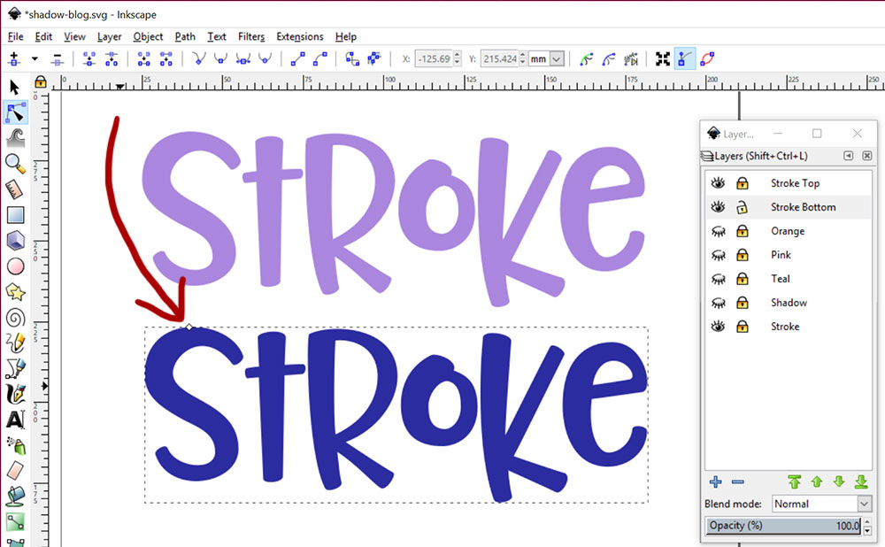
Onward, now, to adding an outline stroke!
We’ll only need two layers for this one:
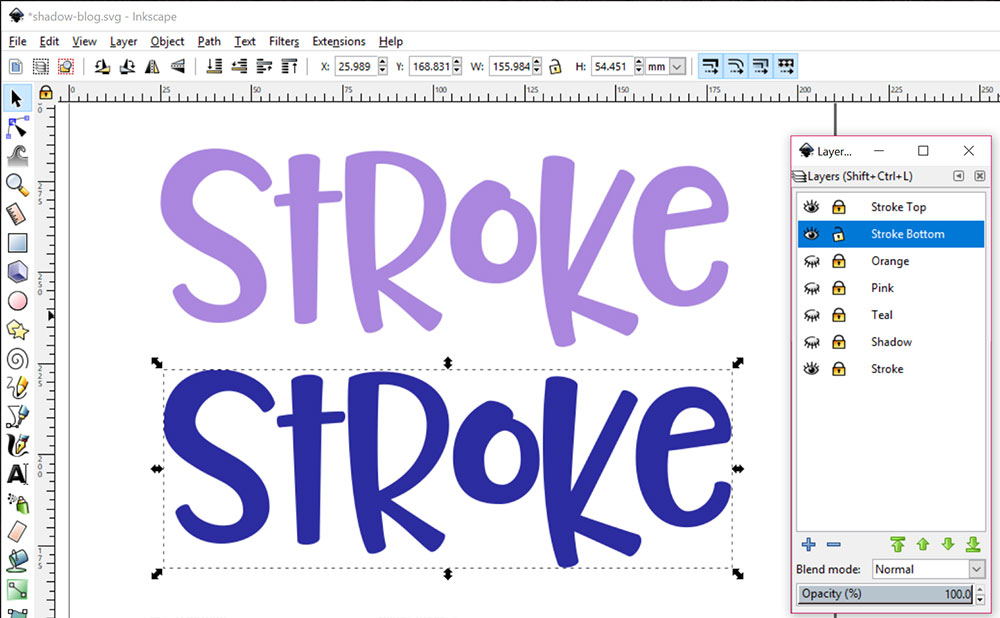
Once again, I’ve made them different colors to make these screencaps a little prettier. I’m just calling the layers Stroke Top and Stroke Bottom, though I totally could have called them Purple and Blue.
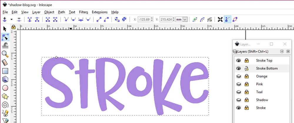
The bottom blue layer is going to get monkeyed with, so I’ve selected all of the letters and grouped them together. (Just like we used Object > Ungroup earlier on, now we’re going to use Object > Group.)
Now normally, I’d stack the two layers directly on top of each other before moving on. But I’m going to keep them unstacked for a couple of screenshots, because I’mdoing things to the bottom layer.
So just note, this is for display purposes only. After I show this, we'll go back, stack the layers, then do this over again.
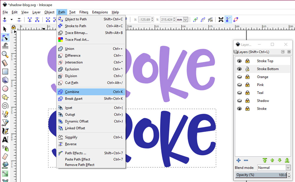
First off, even though the letters are grouped, they’re still individual vector objects. In order to do what we’re going to do, we need Inkscape to see all of those letters as one big object instead of six smaller ones.
We do that by using the Path > Combine feature. It turns our six vector objects into one. (In Illustrator, I’d call this a “compound path.” So “combined path” in Inkscape is pretty darned similar.)
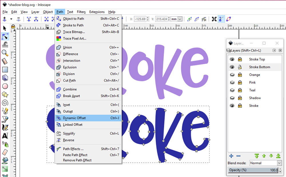
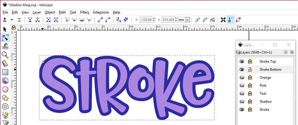
After combining the paths, select the whole layer with the path edit tool (just below the black arrow on that left-hand toolbar; you can see that it has a light blue box around it, because it’s selected). Then go to Path > Dynamic Offset.
It will look like nothing has happened.
You’ll know it’s worked if you get a dashed rectangle around the whole object, and see one little white diamond along the top of that rectangle. By clicking and dragging on that diamond, you can expand or contract your shape!
So now that we’ve seen what we’re doing, let’s stack the words on top of each other and do it.
This may look like I’ve done the Dynamic Offset to the top purple layer, but that layer’s still locked. I’ve done the same moves (combine the path, then dynamic offset) to the blue layer that I did before, and the little white diamond shape up there tells me I’m in Dynamic Offset mode.
Even though it looks like it’s on top of the purple layer, it actually belongs to the blue unlocked layer.
So click and drag that little white diamond upward.
Dragging upward makes the outline grow larger, and dragging downward makes it shrink. Dragging side to side doesn’t appear to do anything.
There are two reasons we stacked the layers first, before doing this offset. The first reason is that you’ll only know how big you want that blue layer when you have the purple layer on top.
Without them stacked, you’re just guessing blindly at how thick a stroke you'll get. The other reason is that the offset grows uniformly from the center outward, so if you have the layers stacked, everything starts and stays nice and centered.
The layers snap really well on top of each other when they’re the exact same thing. When they aren’t, the snapping isn’t so accurate, so you’re left to guess and nudge to get your top layer centered on the bottom layer.
If you’re going to be cutting the layers out of two different colors of paper or vinyl, it’s easy: just grab that bottom layer and move it out of the way. Now you can save these as an SVG, and cut them separately.
If, however, you’d like to chop the purple area out of the blue and make that transparent, we can do that too!
Your top purple layer is still ungrouped individual letters at this point, which is good. I tried this several different ways, and this is the only way I got it to reliably work.
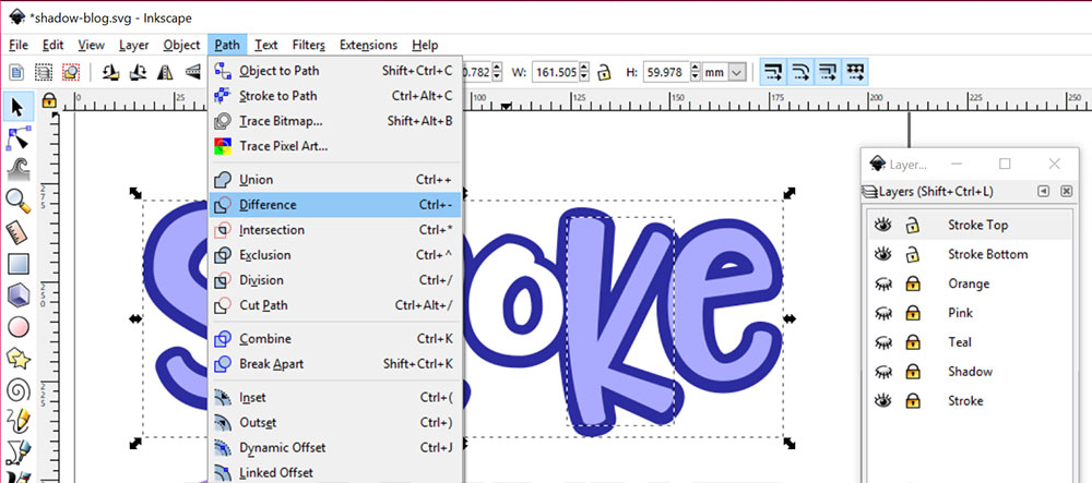
Unlock both your top and bottom layers. Select one purple letter, then hold down the Shift key and select the entire blue shape. Here you can see I have the purple K selected, as well as the full blue shape below.
Click on Path > Difference in the menu, just like we did with the shadow project. Like a cookie cutter, it takes the upper-layer K shape and chops it out of the lower-layer blue shape. You can see that the O has already been done here.
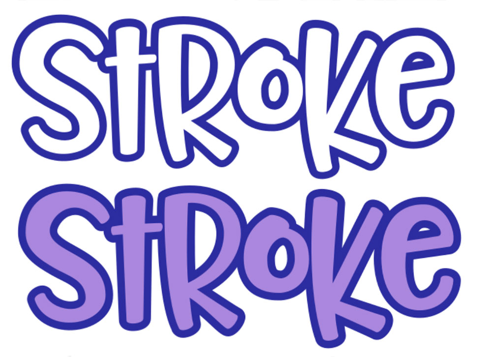
So there you have the stroke two different ways: One where the stroke is just an outline around transparent letters, and one where the stroke layer is one solid object that can be cut out.
I have to admit, I was surprised – Inkscape wasn’t that hard to work with. I’ll have to think about some other vector techniques that I can translate over from Illustrator. If you have any in mind, let me know!


Crafter's Calendar: A Guide to Inspire You All Year Long!

The Ultimate Dollar Deal Event: What You Need To Know

5 Cool Graffiti Font Styles That Are Trending