Posted 5th December 2016 •
By Design Bundles

I ended my previous post about creating a connecting script font with the idea that I’d create a sans-serif that could pair with it. Turns out, that was way more of a challenge than creating the script font itself! While the script font was fairly straightforward, and didn’t require a lot of extra tweaking (kerning, especially, is easier with a script font – as long as you have your left and right guidelines set, the font practically kerns itself), a sans-serif is a surprisingly large amount more work.

I ended up naming the script font
VIRGA, which is a cool atmospheric phenomenon where it’s raining, but the air is so dry it absorbs the rain, so that rain never reaches the ground – you can see it disappear halfway between the clouds and the earth. We see it a lot here in the desert. And it’s been one of my favorite rain concepts since taking Atmospheric Sciences 101 in school. (Yes, I’m a dork who took a class about clouds and rain for one of my science requirements. Way better than dissecting frogs.)
So this is our starting point; now to create a font that could pair with it! Let’s analyze this script so we know what would go well with it. There’s a contrast between thicker lines and thinner lines, but it isn’t that strong a contrast. So our sans-serif should either have a similar mild thick/thin contrast to its line weights, or it should be a monoline font that could match either the thick line weight or the thin line weight, depending on what size you use it at. Also, due to the long tails, the space each letter takes up is really wide. So a wider sans-serif would go well with it.
First off, I drew up my base alphabets using the exact same pen settings that I used on the script font. That way, I knew I’d have a similar balance between the thick and thin strokes. I drew the letters a little shorter and wider, since I thought that would go nicely with the short, wide aspects of the script.
I considered doing this new font as a regular uppercase/lowercase font, but ended up going with two sets of uppercase letters instead, for a couple of reasons. First, the script font is really built to highlight its lowercase letters, and as we discussed in the font pairing post, a great way to pair is by using all-lowers in one font, and all-uppers in the other. Second, by doing two sets of uppercase letters (one set mapped to the uppercase keys, and one set mapped to the lowercase keys) it gives the end user a ton of options for mixing and matching and variety when things come up like words with double letters in them.
As usual, I created these letters on the iPad, saved them as a JPG, turned them into vector objects in Illustrator, saved those as SVG files, then imported them into my font creation software. And then I got to work cleaning and adjusting the heck out of them.

For my first attempt, I’ll tell you right now, I cleaned them up WAY TOO MUCH. I wanted to get a similar thick/thin balance to what I’d achieved with the script font. But in making the lines this smooth and regular, even though there’s a little bit of hand-made personality left in them, they became kind of (to me) boring.

One goal was achieved here: the contrast between the thicker strokes and the thinner strokes is very similar to the thick/thin contrast in the script font. But generally, I just personally . . . don’t like it for this pairing. It has kind of an Art Deco vibe to it, which would be cool if I was going for a 1920s style, but I’m not. The script is far more modern, so the time periods are a mismatch.
So, I tucked a copy of that away, and starting from these letter shapes, I started adjusting the entire font.

I thickened all of the thin lines, so that it was closer to a monoline weight – the thick/thin balance on the previous version was a big part of what gave it that Art Deco feel. Then I took the slight roundness at the ends of the letters and exaggerated it, so that they were very, very rounded.

Here are the two together. The line weights work, and I don’t
hate the combination. I even went so far as to create some promo images with the two fonts together, so I could see how they paired in a variety of situations.
Here’s a portion of one of the test promo images: a window for a made-up salon/spa:

I created those promo images, then slept on it. The next morning, I looked at them all again, and just felt like it wasn’t quite right. I decided it was the rounded ends – they added a sort of comedic inelegance to the letters, which didn’t match the more elegant mood of the script font. Don’t get me wrong, I’m not against a little splash of fun and whimsy in a font; it was just a little
too much whimsy for this particular pairing.
So, I saved a copy of that version, took the set of letters, and went back in to change them all again.

I basically squared off all of the ends; otherwise, the letters are mostly the same. And as you can see by the top of the A, things aren’t
precisely squared; I still wanted a little bit of a hand-made feel. (Although when my husband looked at this version, he referred to it as “mechanical,” which is pretty apt. Even though it isn’t as regimented as a Helvetica or Futura or Univers, it’s still far more strict and straight and upright than the kinds of things I normally do.)

The line weight stayed the same, because I thought it went well with the script. And I kept a lot of the quirkier aspects, like how low the crossbar on the A sits (same with the E, and where the bottom of the bowl meets the terminal stroke on the R). So it’s a lot more formal, which works with the script, but it still has
some quirk to it. Just not too much. And I kind of like the fact that it’s all squared ends for the sans-serif, while it’s all rounded ends with the script. Remember, you want
some elements in your paired fonts to contrast (you just want way more elements to be in concord).

Here’s the exact same section of that promo image, but with the squared-off ends on the sans-serif instead of the rounded ends. The difference is very subtle, but it’s there. With this version, it’s just a bit more formal and less comic, which I feel goes with the script a bit better. I also had promo images of a save-the-date wedding card, some business branding, and a couple of other things, and they all looked that little bit better with the squared-off version.
So there I was, all, “I’m definitely done now.”
BUT.
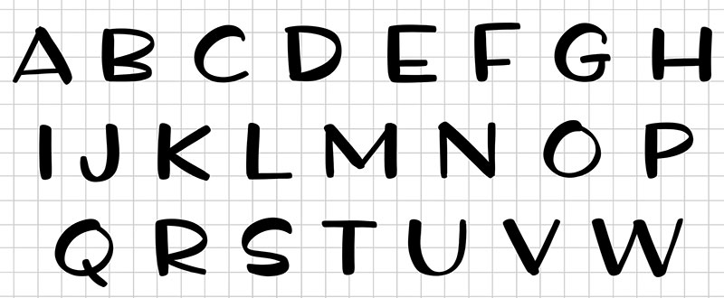
I couldn’t stop thinking about the original letters I’d created, and how very far I’d come from them. So I decided I’d start over from scratch, import them all again, and instead of trying to make them so formal, I’d just clean them up and let them still look hand-written.

Even if they didn’t end up working well with the script font, I still just liked the looks of them. So I cleaned up a lot of the jagged lines, but as you can see, they still have a lot of organic curves and flow to them. Some ends are more rounded than others, but that just reflects the attributes of the pen they were created with. They have a consistent contrast between the thicker and thinner lines. I like them!
The question is, how does this pair with the script font? After all, they’re both in the handwriting category, and it’s really, really hard to mix two fonts from the same category.

And you know what? I don’t hate the pairing! It’s helped by a couple of things: the thick/thin balance between the two fonts is really consistent, and the fact that the script here is all lowercase while the block text is all uppercase helps make them different enough so it doesn’t look like I’m trying to pair two similar script fonts together.
I think also, while the squared-off sans-serif matched the elegance of the script, in this pairing here, the more casual nature of the uppercase letters actually works to soften the script and make it a little
less formal. It’s not a pairing that will work for every purpose, but it actually makes the script font a bit more versatile by opening it up to less formal applications.
I also totally helped myself out on making this one easier. I’d already kerned the rounded and squared-off versions, so I was able to export all of those kerned letter pairs, then import them into the casual font. (When you do an all-caps font, it’s four times as much kerning: instead of just one pair like PA, you have to also do Pa, pA, and pa. The list was almost a thousand kerning pairs.) Since the fonts had a common ancestry, the kerning was pretty similar, and only needed a few adjustments.
So again, I was all, “I’m
definitely done now. For serious. For realsies.”
BUT.
Having done all of that work, I thought to myself that I could take that mechanical sans-serif and turn it into a slab serif without a lot of extra work. So onward I rolled:


I added big squared-off serifs to all of the characters, and did some re-kerning and other adjustments. They still have a bit of that funky hand-crafted vibe, which I like. It still works paired with the script, and just like the more casual handwriting style, it helps makes the script a little less uptight.
So all in all, the set of all-caps letters I drew went through five iterations:

And stacking them all up like this, it’s kind of cool to see how they clearly all have the same heritage. Especially with the bottom three – the mechanical sans-serif and slab serif next to the casual handwriting – it’s cool to see that they clearly came from the same base, but ended up so different.
Because I liked all of the versions of this all-caps font (just not all when paired with that script font), I’m bundling all five of them together under the name
QUINTSY. And even though they’re all meant to be supporters, to hold up other fonts . . . they can be paired with each other, too!

For the casual handwriting font on top, I typed each of the letters separately, gave a few of them a little rotation one way or the other, and then put them together in a little quirkier manner. I don’t think this pairing would have worked as well had I just typed the letters straight-out all together; the two fonts would have been too similar. But by rattling the casual letters around some, it breaks up the lines and gives them a little more character, which makes them contrast a little more with the sans-serif. I also typed out a couple of periods and put them in the middle of the Os for variety.
(And those are a couple of huge hints I’d advise everyone to try with any font – if a word seems too static and lifeless, type your letters one at a time, rotate them a little bit, and move them around. You can make some really unique-looking projects that will be different from everyone else’s! And also, don’t be afraid to combine elements to create new things. Making something winter-themed? Put the asterisk in the middle of the letter O, and you have an instant snowflake feature. And oooh, there’s a future blog post: using glyphs in non-standard ways to make cool and unique designs!)
As always, if you have a question or an idea,
I have a question thread going over at the Fonts and Typography group on Facebook. Drop in and let me know what you’d love to read about!


