Posted 18th November 2016 •
By Design Bundles
I field questions from all over, and this particular one came from my husband, after once again having to stop while I was all, “Oh, hold on, I have to double-back and take a picture of that!” I’m always on the lookout for a new font to use in a design, or something to inspire me . . . or a font failure that I need to share with all of you.
I didn’t post last week because we were on the road in Las Vegas. I took a bunch of pictures so I could share some of the good, the bad, and the ugly with all of you.

First off, let’s take a look at the Thrifty Rental Car company logo (which I had plenty of time to look at, as there was a long line to pick up our rental car). This thing drive me nuts for a couple of reasons.
Thing number one: let’s talk about the spacing between the letters, versus the width of that line cutting horizontally through the word. If we had to measure, I’d say that the horizontal line is about two times as wide as the spacing between letters, and for me, that’s just too close. I’d much rather see either a 1:1 ratio, or a 1:3 ratio, so that the spacing is either exactly the same or distinctly and purposefully different. It’s like when you’re pairing up two weights of a font — you want to go for really light and really thick, so the difference stands out as an intentional choice, instead of a maybe-mistake.
Thing number two: the way the final “ty” is merged into a ligature. I’m not against a good ligature, but I don’t think this one is a good one. It makes the Y feel really cramped up next to the T, like the Y is slowly being eaten. It just feels so odd and weird and unnecessary. If you’re going to merge letters together into ligatures, either do it more than once, or don’t do it at all. If they’d also combined the opening T with the H, and then the crossbars of the F and T, I’d be much more OK with it.
Minor thing three: That capital T that starts the word? I’d even out the length of the bar across the top, so it extends the same distance to the right as it does to the left. It’s just uneven enough to be jarring.
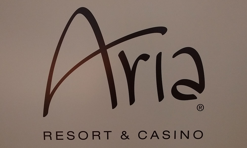
This was our hotel, the Aria. I’m pretty sure the name of the hotel is hand-lettered — it has the look of something made with an angled calligraphy brush in Adobe Illustrator. But it’s simple, and I appreciate that. I also like the way they extended the crossbar of the A so that the tip of it could serve as the
tittle (AKA the dot) for the lowercase I. Let’s also talk about the pairing: it’s a classic pair between handwriting/script style type and a sans-serif. You pretty much can’t go wrong with this combination, because it’s so safe. I think they also did a really good job balancing the tracking (which is the uniform spacing between all of the letters in a word, while
kerning is the spacing adjustment between two specific letters). The letters aren’t so far apart that they lose touch with each other, but they have plenty of breathing space between, and it’s a similar amount of tracking in both the large script and the small sans-serif.

An awesome part of Las Vegas is that you don’t just have typography in the hotel names. Each hotel has restaurants, bars, nightclubs, and shops, and all of those places have their own typographic logos. Here’s the nightclub in the Aria, and it’s another great example of pairing. The “JEWEL” is in a stylized sans-serif, while “NIGHTCLUB” is in a serif font (another of the classic pairings). Just like with the hotel’s logo, check out the tracking — a good amount of space between the letters, but not
too much. I also love the mirroring of the word “JEWEL,” with the reversed J and L. And look at that W – the rounded bit in the middle gives some unity to the rounded edges of the J and L, while the harder edges at the tops and bottoms go well with the straight lines of the Es.
There are also some designer tricks in here. I bet if you got a ruler out and held it to the wall, you’d find that the distance between the two bottom points of the W is pretty darned close to the distance between the bottom points of the W and the neighboring Es. And that’s probably also very close to the distance between the bottom of JEWEL and the top of NIGHTCLUB. Meanwhile, the spacing between the lines of the Es in JEWEL is very, very close to the spacing between the letters in NIGHTCLUB. If you have some elements in your design with similar spacing, let those same spacing measurements dictate the rest of your design, and things will look a lot more unified.

All right, now we’re going to get a little bit of Angry Missy. We passed this sign every time we entered or left the hotel, and it filled me with rage every single time. Heck, it's getting me steamed just looking at this picture.
Why, you ask? It’s clear, sharp sans-serif print, easy to read, easy to understand! What could be wrong with it? Well, let’s zoom in and take a closer look at some terrible design:

First, let’s talk about the concept of
small caps. Small caps are an OpenType feature where you can replace lowercase letters with shorter versions of capital letters. They’re created especially so that text can be written in all-caps, but still have that differentiation between “uppercase” and “lowercase.” And they’re ALSO created especially so that you can use them together, and all of the letters will have the same line weight.
The creators of this sign, instead of finding a font with a small caps set, merely used the regular capital letters and just changed the font size. So if the “uppercase” caps are in 50-point text, the “lowercase” might be in 35 or 40. The problem is, the higher a point size, the larger the line width, since everything scales up. So for all of these words like Tram and Vdara and Bellagio and Arena, that first letter is visibly thicker than the others.
But an even bigger problem with all of those words is the kerning. In most fonts, the designer will kern common pairs of letters so that they snuggle in well together. Taking the top word TRAM as an example, any designer worth their salt would have kerned the T and a lowercase R so that the R nestled under the umbrella of the T, to avoid leaving that huge gap of white space between the two. But because the designers of this sign used all caps, and just mixed sizes, they really needed to kern these pairs by hand. And it’s a problem in ALL of these words – The V and D of Vdara need to be closer, as do the B and E of Bellagio, as do the A and R of Arena.
And the real killer is, if you go back up one picture to look at the whole sign, some things
were kerned! Look at the third row down, with “Taxi * Limo” in it. The A of Taxi has definitely been moved underneath the T! If I had to guess, I’d say that at least two different people made parts of this sign. Aria, Main Valet, and Taxi * Limo were done by someone with at least a passing interest in doing some kerning, while for Bell Desk on downward, the idea of kerning went out the window.

And lest you think that the problem was just at the Aria, here’s a sign at the Bellagio (which gave us a real
Ocean’s Eleven vibe when we walked through, not gonna lie) with the exact same problem. That gap between the T and R of Tram is just as bad as the one at the Aria. And in the word “Bellagio” itself, look at how far that B is standing away from the rest of the letters. ARGH! UGH! (And this was probably about the point where my husband asked his follow-up question, “Are you going to be all, ‘argh, ugh’ for this whole trip?”)
But bad kerning wasn’t just limited to the hotels:

Here’s a jewelry store located in the super-fancy mall next to our hotel. As you can see, watches are a big thing in Vegas, presumably so you can see how much time you’ve spent losing money gambling. What makes me jittery about this sign is that last letter O. So far from its neighboring L, so close to the N! And there are really a lot of tiny adjustments I’d love to make here: the OU is a little widely-spaced, as is BI.
Here’s a super-helpful trick when kerning: don’t just look at two letters, look at
three letters at a time. Block everything else from your vision, and just look at letters three at a time. Adjust the letter in the center so that it looks evenly-spaced between the other two, then move one letter down the way and do the same thing. So you’d do TOU, then OUR, then URB, and so on and so forth. Knowing that, block out the rest of this word, and just look at that last LON. Makes you say ARGH and UGH, right?

And so you know it’s not just that one window, here’s the store’s lighted logo out front. Harder to see because of the back-lighting and shadows, but that LON is still pretty darned terrible. (It also appears that the fewer actual things that are on shelves/racks in a store, the more expensive those things are. We saw clothing stores with six inches between every item hung on a rack, so I’m sure it was all
well above my budget.)
So there’s some kerning food for thought for you. Look at three letters at a time, and know that if you’re doing something non-standard with a font, you’ll need to kern things by hand.

Moving on to another topic: wildly overused fonts.
This is one of several different slot machines that used the font Papyrus. Because it’s a font that comes stock with most computers, you’ll see it out in the world a LOT. I’ve seen it on many logos here around my town (Phoenix, AZ) from landscapers to apartment buildings to one home mortgage company. It was even used as the title font (and used for the in-movie subtitles) for the movie Avatar.
Now, some people like the look of Papyrus, and I’m not going to say they’re wrong — we all have our own tastes, and if we all liked the same thing, this would be a very boring world. My primary issues are twofold: one is that since it’s a font that’s been around since the ’80s, and included for free on computers for decades, it’s just way too common. Especially if you’re making something that will make money (like slot machine designers, or billion-dollar moviemakers), you should spend the money for something more unique, that you aren’t going to see on every corner. The other thing is, it’s the font equivalent of “jack of all trades, master of none.” To some, it looks old-west. To some, it’s biblical or ancient. To James Cameron, it looked alien. And while writing this post, we just went to Costco, and I saw it on a box of meatballs, so clearly to that designer it looked Italian. For all of those looks, there’s another font to choose that looks
more like the meaning you’re trying to convey.

Comic Sans: same thing.
A lot of people have a full-on
hate on for Comic Sans. Because, like Papyrus, it’s been a freebie on computers for decades, so it’s
everywhere. This is a package of tortilla strips that was in our hotel mini-bar, and if we’d chosen to take it and eat them, it would have cost us $6. For a one-ounce package of chips/crisps. If you’re getting your food products into the lucrative hotel mini bar market, please spend a couple of extra dollars to get a font that’s more unique, and matches your product.
Comic Sans is great for the grandparents’ yearly Christmas letter, or posters in a kindergarten classroom. It has a young and childlike feel. Which, I don’t know about you, isn’t a feeling I want associated with my high-end snack food.

Here’s another example of pairing, but this time it doesn’t work. This restaurant is attached to the outside of the Paris hotel. First off, they’re using two handwriting/script fonts together, which can be a tough match. The text on the top is likely hand-made (I tried running it through the font identifiers, but came up with nothing). It’s kind of like if ITC Matisse and AdPro had a baby. I actually really like it for its purpose — it definitely evokes a feel of France, and has a similarity to some of the stylings of French posters from the 1900s-1920s.
But remember from the post on font pairing, you want to keep your pairs to similar moods and time periods. And the bottom font here evokes a 1950s retro grocery store sign feel. You can almost picture that font in a sign advertising eggs for 50 cents a dozen. It's a time period mismatch as well as a mood mismatch. They would have done much better to pair the top font with a simple sans-serif. (I’d choose sans-serif over a serif font, because sans-serif is usually a little more light and casual, while a serif font is usually a little more formal.)

So let’s end with something I found fascinating. There’s a sign on Las Vegas Boulevard that welcomes you to Las Vegas. (Sadly, it was hard to get to, so I got a picture instead of this very similar sign at the entrance to the historic section of Fremont Street in downtown LV.) But we saw versions of this sign everywhere — pawn shops, car dealerships, bail bondsmen, and a bunch of others, all with the same circles-and-rounded-diamond shapes, and the same style of lettering. I knew the sign was created after 1923, so I wondered how so many businesses could use a design that should be under copyright.
Turns out, even though the sign was originally designed in 1959 (which means it should still be a text/shape design covered under copyright), the original designer, Betty Willis, refused to copyright it, and gifted it to the public domain! And back in 1959, they knew about pairing fonts — a fabulous script with two different widths/weights of a nice, simple sans-serif. Just goes to show, good design never goes out of style!


