If you’re interested in fonts, you’ve most likely heard of the site Dafont. It hosts A LOT of fonts, all of which are free (though the vast majority of them are only free for personal use). From hanging out in the WHAT FONT IS THIS? group on Facebook, I’ve pointed a lot of people toward Dafont to find the font they seek.
But I’ve noticed a common thread: most of the fonts people are looking for are the most popular ones. They’re the fonts that get downloaded the most.

When you go to Dafont, you can browse through the categories that fonts are filed away in … and it defaults to showing you the most popular fonts first. That means the ones that were downloaded the most on the previous day. The day I wrote this post, the top font was downloaded almost 11,000 times!
Since most people just look at the first page and find something they like there (which means they're grabbing something popular), I thought, why not show people how to find the real hidden gems on Dafont?
So I’m going to show you how to look for the less-used fonts, to get a more unique and distinctive look to your project. And I’m going to show you some hand-picked fonts that are totally free for commercial use, so you can see what fun fonts hide at the bottom of the lists.
Side note: would I rather you buy a font here at Font Bundles, rather than get a free font? One the one hand, yes, because I make my living selling fonts.
But on the other hand, I want you to have a variety of fonts that you love, at a price point that makes you comfortable. I built my own font collection based on freebies first; then I got obsessed, and by this point I’ve purchased far too many.

First off, let’s look at the main page of Dafont.
Actually, FIRST first off, let’s talk about how Dafont was in the news in the last few weeks. Some people have worried that the site is riddled with viruses, but that isn’t the case.
The Dafont user database got hacked, which means those of us with usernames and passwords had those stolen. For folks who just download, you’re totally in the clear.
And a site having its database hacked isn’t out of the ordinary; I get notices a few times a year from all sorts of web sites that I need to change my password due to a hack.
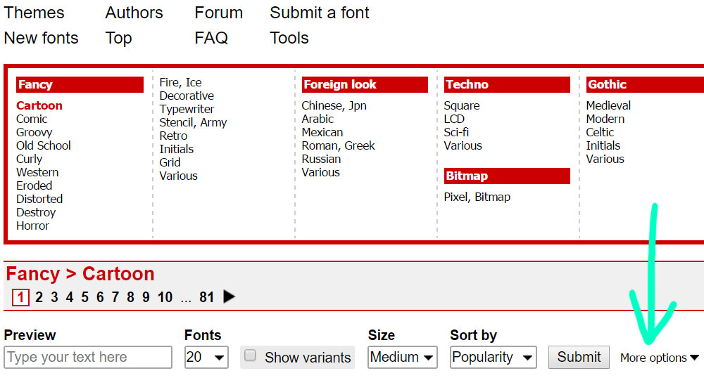
OK, back to the main page of Dafont. It starts off by giving you a list of all of their style categories, so let’s just pop into one at random. I have the blue arrow pointing at “Cartoon” because it’s the first in the list. Look them over and choose whatever category you like!

Next, let’s talk about applying some filters to your search. The very bottom line in this image offers a lot of options.
Preview: type your text of choice in this box, and it will show you that word or phrase in every font.
Fonts: this is how many fonts are shown on each page. I always set it to 100, the highest number available.
Show variants: if a font comes in more than one style or weight, it will show them all when this box is ticked.
Size: how large the sample of the font displays. Default is medium.
Sort by: there are three options in this drop-down: name (alphabetical order), Popularity (default, shows the ones downloaded the most yesterday at the top of the list), and Newer First (how recently they were added to Dafont).
Last in the list is More Options, and it’s my favorite. (Thus it gets the arrow.)

The More Options choices pop in under the rest of the filters, and this is how you can search for fonts by how they’re licensed. If you need something that’s licensed for commercial use, you’ll want to tick the two boxes on the left (see the blue arrows): Public Domain/GPL/OFL, and 100% Free. (If you’re just doing a personal project, you can tick all of the boxes farther to the right.)
For my searches, I’ve also (orange arrow) set the number of fonts per page to 100. Before applying the license filters, the Cartoon category had 81 pages of fonts, at the default display of 20 fonts per page. So around 1,620 options. Overwhelming!
After applying my filters (only Public Domain and 100% free fonts, and show 100 fonts per page) I only have 4 pages to browse through. It’s still almost 400 fonts, but four pages sounds much more manageable, doesn’t it?

With four pages available, I’ve gone straight to the 4th page for the less-used stuff. You can see the stats on every font from this display: total number of font lifetime downloads (orange arrow); number of downloads yesterday (blue arrow); and what kind of licensing to expect (green arrow).
When you click on the font name (or the text preview of that font), you go into a more detailed page about that font.

I opted to find another font that has some notes from the designer for this image. Often there will be confirmation in these notes that the font is valid for commercial use (the highlighting here is mine).
If it’s a personal-use only font, you can usually find contact information or a link from the designer so you can buy a commercial license if you need it. And down at the bottom, you can see when the font was first uploaded to Dafont, as well as when it was most recently updated.
Side note: 3.6 million total downloads! That’s kind of amazing! Yesterday’s top font, Bebas Neue, is about to cross the 10 million downloads mark. These are very nice fonts, but again … everybody’s using them!
NOW, it’s all well and good for a font to be labeled as “100% free,” but I, personally need a little more than that. When I download the ZIP file with the font in it, I expect to also see a text document or PDF with the details of the font’s license.
It may be as simple as a text file saying, “Thanks for downloading, this font is free for commercial use / freeware.” Or it may be more intricate than that. But if I don’t have some sort of document mentioning the licensing of a font, I don’t install or use it.
So now you have a set of tools in your toolbox to find some free fonts that are more rare. Let’s take a look at some that I’ve found! All of these fonts are 100% freebies, and they all include a licensing document in the download file.
As an added challenge to me, I've only picked fonts that had fewer than 10 downloads yesterday. (Compare that to 10,000+ for the top fonts!) Note, many of these creators have donation links, in case you’d like to pay a little something for using their freebies.

Asparago by Paulo Skomii: this is a cute, thin hand-written font. I especially like the uppercase set. This is uppercase, lower case, and numbers only; no punctuation is included.

Atômico by Daniel Maciel: this is a nice, heavy dry-brushed marker font. The edges are rough, but there’s very little roughness inside the letters, which makes things much easier on those who use cutting machines. This is an all-caps font, with the same letters in both the uppercase and lowercase slots.
No numbers, but there’s some limited punctuation and a number of basic Latin accented characters.

Bristol by Jovanny Lemonad: a smooth, heavy hand-lettered font based on the signature of street artist Banksy. This would be fun for projects for men and boys. It’s a full-featured font, including uppercase, lowercase, numbers, plenty of punctuation, accented characters, and even Cyrillic characters.

Catharsis Macchiato by Christian Thalmann: a quirky serif, this font has just enough character to stand out, while still remaining smooth and sharp enough to pair with a lot of other options. Contains uppercase, lowercase, numbers, most punctuation, basic Latin accented characters, and a few double-letter ligatures.

Chronic by Noem9 Studio: the “geometric” look is all the rage these days, whether you’re making a t-shirt for a teenage boy or an album cover for an indie rock band. Chronic combines geometric styling with readability, and I’m honestly shocked that there were only 2 downloads of this great font yesterday, and only 15,000 in its lifetime at Dafont.
Comes in 4 styles, each containing two different uppercase sets (the letters mapped to the lowercase are variations on the uppercase letters), numbers, punctuation, and basic Latin accented characters.

Euphoric BRK by Ænigma: this font comes in both a regular and 3D style. A fun, hand-lettered sans-serif style. Both fonts include uppercase, lowercase, numbers, and limited punctuation.

Letters by Fenotype: it’s like Art Deco and the ’80s had a baby! The Letters letters have very crisp lines and sharp corners, but this font has a limited character set: only uppercase (duplicated in the lowercase slots), numbers, and six punctuation marks. Comes in two styles.

Mudshovel by Spork Thug Typography: a heavy brush-style all-caps font. It’s a little messy, and a little limited, but I liked it as soon as I saw it. Contains uppercase (duplicated in the lowercase slots), numbers, and five punctuation marks.

Noodle Script by Dave Bastian: a retro-style monoline script, with a fun upright stance. This font could also be paired with a western font, since it has a kind of lasso flair to it.
Comes in two styles: solid and shadowed. Both include uppercase, lowercase, numbers, and very limited punctuation. (Again, I'm very surprised that this only has 7 downloads yesterday!)

Sanitrixie Sans by Jayvee Enaguas: this sans-serif is great on its own, but you can also pair it with almost anything else. Clean, simple, and sharp. There are a ton of sans-serif fonts out there, of course; but I wanted to include one in this list, and Sanitrixie has some really nice lines to it. (I especially like the lowercase a.)
Contains uppercase, lowercase, numbers, punctuation, basic Latin accented characters, and Cyrillic characters.

Triac 71 by Typodermic Fonts: the description of this font calls it “funky,” and I totally agree. It’s hip and cool and super-skinny, all things that tickle the font part of my brain in the best ways. Includes uppercase, lowercase (a number of the lowercase letters are duplicates of the uppercase, but not all), lots of punctuation, and a meaty selection of accented characters.

World Tour by JLH Fonts: the last freebie in our list is a mishmash of lots of other styles: a “ransom note” font. I’ve seen quite a few of these mixed-up fonts being used lately; this one uses some really nice variations in style and width. Contains uppercase (duplicated in the lowercase slots), numbers, and the most common punctuation marks.
There you have it – a bunch of cool fonts, free for your commercial projects, that aren’t the same fonts that are appearing on everything these days. Dig deep, my friends, and find some of your own hidden gems!
And of course, I’d be a fool if I didn’t point you toward the free font section right here at Font Bundles! Some are lite versions for personal use only, but there are over 20 high-quality free fonts there that include a commercial license. Plus the always-changing free font of the week!


Crafter's Calendar: A Guide to Inspire You All Year Long!

The Ultimate Dollar Deal Event: What You Need To Know

5 Cool Graffiti Font Styles That Are Trending
By using our website you consent to all cookies in accordance with our cookie policy.
