
This week, I’m doing another tutorial based on a question I’ve seen a lot recently: how to warp text. In the interest of full disclosure, I created this effect in both Illustrator and Inkscape; maybe it’s because I know Illustrator better, but the Inkscape version took me twice as long, with twice as many steps. So it’s Illustrator today.
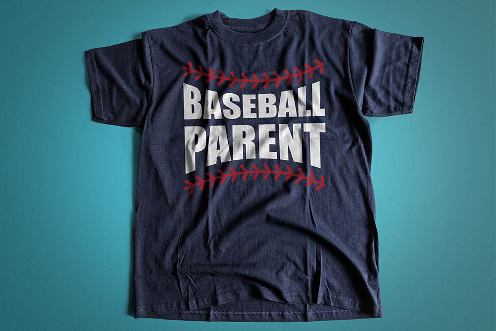
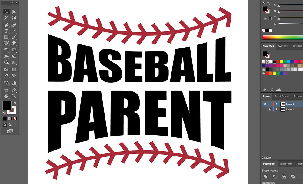
We’re going to do a baseball-themed shirt, since the season has just started. Here’s a look at the final product:
Ready? Off we go!
The first step is, as always, typing out the text. I’ve opted to use Impact as my font, since I’ve spotted it in the wild used for the word BASEBALL, and almost every Windows computer user on earth has it already.
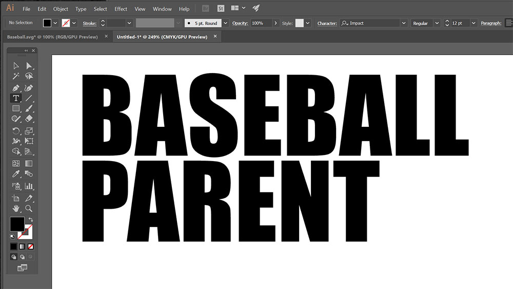
Plus, it’s nice and heavy and tall. Since the warping effect presses down on some of the letters, squashing them shorter than normal, it’s smart to start with a taller, thinner font.
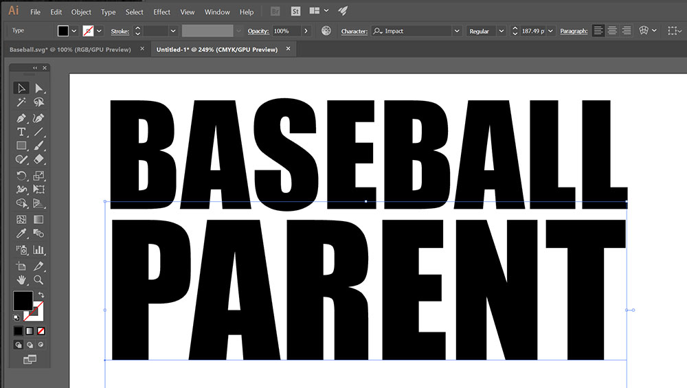
Line up your words along one edge, then scale the shorter words up to be the same width as the longer words. This effect works best if you can essentially make your text into a rectangle or square.
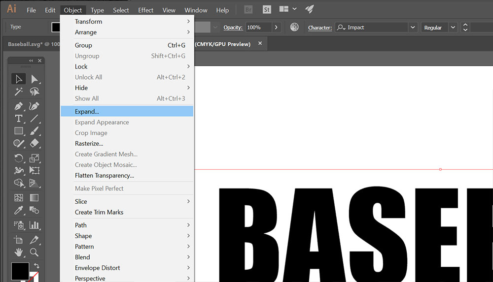
Next up, we’re going to change our letters from a typeable font into vector objects. Select all of your text, then go to Object > Expand. The expand window will pop up; just leave everything as-is and click OK.
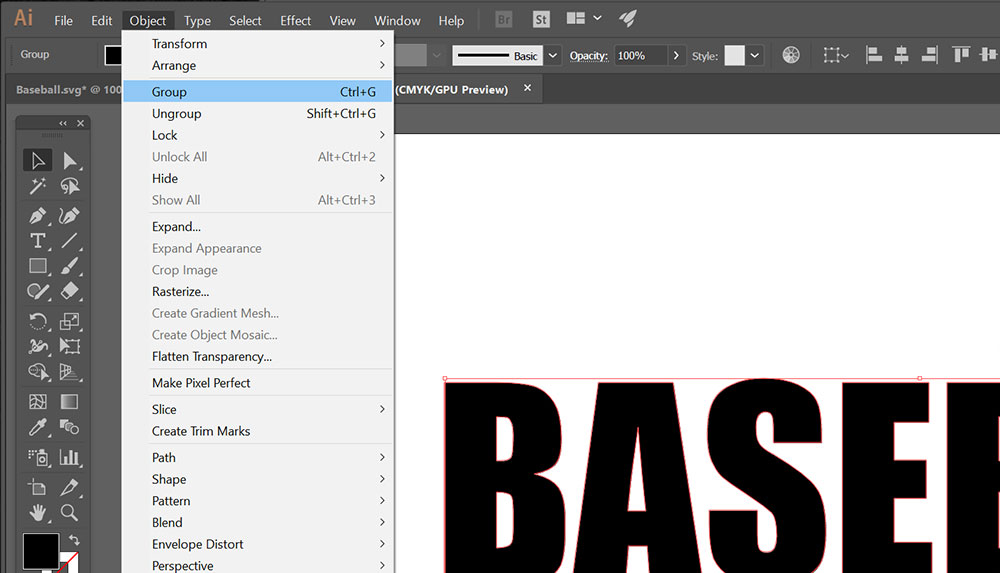
You’ll want to make sure the letters in each word are grouped. If you aren’t sure, ungroup everything, then select just the letters in BASEBALL and go to Object > Group (or use the shortcut Ctrl+G). Then do the same thing with the letters in PARENT.
All right, we’re ready to warp!
After you make a copy of everything and hide away your original letters, that is. You’re going to work with a copy, right?
We’re going to warp the words one at a time. So first, select the word BASEBALL. You should be able to click anywhere on it and select the whole thing, since the letters are grouped.
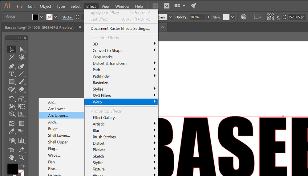
Open the warp menu by going to Effect > Warp > Arc Upper. In reality, you could choose any of these final options; they all pop open the same menu, which has a drop-down with all the options listed in it.
The nice thing about that drop-down menu at the top is that it gives you a wee preview of the effect you’re going to be creating.
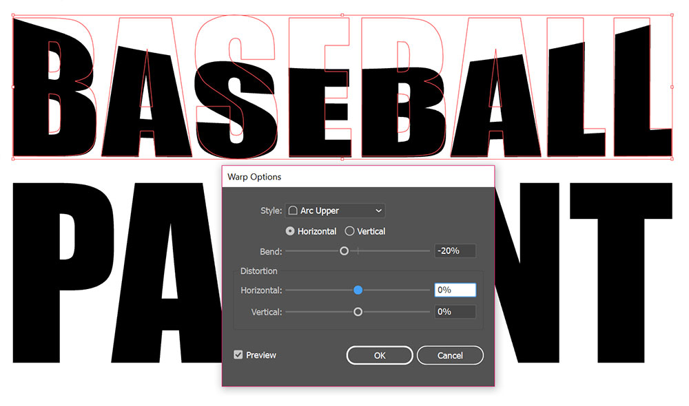
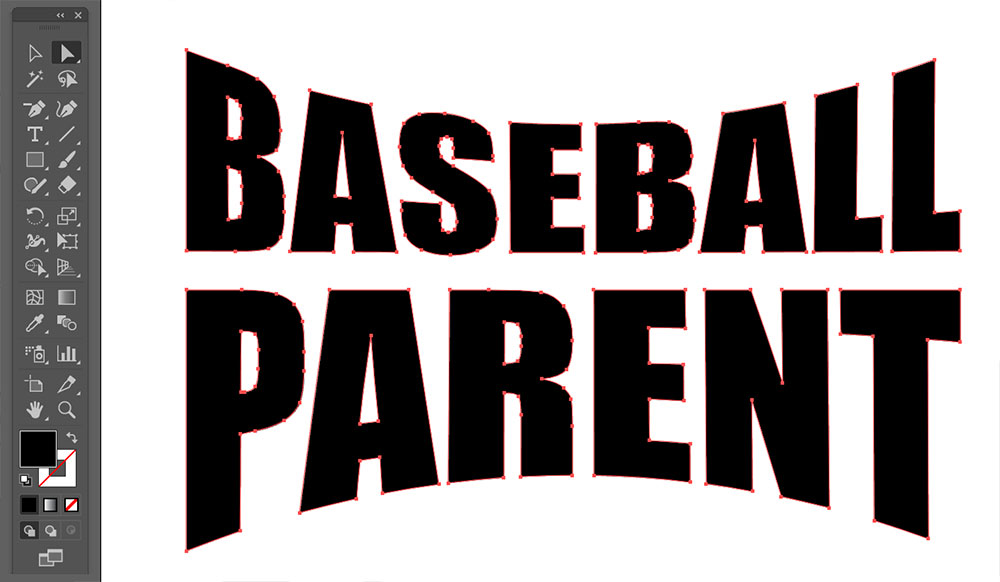
With Arc Upper, the two sides and the bottom remain straight and flat, while the top line curves either up or down.
I’ve created a downward curve by moving the Bend slider to the left of center.
If I’d moved it to the right of center, the curve would go upward, like a fresh-baked loaf of bread.
I’m going with a 20% curve here, but of course, you can fiddle around with it and see where you like it. Be sure to check the Preview box in the lower-left so you can see everything in real time.
Once you get it how you like, select PARENT and do everything the same. Except you’ll choose Arc Lower instead of Arc Upper, so we can do the warping on the lower part of the word.
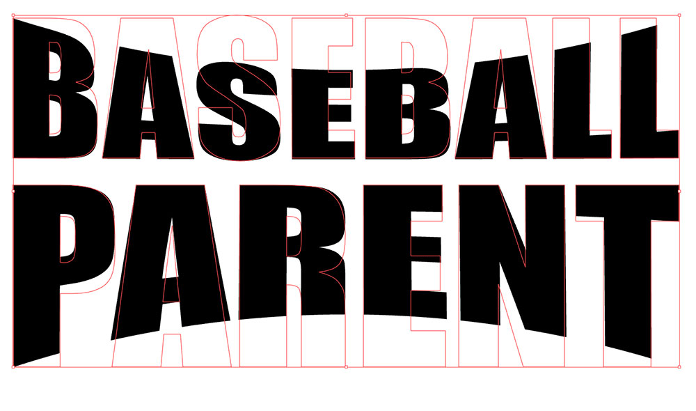
Now, things are going to look a little weird. The letters are warped, but their original outlines are still there in red, looking like the ghosts of the words.
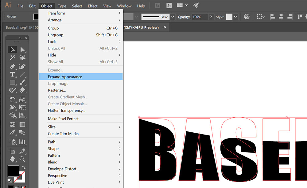
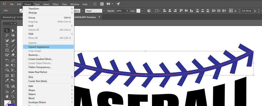
We can take care of that by selecting everything and going to Object > Expand Appearance.
Which banishes the ghosts, and turns our warped text into fabulous vector objects.
Looking at what we have, I feel like it’s a little short. So I’m going to stretch my letters a little taller. Now, I know, I’ve railed against font stretching forever.
But if you think about it, we’ve squished the letters down in the middle, so stretching them just gets them closer to being their normal height.
Also, and I hate to say this, Impact in particular handles being stretched like a champ (unless you go way overboard). So be gentle, but stretch it some if you like.
Now just so you know, there are a couple of other options you could have chosen in the Warp menu.
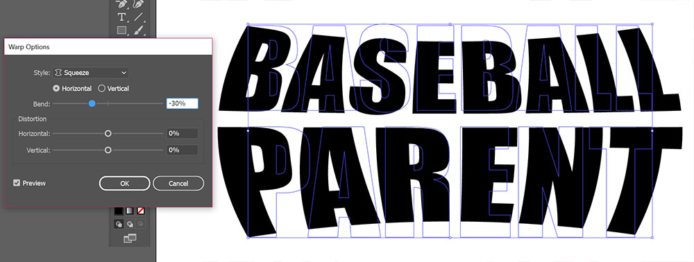
Here’s the Squeeze style, applied horizontally. If the text were a bit taller, you could totally do this to get an even more rounded, baseball-ish look.
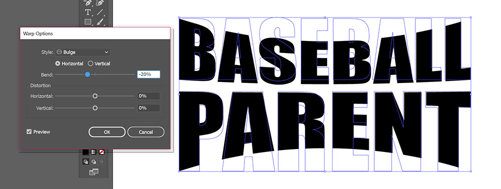
And here’s Bulge, which applies an upper arc and a lower arc at the same time. It’s not quite the same as running both Arc Upper and Arc Lower, however – take a look at the bottom of the letters in BASEBALL.
They aren’t flat anymore, because Bulge is applied to the entire pair of words, not each word individually, and because BASEBALL is shorter than PARENT, the midpoint of the whole thing is lower down. Subtle differences.
If all you wanted to do was warp the text, you’re done! Go forth and font. From here on out, we’re going to create the line of baseball stitches to go along the top and bottom of our curves.
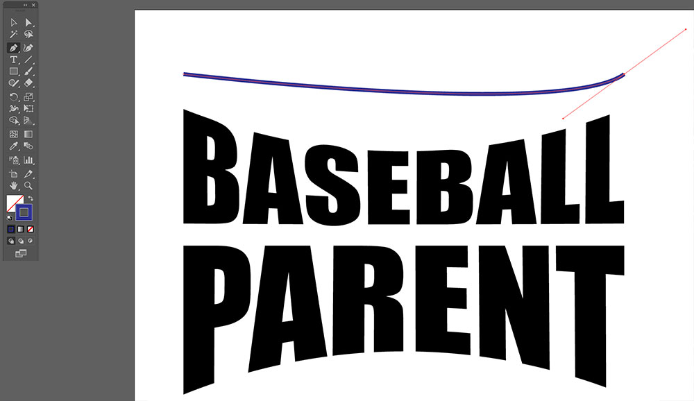
First, we’re going to create a stroke using the pen tool. The beginning and end points are lined up with the left and right edges of our words.
The newer versions of Illustrator do a really good job of snapping and giving you guidelines when you’re in alignment with other lines and planes in your work. If you aren’t sure, you can draw a rectangle around the words, then align the points of your stroke with that.
The curve isn’t quite right here, but that’s OK. It’s easy to edit.
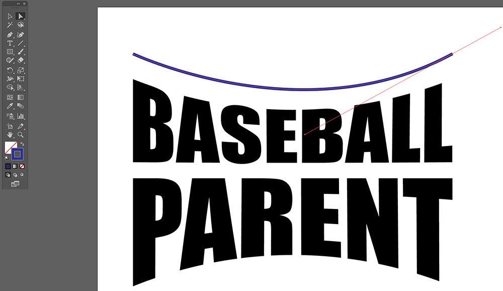
I used the Direct Selection Tool (the white arrow at the top of my toolbar) to grab the handle of the curve and pull it down until the curve of my stroke matched the curve of the text. You don’t have to be 100% exact here; once we get the stitches put in, they’ll hide any small differences in the curves.
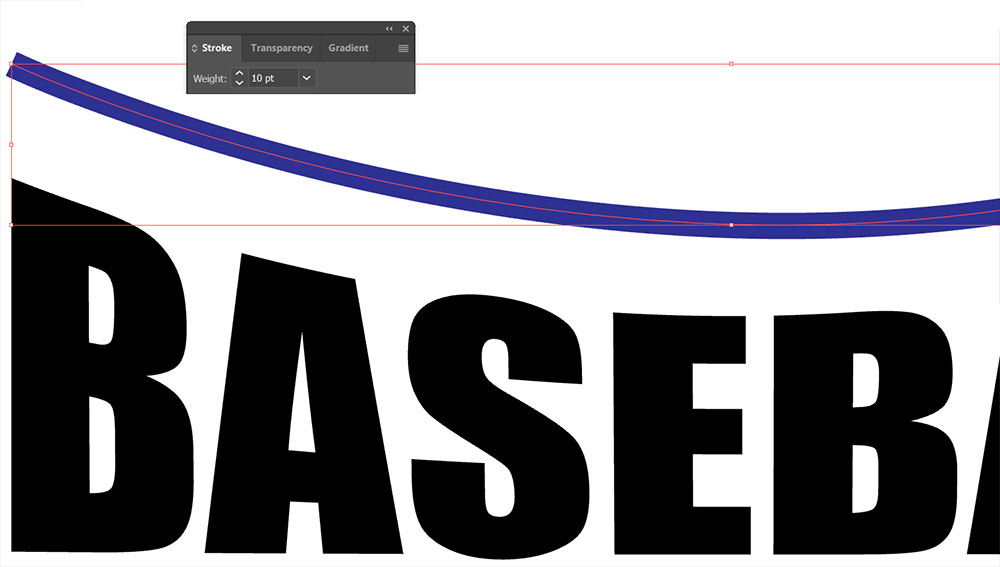
Decide how wide you want that stroke to be, and go to Window > Stroke to pull up the Stroke menu. You can either type in a number of points, or just use the up and down arrows until you get a width you like.
Now, let’s lace this baby up.
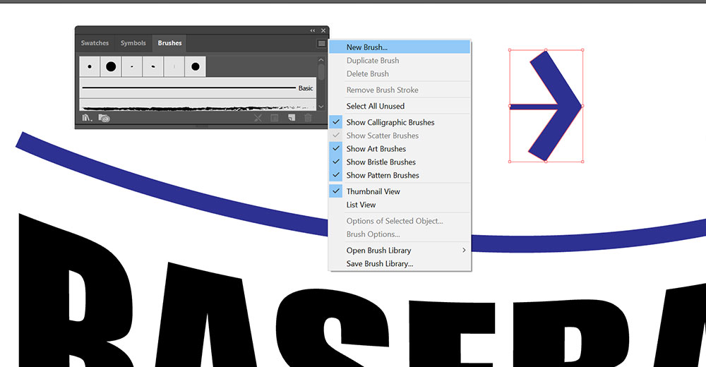
Create a basic lace shape using your pen tool. It’ll look like a weird arrow. I built my shape right next to my stroke, because I wanted to make sure I got the lace width pretty close to the stroke width.
As you can see here, I’ve made the shaft of the arrow quite a bit narrower than the stroke. I’ve done that for a reason, and I’ll explain it in a couple of images.
We’re going to make a brush out of this shape. With the shape selected, go to Window > Brushes, and click on the little stack of lines in the upper right. Click on New Brush.
It’ll give you a pop-up window with lots of different options for brush types; we’re going to make a Pattern Brush.
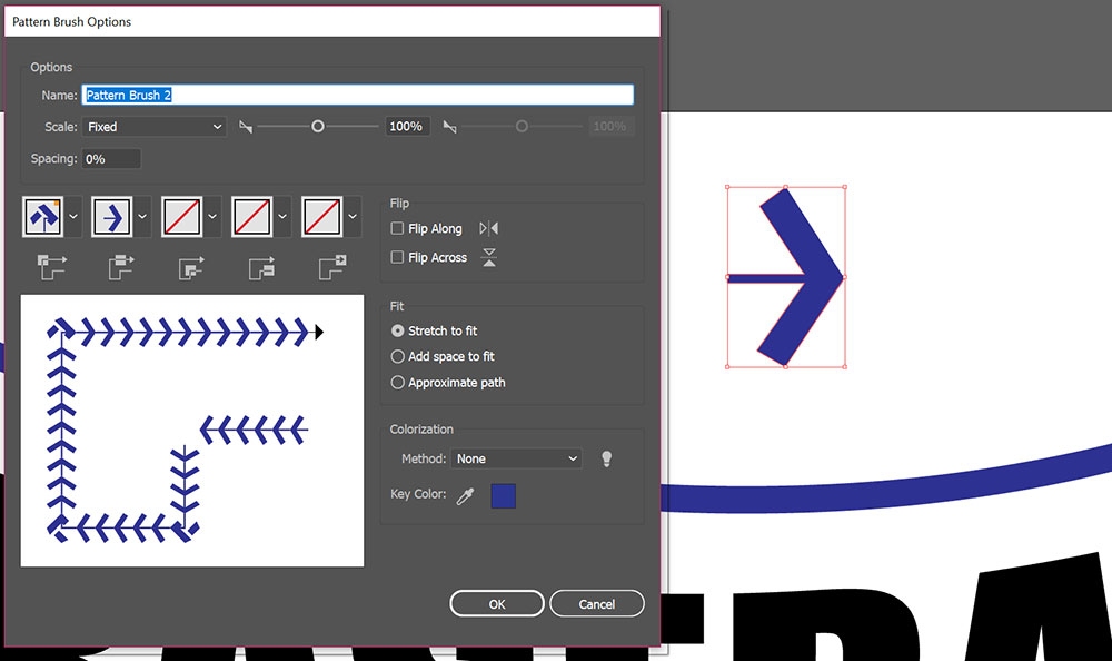
The Pattern Brush Options window will open, looking like this. It gives you a preview of how your brush will look, and I don’t know about you, but the corners in that preview look really messed up. That’s OK, though! We’re going to apply this brush to a curved line, so we don’t have any corners to deal with.
I didn’t make any changes to the default settings here. This window popped up, and I just clicked OK.
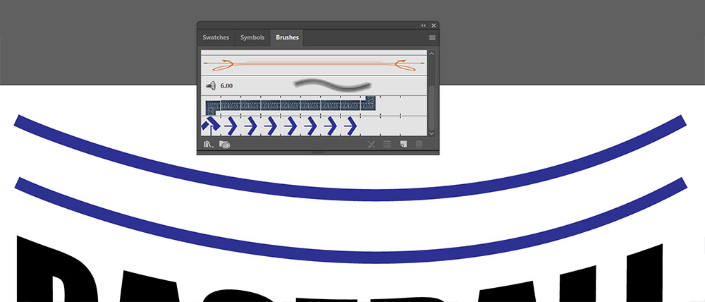
Next, make a duplicate of your curved stroke so you have two identical curves. (Here are mine, like big blue smiles.) You can see the brush window here, and look! There’s our weird arrow brush at the bottom of the list.
Select one of your strokes, then click on the arrow pattern brush in the brush window to apply it to that stroke:
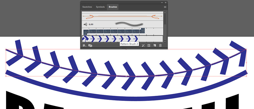
The brush is applied!
Now let’s talk about why I made the shaft of the arrow so thin. As you can kind of see here, the arrows don’t meet cleanly; there’s a little gap between the butt of one and the point of the next. Also, the shafts are all straight here – it’s a series of straight lines set in a curved shape, instead of being a true curve.
Knowing that, we have the second copy of our curved line. We’re going to stack the two on top of each other, so the beautiful fat curve completely covers the shafts of the arrows.
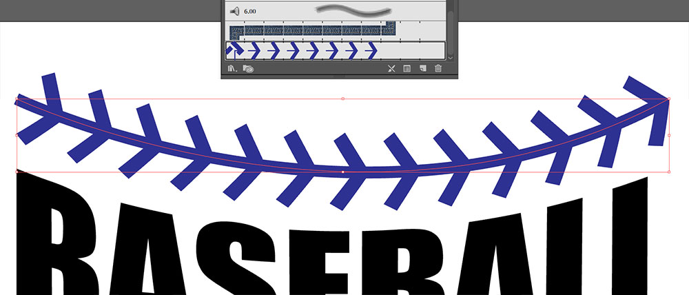
There we go! Now the curve is perfectly smooth, and we’ve hidden away all of the weird little connections between the arrows.
Our next step is to expand all of the parts of this graphic, so they all merge into one big beautiful vector object.
Weirdly, the two strokes now need to be expanded in two different ways. The plain old curved stroke is expanded by going to Object > Expand, just like we did with the text at the beginning of this tutorial.
The stroke with the pattern applied to it, on the other hand, is expanded by going to Object > Expand Appearance.
Basically, click on each shape, and whichever Expand option it gives you, use that. As you can see here, if Expand Appearance is the way to go, then Expand is grayed out and unusable. The same goes the other way – it’ll only give you one or the other, depending on what kind of object you’re expanding.
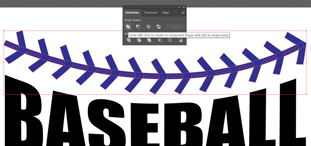
Now you can see that both the regular curve and our stitched curve are expanded to vector objects. We’ll merge them together by opening up the Pathfinder (Window > Pathfinder) and choosing the top-left option, Unite. It takes everything in a stack and turns them into one big, happy shape.
Do we need to do all of that again for the bottom stitches?
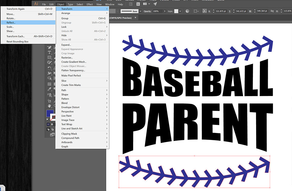
Well, you can if you want. I’m just going to make a copy of our stitched-up curve object and flip it over.
Go to Object > Transform > Reflect…
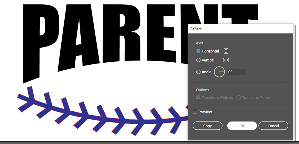
And click the circle next to Horizontal. (Illustrator is kind enough to give us a little icon, so I don’t have to remember whether I want to flip horizontally or vertically.) Click OK, and your stitches flip over!
Nudge your stitches to where you want them, change their color to whatever you want, and you’re done! You can save this out as an SVG, PNG, EPS, DXF, or whatever other file format you’d like to work with.
There you have it! Warped text, baseball stitches, and some fun new elements in Illustrator to play around with. (I could spend hours in that warp menu.)


Crafter's Calendar: A Guide to Inspire You All Year Long!

The Ultimate Dollar Deal Event: What You Need To Know

5 Cool Graffiti Font Styles That Are Trending