Posted 6th October 2016 •
By Design Bundles
Hello, all! Missy here, kicking off a weekly blog feature here at FontBundles. A lot of you have questions about how to make fonts, how to use fonts, how to find fonts, and tons of other font-related stuff. As someone who’s been creating them for over 10 years (and obsessed with them for at least twice as long – when I got married 20 years ago, since we didn’t have a wedding song, we told people, “Times New Roman is our wedding font”) I’ve learned a lot about type, and I’d love to share that knowledge with you. And if there’s something I don’t know, we’ll learn it together!
Today’s topic: what’s your process?
I posted over on the Fonts & Typography group
asking what people wanted to learn about, and have a great stockpile of topics already. (Though feel free to add a comment over there if you have a question or topic!) I’m going to combine a request for “a basics 101 of creating a font” with “your process of creating a font . . . including the software you use” into one post, because they’re mostly the same thing. I did a post a while back here at the blog about
how to create a font using 100% free tools, but commented throughout that those aren’t the tools I use every day. So let’s dig in!

Creating the letters
There are tons of ways to create your letters, and this step can take minutes, hours, days, weeks, or even months. Because I work primarily in handwriting and script typefaces, it’s a lot faster than if I were developing something with more formal rules, like a serif typeface (we’ll definitely be discussing the different styles of font in an upcoming post). You could create your letters on paper with pencil or pen, or digitally. For this particular font,
Zooky Squash, I opted to use an iPad, Apple Pencil, and a program called Procreate. Here you can see underneath the letters I’m creating is a grid, as well as a set of letters. The grid keeps everything the right height, and the letters (in this case, Arial Narrow) serve two purposes: [1] to make sure my letters have a consistent width, and [2] to make sure include all of the letters, numbers, and punctuation I need. Without a guide of some sort, I’d undoubtedly forget to create the Euro symbol, or a set of brackets, or . . . not proud to admit it, but one time I forgot to include the comma.
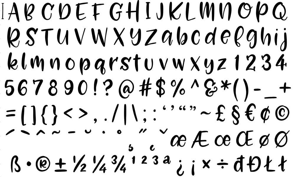
After creating all of the letters, I need them all to be in a JPG or BMP image format. With Procreate, I can just turn off the layer with the grid and the layer with the Arial alphabet, and export this whole thing as a JPG. (For alphabets I create on paper, I have the added step here of scanning those pages. I have a little USB flatbed scanner that just barely holds a sheet of 8.5x11 paper, but really that’s all I need. I use Photoshop to scan the pages in, then save them as JPGs.) This is one alphabet set – for this particular font, there were more alphabet sets (every letter had at least two other alternates) as well as some flourishes and illustrations. I just went in and counted, and this font ended up with 12 JPG files (though not all of them were as packed full of characters as this one).

Converting the letters to vector
Once everything is in JPG format, I place the JPG files in Adobe Illustrator and “live trace” them. This turns the JPG, a raster item (meaning if you blow it up big, it’ll get all pixelated because it’s at a set resolution) into a set of vector objects (vectors are just objects made up of dots connected with lines and curves, so even if you blow them up huge, they retain their shape – the dots and curves stay smooth and keep their relation to each other). Here you can see the letters outlined with their dots and curves. Once I get all of the characters into vector format, I break them up into manageable chunks (a file with the 26 uppercase A-Z letters, another file with the 26 lowercase a-z letters, another with numbers and punctuation, and so on). I save each set as an SVG (scalable vector graphics) file, because I’m going to want all of those vector dots and curves when I get into my font creation program.

Into the font program!
In the freebie post, I used
FontForge, which is a free open-source program. If you want to learn to use it, you’re a stronger person than I! It’s a tough learning curve, and it doesn’t do a lot of things automatically like a paid program does. But the price is certainly good. I test-drove the demo versions of a couple of under-$100 options, and ended up buying
Type 3.2 from CR8 Software (PC & Mac). There are other programs that cost a lot more, and have a lot more features, but I’ve yet to come up with something I want to do that I can’t do with this program. I also tested out
TypeTool (PC & Mac), which is around the same price, and liked it as well – I just liked Type 3.2’s pen tool a little more.
Importing the characters
Type allows me to import SVGs, and it doesn’t choke up on large files (like FontForge can). So, as you see above, I can open up the spot where the uppercase A goes and import the entire alphabet at once. I resize the letters all together, which ensures that they'll all be the same size and scale. (This is also helped by the line to the left of the uppercase A – every set of letters has one, so as I scale each set of characters, I always make sure that guide is the same size.) Now I can just copy each letter one by one and paste it into its spot.

Cleaning everything up
Here’s a side-by-side comparison of the uppercase Y. On the left is the raw version, imported straight in from the SVG file. On the right is the cleaned up version, with much smoother curves. The fewer points along your curves, the smoother the curves and lines will be. Mind you, not all fonts need this kind of cleanup – if you’re importing a streaky, grungy brushed set of letters, you’re going to want all of the rough nooks and crannies to stay. (Although even those may need a little tweaking here and there.) At this stage, I also line up the letters (using those horizontal dashed lines) so they’re consistent with the rest, and set the spacing on each side of the letter (the vertical pink and green lines).

Testing out sentences
The next two steps are performed at the same time, back and forth. I have a bunch of files with various sentences and phrases, so I can see how well the letters sit next to each other – maybe the lowercase A needs to snuggle a little tighter under the umbrella of the uppercase T! Maybe some other letters need to be a little bit farther apart! Which is fixed with:

Kerning!
Oh, kerning. How I love you. Kerning is the spacing between two characters. And you can kern any two at all, even if they don’t normally go together. Want to kern “QV”? You can do that. "M7"? Go for it. For every font, I start by loading in my base list of around 440 letter pairs, then I add more in as I go. Some pairs are perfect as-is, and some just need a little nudge. I’ll kern all of my basic pairs, then fire up that preview window with the paragraphs and see where there are letters too close or too far apart. Then it’s back to the kerning window, add in that letter pair, and make the adjustment. It can take several days to kern a font, but it’s kind of nice mindless work.

Alternate characters and extras
Some fonts have “OpenType features,” which means that in some programs, you can type a letter, highlight it, then just click a button and it’ll change to an alternate version of that letter. We’re going to go over a lot of these features in an upcoming post so that you’ll know what they all are and some of the cool things font creators can code into a font. Here you can see in the background I have an alternate uppercase Y. Then there’s a pop-up window of a list of possible OpenType features I can include. Each of those checked boxes calls out to a text file, like the one you see in the foreground, which basically says, “If someone clicks on the ‘stylistic alternates’ button, change the letter named ‘A’ to the letter named ‘A.salt’.” (I can name those alternate letters whatever I want, then edit the text file to refer to whatever I’ve called them.)

Accented characters (the easy way)
One of the really nice parts of this font program is the “composite wizard,” which helps make most of the accented characters for foreign language support. In this example, the software knows I have the uppercase Y installed, and it knows I have the dieresis installed (the accent mark made of two dots). When I run the composite wizard, it combines those two and creates a new letter named “Ydieresis.” Then I go through all of the composites and make sure that the accent marks are centered in the right place – sometimes those, too, need a little nudge to one side or another.
Creating a font file!
When all of that is done, I figure out a name. (I pretty much just look at the font, decide how it makes me feel, then head to the thesaurus. Then I find a name I love, Google it, curse a few times because it’s already been used, and go through that process again a few times before I find my final name.) Then I create my OTF font file, install it on my computer, and test it out even more with other programs (with Word, you can just rattle off sentences, or apply the font to a previously created document, and look for even more pairs of letters that may need some gentle kerning). With some fonts, I’ve had to go back and make tons of little fixes, and re-generate the OTF file dozens of times. Others, I get it right on the first or second try. When the font is finally done, then it’s time to get it ready for sale!

Promotional images
Ten years ago, if you wanted to buy a font, you were lucky if you could look at a few sentences, an image of the alphabet, or (on rare occasion) input your own text and be able to see what it would look like. Nowadays, everyone wants to see not only the entire alphabet, but also examples of that font as it would appear in the wild. Fortunately, there are tons of mock-ups available out there, so you can use Photoshop to type something out in your font and instantly apply it to a poster, coffee cup, t-shirt, book cover, or any other object you could name. I’ve been trying to up my promo image game, because there are some incredible ones out there! For this particular image, there are forty-one layers: one is the background image of the frame, wall, and potted plant; the rest are the contents of the poster. I put it together one letter at a time, so I could really play around with nestling the letters together in ways I liked. And I loved every minute of making it, because it’s your first chance to see the font you created really come to life.
So there you have it!
That’s how I create a font, from first drawing the letters to making it ready for sale. It may look like a ton of work, but every step of it is enjoyable! (Okay, maybe not all of the cleanup. Especially if you have 500+ characters in a font.) I’ll be back next week with another answer to a font-related question, so be sure to let me know what you want to learn about! You can either
comment on my post over on Facebook, or drop me an email at
[email protected] with your ideas. Coming up, we’re going to cover font managers, the vocabulary of fonts, how to pair fonts, and much more!


