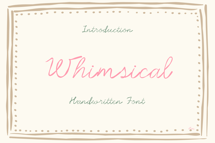
This hip, but whimsical, serif font is like getting two fonts in one. The uppercase is a more decorative case that works best to begin or end words. The lowercase is simplistic. We suggest typing largely in the lowercase but mixing in the uppercase here and there for an artistic and creative look. The sample was typed as the following - "HouseWinE" For a sans serif version, check out PN Housewife.
Included:
- Uppercase
- Lowercase
- Numbers
- Symbols
- Multilingual support (standard)