Cindervale was born from a quiet obsession with imperfection. As a type designer, I kept to the same question: why do the oldest printed books feel more alive than anything made today? The answer, I realized, wasn't age — it was evidence. Evidence of a human hand. Evidence of pressure, of ink, of a tool dragged across a surface by someone who cared.
Cindervale is my attempt to capture that feeling.
The name comes from two worlds colliding — cinder, the remnant of something burned, and vale, a valley sheltered between hills. Together they describe exactly what this font feels like: something that survived, settled, and grew quieter and stronger for it. There's warmth in the ash. There's shelter in the low places.
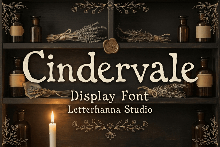
Structurally, Cindervale is a display serif with hand-lettered origins. The strokes carry deliberate weight variation — heavier at the body, lighter at the lift — mimicking the honest pressure of a broad-nib pen. Terminals are rounded, slightly swollen, never clinical. Serifs anchor each letterform without stiffness. The overall texture reads as aged without being illegible, imperfect without being careless.
It's designed for the makers, the storytellers, the brands that understand that character is built slowly — not downloaded from a template.
Use Cindervale for book covers, apothecary branding, wedding stationery, artisan product packaging, editorial headers, and anywhere authenticity matters more than perfection.
Because the valley remembers everything that burned above it.
→ Download Cindervale now and bring something real to your next project.