🅐 About
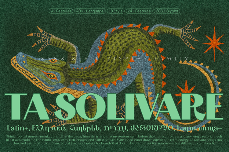
TA Solivare is a high-contrast display typeface rooted in classical visual structure but stripped of traditional serif detailing. It features sharp angles, stable rhythm, and a clear sense of construction, making it ideal for prominent use in editorial headlines, brand identities, and cultural communication.
TA Solivare balances visual tension with restraint — offering a distinctive voice without excessive decoration. With six scripts and ten weights, it adapts well across multilingual and multidisciplinary contexts.
🅑 Features
– 10 styles (from Thin to Black)
– Support for 6 writing systems: Latin, Cyrillic, Greek, Hebrew, Georgian, Armenian
– 2050+ glyphs
– OpenType features:
• Standard Ligatures
• Contextual Alternates
• Stylistic Sets
• Subscript / Superscript
• Lining and Tabular Figures
– Carefully hand-kerned
– Optimized for both Adobe and Figma environments
🅒 Recommended Use
– Branding & logotypes
– Editorial design (books, magazines, catalogs)
– Posters and cultural campaigns
– Art and museum identities
– Multilingual and global publishing
– Packaging and invitations
🅓 Language Support
– Latin Extended A & B
– Cyrillic (incl. Russian, Ukrainian, Bulgarian, Serbian, Chuvash, Bashkir, etc.)
– Greek
– Hebrew
– Armenian
– Georgian (Mkhedruli and Mtavruli)
🅔 Tone & Personality
TA Solivare doesn’t try to be loud — but it stands firmly in place. Its tone is sharp, deliberate, and culturally adaptable. It’s not quite modern, not fully retro — but something quietly present in between. Its multi-script support gives it technical depth, while its visual rhythm adds just enough expression to make it memorable in use.