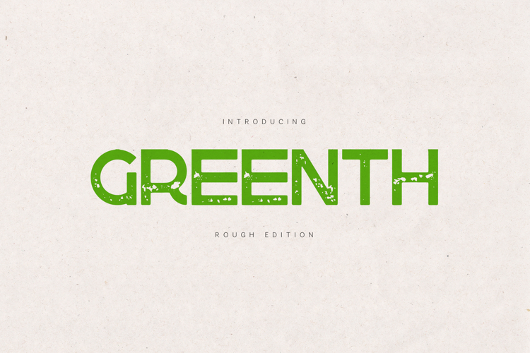
Greenth is a heavy industrial sans serif with a textured, worn-in attitude.
Built with strong geometric structure and layered with organic rough details, it delivers impact without losing clarity.
This is not a subtle typeface.
It is direct. Confident. Street-aware.
Designed to feel printed, pressed, stamped, and slightly imperfect — like ink on recycled paper or paint on concrete.
⸻
Design Character
Greenth combines:
• Solid, modern sans-serif construction
• Balanced proportions for strong readability
• Carefully crafted rough texture (not random noise)
• Controlled distress for professional results
The texture is integrated into the letterforms — not overlaid — so it prints cleanly and scales beautifully without becoming messy.
⸻
Perfect For
Streetwear branding
Skate & urban culture
Craft beer labels
Music posters
Packaging design
Merchandise
Sustainable brands
Eco projects
Event graphics
YouTube thumbnails
Editorial headlines
⸻
What Makes It Different
Most rough fonts look chaotic or overly destroyed.
Greenth keeps structure intact.
The texture enhances the form instead of breaking it — giving you that authentic vintage print feeling while staying modern and usable.
It works extremely well in:
• Bold headlines
• Posters
• Logo marks
• Packaging fronts
• High-contrast layouts
⸻
Features
• Uppercase & Lowercase
• Extended Latin & Multilingual Support
• Numbers & Punctuation
• Built-in Rough Texture
• Clean Kerning
• OTF Format
• High-impact Display Ready
⸻
Style Direction
Think:
Independent clothing brands
Modern eco startups
Urban food trucks
Minimal brutalist posters
Industrial typography systems
Greenth is designed for brands that are not polished — but powerful.