
The distressed look is popular these days, and for good reason – it can look totally cool. There are plenty of pre-distressed fonts out there to choose from, but sometimes those fonts have issues.
For example, here’s a word typed out in Asfalto (A freebie!). It looks cool, but there are a couple of things that might get on your nerves here: first off, whenever you use a letter, the distressing effect looks exactly the same as every other time you’ve used that letter. Follow the colorful arrows and you’ll see – the Ds, Es, and Ss are all repeats.

Some people probably don’t mind it, but I’m sure it drives others batty. Another issue is that the font designer has dictated how much distressing there will be, and how large the distressed spots will be. If you’re working in vinyl, can you imagine having to pluck out every single little spot here?
So while distressed fonts are awesome, today we’re going to talk about creating your own distressing effects and applying them to solid fonts. You get to choose how much distressing, how big those distressed spots are, and (if you’re creating this in vinyl) how easy or difficult you’re going to make your work.
And with these techniques under your belt, you can apply a uniform layer of distressing to all fonts and graphics on your project!
All of my examples in this guide will be done in Photoshop. But most of this stuff can be done in other image editing programs (like GIMP), and I’ll talk a little bit at the end about how you can apply some of these techniques to other design programs.
Our first step is going to be making our own gritty texture to distress things with. Yes, you can get gritty textures from the internet – there are tons of premium paid textures out there, and quite a few decent freebies as well. But I wanted to cover everything, and as a bonus, I’m going to give you all of the textures I create today for free!

How do you make a gritty texture? You could start with any photograph. Does the pavement outside your house have a cool texture? Are your windows a little bit dirty? Those could make awesome textures! But because I wanted a very specific look, I wanted to photograph something as close to black-on-white or white-on-black as I could get.
If the dirt in your yard is black, you could sprinkle it on a white sheet of paper. Sadly, our Arizona dirt is reddish-pink, so instead, I opted to scatter some salt on a black sheet of paper.
My assistants gave everything a very thorough sniff, don’t worry.
I took a few different pictures, re-scattering the salt every time. I just took them with my phone’s camera – no need for any fancy special equipment.

I brought the images into Photoshop and cropped them so it was just paper and salt – no table visible. Then it was time to adjust the settings so I could get the texture I wanted – speckles of black all over a field of pure white.
First up, I had to invert black to white, and vice versa:

I went to Image – Adjustments – Invert first, which swapped my lights and my darks. Everything still had a kind of yellowish cast to it, thanks to the lighting over my kitchen table. So I went to Image – Adjustments – Black & White, and dialed the yellow channel way over, so that there was no color left – it made everything into shades of gray.

Here you can see – the yellow was showing up on the lighter parts, so in the Black & White options, I told it to make everything yellow as white as possible.
Since I had the preview box checked, you can see the grayscale result behind the pop-up. It still has a bit of fiddling before it gets to true black on white.

Next up, I adjusted the levels (Image – Adjustments – Levels). I pulled both end sliders toward the middle, until my background was totally white, and the specks were totally black. (Again, you can see the preview behind the pop-up.) Some people may prefer to use Curves instead of Levels here, but I figured the single slider bar in Levels was the easier option.
Now that we have a black-on-white speckled texture, there are a few different things we can do with it.
First off, we could make a Photoshop brush!

You don’t even need to fiddle with transparency or anything to make a brush – as long as you’re working in pure black and white, just go to Edit – Define Brush Preset, name your brush, and you’re good to go. Everything that’s white will be transparent in your brush, and everything that’s black will be where “paint” gets put down.
We’ll come back to the brush a bit later, when we use it as one of our options for distressing our text.
If you want your texture to be a bit more flexible, you can save it as a transparent PNG file. That way, you can import it into other programs (as opposed to a Photoshop brush, which can only be used in Photoshop). But to create that, we have to carve away the white, so that only the black speckles remain.
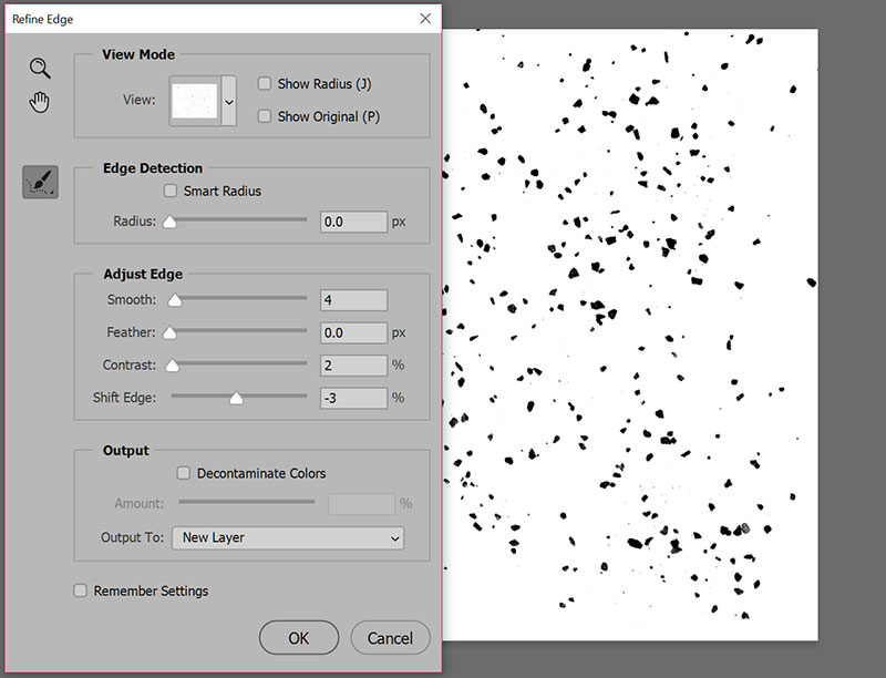
We’re going to get a little technical here. You COULD just use the magic wand tool, select the white, and hit the delete key. However, that’ll give your black specks some jagged edges. This method takes a little more time, but gives you a much smoother result.
Use the magic wand and select something black. (Make sure the “Contiguous” box is unchecked when you're using the magic wand, so that it selects all of the black on the page.)
Then open up the Refine Edge window. Depending on your version of Photoshop, that option could be in Select – Refine Edge, or if you’re using Photoshop CC, you need to open up the Select menu, then hold down the Alt key while clicking on Select and Mask. It’s weird, just go with it. (I believe on a Mac, you’d use the Option key instead of the Alt key.)
In the image above, you can see that I’m not adjusting these settings very much. Just enough to soften the edges a little bit. Be sure you have New Layer selected down in that Output To: spot at the bottom.
Click OK, and you’ll have a new layer pop up, with just the black speckles. Everything else on that layer is transparent.

Make sure you have all other layers turned off (you should see that checkerboard pattern behind your texture) and save your file as a PNG.
(You may ask here, should I save it as a PNG-8, or a PNG-24? I’d say that PNG-8 is just fine. It gives you a smaller file size, and even though it supports a smaller number of colors in the file, you’re only working with black and some shades of gray.)
Here are the three textures I ended up making, which will be included in the free download at the end of this post:

I did a light, medium, and heavy salt. For the rest of this post, I’ll be working with the medium saltiness.
Now that we have a couple of different options for our texture (PNG and Photoshop brush), it’s time to apply that texture to our text! And if you'd prefer to use my free textures (or any others you have on hand), and not bother with making your own, here's where things are going to get good!

I’m going to cover 3 different ways to apply the texture to the words. I’ve made 3 copies of the word DESTROY, so we can compare our results at the end of all 3 methods.
First off, I’m going to do the middle method: using a layer mask. (Why start in the middle? I have my reasons. Most of which are reasons of the “I didn’t plan out things very well” variety.)

Select your text layer, then click on the “Add Layer Mask” button at the bottom. (It’s that black rectangle with the clear circle in the middle of it. An icon that just screams layer mask, right?)
Once you’ve added a layer mask, a white box will show up next to the text in your Layers panel:

We’re going to sneak in the back way to mess with this mask. So here’s what I want you to do: hold down the Alt key (or Option key on a Mac) and click on that white rectangle in the Layers panel.
Your text should have disappeared over in your main image, replaced with a field of white. That’s perfect! You’ve gone directly into editing your layer mask mode.
Now open up one of your transparent PNG texture files in another Photoshop tab. Select the whole thing and copy it. (You can select all by hitting Ctrl-A (PC) or Cmd-A (Mac), then copy with Ctrl-C / Cmd-C.)
Go back to the tab where you’re working on your text, and paste (Ctrl-V / Cmd-V) your copied grit over the white layer:

If your grit layer is too big, you can resize it to fit. And you can scootch your grit around so that you’re getting the very best bits of grit over the white. You can see in this image that the grit image was more square, so I could move it up or down quite a bit to get just the right texture over my work area. Once you get the grit where you want it, click on any other tool in your toolbar, and Photoshop will ask if you want to place your pasted object. Click on the “Paste” button.
Back over in the Layers panel, one again hold down Alt and click on the little white layer mask thumbnail. This will take you out of editing the layer mask mode.

Here you can see the result: the little thumbnail of the layer mask in the Layers panel has black speckles on it. Anywhere those speckles fall on your text, the text goes transparent. (In all layer masks, masking things with white leave them visible, while masking them with black makes them transparent.)
The one big problem with using the layer mask method is that you can’t really see where you’re putting your texture on the text. Because you’re placing it on a field of white, you kind of have to guess where the distressed spots are going to appear. (There ARE ways around that, but I'm trying to keep things as basic as I can here.)
On the plus side, using the layer mask is a “non-destructive” method of manipulating your text. You can turn that mask off, or delete it, and the text will still be there, solid and sturdy and non-distressed, so you can try something else.
Our next method will be to use the brush we created earlier:

I’m going to call this a destructive method, although there ARE ways to use a brush in non-destructive ways. But I’m trying to keep this blog post from being eight thousand miles long, and I’m already failing a little bit. So we’re going to use the brush tool the easy way. It’s the fastest and least tech-savvy method, but again, destructive – you can’t just turn off the changes you’re making; they’ll be permanent changes to the text.
First, right-click on your text layer and select “Rasterize Type.” This changes your text from being a vector object (adjustable to any size) to a raster object(made of pixels like a photograph). If you try to make the text larger after rasterizing, it’ll get blurry and pixelated. So if you’re going to do this method, I highly advise duplicating thelayers you're working with, so you have a backup.
Once the text is rasterized, select the eraser tool (it uses the same brushes as the paintbrush), and select thegritty texture brush you created.

You get a photo instead of a screenshot here, because I couldn’t get the phantom brush preview to show up in a screenshot. What’s nice here is that you can resize the brush to be as small or as large as you want, then hover it over the text to see where the texture is going to fall. Don’t like it? Make the brush a little smaller or larger.
Once you have your brush sized how you like it, just tap once on your text. All of those texture areas will be erased!

Here you can see the two methods we’ve done so far. And it isn’t just you – the texture from the eraser method is a little bit blurry compared tothe layer mask method. That’s because in tapping, you need a very steady hand. I think I jiggled just the tiniest bit when I tapped that eraser down on the text, and that’s why it’s a bit blurry.
But again, that eraser method was super-fast.
So here’s where I was originally going to end, with just those two methods. But then I thought, Self, what about applying a pattern swatch?And I was all, Yes, self, you’re right! Let’s do that too!
So! To create a pattern swatch, I opted to reverse my texture: black background, white speckles. So I went back to the earliest steps in this post, and did everything except inverting. All the rest was the same: crop, then Black & White, then Levels.
Once again, I also clicked on the black (the part I wanted to keep) and did the Refine Edges adjustment. That gave me a layer that wasmostly black, with the grains of salt transparent:

I turned it into a pattern using the same drop-down menu we used to make a brush: Edit – Define Pattern. And once again, you can name it any goofy thing you please.
You can overlay a pattern on anything (in a non-destructive way) by using the FX panel. Select your text layer, then click on the little fx next to the “Add layer mask” icon in your Layers panel. Choose “Pattern Overlay,” then select the pattern you just created.
The Pattern Overlay menu has the option to re-size your pattern as large or as small as you want, by percentage. I advise sticking to 25% increments, because it usually looks sharper and crisper. So try 25%, 50%, 75%, or 100% and see how the distressing works for you. Check the “Preview” box and you can see the changes on the fly.
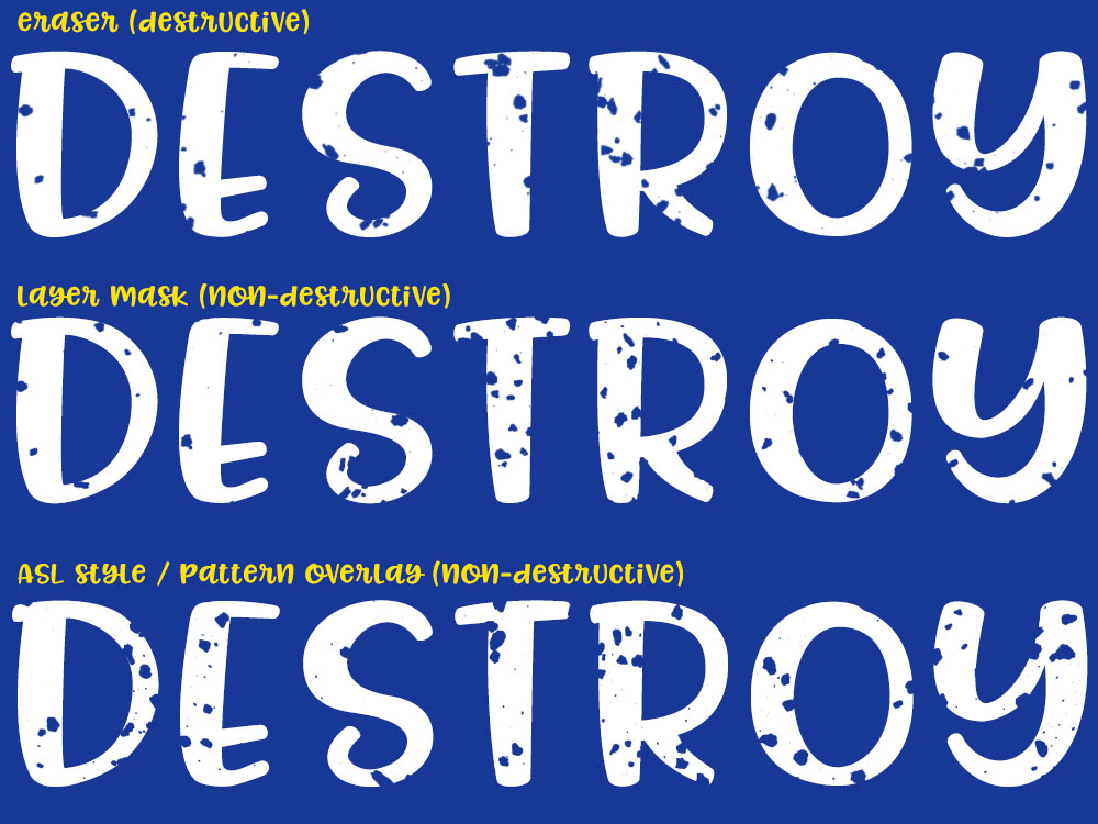
So here are all three methods laid out together! They all have their perks, and if you’re more comfortable with one method over the others, use it! (I, personally, tend to use pattern overlays a bit more than layer masks.)
Last but not least, it’s time for freebies! Here’s a ZIP file that contains three transparent PNG files with the salty textures: black grit on a transparent background. And for funsies, I’m also including an ASL file with two layer styles (black background with transparent texture) for the more advanced users. Enjoy!
Download file: Missy-Salty-Grit.ZIP
Also, because I mentioned this earlier: if you’re using a program other than Photoshop, you can still use these textures! The PNG files can be imported into many different programs, and a lot of those programs have similar brush tools, layer masks, or pattern overlays. Not to mention, you can use them with vector programs too!Just bring the PNG in and run the trace function over them. Then put that traced texture over the top of your text, and delete the one from the other. (Or however you’d do it your software – you know it better than I do.)

DTF Troubleshooting Guide: How to Fix Common Problems & Get Perfect Results Every Time

Ask a Font Creator: Stitch Text Effect in Inkscape and Illustrator

Let's Judge Books by Their Covers!