I’ve seen a few requests lately for a 3-D font. But why limit yourself to the few 3-D fonts out there, when you can create your own 3-D effect with any font?
As is my habit lately, I’ll be doing this tutorial in good ol’ Inkscape, primarily because it’s free, and there are versions for Mac, PC, and Linux. So hopefully, that should cover almost all of you.
First off, let’s type out some text!
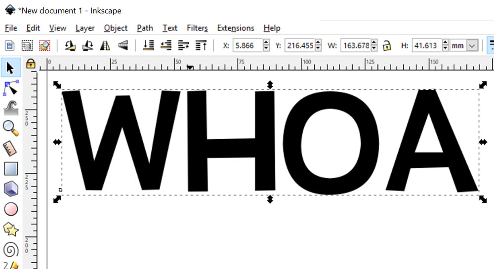
Because this is areally cool technique, I’ve chosen the word WHOA. (I also like WHOA because it has straight lines, angled lines, and curved lines. It covers all of the shape bases!)
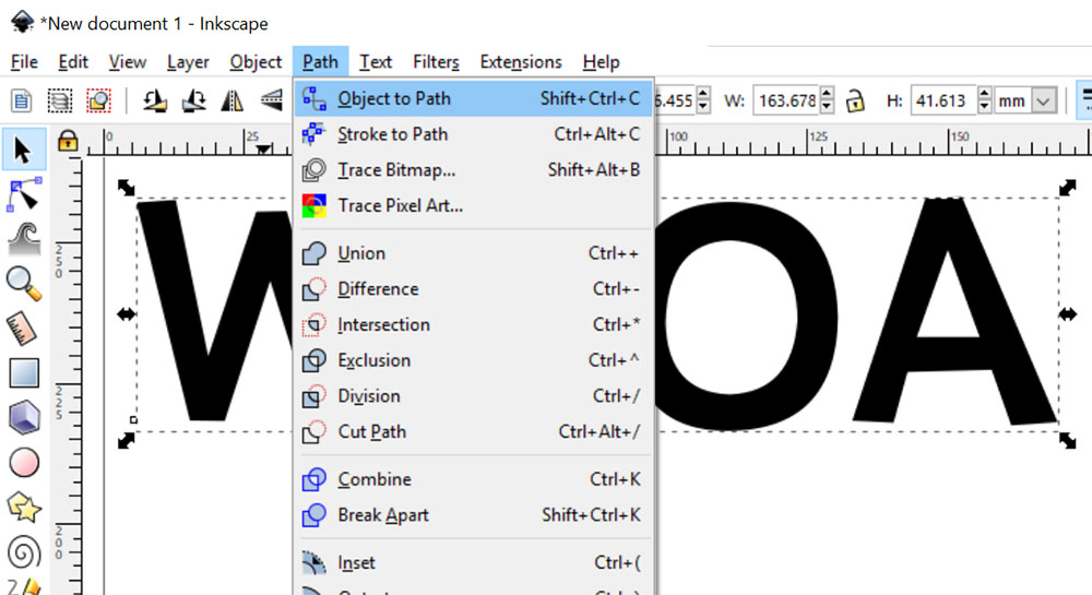
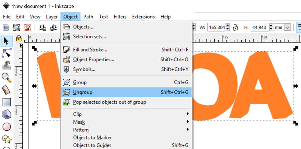
When you get the text the size you want, then it’s time to transform it from editable text into a vector object. The first step is using Path > Object to Path.
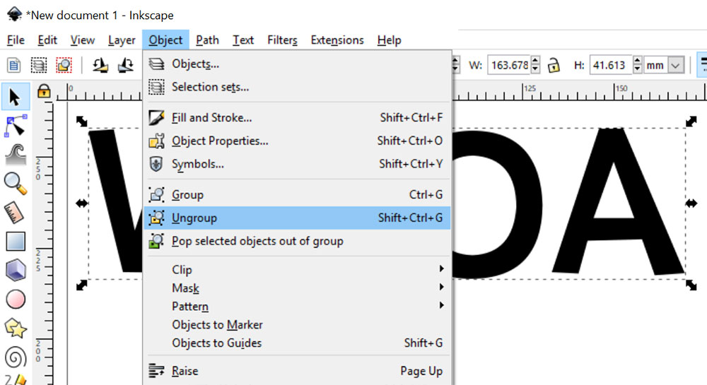
Next up, you’ll want to ungroup the letters. (Doing Object to Path automatically groups everything together.) Ungroup by using Object > Ungroup.
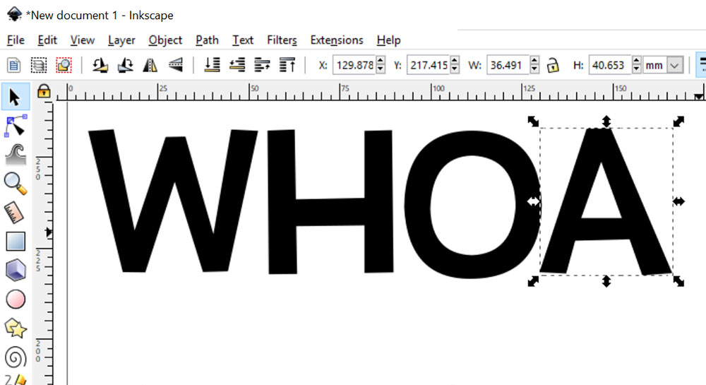
If there are any spacing adjustments you want to do, now’s the time. I feel like my A is a little bit too far from my O, so I’ve selected the A individually and nudged it to the left using my left arrow key.
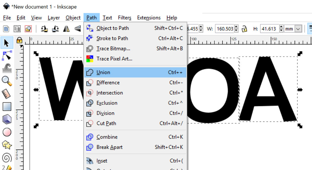
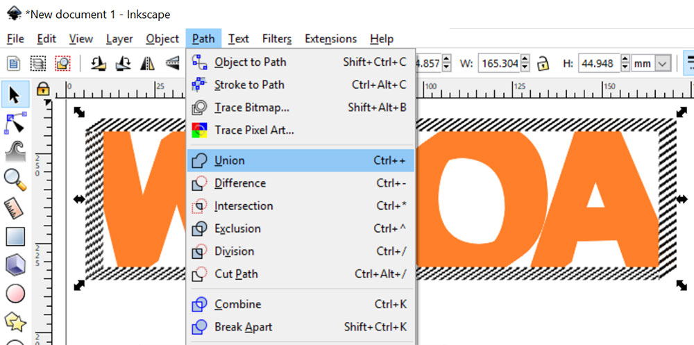
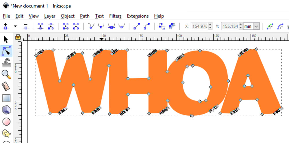
Now, select all of your letters and go to Path > Union. This will recombine the individual letters into one object. We’re going to be taxing Inkscape a little bit, so we want to do that with as few objects as possible.
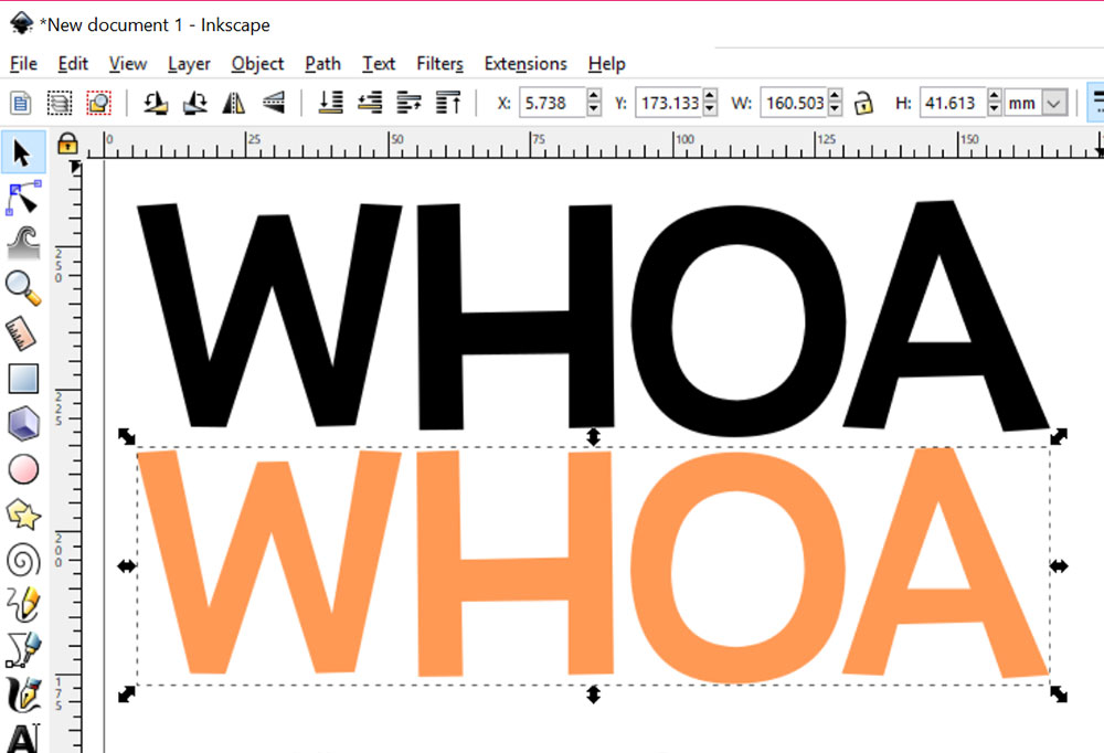
Make a copy of your text object. Now you’ll have two copies of the exact same thing, one stacked on top of the other. Move the one on the top, and recolor the one on the bottom any color you like. (You just need it to be something distinctly different enough from the top color so you can see what you’re doing in the next step.
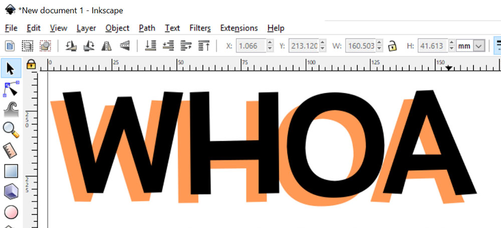
Now, move the bottom layer around under the top layer until it sits where you want it. You may want it closer in to the top layer than I have it; you may want it farther away. Whatever rocks your socks here!
After you have them where you want them, this is a perfect spot to make a backup copy of these layers and tuck them away at the bottom of your artboard, or on another layer. Just in case you decide later that you want your 3-D effect to be a little heavier or lighter, having this copy means you can skip all of the previous steps and start from here.
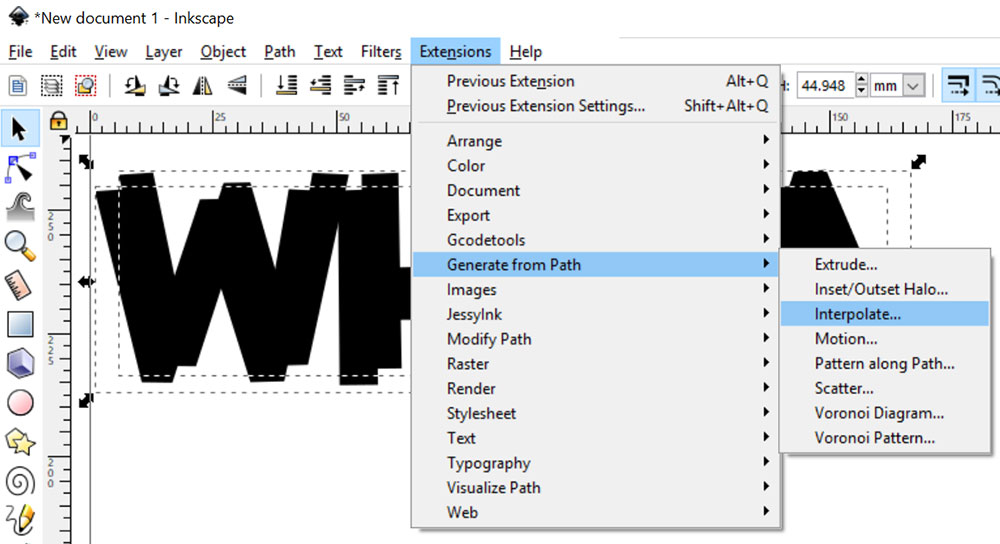
Made your backup copy? Good. Now make that lower layer black again (or whatever color the front layer is; we just want them to both be the same color). Select both text objects and go to Extensions > Generate from Path > Interpolate.
That will bring up the Interpolate menu. There’s a lot of weird-looking stuff in here, but there are really only two fields we need to worry about: Interpolation Steps and Interpolation Method. You’ll want the Method to be set to 1 (sometimes it starts you with 2 as a default).
As for the steps: I’m going to discuss in a minute what that number means. For now, just know that the higher the number, the more work your computer and Inkscape will need to do. So keep it lower if you can; under 100 should usually work for everything. I’m going to try out 50 here.
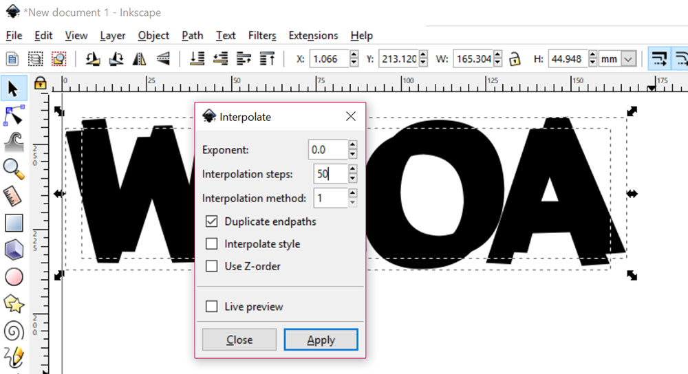
Click the Apply button, and this will happen. The Interpolate menu likes to stay open, so once you get this result, you can click the Close button.
Cool, right? And even cooler: the original two text objects are still there. You just can’t see them because they’re behind this 3-D object.
“So,” you’re asking, “what is it that Interpolate actually does?” Well, my friend, I’m glad you asked.
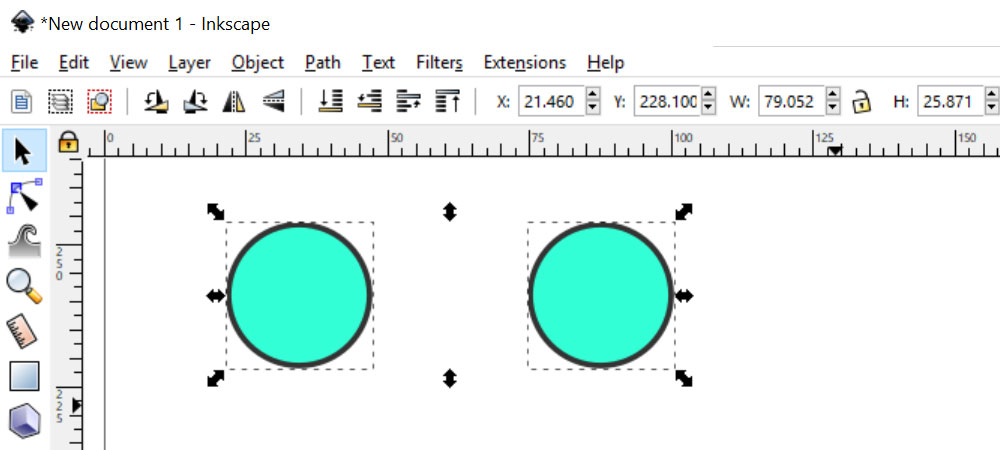
To illustrate, here are two identical circles. I’m going to apply Interpolate to them, but with Interpolation Steps set to just 8.
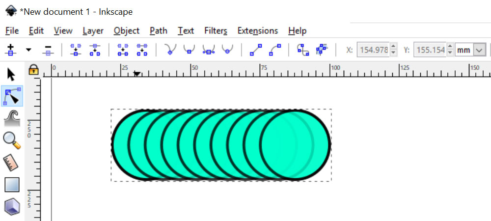
And here’s the result. Inkscape has created 8 “steps” between the original two. That is, it’s created 8 identical versions, evenly spaced between the original two.
Yes, you can Interpolate with different shapes. The steps between then morph from the one shape to the other. It’s weird and fun, you should try it. But this tutorial is dealing with identical shapes, so let’s get back to that.
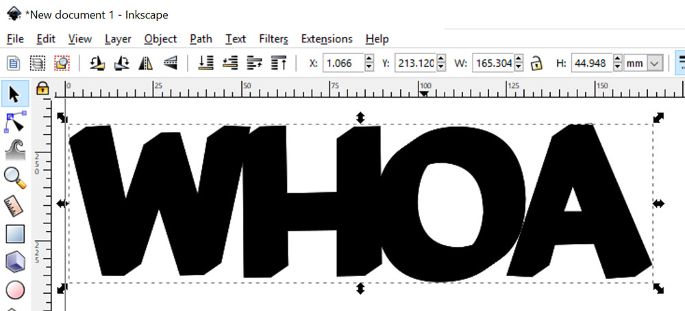
With that knowledge in mind, let’s take another look at the 3-D object we just created. Because I used 50 steps, what this object really is made of is 50 copies of our text object, each one set a little bit diagonal from the next.
Which is why the higher number of steps takes longer for Inkscape to process – it’s creating this giant stack of text objects and aligning them just so.
I’d like to combine those 50 text objects into just one, to make things easier for myself. Interpolate automatically grouped them together, so the first step is to ungroup them with Object > Ungroup.
It’s going to show you your object surrounded by this big ol’ zebra-stripe border. Normally when an object is selected, it’ll show a one-pixel-wide dashed line. This is exactly that! Because there are 50 copies stacked on top of each other, with each one maybe a pixel higher and a pixel farther to the right than the one before, you get to see all 50 sets of dotted lines too.
In order to merge all 50 objects into one, I’m going to use Path > Union.
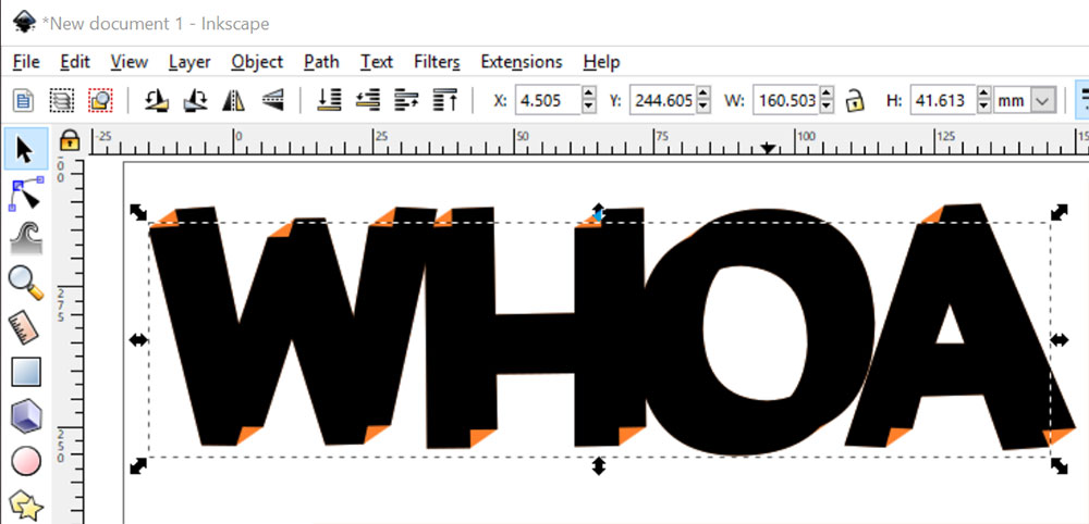
There we have it – this is now one solid object. But hold up – what’s with all of these points along some of the diagonal lines?
Well, remember, this is 50 copies all merged into one. So let’s take a close-up look at one of those diagonal lines:
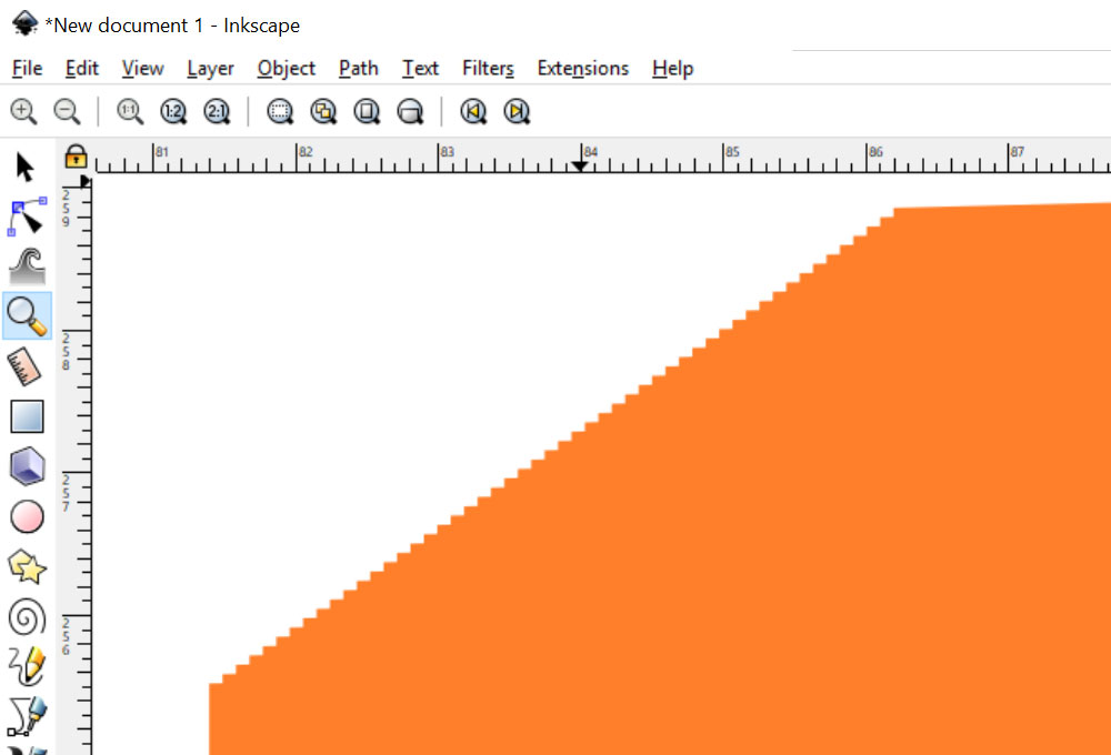
This is the top left of the W. And there are the upper-left corners of all 50 copies of that W. It’s all been merged into one object, but it’s an object with a serrated edge. Like a Ginsu knife. (Do young people today still know what Ginsu knives are?)
If you’re going to print this on paper, it’s probably fine as it is. The zig-zags along these edges are so tiny, it wouldn’t make a difference to most home printers.
If you’re planning on cutting this shape out of paper or vinyl, however, this would be a nightmare to cut. So you’ll need to do a couple of extra steps.
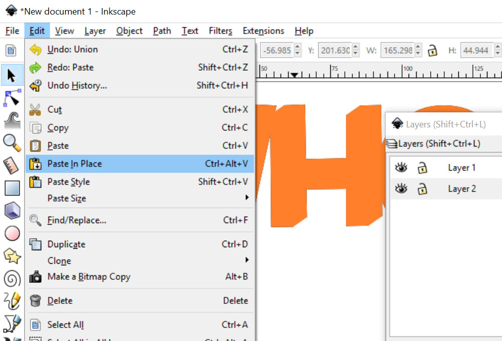
First, I’m going to makea copy of this new 3-D object and put it on a new layer, below the original layer. I copied it, then instead of just hitting Ctrl-V to paste (which often pastes your object in a weird spot on the artboard).
I’ve used Edit > Paste in Place so that it pastes in the same exact spot as the upper layer.
I’m making this copy on a separate layer because remember, the original two pieces of black text are still there. And I’m going to want to use one of them later.
But I’m going to be digging in close and doing some editing on this vector shape, and I don’t want that original text getting touched in any way.
You could actually perform this new-layer step earlier – before we used Ungroup and then Union to turn these 50 objects into one. Up to you.
Turn off the visibility on the top layer (click on the eyeball in your Layers panel) so all we see is the merged 3-D shape.
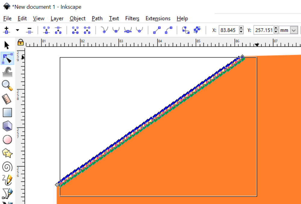
All right, let’s dig in. Using the Edit Path by Nodes tool (just below the black arrow), you can click on your object to show all of its points. Then, you can click and drag to create a rectangle, to select just specific points. Be sure to not select the points at the very ends (as you can see, I’ve left those unselected/gray).
Once you have the rest of the points selected, just hit your Delete key. If you missed a couple with your rectangle, just click on them individually and Delete.
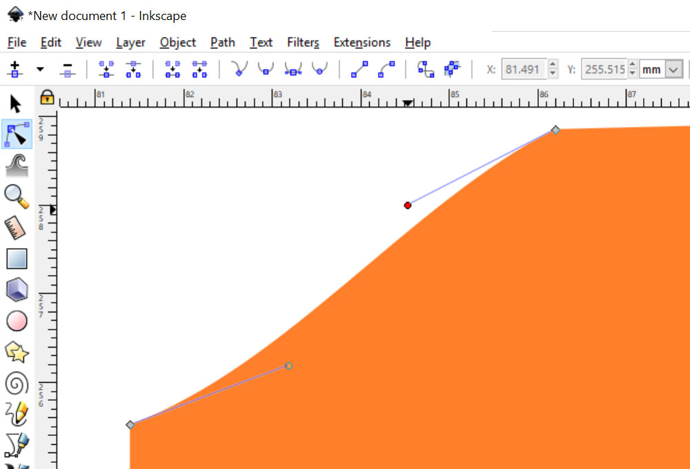
You’ll be left with two points, but the line between may be wobbly or wavy. Just click on each of the little circles at the ends of the stalks (these circles are called handles) and drag them over on top of their gray diamonds.
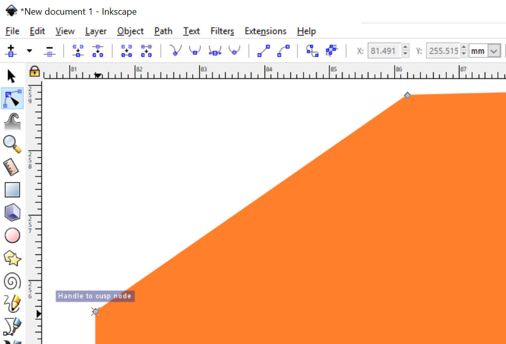
When you have the circle directly over the diamond, you’ll see this “Handle to cusp node” box. Release the point, and your line will be straight instead of curved.
In case you want more nitty-gritty on what we’re doing here: pulling the handles around is a way to adjust curves, along a curved path.
By dragging that handle and attaching it to the cusp node, you’re essentially saying, “I don’t want a curve here. Just shoot that path straight out from this point to the next.”
Yes, it’s a pain to go through this process. But if you zoom in enough so that these zig-zag areas fill almost the entire work area, you can make fairly quick work of it. This word had 14 areas with zig-zagging diagonal areas, and it was less than 5 minutes to get them all smooth.
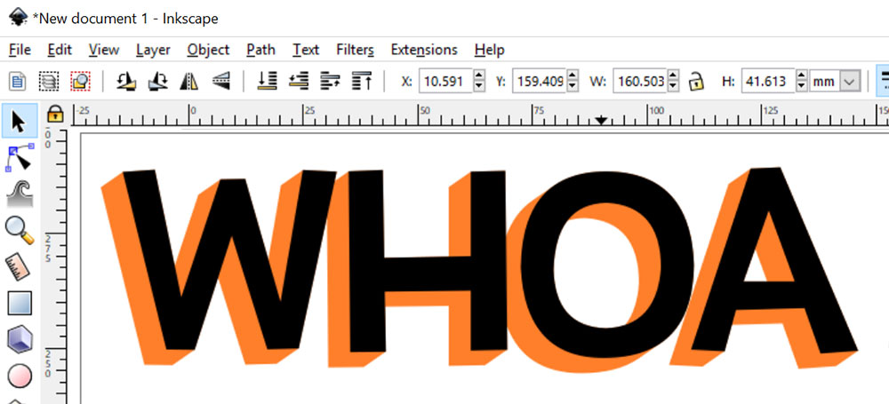
I’ve made my top layer visible again, and I’ve deleted the 3-D shape from that layer. So now all that’s left is the original two text objects on the top layer, and the 3-D object on the bottom layer.
From this point, you can delete either one of the text objects. I have the option here – do I want the 3-D effect to be coming down out of the bottom left? Or shooting up from the upper right?
I’ve decided to delete the lower piece of text, so the effect comes out of the lower left:
And there we have it! Since this is two separate objects on two separate layers, you can change colors of each one separately to whatever you like. And if you’re cutting these shapes out of paper or vinyl, you can save an SVG or PNG out of Inkscape with the two layers separated, so you can cut them out of different colors.
There are tons of other ways you can use this effect. Here are a couple of examples:

In the top one, I made a couple of copies of the word, and did a dynamic offset on each one – a little larger in white, and a little larger than that in purple. Then I did the Interpolate effect on the purple offset. You could even chop the white shape out of the purple shape, if you want your background color to show through.
In the bottom one, I made a smaller copy of the text, centered below the first one. Aside from size and placement, every other step was the same!
I hope you all have fun with this one – I certainly did! I even re-did my signature. Since it’s for a web image, I skipped the refinement of the zig-zags, so it took maybe 2 minutes, tops!

DTF Troubleshooting Guide: How to Fix Common Problems & Get Perfect Results Every Time

Ask a Font Creator: Stitch Text Effect in Inkscape and Illustrator

Let's Judge Books by Their Covers!