Introducing Design School – our jam packed platform with its own mini search engine! Design School was made to help you learn all there is to know about fonts, graphics, templates, designs, file types, different software programs, Frequently Asked Questions and much much more.
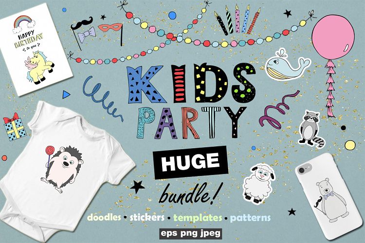
Viewing Product
By VPcreativeshop