I’ve seen a lot of cool text layouts lately, and while some of them have really awesome color schemes, others … aren’t the best. So I figured I’d dip into graphic designer mode and talk a little bit about color theory. And forgive me, readers from the UK, Canada, and other wonderful places – I’m using the American spelling of “color” throughout.

Generally, I feel the same way about pairing colors as I do about pairing fonts. You can’t pair any old two, and it’s best to keep it to two different options in one design, maaaaaaaaybe up to three. I’d only use fourif you’re well versed in color theory.
And don’t forget, unless you’re putting your fonts on something black or white, the color of the thing you’re putting the letters on counts as one of the colors in your scheme.
Let’s start out with every designer’s best friend: the color wheel!

There are a bunch of different color wheels out there; some are based on RGB color (the color scheme used for computer monitors), some on CMYK (the colors used for production printing), some on other color schemes. But I’m going to stick with the simple, basic wheel I grew up with. This wheel has 12 main positions, so I’ve numbered them like a clock.

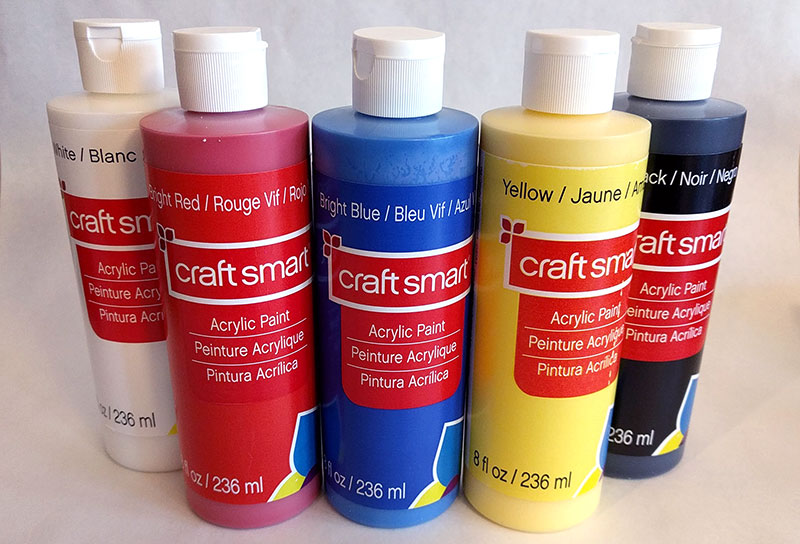
This is the color wheel I use when painting with acrylics, because if you start out with three colors (blue, red, and yellow) plus black and white, you can make any other color.
 Primary Colors
So let’s start by talking about those three colors: blue, red, and yellow. They’re evenly spaced around the clock at the 12, 4, and 8 o’clock positions. These three are known as primary colors, because they’re the main colors that all other colors can be made from.
The three primary colors are fully saturated (not mixed with anything else), so they appear super bright and vibrant. (We’re going to get into saturation a little later in the post.) They’re also very often the colors associated with children’s things – building blocks, LEGO, lots of toys.
Next up is what happens when primary colors meet, fall in love, and have babies:
 Secondary Colors
This trio isthe secondary colors. Each one is made up of equal parts of two of the primary colors. So red and yellow make orange (2 o’clock), red and blue make purple (6 o’clock), and yellow and blue make green (10 o’clock). Just like the primaries, the secondary colors are evenly spaced in a triangle around the wheel.
Looking at the three secondary colors above, it’s interesting to note that even though they’re made up of those vibrant, fully-saturated primary colors, the secondaries aren’t quite as bright themselves. They’re a little more toned-down. Every time you mix colors, they get a little bit more muted.
This next part is where my “colors meet, fall in love, and have babies” concept takes an unpleasant turn. Because the other 6 spots on the color wheel are…
 Tertiary Colors
…each created by combining a primary color with a secondary color. These 6 shades are tertiary colors, and when you refer to them, you combine the color names by putting the primary name first, then the secondary name. So red mixed with orange becomes red-orange, blue mixed with green is always blue-green, and so forth. It always makes me think of weddings: I used to book DJs for weddings, and we always, 100% of the time, listed the bride’s last name first. I guess it’s just how it’s done.
So there we have the basic 12 colors around the color wheel, made up of 3 primary colors, 3 secondary colors, and 6 tertiary colors. Now that we’re done with that, we can start talking about how to combine these different colors into a color scheme!
Let’s start with the most basic (because it’s only two colors), and sometimes the most misunderstood combination:
 Complementary Colors
Any two colors that are directly opposite each other on the color wheel are called complementary colors. It can be a confusing term, because often, complementary colors really don’t go well together.
They can totally clash! But I hear the word “complementary” and I expect them to work as a pair. However, in color theory, complementary means that–in the right proportions–the colors can be combined to create a neutral color. Usually brown, sometimes gray.
Because the colors are exactly opposite on the color wheel, they don’t containeven a little bit of the opposite color. In the example above, I’ve chosen yellow and purple. Purple is made up from red and blue, so there isn’t any yellow in there to help it get along with straight-up yellow.
When you look at complementary colors next to each other, it can create ocular tension, another term for making your eyes hurt and go all wibbly. Which might be what you’re going for in your color scheme, but generally, use complementary colors together with extreme caution, and only for specific purposes.
 Analogous Colors
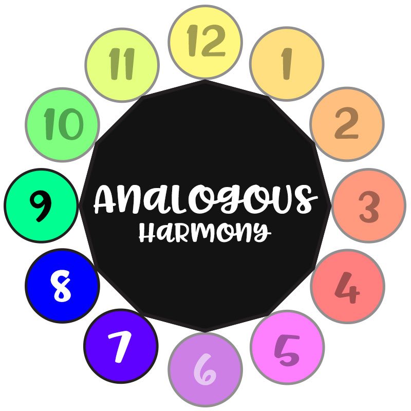
Next up is a scheme made up of analogous colors. This means the colors are adjacent to each other on the color wheel. Because colors next to each other share some of the same color roots, they get along quite well in almost all situations.
When in doubt, an analogous color scheme is one of your safest bets for any project. (I mean, look at my header! It has orange, red-orange, and magenta, which is pretty much red-purple. I’ve just skipped over full red, but otherwise, the colors are all on the same side of the color wheel.)
Now we’re going to get into some exciting color scheme options.
 Split Complementary Colors
With a split complementary color scheme, you take your complementary colors, then instead of using one of those two colors, you use the two colors on either side. In this example, instead of a complementary pair of red and green, I’ve kept the red, and split the green out into blue-green and yellow-green.
Just that little shift on each side makes the scheme not as harsh as a complementary pair! You can put these colors near each other without your eyeballs freaking out as much.
 Triadic Colors
Another 3-color scheme is the triadic set. It’s any three evenly-spaced colors around the wheel. So the three primary colors are a triadic color scheme, as are the three secondary colors. But I think the real fun comes when you grab three tertiary colors.
Here’s a scheme made up of yellow-green, red-orange, and blue-purple. They’re bright, but not in a child-like way. They’re kind of retro. I dig it, daddy-o!
The last color scheme option from the color wheel is a biggie:
 Tetradic Colors
The only 4-color group I’m going to talk about today is the tetradic color scheme. It’s made up of any two complementary pairs, so it’ll form a rectangle or square around your color wheel. It can help ease the tension between the complementary colors, because each one has a couple of softer, gentler options that it can sit alongside.
Now, we’re going to step away from the color wheel for a moment and talk about saturation.
 Monochrome Colors
A color at its fullest and brightest is considered to be saturated. You make it less intense by desaturating it, either by adding white to make it lighter, or adding black to make it darker. Whether you’re going light or dark, it’s still desaturating either way.
You can make a great and simple monochrome color scheme by starting with just one color from your wheel (hence the “mono”), then adding a little or a lot of black or white to get darker or lighter shades of that same color. Here’s where it gets safer to use more than two or three colors; because all of these five example shades are based on red, they’re all going to go together well.
You can also apply desaturation techniques to a color scheme from the wheel:
 Low Key and High Key Colors
Here we’re starting at the top with an analogous color scheme: red, red-orange, orange, and yellow-orange. On that top line, they’re as bright and vibrant as those colors are going to get. It’s like a color scheme for a hot summer’s day.
In the middle line, all four colors have been mixed with the same amount of white. This desaturates all of the colors.
Since it’s a color scheme that worked initially, it still works when the colors are washed out; they’ve just become more pastel and candy-like, and it turns the colors from summer into spring.Desaturating a color scheme with white makes it a high key scheme.
The bottom line is the opposite, a low key scheme: where we take the saturated color scheme and desaturate them with black. Once again, the colors all still go together, but it’s a very different mood than the high key set. Instead of summer or spring, now we get autumn leaves.
At the beginning of this post, I noted that combining colors is very similar to combining fonts. Here’s another aspect where they’re similar: just like with multiple fonts, you want one of your colors to be the hero, and the other(s) should have sidekick status.
Let’s take a look at this color scheme as an example:

Here I’ve taken a split complementary scheme (blue-purple, blue-green, and orange) and added in grey as a neutral fourth color. On the top line here, all four colors are treated as equals. It isn’t terrible, but it isn’t very exciting either.
In each of the next three sets, the colors are balanced differently. One color takes over as the main hero of the piece, and takes up over half of the bar. A second color still has about a quarter of the bar’s real estate. The third color only gets about an eighth of the bar, and the last color gets even less – just a sliver.
But each of these three combinations are much more exciting and interesting than the top one! One color gets to be the hero, and the others can all be supporting players, adding little pops of excitement. And as you can see, when you have a good base color scheme, it doesn’t really matter which player is the star; they can all fulfill the role!
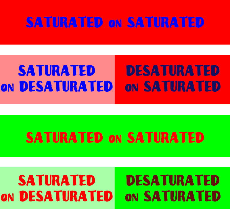
Everything I’ve talked about so far has addressed colors next to each other. But you need to keep an extra-close eye out if you’re stacking colors on top of each other. Some combinations, especially if they’re fully saturated, can be painful:
 Font used in image: Kanover
Nobody likes to look at blue on top of red, or red on top of blue. It hurts your eyes, because they’re both really richly saturated, so they’re competing against each other in a fierce battle to the death. Once either one of those colors becomes desaturated, it’s easier on the eyes.
The same thing happens down below: the complementary pair of red and green are very hard to look at on top of each other, but once one of the pair becomes desaturated, it’s much easier.
I’m not saying that I recommend either of these color schemes, by the way – they’re both very hard to get right so that they work in harmony together. I’ve made things easier to read here, but they're still hard to look at, and none of the combinations are necessarily attractive.
So now, with all of that under our belts, let’s look at a few examples before we part ways!
First off, this is based on an image I saw in one of the Facebook groups where people try to identify fonts:
 Fonts used in image: Beloved Sans, Chamelia
I have a couple of issues with this design. (I’ve recreated it with my own fonts instead of posting the original, but this is pretty darned close.) First off, it’s combining low-key dark red with higher-key silver, so the dark red jumps forward as the main part of the shirt. However, going by the font choices, I think the designer wanted “sugar” to stand out as the hero word. It’s a tough mismatch of the hero color on the sidekick font, and vice versa.
Another issue with this shirt is the use of silver sparkle text on a gray shirt. Any shirt that isn’t black or white needs to be treated like an additional color in your color scheme, so this gives us dark red, medium gray, and slightly lighter medium gray. The two gray shades are way too close to each other, which makes “sugar” even harder to see.
How could this be fixed? I think the sports team in question’s colors were dark red and silver, so the lettering needs to stay the same. But if this had been put on a black shirt instead of a gray shirt, the dark red would have moved to being the background color (due to the red being low-key, desaturated with black) and the lighter silver would have jumped out as the hero.
 Font used in image: Pinsetter
Here’s a phrase I’m seeing a lot, as it’s Mardi Gras time when I’m writing this. I’m using a split complementary color scheme here: yellow, red-purple, and green. The fonts are all relatively well-saturated, so they all stand out well against the black. They’re balanced unevenly, with the green getting much less real estate on the shirt, which lends a little more visual interest than if “les bon temps” had been the same height as the other words. Generally, it works, but I wouldn’t add in any more colors. This design likely couldn’t handle more.
 Fonts used in image: Shartica Script, Boucherie Sans
Here’s one that I totally made up, just to show the power of primary colors. It doesn’t matter that it’s for a Fancy Bistro Restaurant – the use of red, blue, and yellow make this look like something for kids.
Not only would I change the color scheme to something less childlike, but I’d also shave it down to two colors: one for the script, and one for the sans-serif. Using different colors for every word may sound like fun, but as you can see here, it just makes things more busy and jumbled.
 Font used in image: Rainday
Here’s an example of a monochrome color scheme. If you include the gray of the t-shirt, there are five colors total in this design, but they all work together because theytext colors are all based in that magenta (red-purple) of “Auntie.”
Each line you go upward, a little more white is mixed in. Because these are on a lighter background, it makes those top lines fade back, so that the big “Auntie” at the bottom stands out as the most important part of the design.
If this were on a black t-shirt, I’d desaturate each line with black instead of white, so that the bottom line is still the brightest and most vivid thing on the shirt.
This is also a fun way to make a design exciting without using more than one font – it’s all done with font size and tracking [the uniform spacing between letters] to put emphasis on the two A-words.
So there you have it – some color basics to help put together dynamic and vibrant designs with fonts! There are tons of tools out there to help you maneuver your way around the color wheel – one my favorites is this color wheel calculator, where you pick one color to start, then tell it what kind of color scheme you want to build.
You can also browse through user-created color palettes at ColourLovers. So get out there, and get vibrant!


DTF Troubleshooting Guide: How to Fix Common Problems & Get Perfect Results Every Time

Ask a Font Creator: Stitch Text Effect in Inkscape and Illustrator

Let's Judge Books by Their Covers!
By using our website you consent to all cookies in accordance with our cookie policy.
