Posted 28th October 2016 •
By Design Bundles

This question comes in a couple of forms: either straight up “how do I pair fonts,” or a more specific “I have (FONT X) I want to use, what would go with it?” So today we’re going to talk about some key points to keep in mind when putting together a project with multiple fonts.
I think the most important thing I can say, right off the bat, is:
don’t use too many fonts. How many are too many? Usually, more than three. And even three can get muddy if you aren’t careful—it’s definitely an intermediate step. So to begin with, in this post, we’re going to stick with
two fonts. After all, it’s called “font pairing” for a reason.
We’re also going to hit the concepts of
contrast and
conflict. When pairing fonts, we want things to contrast (that is, differ greatly; be opposites, while still complementing each other) but not be in conflict (battling with each other because they’re either
too different, or they’re too similar).
 Fonts used in image: Bodoni, Alfa Slab One, Branding, Aaron Script, PlainBlack, Courier New, Humus, Sweety Donut
Let’s recap some of the styles of fonts, as discussed in Vocabulary #1. I’ve added in a “Misc.” style here, which can cover anything that doesn’t fall clearly under one of the other styles.
The two most important styles in this list are
serif and
sans-serif, because for the most part, to put it in fashion terms, a simple version of either of those styles can be treated like a neutral. If you have a fabulous, colorful striped shirt (like a showy script font), you’ll want to pair it with a pair of black trousers (a clean, simple sans-serif) so that the two aren’t clashing.
 Fonts used in image: Alfa Slab One, Branding, Mischief Swashes, Italo, Fruitella, Chaparral Pro
Now that we’re fresh on our styles, I want to also discuss the idea that your paired fonts normally can’t be equals. One needs to stand out and be the hero, while the other is a sidekick. Think of a magazine: one font is the headline of a story, while the other contrasting font is used for the body text. The hero is often (though not always) larger and bolder. If you’re going a step farther and using three fonts, then (since heroes usually only have one sidekick) you could think of it as a villain and his two loyal henchmen.
As you can see in these examples, the fonts used are in different styles. Though as we progress through this post, you’ll see that they may have more things in common than things that differ: look at the two henchmen and consider the fact that they have roughly similar heights, widths, and line weights. Even though one henchman is a script and the other is a slab serif, they have enough things in common that their differences keep them in
contrast instead of
conflict.
 Font used in image: Myriad Pro
All right, let’s get into some elements of contrast. If you read the caption under this image, you may have wondered, why didn’t I list all of the fonts? Thing is, I did. Every single font in this image is a variant on Myriad Pro! So the first big lesson is: you can pair different weights, sizes, and formats of the same font, and it’ll almost always work well. This is probably the easiest way to make a great pair.
Heavy vs. Light: A great way to make a hero is to put the text in bold, with a light/thin variation as the sidekick.
Caps vs. Lowercase: The all-caps shouts louder, and can easily take the hero position. But what if you made your top word in large, bold lowercase, with a thin, small, all-caps font underneath? Then the roles can easily change.
Roman vs. Italic: Remember, “Roman” is just another word for “regular.” Pairing it with the italic version of the same font is
almost the same look as pairing a Roman font with a script font, but you know since they’re part of the same font, they’re going to go together well.
Wide vs. Condensed: Not all fonts have wider versions or condensed versions, but if they do, you can use those for contrast as well. (I don’t recommend, however, stretching or squishing fonts to make them wider or thinner—that will almost always make the letters look weird, and it’ll make the font designer cry.)
 Fonts used in image: Century Schoolbook + Century Gothic; ChunkFive Roman + Branding; Aaron Script + Bodoni; Roasline + Gill Sans
These are the classic pairing matchups, using the big four styles: serif, slab serif, sans-serif, and script. You can rarely go wrong if you stick with one of these pairs!
Serif & Sans-Serif: This is the classic of the classics—you’re basically taking two neutrals and pairing them together. Picture a navy blue shirt with black trousers. Granted, this sometimes isn’t the most
exciting pairing, but it’s a great standby to have in your back pocket. And if you can find a font family that includes both (these examples above are both Century) it’s an even easier bet that they’ll go well together.
Slab Serif & Sans-Serif: This pairing takes the first one and gives it a little kick in the rear. Generally, slab serif fonts are a little more fun than their regular serif cousins, and sans-serif is also a little less formal than serif. So this pairing, while still basically being two neutrals, has a little more flair. Let’s say it’s a brown leather jacket paired with those black trousers.
Script & Serif: Take a look at the script font I’ve chosen here, compared to the one in the next example. I’ve gone with a bit more elegant script, because a serif font is generally a bit more elegant itself. For this pairing, the script will usually be the hero, because of its natural flamboyance compared to the serif.
Script & Sans-Serif: In this one, I’ve chosen a more fun, hand-lettered style script, because the sans-serif is less formal than a serif font would have been. The script would still usually be the hero in this case.
 Fonts used in this image: Kontakt, Be Grateful, Beloved, Arial, Blackfat, Roomfer Sans, Astell Longhand, Lightening Sans
Now let’s look at some other ways to create contrast between two styles of text. These pairings above aren’t necessarily ones I’d go with—I chose these fonts mostly to demonstrate extremes. (And remember, you don’t want to throw all of these in at the same time! Keep it to one or two big differences between fonts, so things don’t get muddy.)
Hard & Soft: One font could have sharp edges, or really crisp lines, while the other is rounded and gentle.
Fancy & Plain: This speaks back to using a serif or sans-serif as a neutral to support a script font. If you’re going to use a font with tons of details, swashes, flourishes and the like, it’s smart to pair it with something simple.
Thick & Thin: Remember back to using two weights of the same font: one bold, one light. In this particular matchup, thick is usually going to be the hero.
Tall & Short: You can make some really cool looking projects by nestling shorter sidekick words in among taller hero words, like little woodland creatures in a forest. (Okay, that’s a weird image.)
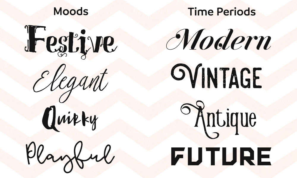 Fonts used in image: (moods) Shakila, Stefhanie, Adilla and Rita, AirWooster, (time periods) Jitzu Swash, Steelworks, Victorian Parlor, Kontakt
A couple of places where conflict frequently occurs: mood and time period. If your hero font is something fun and goofy and dorky, you’re never going to find a somber font that pairs well with it. Likewise, your super-futuristic font will almost never work with a vintage font. Try to keep your paired fonts in the same mood, and in the same time period.

Before we get into pairing up some examples, let’s touch on pre-paired fonts, which are fabulous! (I don’t feel the need to type out the names of these, because they’re already up there. Note: I double-checked, and all of these pre-paired fonts are available for sale here on FontBundles!)
Often, a designer will create two styles at the same time, and bundle them together, so you can be pretty darned sure they’ll work well with each other. The most frequent pairing you’ll see is a script with a sans-serif, though as you can see from these examples, there are a variety of other options as well. Designer-paired fonts will often have many features in common (line weight, font height, x-height) so they have a great common base, which lets the contrasting differences really shine clearly.
Pairing Samples
All right, let’s get into some sample pairings! I’m going to point out what these fonts have in contrast, as well as what they have in common, so you can get a feel for what makes a good pair. A ton of articles out there, as well as interactive pairing helpers like
TypeGenius and
Font Flame, concentrate on pairs for use on websites, so it’s mostly serif, sans-serif, and slab serif options. As such, all of my examples here are going to include at least one script or display font.
Remember, we want a lot of elements to be the same between the fonts we use, so that the
one or two elements that are in contrast can really stand out. (And usually, one of those elements is type style.) Compare this to blending just blue and red to make a lovely purple, or throwing blue, red, yellow, green, purple, and orange in a bucket together—you’d just get a muddy brown. Like with so many things in design, making fewer and simpler choices often results in a better product.
 Fonts used in image: Beloved Sans, AirWooster
First off, we’re using a script font with a sans-serif font, one of the classic pairs. We’re using all-caps and a larger size for “TURKEY” to make it the hero, while the smaller size and lowercase letters make “sandwich” the sidekick.
These fonts work together because they actually have a lot in common. They’re monoweight fonts, meaning the strokes of the letters are one thickness throughout. There’s a height similarity: if you hold a ruler up to the screen, the tallest letters in “sandwich” are almost the exact same height as the uppercase letters in “turkey.” For another height comparison, look at the height of the lowercase W and C in “sandwich,” and compare to the distance from the bottom to the crossbar of the uppercase E. Pretty similar! The mood is light and fun in both, especially because this sans-serif font has a few extra curves where you don’t expect them—it adds a softness to the sans-serif which goes well with the softness of the script.
 Fonts used in image: Beloved Sans, AirWooster
And this is just a reversal of the hero/sidekick roles with the exact same fonts. I’ve thickened the line weight of “turkey” just a tiny bit to make the stroke width closer to the width of “sandwich,” and I've added one of the included alternate characters to the end of the sandwich. A lot of the same reasons apply for why the work well together: monoweight strokes, fun mood, softer angles and lines. We also still have some size unity, since the all-caps “turkey” letters are roughly the same height as the shorter lowercase letters.
 Fonts used in image: Luxurious Line, Salamanca
Here’s another classic pairing, a script with a serif font. We can go a bit more playful with the script here, because the serif itself is more playful. The lines in the serif font aren’t strict and straight; they have a lovely hand-made wobble to them that lets this serif font be less serious.
Similarities between these two include the line weights (both fonts have thick and thin strokes, which are roughly similar in width for both fonts), letter height (the uppercase “FRESH” letters are similar in height to the lowercase letters of “fabulously”), hardness (both have a semi-soft, hand-crafted feel), and mood. They’re getting their contrast from style (script vs. serif), caps vs. lowercase, and a little bit of letter width—the script is a narrower font, while the serif has a wider stance.
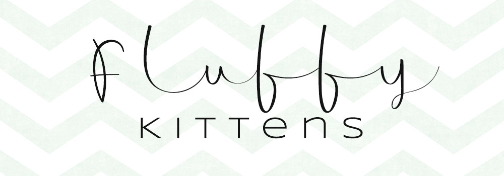 Fonts used in image: Archipelago, Syncopate
Pairing another script with a sans-serif here. Again, there are way more similarities than differences! The line weight in both is similarly light, the letters in “kittens” are roughly the same height as the lowercase letters in “fluffy,” and if you ignore the long tails connecting the script, both sets of letters are around the same width. I’ve added more space between the letters in “kittens” to help it work even better with “fluffy” because of those long distances between the letters. They have similar levels of softness, and both have lighter moods.
Even though I can say that they have some unity when it comes to letter height, I can also say that one of the points of contrast here is tall/short, since the tall letters in the script are
really tall.
(A brief vocabulary aside: while the spacing between two specific letters is
kerning, adjusting the spacing uniformly between all of the letters in a word is called
tracking.)
 Fonts used in image: Candy, Cherry Cordial
Here’s a sans-serif combined with a display script font. They’re balanced in height (the taller letters in the bottom half are roughly the same height as the letters in the top half) and in mood (both have a fun, hand-crafted feel). Neither is particularly more fancy or plain than the other, and both have some elements of softness to them, thanks to the quirky curved lines of the sans-serif. A point of contrast is in the weight of their strokes, but one could argue that they have some weight similarities as well—while the sans-serif is
very heavy, the script font is relatively heavy for its style.
 Fonts used in image: Adilla and Rita, The Anomali
With this pair, like with the “turkey sandwich” pair, either one of these fonts could be the hero or the sidekick; it’s just a matter of how they’re treated. I’ve made “cupcake” the hero word by making it larger in size and in all-caps; “chocolate” is the supporting player because of its smaller size, all-lowercase type, and off-center placement with parts of some letters snuggling in cupcake’s empty spaces.
Their similarities are many: they both have thick and thin stroke weights, and the thickest parts of “cupcake” aren’t too far off from the thickest parts of “chocolate.” Same with the thin line weights. If you ignore those beautiful rounded C shapes in “cupcake,” the rest of the font is relatively narrow, which matches well with the narrow script above. They have some unity in height—if you look at the lowercase O and A in “chocolate,” they’re pretty close to the same height as the bowl-and-counter in the P or the counter in the A of “cupcake.” They definitely both share a mood, and are very similar in softness.
(And can you tell from the food examples that it's almost dinnertime?)
 Fonts used in image: Awesawez, Italo
For a lot of these examples, I’ve kept the line weights similar. For this one, however, the top text has some much heavier strokes than the bottom—an element of contrast that helps the top line stand out as the hero. (However, look at the lightest strokes on that top line: pretty close to the stroke weight of the bottom letters!) There’s some unity in height: if you look at the lowercase I in the top word, from the top of its tittle to the bottom of its terminal curve (Hey,
vocab #2!) it’s about the same height as those uppercase letters on the bottom line.
I’ve also increased the tracking between the letters on that bottom line in order to make it fit better under the top line; more empty space down there also helps with the sidekick role. I also chose to use an italic version of Italo for that bottom line, so it more closely matched the angle of the letters in Awesawez.
That’s all for today, though we may revisit pairings again with some samples in the future. (And probably step it up to get into three-font combinations!) I hope these examples have helped with the selection process. Just remember: if you keep most elements similar, then your one or two contrasting elements will really stand out. And you can’t go wrong with a sturdy serif or sans-serif in your pair.
Also: I have a
fresh post over on the Fonts & Typography group on Facebook, looking for your suggestions for future blog posts! I’ll happily push aside anything in my to-do notebook if there are topics you really want to know about, or questions you’d like to ask. Head on over and let me know what you’d like to see here!


