Adding swashes and flourishes to the beginning and end of words can really up their level of fanciness! But not every font comes with swashes built in. Or if they do, they might not be exactly what you want. So today I’m going to show you how to use Inkscape to make and add decorative swashes to ANY font.
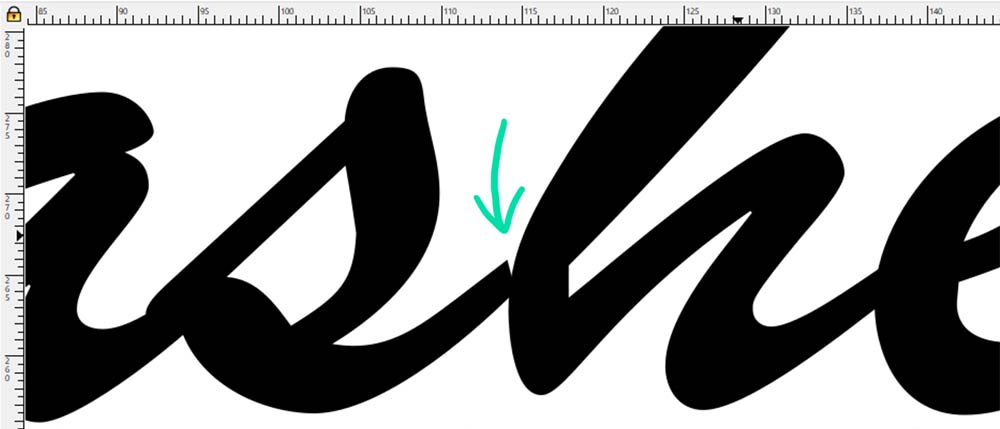
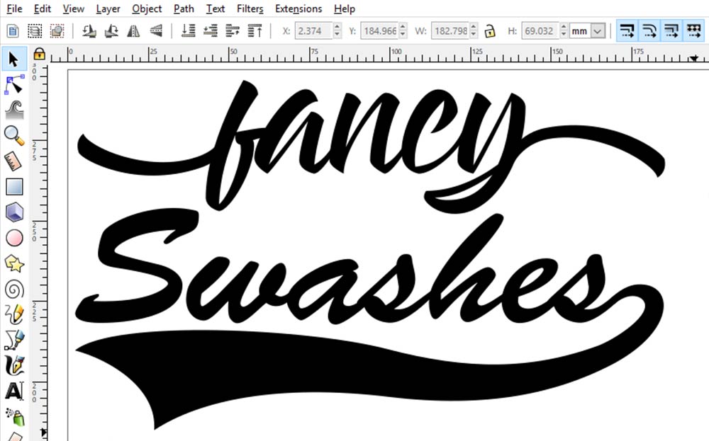
In this tutorial, we’ll be creating the exact “Swashes” design that you see up above. Some refer to this as a “baseball” swash, because it’s often used for baseball team logos. Others refer to it as a “pilsner” swash, because of their use in beer logos.
Either way, they’re totes cool-looking. And while yes, you can find fonts with sets of these kinds of swashes, most of those are only free for personal use. By building your own, they're yours to use for any purpose: personal, commercial, logos, you name it!
Bear in mind, this is edging into slightly more advanced Inkscape territory. If you’ve followed along with my previous Inkscape tutorials, I think you’re ready. But we’ll be getting into some more in-depth manipulation of points and curves.
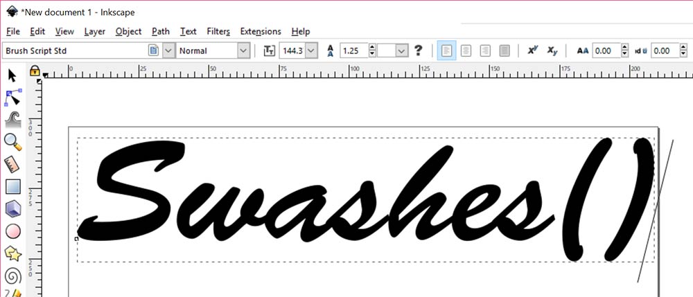
I’m going to use Brush Script MT as my font, because I see it used often in designs of this style. Lots of you probably already have this font installed – I think I’ve had a licensed copy bundled in with some software or other on every new computer I’ve purchased over the last 15+ years.
First off, I’ve typed out my word, and added in the two parentheses. I wasn’t sure at the time if I was going to need both of them or just one, so I grabbed them both. Those parentheses can serve as the building blocks for a thousand and one cool swashes.
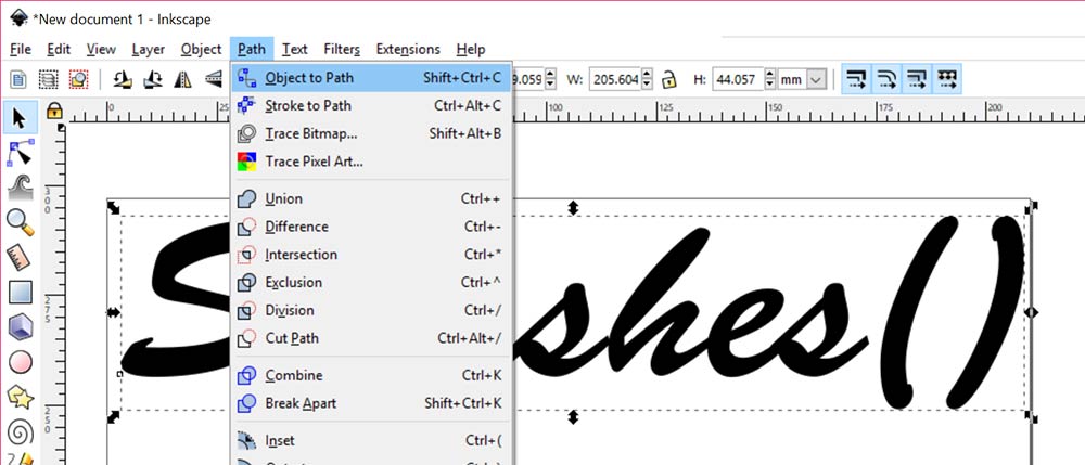
As we usually do when manipulating text, first I’m going to convert the typed-in letters to vector objects by selecting the text and going to Path > Object to Path…
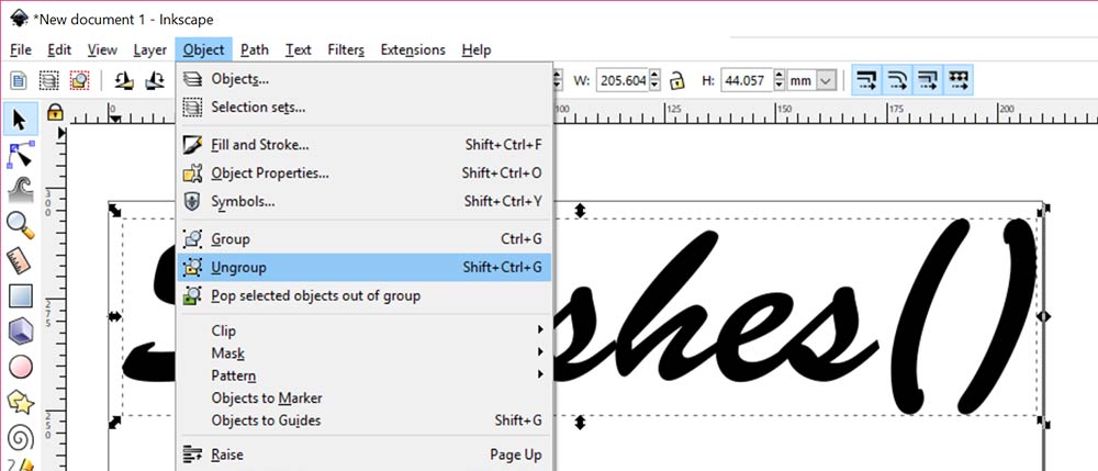
And then ungrouping everything by going to Object > Ungroup. This makes every letter (and each of the two parentheses) into separate vector objects.
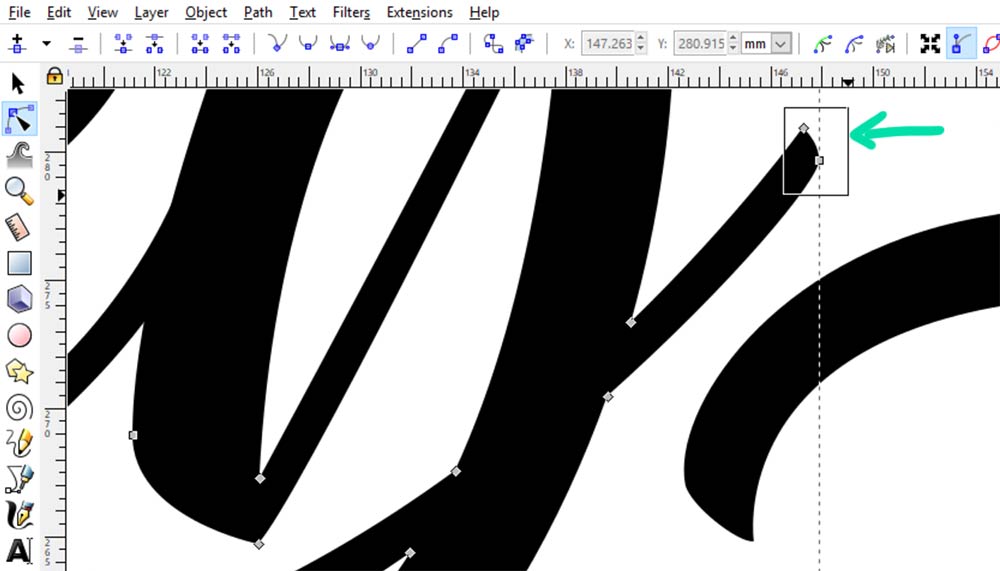
Now’s the time to fix any spacing issues, or any other problems you may see with your lettering. I don’t like the way the S and H meet – there’s a little triangular gap where the letters don’t quite meet up. This is an easy fix!
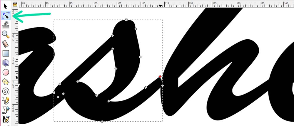
I’ve selected the Edit Path by Nodes tool (where my tealarrow is pointing), then selected the letter S. Now I can see all of the points along the shape of the letter. All I need to do is grab that one point (the diamond highlighted in red)…
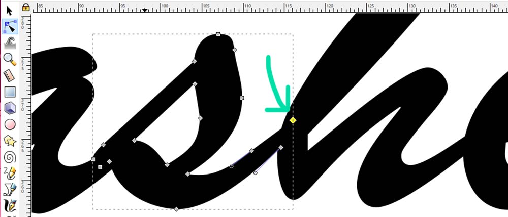
And click-drag it up into the H. The yellow diamond is that same point that was highlighted in red. The mysterious triangle is gone!
Next up, let’s turn one of these parentheses into a swash!
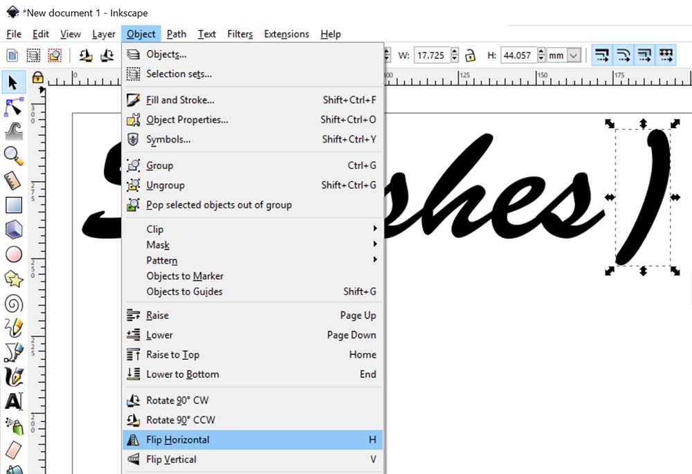
Since I want the swash to come out of that final S and curve downward to the right, I’m going to want my parenthesis starting out in that direction. It’s curving to the left at the moment, so I need to flip it by going to Object > Flip Horizontal.
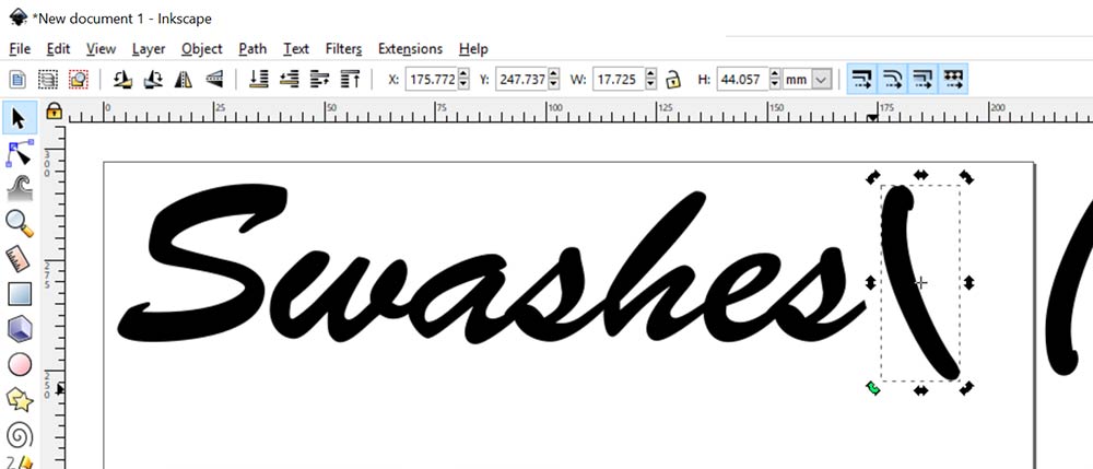
And then I’ll want to rotate it around to get its narrower end lined up with the exit stroke of the S. You can do that by just single-clicking on the letter you’ve selected.
The arrows around the outside of your selection box will change from the outward-pointing arrows (like in the previous image, which allow you to resize an object) to these curved arrows at the corners. This allows you to click one of the corner arrowsand drag it around, freely rotating the shape.
Rotate that little sucker around until it’s shooting off at roughly the same angle as the end of the S.
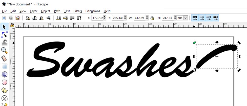
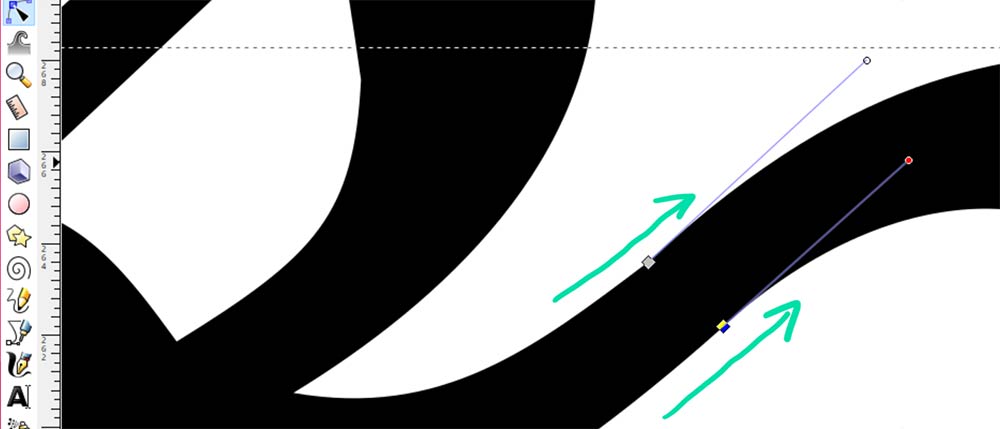
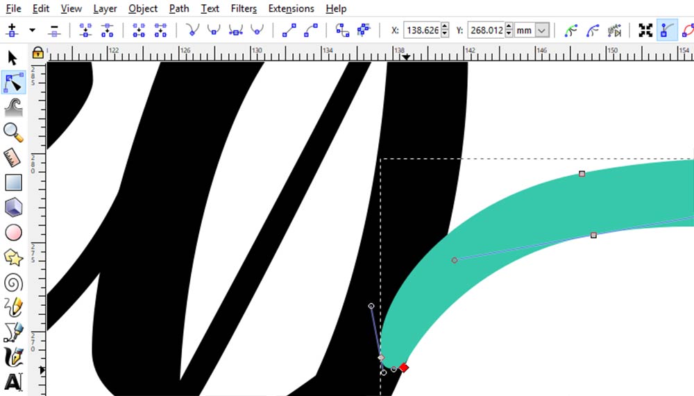
Now comes the fun part. We’re going to dig in and do some serious adjustment of the points and curves that make up that parenthesis.
First off, fire up the Edit Path by Nodes tool and click on the parenthesis. You’ll see all of its points show up. We’re going to take the two points closest to the S and move them down, so they overlap that exit stroke on the S.
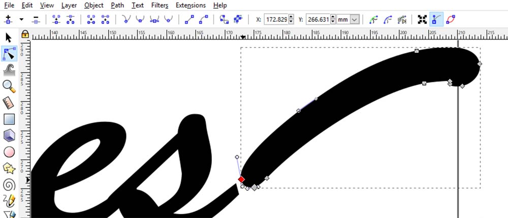
Each of those points can be moved, and then you can adjust the handles coming out of the points – those lines with circles at the end. Click on one and drag it around so you can get the feel for it!
The handles are how you adjust the curves that come away from the points: the handle position indicates the direction of the curve, and the handle length indicates how deep or shallowthe curve is.
For right now, we’re going to do general adjustments of these points and handles, just to get them in the approximate right places; then we’ll come back for a second sweep through to refine everything.
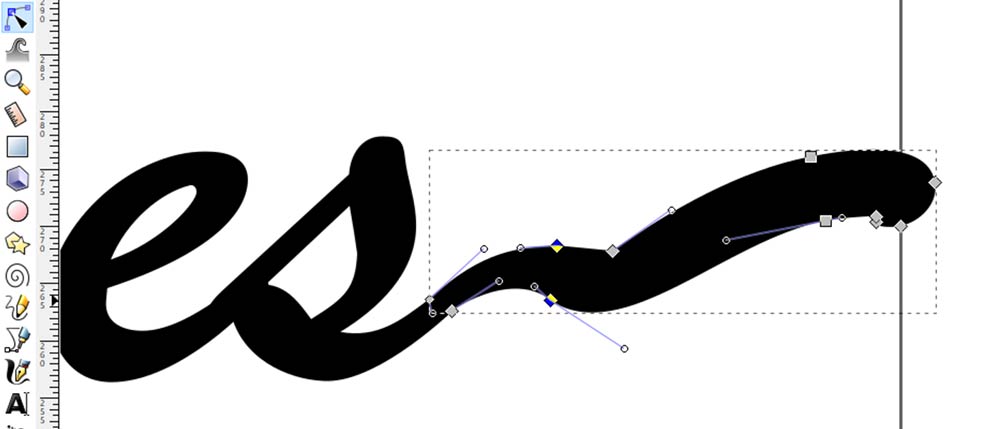
I advise working with your nodes in pairs. First the two that match up with the tail of the S, and now these next two. Work your way down the shape you want to build bit by bit.
Where, you may wonder, should you put the nodes? Generally, there should be one neareachplace where your line changes direction, or at the peak of a curve. They’ll take some more adjustment, but the two highlighted points above are going to be approximately at the rightmost spots along this curving shape.
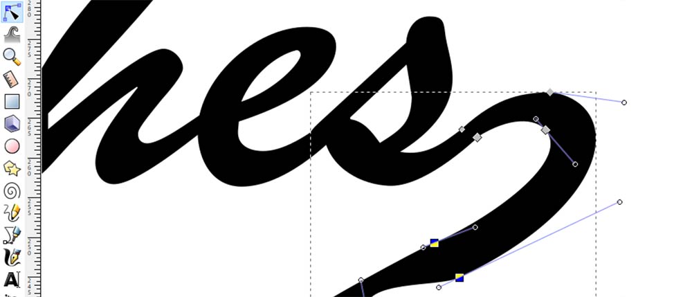
Here I selected all of the remaining points and moved them down underneath the word, making it easier to see what I was doing. Drag the next pointsfarther down and around…
And so on, until you get all of your points roughly where you want them, and you have your shape positioned where you want it, as large as you want it.
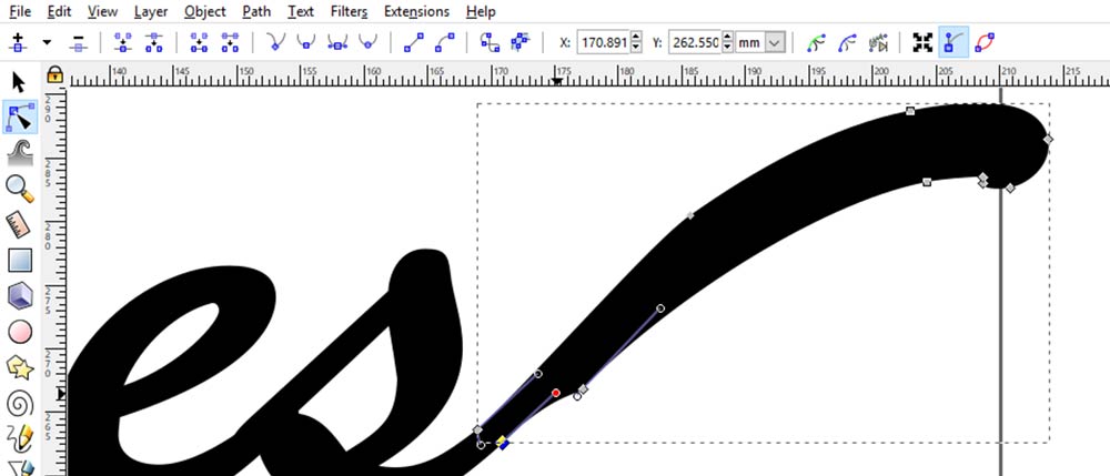
Next, we’ll go into all of these points and refine their placement.
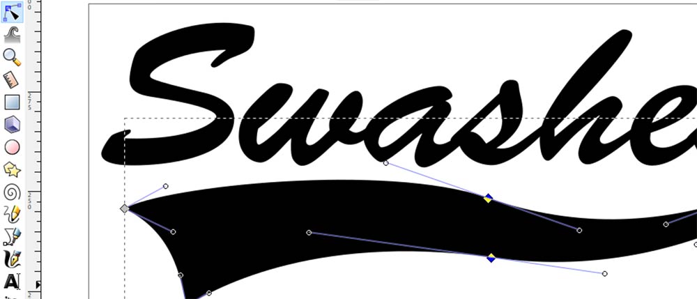
Let’s talk about these handles for a moment, because they’re very important when it comes to the smoothness of your curves. The smoothest curves possible are going to come from a point where the handles are exactly 180° from each other – they should form a straight line right through the point. And your curve will be smoother when the handles are of similar lengths.
If they aren’t straight across from each other, what can you do? You can snap them into place! Click and drag one of the handles, and hold down the CTRL key. This will tell the handle point that it can only move to measured positions at 15-degree increments.
Move it so that it sits perfectly horizontal, like in the image above. Then do the same with the other point – click and drag while holding CTRL so that it sits perfectly horizontal.
This aligns your points so they’re in that straight line formation. To keep it that way, hold down the SHIFT key when moving one of the handles. The other handle will rotate around in the opposite direction, keeping the handle straight!
Refinements should start where your shape meets the S. Make sure your points are lined up with the exit stroke of the S, and your handles on those points are headed in the same direction as that exit stroke. That will help ensure that the letter flows into the shape smoothly.
Work your way around the shape, adjusting the handles on every point so that they’re in that straight line formation, then rotating and lengthening or shortening them so your curves look the way you want them to.
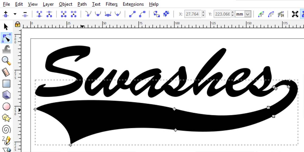
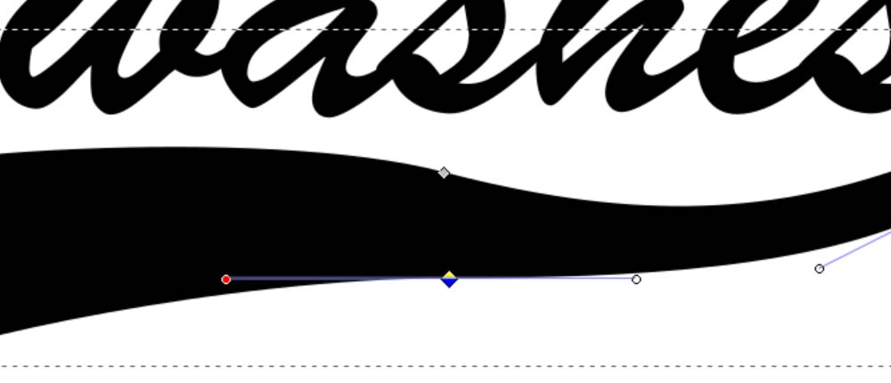
You can spend as much or as little time refining as you like. Since I was making this as an example, and not as a final product, I only spent about 5 minutes total on it. (And looking at it, it’s a wee bit lumpy in spots to my eye.) But at least you can see where the final points ended up sitting. And I only ended up using that one parenthesis with its 10 points.
As an added bonus, let’s talk about another way you can use parentheses to add swashes to your fonts!
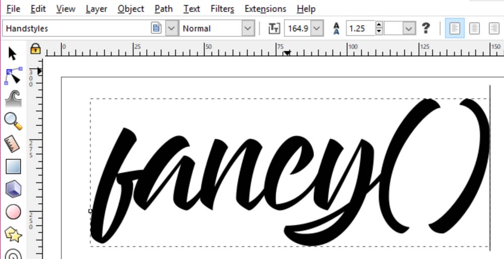
For this one, I’m using the Handstyles font, just because I’d looked at it earlier today and thought, I should use that in something!
Once again, I’m going to use the two parentheses as my building blocks for cool swashes. This time, I’m going to put them at the beginning and end of my word.
Using the same steps as above, I’ve turned the characters into vector objects (Path > Object to Path) and ungrouped them (Object > Ungroup). Then I’ve rotated the parentheses around and put them on the ends of the letters.
The one at the start of the word is good to go! I don’t need to do any adjustments there. But at the end of the word, the tail coming from the Y doesn’t line up well with that parenthesis.
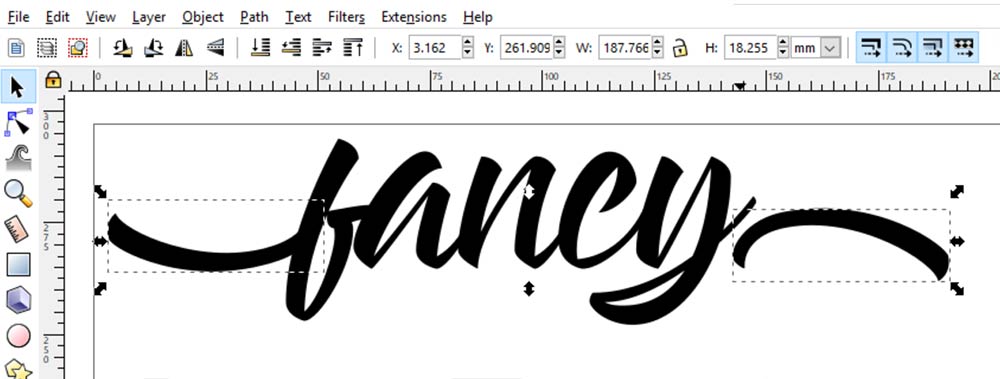
So I’m going to head in with my Edit Path by Nodes tool and remove the existing tail of the Y, replacing it with my parenthesis. You can see here the two nodes I’m going to delete. And it’s as easy as clicking on each node, then hitting the delete key on your keyboard.
You may have to adjust the handles coming off of the body of the Y as well, depending on how the font is constructed.
I’ve changed the color temporarily on the parenthesis, so I can see easier where it ends and the Y begins. I’ve moved it into place, but the parenthesis had a little bitty extra curve I didn’t want sticking out, so I’ve moved that point (selected, so it’s red) over so it sits just where the parenthesis and the Y meet.
Turn the color back to black, and there you have it – swashes coming out of the left and right sides of a word, made from parts that the font already had on hand!
You can make swashes and flourishes out of tons of shapes, like the hyphen or underscore for straighter swashes, or even a letter S or C for curvier swashes. I love the parentheses in general for this stuff, because they have a nice, gentle curve to them, and they’re usually the same weight and style as the lettering, so you know they’ll fit in well.

DTF Troubleshooting Guide: How to Fix Common Problems & Get Perfect Results Every Time

Ask a Font Creator: Stitch Text Effect in Inkscape and Illustrator

Let's Judge Books by Their Covers!