I was asked to explain a couple of Inkscape techniques this week, so of course I wanted to bring those to all of you! I’ve seen a number of items using these techniques lately – text knockouts used for phrases like “mama bear” (knocked out of the shape of a bear, of course) and perspective treatments for nerdy dads. I’m writing this post on Father’s Day in the USA.
First off, we need a solid shape to carve our text from. I’ve decided to use Washington state:
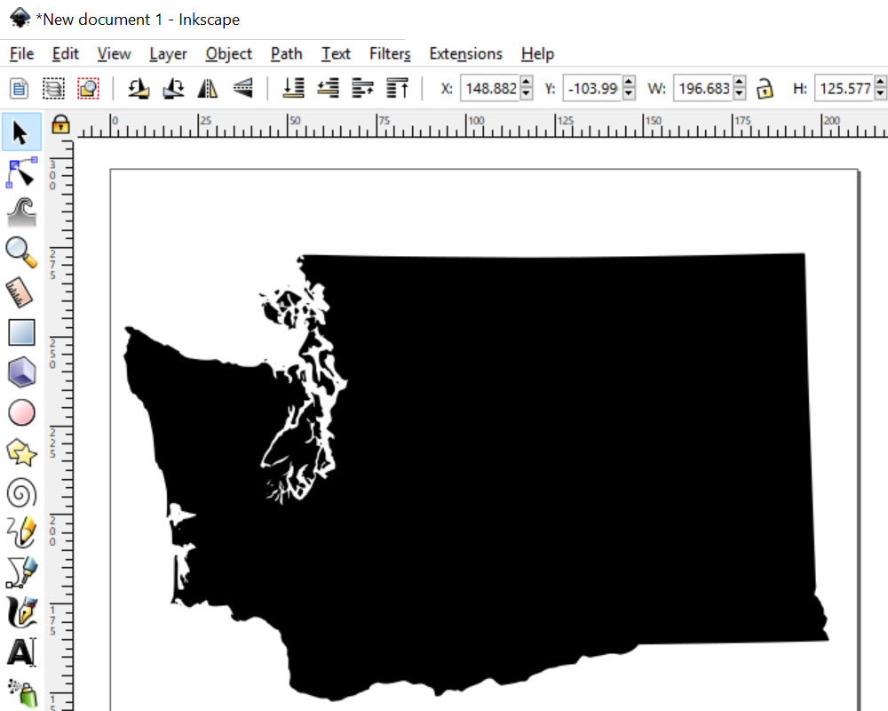
Even though I live elsewhere, Washington will always be near and dear to my heart; I spent 35 years living there.
I have a set of state silhouettes from a bundle I got somewhere at some point. You could use any silhouette shape for this, and there are a surprising number of them out there for free or very little cost.
Just remember, tracing something you find on Google or Pinterest is a violation of copyright. Make sure you have the rights to use whatever shape you’re using, or go nuts and draw your own shape! States, countries, animals, or just plain circles or squares – any shape will do.
There are a LOT of little islands and rugged bits in Washington, so I’m going to simplify the shape a little bit:
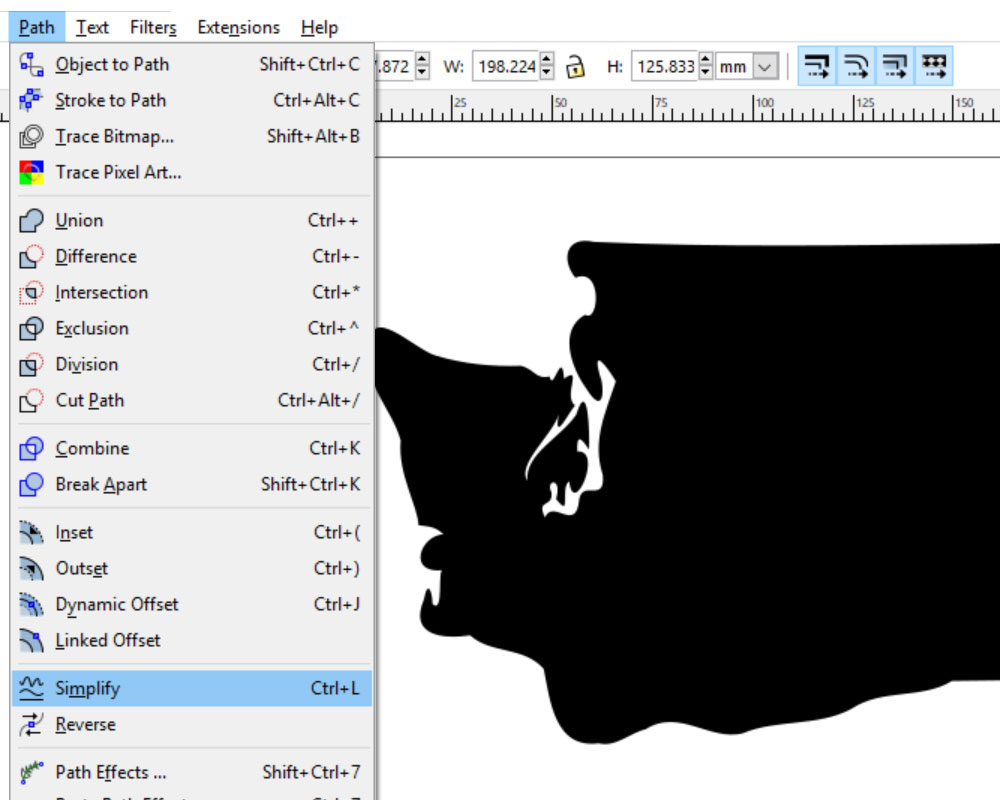
With the state selected, Go to Path > Simplify. It’ll smooth out a lot of the rough edges. Here, I did Simplify three times, then went in close and deleted any tiny islands that remained. You can see that I still have the general shape of the state, but things are a lot smoother.
If you’re working in print, this step isn’t necessary; if you’re cutting out your project, this can help immensely, getting you a smoother, faster cut.
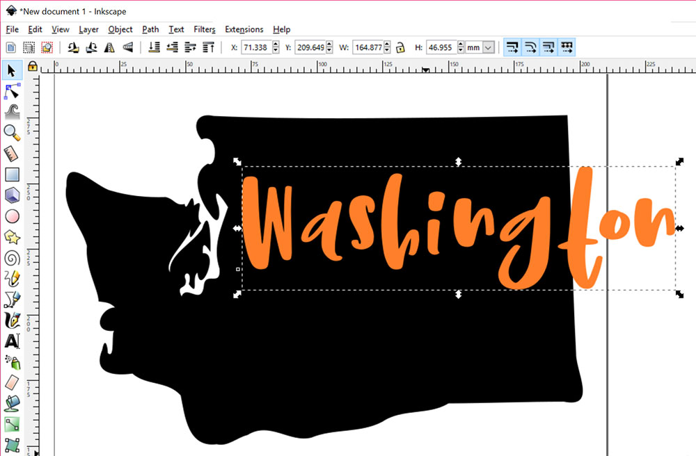
Next, I typed in my text. I’m just going to use the word “Washington,” but you could do anything you want. I’ve typedit in a different color just so it’s easier to work with on top of the black shape.
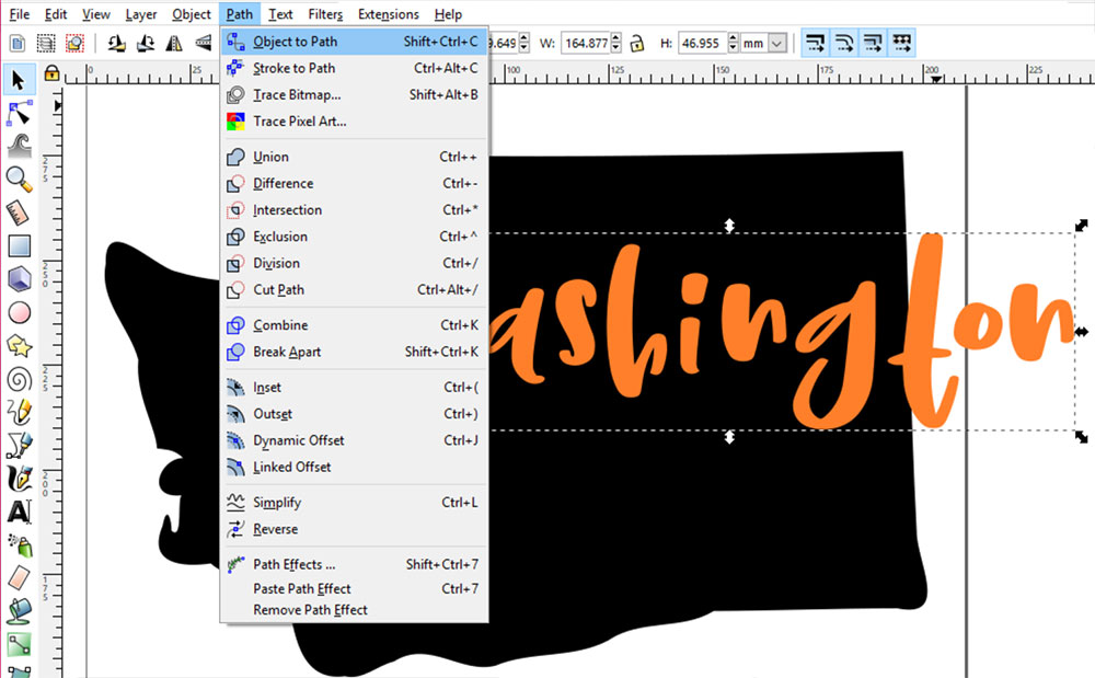
With the text selected, go to Path > Object to Path. This converts your typeable text to a vector object. (Remember this step; we’re going to use it in the second tutorial in this post as well!)
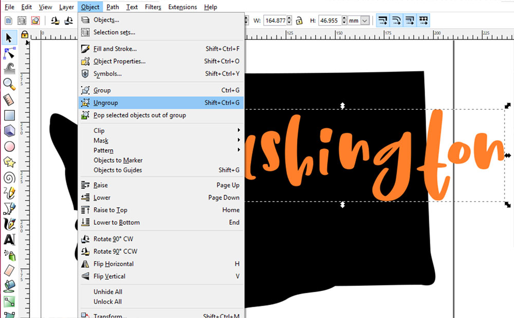
And then go to Object > Ungroup. When you convert the text to vector objects, Inkscape groups everything together, so it all moves as one. By ungrouping, now we can move the letters around individually.
Now it’s time to have fun! Move the letters around, tilt them at angles if you like, or resize them. You could even stretch or squash them a little bit, but try to keep that to a minimum.
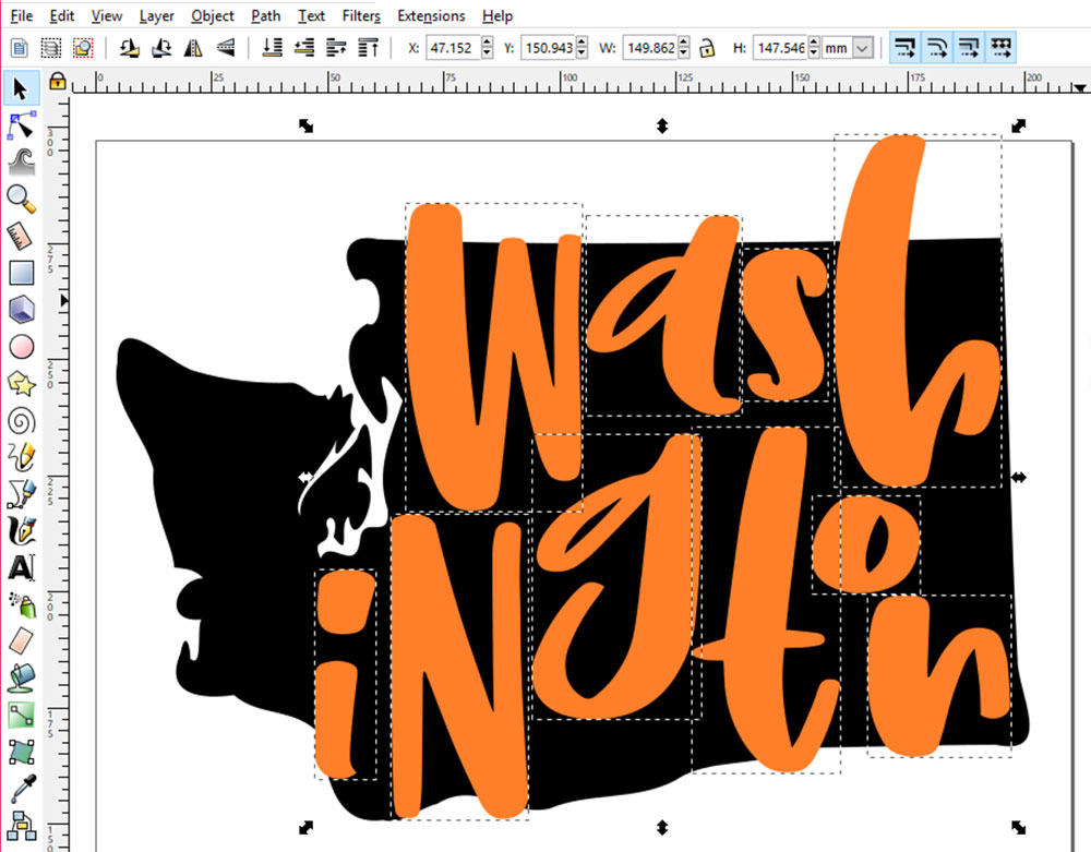
Here’s my final text layout. I’ve made several of the letters extend outside of the shape, because that’s part of the look we’re going for. You could, of course, keep everything inside the boundary of your shape – it’s totally up to you.
Now that the letters are arranged how we want them, we’re going to select them all (hold down your Shift key while clicking on each letter). Then we’re going to re-group them together.
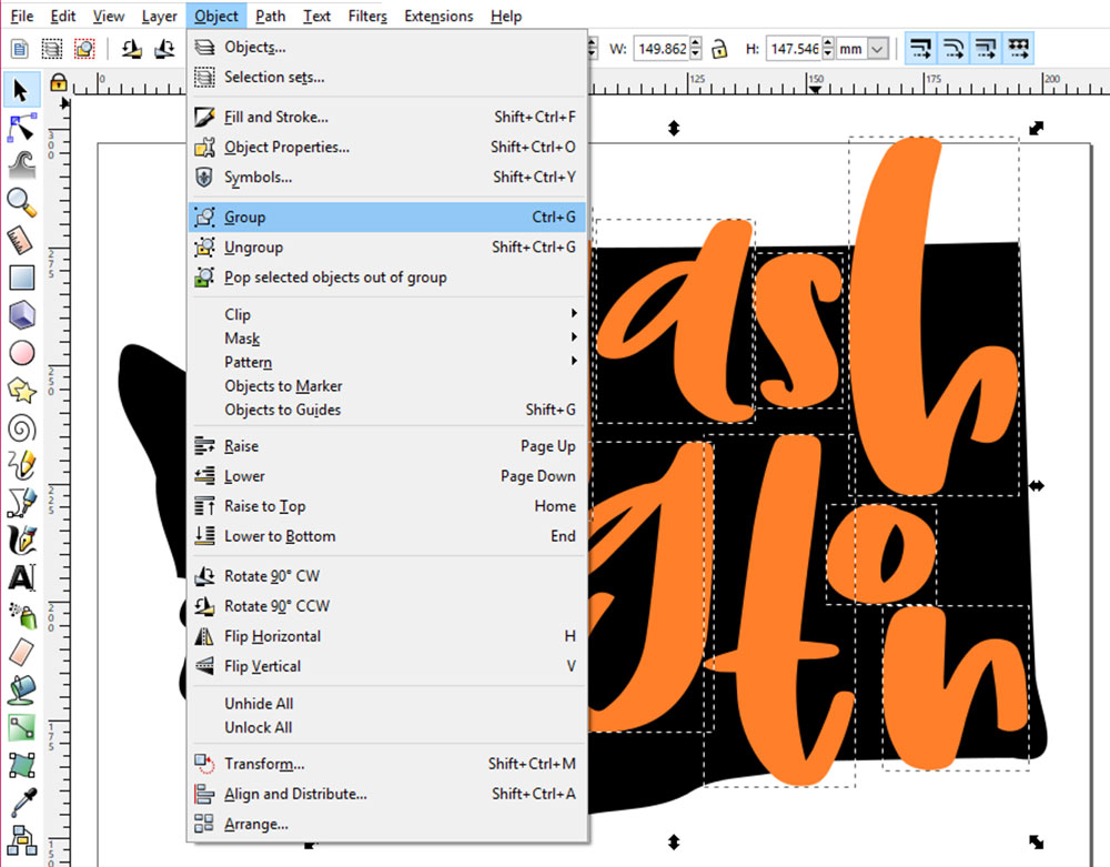
Go to Object > Group to turn the letters back into one unified group…
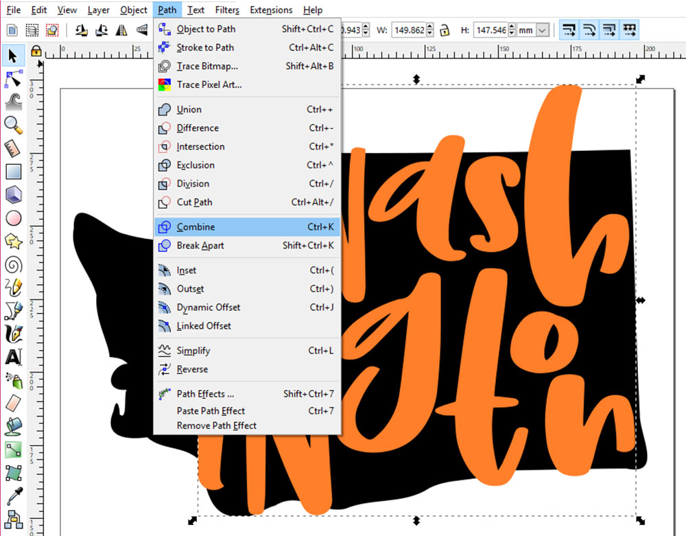
And then go to Path > Combine to turn them into one shape.
What’s the difference between Group and Combine, you ask? With Group, Inkscape still sees each letter as an individual vector item; they’re just riding around in the same container. With Combine, the letters all get merged in Inkscape’s mind into one big Frankenvector item, so they’re no longer ten small individual shapes, but one big shape.
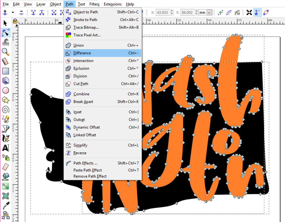
Now we’re ready to knock the text out of our shape. Select both the text and the shape with the Edit Paths by Nodes tool (the triangle pointing at blue dots, just below the black arrow on the left-hand toolbar) so they look like the picture. The gray dots are all points along the vector curves.
With everything selected, go to Path > Difference.
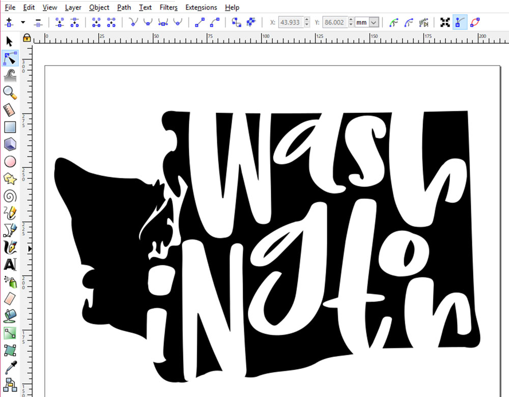
And there you have it! The text on top gets knocked out of the shape on the bottom, resulting in transparent areas where the letters were. Now you can save your shape to send to a cutting machine, or overlay it on another image.
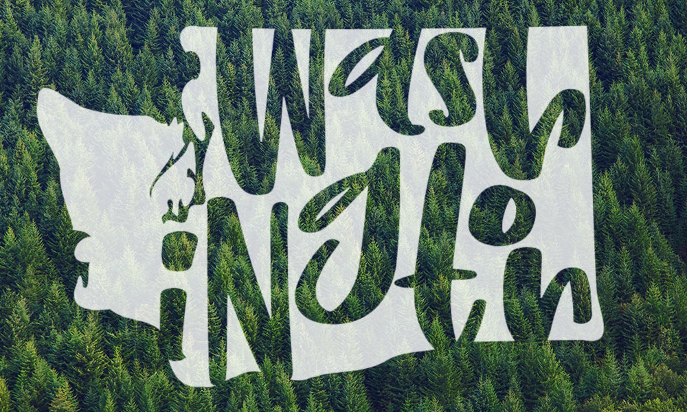
Here’s mine in white, at 80% opacity over a picture of trees. (Evergreen trees are a very Washington thing.)
Onward to our second tutorial of the day:
For our perspective sample, I’m going to go all Star Wars on you:
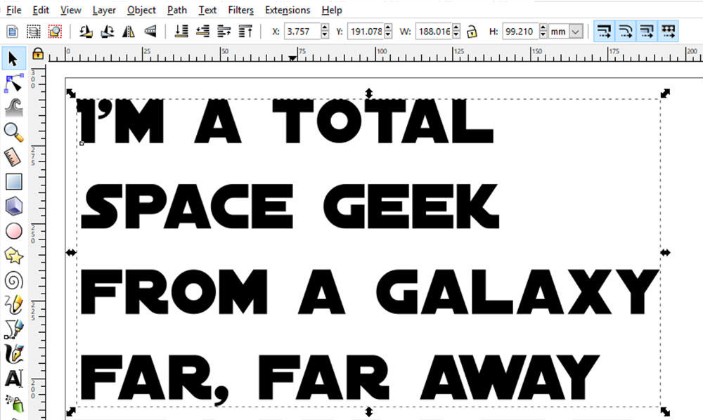
I’m using the Distant Galaxy font here, but there are a half-dozen other Star Wars fonts, with varying licenses.
After you type in your text, you’re going to want to turn it all into vector objects, and ungroup the letters, just like we did in the first tutorial. So with your text selected, use Path > Object to Path, then Object > Ungroup.
Once it’s ungrouped, you can make any adjustments you like.
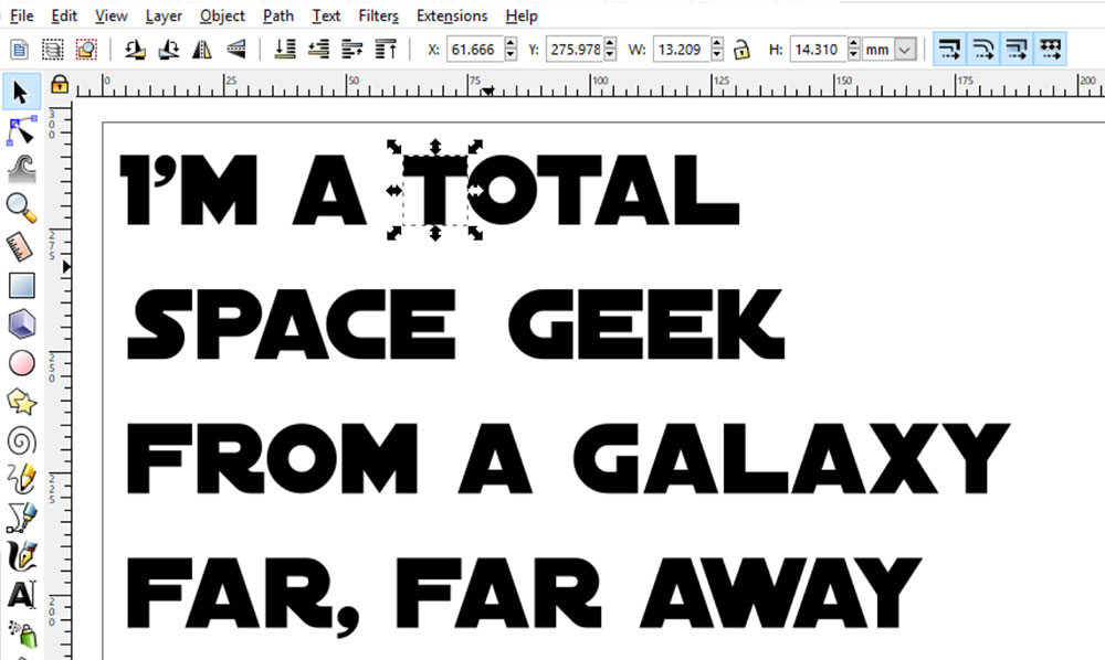
Some of the spacing between letters was a little wide for me, and the spaces between the words were a bit big. So I’ve selected the letters I want to move, and nudged them gently over to the left or right using my arrow keys.
Once you have your spacing set, it’s time to set the text into a more rectangular shape.
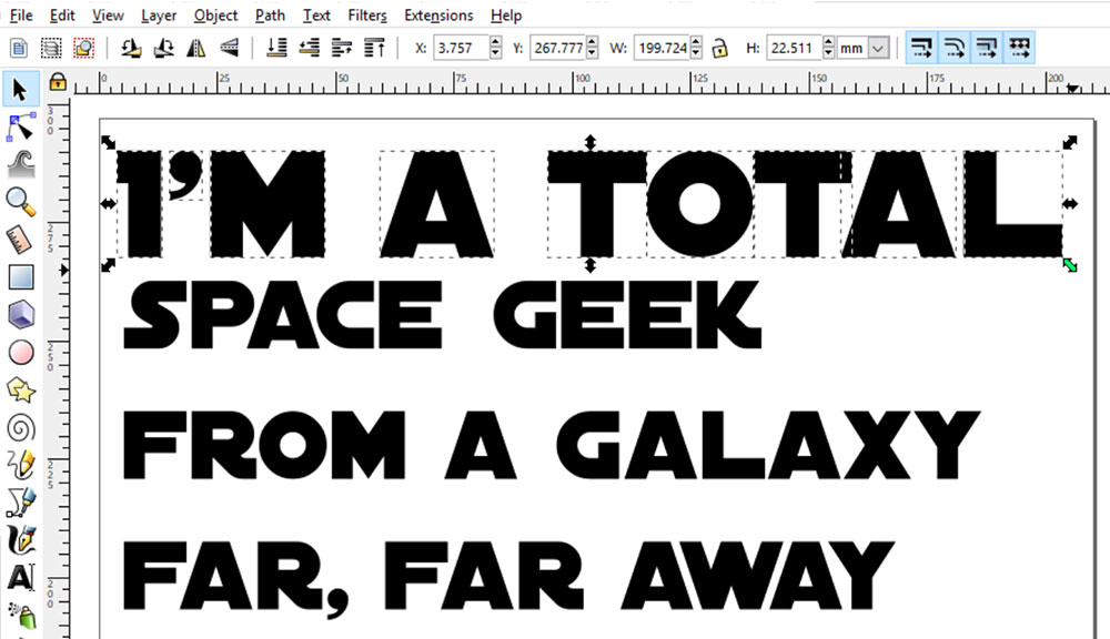
Do that by selecting the letters of the line you want, then click and drag one of the corner arrows while holding down the CTRL key. (Most likely you’d use the CMD key on a Mac.) By using the CTRL/CMD key, you’re keeping the letters in their original proportion, so nothing’s getting stretched.
Do the same with each line:
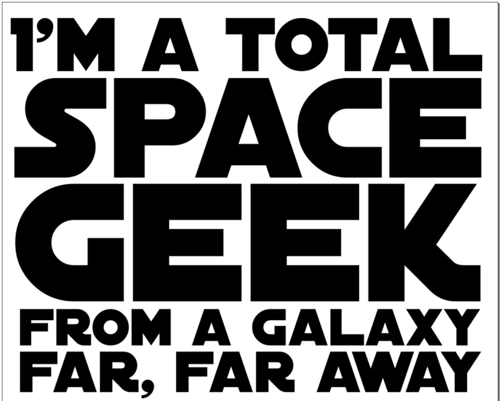
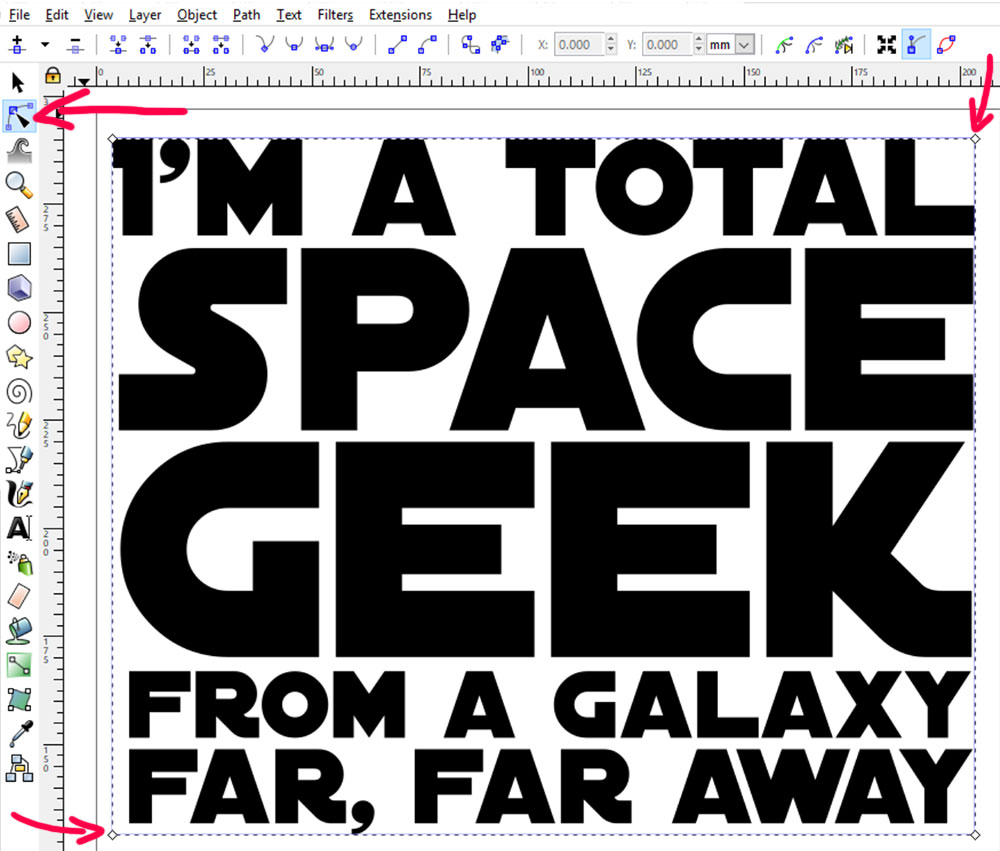
Until you have your words laid out in a square or rectangular shape the way you like them. You can make some of the words or lines larger for emphasis, like I’ve done here with SPACE and GEEK. Choose your important words, and make them the focus of your design!
Now, you’re going to once again Group and Combine your letters. Just like we did in the first tutorial, select everything, then go to Object > Group, then Path > Combine. Now you have one big vector shape.
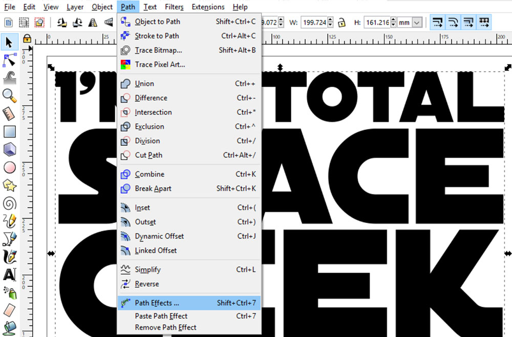
In order to apply the perspective effect, we’re going to go to Path > Path Effects.
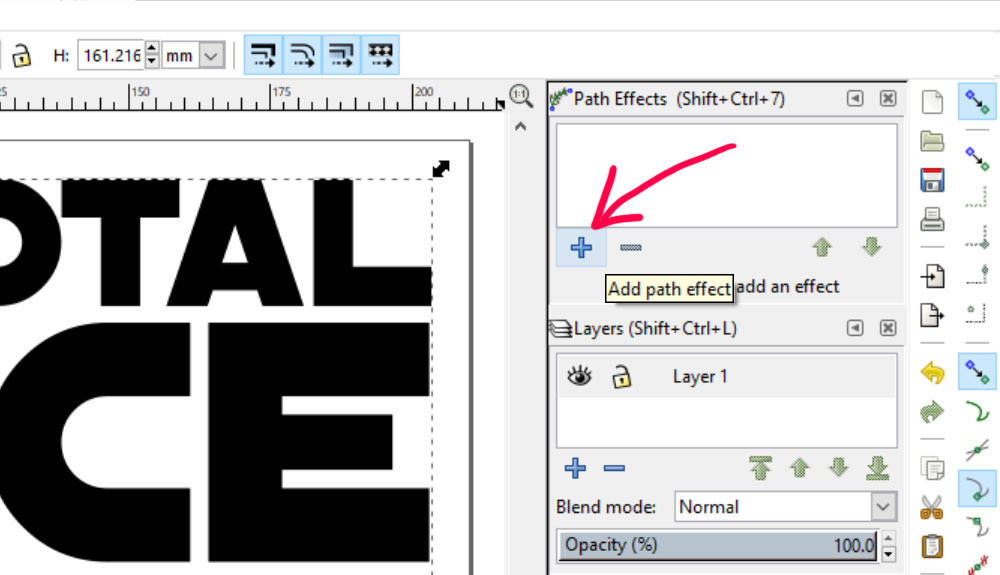
You’ll either get a pop-up window over the top of your workspace, or the window will show up in the right-hand sidebar. Click on the little blue plus-sign in the Path Effects window in order to add an effect.
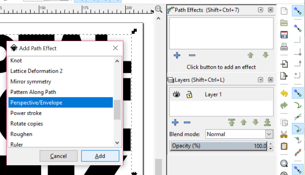
This will pop up another window, with a list of available Path Effects. We’re going to choose Perspective/Envelope.
Next, change from the regular arrow selector tool to the Edit Path by Nodes tool (the triangle pointing at the blue squares, just below the black arrow on your left-side toolbar). When you do that, your lettering layout will suddenly get four little white diamonds, one at each corner.
You can click on any of those arrows and drag them around, but we’re going to be more precise about this.
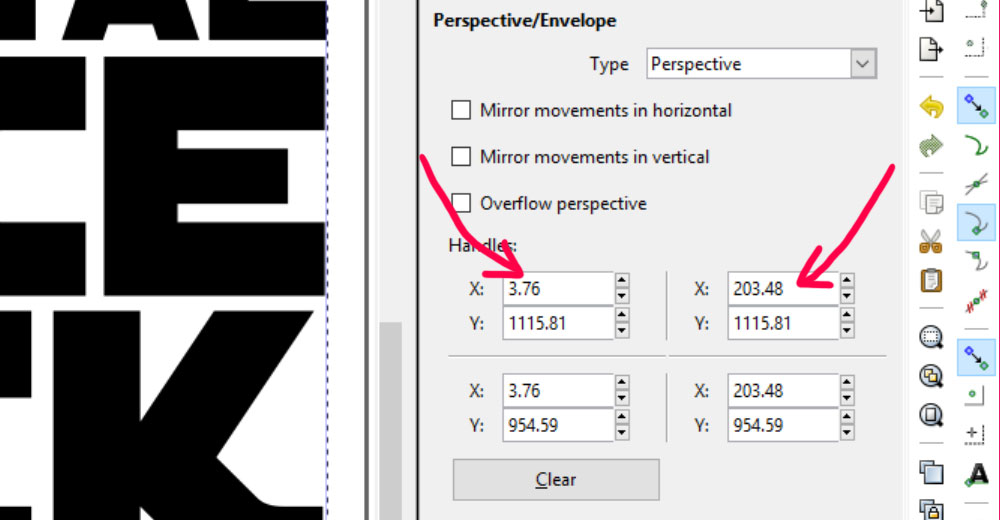
Once you’re in the Perspective/Envelope window, you’ll see this set of numbers over in your menu. These are like the GPS coordinates for those four white diamonds on your artboard, and the sets of numbers are laid out in the same order as the white diamonds.
So the X and Y numbers in the upper left are the coordinates of the upper left diamond, and so on.
We’re going to adjust the X number of both top diamonds, to bring them in closer to each other.
And since we want them to each come inward the same amount, we’re just going to change the numbers in these X fields.
I’ve made my artwork pretty large, so I’m going to move them each inward 50 units.
So I’ll change the left number from 3.76 to 53.76 to move that X point to the right. I’ll also lower the right number from 203.48 to 153.48 to move that X point to the left.
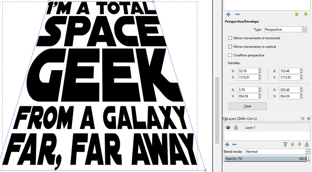
Here’s the result! Just by moving those two points, we give the impression that the words are on a flat plane, with the top farther away from us and the bottom closer.
If you’ve seen a couple of my other tutorials, you may remember that applying a Path Effect is a flexible thing – it can still be adjusted until we decide to finalize it. So once you’re happy with what you’ve created, go to Path > Object to Path.
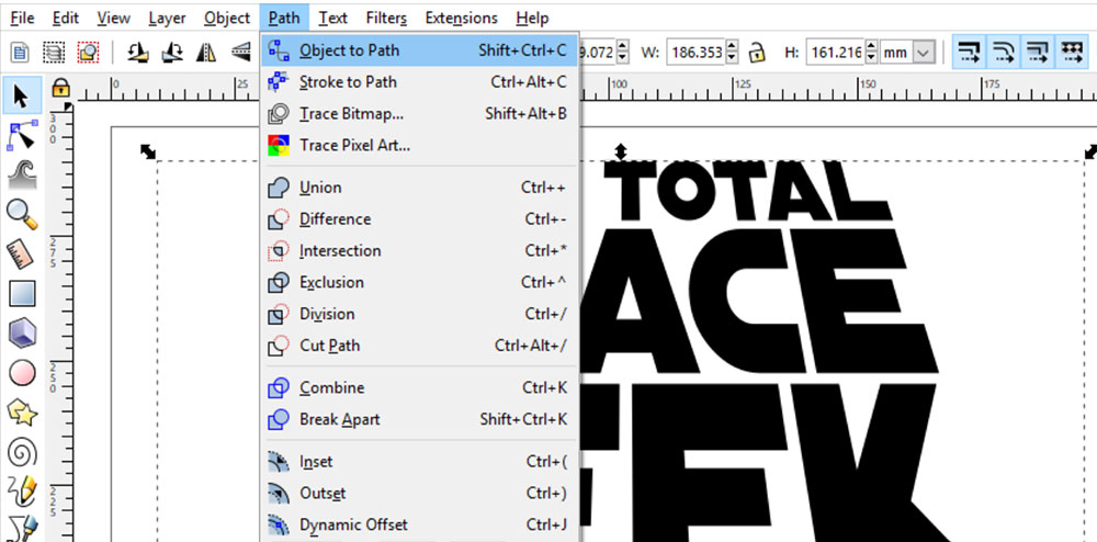
This commits your changes, and puts your paths where you want them. Now this artwork is ready to save! Just like with the knockout artwork, you can now import this into other software.
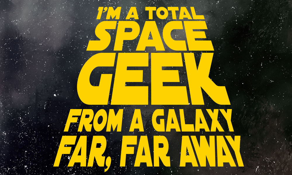
And if you don’t have a space image to put this on? You can improvise! I made this background by taking a watercolor background into Photoshop (though you could do this in GIMP as well).
I lowered lowering the saturation, then throwing an image of grit over the top and turning the grit to white. (You can make your own grit using salt on a piece of black paper; take a look at my Adding Distressed Effects tutorial for tips!)
I hope these two how-toshave given you some new ideas about ways you can play around with text for your projects!

DTF Troubleshooting Guide: How to Fix Common Problems & Get Perfect Results Every Time

Ask a Font Creator: Stitch Text Effect in Inkscape and Illustrator

Let's Judge Books by Their Covers!