
I’ve heard that some of you want more Inkscape tutorials, so here’s another one! I’ve seen a few things posted to Facebook lately with text warped so that it fits inside of a shape. Hearts, baseballs, animals – there’s no limit to the kinds of things you can put text in.
So today, I’m going to fit text into the shape of a weird little monster.

Here’s what our final result will look like. Cool, huh?
Before we begin, however, I’m going to make a couple of brief notes about best practices when you’re manipulating fonts.

There’s a big difference between stretching letters and manipulating them. As you can see here, I’ve taken the uppercase E from Arial. On the left side, first I stretched the whole letter taller than normal,. Then I converted the letter to a vector object and just moved the points of the top bar and bottom bar up and down.
Same thing on the right side – you have both a stretched letter, and a letter where the end points of the bars are moved.
If you’re going to manipulate text like this, always try to keep your strokes their original thickness by converting the letters to vector objects, and just moving the sections/points you need to. It’ll make things look much more even.
All right, let’s get monstering!

The first thing I did was make this little monster shape using the pen tool. You could make your own, or you could get a silhouette of the critter of your choice online. (Remember, though – don’t just grab an image from Google and trace it; that violates the copyright of the image’s creator.
There are tons of vector objects out there for free or cheap that you can get with a proper license.)
If you want to use this exact monster shape, you're in luck! I'm giving it away for free. Check the bottom of this post for a link!
Next up, let’s type out some text:

For this project, I used Sweety as my font. For something like this, I prefer a font that’s relatively thick, and has some nice natural curvature to it – nothing too straight and formal. We’re going to be warping and manipulating, and any little mistakes we make will be hidden by the forgiving shape of the letters.
Side note: I have the monster graphic on a separate layer under the text, and that layer is locked so I can’t accidentally select it or move it around. I’ve also colored it in with a light shade that'smild on the eyes, so I can see what I'm doing with the text.
After typing the text, the first thing I’m going to do is convert the letters into vector objects. Do that by selecting all of the text, then going to Path > Object to Path in your menu. (Or you could use the shortcut Shift+Ctrl+C.)

Now you can see, the letters are all made up of points and lines. A LOT of points and lines. Which is good – it gives us a lot to play around with.
And hey, look at that layers panel. That’s right, I made a backup copy of my text, and I’m working with a copy. (Don’t worry, I’ll remind you to do that on every. Single. Tutorial.)

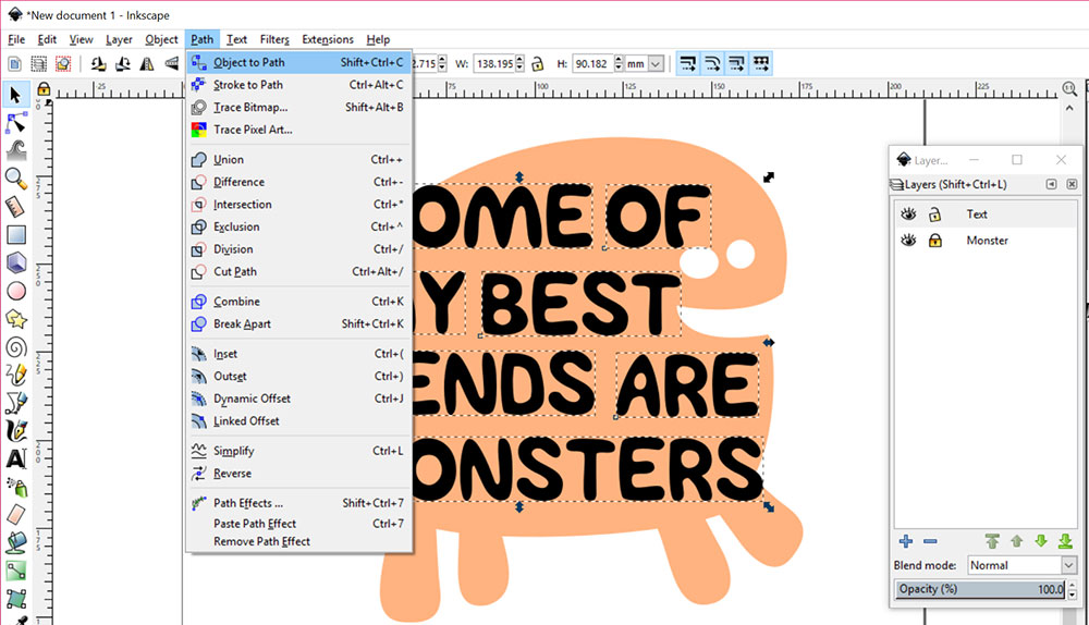
I’m going to start by rotating the text just a little bit, so that it isn’t going straight across the page. Go to Object > Transform to get the Transform menu to pop up.
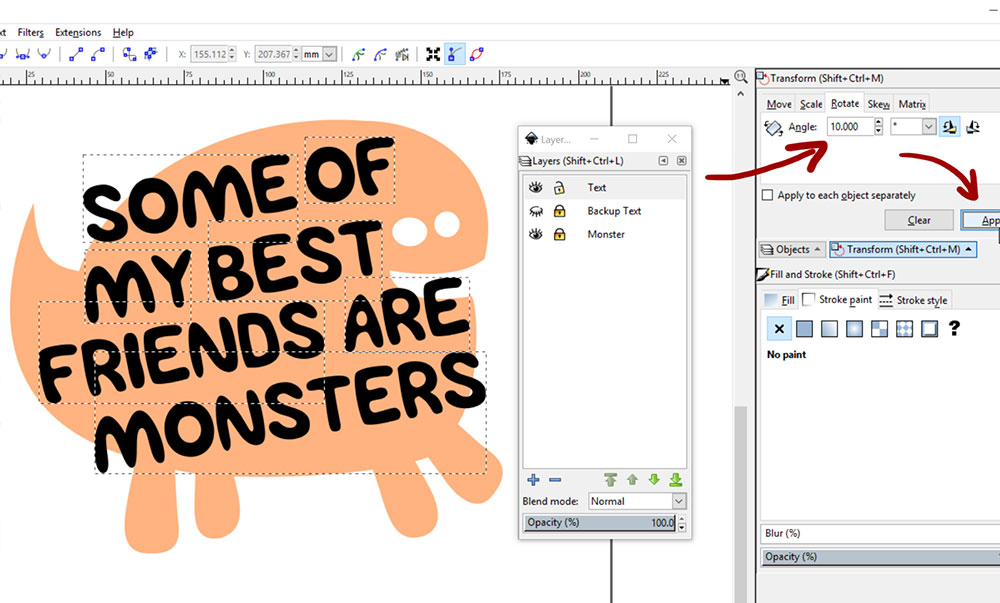
Choose the Rotate tab in the Transform panel. My rotation is set at counter-clockwise, so I’ve told it to rotate 10 degrees (the 10.000 the arrow is pointing at) and hit the Apply button (other arrow; “Apply” got half cut-off, because I’m excellent at the screenshotting arts). How do I know it’s going counter-clockwise?
There are two little icons on the right end of where that 10.000 is: the one that’s clicked (highlighted in blue) has an arrow going counter-clockwise. In order to turn something clockwise, you could either enter -10.000 (with a negative sign) in the box, or click the clockwise icon and stick with the positive 10.000.

Now we’re going to curve the text to fit the monster’s round little body. I’m going to start with the word “monster.” Select just that word, then go to Path > Path Effects.

You’ll have a big empty box. Click on the blue plus-sign at the bottom in order to add a path effect. (I believe you can add more than one path effect to a shape, but that’s more advanced than I’m willing to get right now. [Remember, I’m learning this stuff as I go to teach you all! And that’s getting into some advanced stuff.])

The list of Path Effects pops up, and there’s some weird-sounding stuff in there. Choose Bend, then click Add.

A green line will show up across your line of text. Click on the pen-tool-looking icon (see the red arrow) in order to manipulate that green line. Click and drag the green line either up or down, and you curve that line:

Once you've curved it a bit, you can also pull on the handles of the line in order to make your curve deeper or shallower on either end.
Once you get the text close to where you want it, you can close the Path Effects window. But when you go to start editing those letters, thingslook totally weird:

What what! All of the points are back up where they started, not where they SHOULD be, which is along the edges of the letters. That’s because the Path Effect is just that: an effect applied to your text. The original text shapes are still there, kind of in a ghostly form.

In order to make that Path Effect permanent, select your word, then go to Path > Object to Path. (It’s the same thing we did to turn the letters from typeable font to vector objects.)
By using Object to Path, we’ve created NEW paths, based on where the letter shapes are now:

Here you can see the result: the points are exactly where they should be.
Next up, let’s try messing around with some of the letters.

If you select your Edit Paths by Nodes tool (second down on the left-hand toolbar; the arrow pointing at blue points, just below the plain black arrow) you can click on any single letter and get its points to show up.
Then you can click and drag a box around some of those points, and they’ll be selected. They’ve turned blue/yellow here to show they’ve been selected.

Click on any one of those selected points and drag upward – all of those points move together!
After pulling the top of that T up, I immediately moved the S and E closer in to fill up that empty space.
If you feel like there are too many points, or some you don’t need, you can use this same method of selecting certain points, then just hit the delete key.

Here you can see some areas (the leg of the R, the top of the S) where I’ve removed a TON of points, and just adjusted the curves and moved the remaining points around until the letters had a shape I liked, and fit into the area.
I also took the S and rotated it back clockwise. A little rotation in this kind of project can not only help fit letters into tight spots, but it also adds a little bit of jumbled-up fun.

Here’s a close-up of stretching the letter D. I clicked on my Edit Paths by Nodes tool, selected everything in the bottom half of the letter, and pulledthose all downward.
By doing that instead of stretching the entire letter, the horizontal strokes on the top and bottom of the D stayed the correct width.
I then decided that the bottom of the D was a little too round; I didn’t want it to be mistaken for a misshapen O.
So I removed a TON of the points, and adjusted the curves so that the bottom right is a bit more rounded, a little less squared-off.
Just know that there’s going to be a lot of scootching, nudging, and fiddling. You’ll go back and forth between your Edit Paths by Nodes tool (to edit the points) and your Select and Transform Objects tool (the regular black arrow, for moving/rotating) constantly.

Here’s my final text. As you can see, I’ve made some letters taller and some shorter, so the lines of text encroach a little bit on each other. I also took the leg of the R in FRIENDS and gave it a little hook, just for fun.
When you get the letters where you want them, it’s time to cut them out of the monster shape!

Select all of the text, then go to Path > Combine. This takes all of the individual vector objects (the letters) and turns them into one big single vector object.
Make a copy of your monster, and put it in a new layer. Then make a copy of your text, and put it in that same new layer on top of the monster.
For both of those, copy the objects like your normally would. But instead of just hitting Paste or Ctrl+V, go up to your menu and choose Edit > Paste in Place (or Ctrl+Alt+V). This pastes your object exactly where it was sitting on the other layer, instead of wherever Inkscape decides to plop it down randomly. Illustrator does this too!
Side note: around this point, I decided that my monster needed horns. So I drew a couple with the pen tool, then used Path > Union to merge them into the monsters shape.
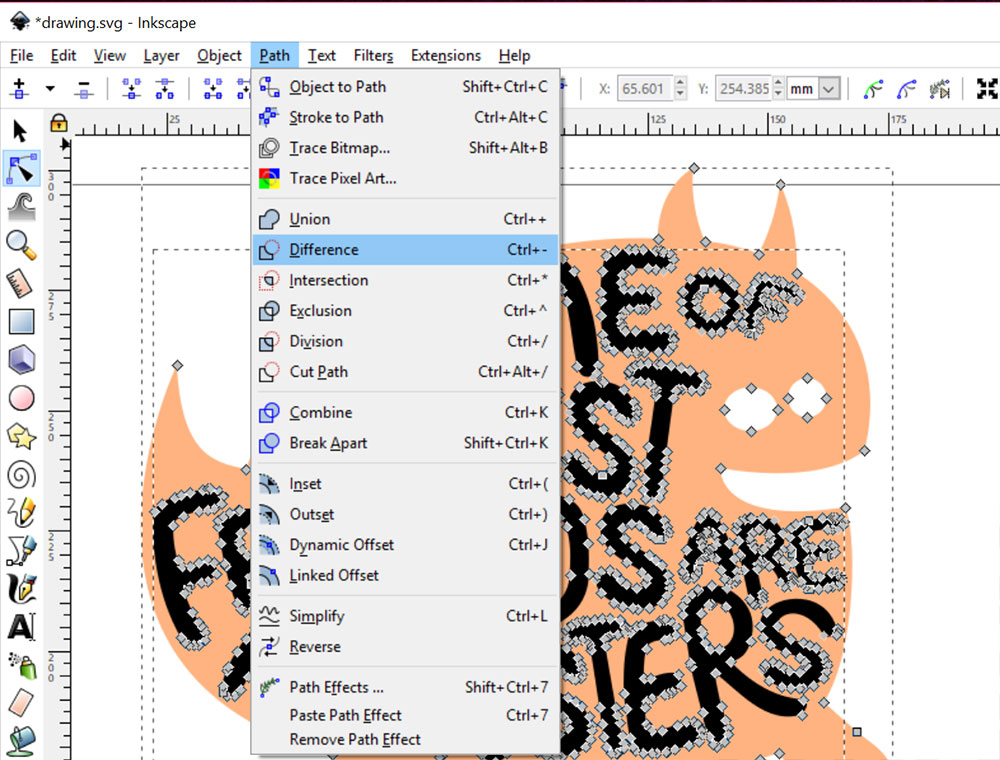
Once you have a copy of your text on top of a copy of your monster in the same layer, select everything with the Edit Paths by Nodes tool, so that all of the points show up. Then go to Path > Difference.
This subtracts whatever’s on top out of whatever’s on the bottom, leaving you with a monster shape with transparent openings where the text is.
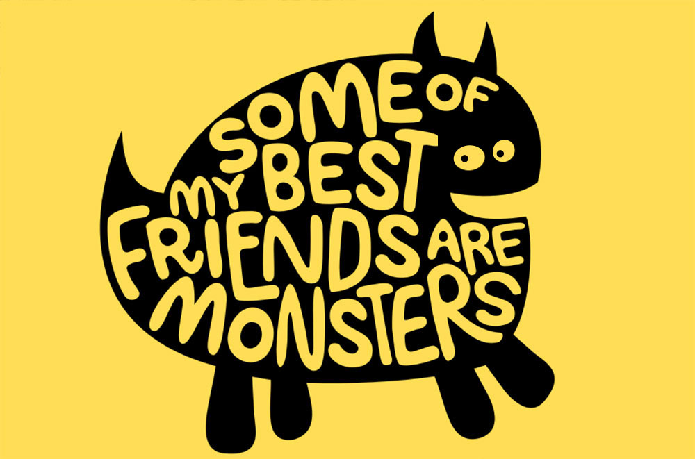
Here it is over a color background, so you can see the transparency. I also optedat this point to give thelittle monster pupils in his eyes – his plain whites-of-the-eyes stare was kind of creepy.
So there you have it! It does take some time, but you can create some really unique and fun designs by manipulating your text into a shape. And really, this took me more time than it should have, because I was making screenshots as I went. Overall, this was less than an hour’s work.
PS – how about some freebies? I’ve bundled up both the plain monster silhouette and my completed monster project as a couple of free SVG files for you! Grab them here: Monster SVGs!

DTF Troubleshooting Guide: How to Fix Common Problems & Get Perfect Results Every Time

Ask a Font Creator: Stitch Text Effect in Inkscape and Illustrator

Let's Judge Books by Their Covers!