Posted 15th December 2016 •
By Design Bundles

Howdy, everyone! This week, I’m going to go over a few really simple design tips that can help make your projects more unique and dynamic. And they all utilize parts of fonts you already own! No extra icons or graphics or dingbats, just straight-up font characters.
And I’ll say right up front here, because I don’t want to commit a
Font Deadly Sin: none of our techniques are going to include stretching or squishing anything. Remember: stretching a font makes the designer cry.
Ready? Let’s go!
Text on a Curve
 Font used in image: Humus
This is probably the easiest way to give your text a little extra life. Many programs have a pen tool or equivalent, and allow you to create a curved path and place text on it. I created all of my examples in Photoshop, but you can get the same results with Illustrator, GIMP, Inkscape, or tons of other programs.
You can see the difference here between text typed on a straight line (top) and the same phrase set on curves (bottom). That little bit of curve really adds a spark! And curving parts of text in a larger phrase can really help fit words together like a jigsaw puzzle.
Helpful hint: When placing text on a curve, you may need to adjust your tracking (the uniform spacing between all characters). On upward arcs like these, the curve makes the letter spread a little farther apart, so tightening your tracking may be necessary. For a downward arc, the opposite is true – the tops of the letters get a little cramped together, so you may need to increase your tracking.
DIY Swashes
 Font used in image: Carissa Wellington
Even if a font doesn’t contain extra underlines or swash characters, often you can use characters that DO exist in that font for underlining purposes. In this example, check out those purple underlines. For the top line, I took the slash character and just rotated it. For the middle line, that’s the left-hand parenthesis rotated around. And on the bottom, I’ve used the underscore character twice.
Especially with a script font like Carissa here, punctuation marks like parentheses and slashes can look like really cool underlines! All you need to do is type it in and rotate it around 90 degrees or so.
Helpful hint: You may be tempted to stretch these characters in order to get them to fit. Please, I implore you, don’t do it. It’ll just make things look wonky and awkward.
Wonkward, you might say. Also, be careful if you just increase the font size; you may make the slash/parenthesis/underscore look way too thick compared to the rest of the font. But on the plus side, I’ll allow you to mix fonts here! One script font may have a fabulous long, thin parenthesis that you want to use with text from another font. As long as the line weights and styles are similar, I say go for it.
Embellishment with Other Characters
 Font used in image: Mooglonk Serif
The next step after using characters as underlines is to use other characters to either embellish or replace the letters you’re using in your project. As with the previous image, the unusual things I’m doing are in purple.
First off, we have a regular “LOVE” typed out in Mooglonk Serif. Next to that, I’ve put the asterisk inside the capital O. That one little addition adds a bit more fun, and makes the design that little bit more different from everyone else’s.
On the second line, I’ve replace the capital O with the lowercase o, moved it upward, and put the hyphen underneath. (The black text, as typed, is “L [space] VE”; by just putting the space in there, I left room for the smaller o. But depending on the width of the blank space in your font, you may need to type that beginning L separately too, and align it with the rest of the letters.) Next to that, it’s the same thing, but I’ve put the period inside the letter o. It’s kind of like an eyeball looking at you, which . . . may be something you want in your design? Maybe not with the word “love,” but picture a Halloween-themed item with the word “spooky” on it. Periods in those Os to make theme eyes would be
awesome.
In the last line, I get numbers into the mix. The number 3 can frequently be horizontally flipped to become an uppercase E. And then in the last example I go totally overboard, turning the 7 around 180 degrees to become the L, putting in the lowercase o instead of the uppercase, tilting the hyphen on its side and fitting it inside the o, then going with the lowercase e and another hyphen at the end. It’s a BIT much, I’ll admit. But it was fun to make.
Helpful hint: There are a ton of characters that can double for each other. Flip a V over to make an A without the crossbar (you’ll see this in a lot of indie-rock album covers). The M and W can often flip over to replace each other in interesting ways. Think about how people make creative custom license plates for their cars. Or how you could make “words” using the numbers on your calculator. Try swapping: B/8, S/5, Z/2, 0/O, I/1, or G/6.
Rotating and Moving Script Characters
 Font used in image: Norffo
Normally, I’d advise you to not monkey around with script fonts too much. As you can see from my previous post with the
Seven Deadly Font Sins, there can be some serious weirdness if you adjust script fonts. But with a careful hand, you can add a little bit more bounce.
The top line here is Norffo typed out straight. For the bottom line, I’ve typed each letter separately, then moved them around so that they all meet up again. I’ve done the slightest bit of rotation (blue arrows) on a few letters, and adjusted how high or low a few of the letters sit (red arrows). Because the tails of the letters need to reach the next letter, there isn’t a TON of stuff you can do, but with some very careful adjustment, you can add a tiny bit more flair to your design.
Helpful hint: Be very careful when trying this technique. Script fonts can be persnickety and hard to adjust, because those tails are all crafted in a specific way. If you converted these letters to outlines in a vector program, you
could adjust the tails, but if you do, make sure you do it verrrrrrry cautiously, so things don’t look . . . what word did I come up with earlier? (Scrolls up) WONKWARD! Yeah, don’t make it wonkward.
Rotating and Moving Non-Script Characters
 Font used in image: Angelica Sans
Non-script characters are MUCH easier to move around, and doing so can really add a dynamic flair to your project. On the top line, I’ve typed this phrase straight out, with no adjustments. It’s cute, but I think we can add some fun to it.
In the middle line, I’ve taken several of the characters and rotated them slightly. I haven’t rotated anything more than 5 to 10 degrees – rotate something too much, and you run the danger of that letter not fitting in with the rest. I’ve also staggered where the letters sit in regard to the baseline, with some sitting low and some sitting high. (I’ve always loved letters tucked into the elbow of a capital L, and will do it every chance I get.)
To add an even higher level of difficulty, take a look at the last line. Every letter in purple has been flipped, either horizontally or vertically! There are tons of letters that can be flipped, rotated 180, and/or mirrored: A, B, C, D, E, H, I, K, M, N, O, S, T, U, V, W, X, Y, and Z are all uppercase letters that
might be able to flip, depending on how they’re drawn. If you’re working with a really sharp serif or sans-serif font, you may not see much difference. But something hand-drawn like this could give you some cool unique results!
Helpful hint: One thing to look out for when flipping letters is the thick and thin strokes. Generally, a hand-written font will have thin upward strokes and thick downward strokes, and if those get reversed, it might look a little wonkward.
Resizing Letters
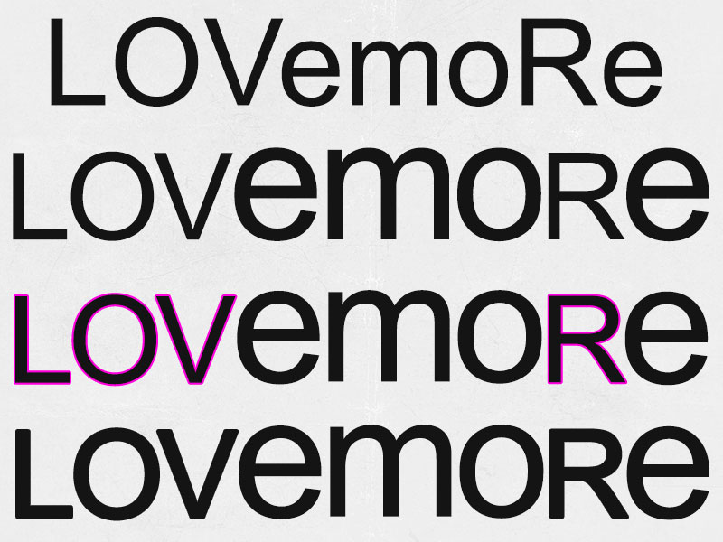 Font used in image: Arial
I wanted a really simple, clean font for these examples, so my changes really stand out. I did a mix of lowercase and uppercase letters, and resized the lowercase so that they were at the same height as the uppercase. The steps:
First, I decided which letters I wanted to upsize from lowercase, and which I wanted to leave uppercase.
Next, I separated the text into sections, keeping uppercase and lowercase letters together: LOV, emo, R, e. I took the lowercase letters and increased their font size (the uppercase letters are at 130 point, and the lowercase were increased to 190 point). As you can see, now it’s a little hard on the eyes. The strokes on the uppercase are weirdly thin compared to the lowercase, because of the difference in font size. (I saw a drink cup from McDonald’s do this a few months ago, and it made chills run down my spine. They didn’t do the next steps.)
In order to equalize the width of the letters, I’ve added a 2-pixel stroke to the outside of the uppercase letters. (In some software, I believe this is referred to as an
offset.) The size of your stroke/offset will vary, depending on the size difference between your letters. Zoom way in and adjust until it looks right. You can also stack letters on top of each other and make one 50% transparent – the uppercase L could sit over the top of the first stroke of the lowercase m, since those are both straight up-and-down strokes. With one of them semi-transparent, you can adjust the other until they’re the exact same width.
I made those strokes purple so you could see them. Last line, they’re the same black as the rest. Pretty cool!
Helpful hint: The one problem with adding a stroke in Photoshop is that it makes softer corners. Zooming in, you can see that the giant lowercase letters in Arial have very sharp, pointy corners; the uppercase letters with strokes around them have slightly softer, more rounded corners. So if you’re going to do this, do it in a vector program like Illustrator, where you can then expand the shape & stroke together into one outlined shape, and tweak those corners so they match. Or just use a font that doesn’t have such sharp, pointy corners.
All of the Techniques in Action!
 Font used in image: Sweety Regular
So let’s take these techniques out for a spin! First up, here we have a couple of words typed normally at the top, then played with at the bottom. Let’s take a look at what I did:
I did some gentle rotation (remember, no more than 5 to 10 percent) on many of the letters. Then I played with how they sat on the baseline. That also allowed me to tuck the letters of “FUN” in under the “WINTER” in a really snuggly way. And since it's the only letter that appears twice in this phrase, I've taken the second N and rotated it 180 degrees, so it looks different from the first one.
I also added in a ton of asterisks, which (if they’re six-armed, like these are) make great snowflakes! And I’ve thrown in a bunch of periods as well, to add to the snowy feel.
Helpful hint: The asterisk is your best friend. Snowflakes, stars, sparkles, even flowers! (Picture typing one of these asterisks from Sweety in one color, then putting a different-colored period in the middle of it. BOOM, totally cute flower!)
 Font used in image: Lovelia Comic
Here’s another couple of words just typed out in uppercase at the top. Then I’ve gone mad with them on the bottom!
If I were to type this out, it’d be “sWeet LovE”. These letters are all different sizes, and were all typed separately. The largest letter in the bunch is that middle e in “sweet”; then I added strokes of varying sizes around the rest until they had a similar line weight to that largest, heaviest letter. (And with a font like this, curved corners to your strokes aren’t an issue.) I’ve also used some gentle rotation, and moved the letters up and down off the baseline, to give them some energy.
Then, the embellishments! I have a period inside the O, an underscore along the bottom under the OV, and two sets of three hyphens to make those whisker-style ornaments. And how about those hearts? Those are made from two commas each, spooning together! Comma-hearts aren’t something you can make out of every font, but it works with some.
Final helpful hint: Don’t be afraid to try things out! They won’t always work, but you may find some techniques that really rocks your socks. Even in a really simple font, with not a lot of characters beyond the regular alphabet, numbers, and basic punctuation, you can find some fun tricks that will kick that font up to a whole new level.
(And: when the word
wonkward makes it into the dictionary in five years, remember: you saw it here first.)


