Posted 8th December 2016 •
By Design Bundles

At the time I'm writing this post, we’ve just had Thanksgiving here in the USA, and are barreling along the calendar toward Christmas. And since Thanksgiving frequently involves gluttony, and Christmas involves a lot of font-related crafts, the two ideas combined in my head into the concept of a
seven deadly font sins list.
That’s not to say these are the only sins you can commit with fonts, mind you. There are many,
many others. But having seen a lot of holiday crafts (both on the internet and in person at local swap meets and craft fairs), I’m going to highlight several sins I’ve seen lately.
Also, note: If you’re creating things with fonts for customers, those customers are going to want you to intentionally create things that commit all of these sins at one time or another. I’m not a “the customer is always right” person (because they frequently are not), but I am a “give the customer what they want” person, even if it can sometimes mean breaking the rules of good design.
And, note note: You may like some of these sins. And that’s OK. I don’t write this list to shame those who like these things; I just want to let them know that committing these sins may be losing them business.
Additional note note note: Even though it’s the holiday season when I’m writing this post, I want the examples to be year-round things. So I’ll be using lyrics from one of the finest bands of our time: Duran Duran. (What can I say, I’m a middle-aged lady. They’re my all-time favorite band. Simon is still dreamy. Deal with it.)
Onward with the sins!
1. STRETCHING

I’m using Arial in this example, because I couldn’t bring myself to do this to any of the lovely fonts I own. Plus, it actually makes the issues with stretching stand out really well. Win-win! The top line is Arial Regular, totally normal. Then I’ve stretched it tall, then I’ve stretched it wide.
As you can see, the strokes in Arial are the same width throughout. But when you stretch the letters in either direction, you end up making either the horizontal or vertical strokes much thicker than they’re meant to be. It makes the font off-balance, and it makes all of those carefully created curves and lines feel totally wrong. If you look at the top line, no letter really stands out more than any other letter. But in that middle line, your eye is immediately drawn to those ultra-heavy horizontal strokes, like the crossbar of the H. When small parts of letters are emphasized like that, it makes the words very hard to read as a whole.
Some fonts are created with wide versions and condensed (narrow) versions, which you should always use instead of stretching a font. Those specifically-created versions are balanced so that even though the letters are narrow or wide, the line widths are even and legible.
I have categories in my font management program for narrow and wide fonts. So if I need something to fit in a certain spot, I’ll go to those lists to choose a font specifically made for the width I need, instead of picking a font and warping it to fit. Remember: every time you stretch a font, a font designer cries.
2. SEPARATING SCRIPT
 Font used in image: Angelica; apologies to the designer for what I've done.
I have two examples here: on the top, a script font has been separated and the letters are spaced far apart. On the bottom, the letters are separated and crammed close together. In the middle is how the creator intended the font to sit.
I’ve seen examples of both the top and bottom recently, and they both look strange. For a non-script font, the letter spacing can be adjusted and things just look tighter or looser. (We'll address this a bit more in a later sin.) But with a script font, the designer specifically created the spacing they felt was correct for the size/shape of those letters. And they’ve put a lot of effort into making sure the tail of each letter connects perfectly with the next letter.
That’s not to say you can’t loosen or tighten the spacing and make it look good, but you’re going to have to put far more effort into it than these examples. You’d need to use a vector-based program like Illustrator or Inkscape to convert the letters to vector shapes, then
very carefully adjust those tails so that they have uniform curves and meet the next letter in the spot they’re supposed to. And even if you did all that, things might still look off-balance.
Bottom line: if you want a script font that has closer spacing, or more distant spacing, choose a different script font that suits your needs.
3. USING COMMON FONTS
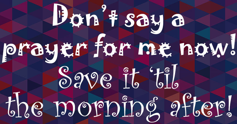
 Fonts used in image (don't use these): Comc Sans, Papyrus, Curlz MT, Scriptina.
Although they make it easy to help people in the
What Font Is This group on Facebook, there are some fonts that are seriously overused. I touched briefly on Comic Sans and Papyrus in a previous post, but there are a lot more fonts that fall into the ultra-common category for the simple reason that they’ve come standard on a lot of computers in the last 10 years: Curlz MT, Mistral, Rage Italic, Algerian, Balloon, Segoe Script, Brush Script MT, Cooper Black, Bradley Hand ITC, Impact, Vivaldi, Copperplate Gothic, Trajan . . . the list goes on and on.
There are also fonts that have been freebies online for a long time, which also means they’ve been around long enough to be overused: Fontdinerdotcom, Bleeding Cowboys, Scriptina, Hobo, Amatic SC, Trashhand, Lobster, and a lot of the Kimberly Geswein (KG fonts) and Misti’s Fonts (MF fonts) catalogs.
That’s not to say I don’t use these fonts! I think Trashhand (which is the free all-caps version of the paid font Verveine) pairs with tons of stuff really well, as does Amatic SC. And there are some fabulous KG and MF fonts out there! But every creator should be warned that if they make a free or pre-loaded font the star of their project, they’re running a very real chance that buyers will feel that their products look stale, common, or too familiar.
This is why bundles are such a boon – they let you get a bunch of varied paid fonts for a much lower price than buying those fonts separately, and they can quickly help to build a font library where your only choices are fonts that everyone else uses. (And I’m not just saying that since I’m writing this blog for a bundle site! I’ve been a bundle buyer for years, since long before I started writing or selling here, and they’ve helped me phase out my use of more common fonts for other stuff that looks just as good, but isn’t as easy to find everywhere else out there.)
4. TOO MANY FONTS
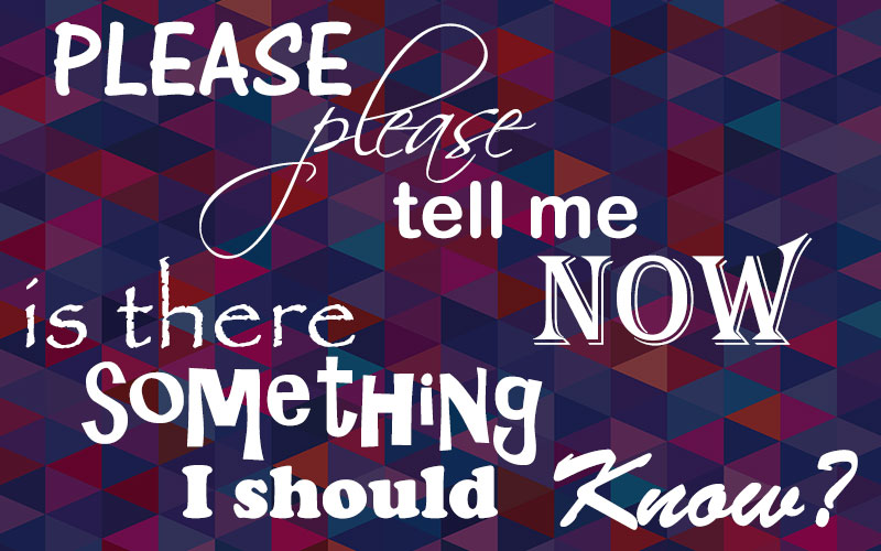 Fonts used in image (again, don't use these): AR Cena, Scriptina, Arial Rounded, Algerian, Papyrus, AR Christy, Cooper Black, Brush Script MT.
In the “Using Common Fonts” image, I used four fonts. Which was already too many. Here, I’ve used eight. (And again, I’ve used a ton of common fonts for this.)
For most projects that involve fonts, fewer is always better. Most graphic designers will tell you to only use two fonts. (Three if you’re
really careful, and
really good at knowing what goes with what.)
A big part of the problem is something we discussed in
the post about paring fonts: you want to use fonts that have a similar mood when you’re using more than one, but you want them different enough to stand apart. If you use more than two or three fonts, you’re pretty much bound to break at least one of those guidelines. If you use multiple handwriting fonts, for example, some of them are bound to look kind of similar to each other, which gets you into the territory of people wondering, “Did they think that was the same font, and just make a mistake?” Or if you use a bunch of fonts that are clearly different from each other, you’re bound to use some that have clashing moods or time periods.
I challenge everyone out there with a design that includes more than two fonts to whittle it down to just two, and see how it looks. Use a fancier/larger/bolder one as the hero, for the important words. Use a plainer/smaller/neater font as the sidekick, for all of the supporting words. I guarantee you, it’ll look cleaner and sharper, and it’ll sell more.
5. BAD SPACING

There are three different ways that spacing can go bad. (And I’m using Arial in all of these, too):
A. Kerning: On the top line, you can see that there are gaps between some letters so wide you could drive a truck through them. Look at the W and A of “WAY” for example. Letters with angles will never sit neatly together without a little adjustment, because there’s an invisible rectangle around each letter that touches the very outermost points of every letter. So the top right point of the W is a corner of its box, and the lower left point of the A is a corner of its boundary box. When some of those boxes sit next to each other, due to the angle of the letter's strokes, those invisible boxes need to be overlapped.
Some fonts come pre-kerned, while some need a little extra adjustment from you. Whenever you type anything using the pre-programmed kerning, squint your eyes and look at it blurry. (Or just take off your glasses.) Look for any large gaps between the letters, and manually adjust. It makes everything look more professional.
B. Tracking: Tracking is also a way of adjusting horizontal spacing between letters, but while kerning deals with the single space between two letters, tracking applies to an entire line or paragraph of text. In the middle line here, I’ve increased the tracking so the letters sit quite far apart; in the bottom line, I’ve decreased the tracking so that the letters are sitting on top of each other. Now, picture both of those used together in the same design. Ugh, right?
Most fonts (besides script fonts, see sin #2) can have their tracking adjusted somewhat. Just don’t space the letters so far apart that they don't seem to be part of the same word anymore, or too close that they’re cramped. And try to have a uniform tracking scheme throughout a project.
C. Leading: This is the vertical space between lines. In the top part of this example, the two lines are awkwardly close to each other, giving things a cramped and uncomfortable feeling. Then in the bottom half, the lines are weirdly far apart, making those lines seem disconnected from each other.
Most software has an automatic setting, where it figures out what a good, comfortable amount of leading is. You can definitely adjust it, but do so with a careful hand and good judgement. (Weird fun fact: the word
leading is pronounced like
bedding, not like
feeding.)
To celebrate bad spacing, here are three of my very favorite images from the internet:

Oh, FLICK and CLICK. Two words that will always be dangerous when it comes to putting letters too close together. Also, the name CLINT and the word AUNT can be dangerous in the wrong hands. :)
6. DECORATION OVERLOAD
 Font used in image: Adorabelle. Apologies to the designer for what I’ve done.
Some fonts out there have alternate letters with flourishes or swashes attached. Some fonts out there, like the lovely Adorabelle here, have TONS of options for alternates. (I just looked, and this font has something like 10 alternate versions for every lowercase letter. Epic!)
But just because you have all of these alternates at your fingertips, it doesn’t mean you should use them on every letter. If you do, you'll end up with something as unreadable as the awful thing I've created here.
As with so many things,
less is more. Use just a few well-placed alternates, flourishes, or swashes for emphasis; your piece will be far cleaner and easier to read.
7. CHOOSING THE WRONG FONT

I’ve picked a slow song for this example. A slow, moody, romantic heartbreak song. So I figured Jokerman and Curlz would suit it perfectly!
Just like you need to match moods when pairing fonts, you also need to match moods when choosing a font for your project. Heavy subject matter shouldn’t have a goofy font; likewise, light subjects like baby Onesies or toddler sippy-cups just look wrong with a serious serif font. Or a greeting card for your drinking buddy compared to a greeting card for your grandmother – even if the sentiments are similar, you’ll want to choose a font to match the mood and specific subject matter. (Unless you’re fine to send your grandmother a “Merry Christmas, ya filthy animal” card. What do I know? Your granny could be raunchier than anyone else in the family.)
8. BONUS SIN: NOT PROOFREADING
I had to throw this in there, because I’ve seen quite a few misspelled or poorly punctuated things lately. We recently had a discussion on the
Fonts and Typography group over at Facebook about using apostrophes in plural last names, like on a “The Johnsons” ornament (no apostrophe). And I posted a reminder a little while back about where the apostrophe should go in the phrase
’Tis the Season.
If you aren’t sure about the spelling of a word, or punctuation of a phrase, never be afraid to ask! There’ll always be someone like me around, with a copy of
The Chicago Manual of Style on my desk and a huge list of helpful links at hand. At minimum, know that you can copy your phrase into Word, and it’ll give you red or blue squiggly lines to let you know that something might be off.
Also, I know that there are a lot of font creators out there whose first language isn’t English, and they’re making promo images in English. I have nothing but respect for the work they’re doing, but by not having a native English speaker take a look at their wording, they’re losing potential sales.
Recently, I’ve seen the following phrases in font promo images:
TROUGH SHE BE BUT LITTLE, SHE IS FIERCE.
(A difference between
trough and
though.)
It’s OK! all be find.
(I’m guessing they were going for “I’ll be fine.” And a new sentence should start with a capital letter.)
MERRY
CHRIS-
TMAS
(When hyphenating, break the word apart between syllables. Many of us don’t clearly pronounce the T in
Christmas, but it feels logical that you wouldn’t break up the “Christ” part of the word.)
So there they are, my deepest, darkest font sins. Have I committed them myself? Yes, of course! None of us are without font sin. But by pointing them out, I hope I can help make your projects and products cleaner, neater, easier to read, and most importantly, better-selling.


 Font used in image: Angelica; apologies to the designer for what I've done.
 Fonts used in image (don't use these): Comc Sans, Papyrus, Curlz MT, Scriptina.
 Fonts used in image (again, don't use these): AR Cena, Scriptina, Arial Rounded, Algerian, Papyrus, AR Christy, Cooper Black, Brush Script MT.

 Font used in image: Adorabelle. Apologies to the designer for what I’ve done.