
We’ve talked in the past about pairing fonts, but the examples in that post were all shorter phrases. I figured it was about time to go over some basic techniques on how to lay out a larger phrase.
The first thing to keep in mind is one of the key takeaways from the pairing post: don’t use more than three fonts, and two is almost always better. One font will be the hero, and you’ll put the important words in that font. The other font(s) will be the sidekick(s), and will take care of the less-important words in the phrase.
How do you know what words are important? Just read it out loud to yourself, and see what words you emphasize. The articles (a, an, the), conjunctions (and, but, or), and prepositions (to, by, with, for, etc.) will likely all be support words.
You’ll also want to make sure you’re keeping the right words together:

In this example, the first option is broken apart in really weird places. The eye wants “cheese nachos” to stay together, because they’re a unified item. Likewise “cold beers” – those two words are working together in the sentence, so they should stay on the same line.
The second option breaks the words up in a much more natural way. (You could even break things up more by putting I ordered and a plate of on separate lines.)
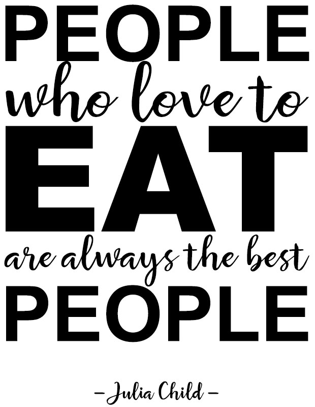
The first actual quotation we’re going to work with in this post is from the great Julia Child: “People who love to eat are always the best people.” Let’s take a look at the words we’re working with.

Here it is in Arial, both in all-lowercase and all-uppercase. Totally boring, right? Right. And in both, every word has the same weight and importance, which adds to the boring feeling. So let’s figure out what words we’re going to emphasize. Arguments could be made that the important words are: people, love, eat, always, best, people. Everything else is filler.
I’m going to choose people, eat, and people as my emphasis words, just for the purpose of this exercise. So first off, let’s see what we can do with just plain old Arial as our font:

Here I’ve used different weights (Arial regular, bold, and black), as well as uppercase for my emphasis words and lowercase for my support words. I’ve sized every line so that they’re the same width (but keep in mind, stretching a font is a crime against fonts; if you need something wider or narrower, choose a different font).
It’s definitely more interesting to look at than the plain versions, but … not by much. There’s a limit to how thrilling Arial can get. So let’s mix it up, and pair Arial with a script font, Ganache.

In this version, I’ve put the key words in Ganache, and the support words in Arial, which is a good way to work your pairing – important words in the hero font, everything else in a simpler supporting font.
It’s better than all-Arial, but I have personal issues with how much white space there is between the lines – especially below the first people and above the last people. It’s because the Arial in all-uppercase is uniform in height, but the script font has those pesky ascenders and descenders that need some breathing room.
So let’s turn the tables, and have Arial be the hero font, with support from a script font.
Here I’m pairing Arial with Rosaline. And while I think it’s the best so far, it has a major problem to it:
If you step back and look at this quickly, all you see is: “people eat people.”
Since Julia Child wasn’t into cannibalism (THAT WE KNOW OF), I don’t think that’s the message she’d want to send. Clearly, my choices of key words weren’t very good to begin with. So let’s switch it up: we’ll keep the pairing of Arial and Rosaline, but we’ll focus on a different set of keywords. This time, I’ll emphasize love, always, and the final people.

This time, Rosaline is the hero font, with Arial as the sidekick. And I think this works much better than the other layouts.
If you look close in this one, you can see a few places I cheated in order to make things fit better. First, I added an extra space between to and eat, in order to make space for the L in always to squeeze in.
That helps with the white space issue – now there isn’t a bunch of emptiness above always, because it’s able to get closer to the line above.
I’ve also made always a little shorter, and people a little longer, so that the descender of the Y and the ascender of the L don’t overlap each other. As it is, they’re still a little too close for my taste. And I shortened the best to fit into the space that was left behind.
Let’s move on to another quote and see what we can do with it. This time, we’ll quote Truman Capote: “Failure is the condiment that gives success its flavor.”

And again, here it is in plain old Arial. I’ve put the potential key words in uppercase, and the support words in lowercase.
For the Julia Child quote, we kept everything relatively straight-across and on the level. For this quote, let’s start adding in a few different quirks:

This layout is still all-Arial, but at least it has a little more visual interest. I’ve stacked the two little support words is the on top of each other, and I’ve turned its on its side. Everything’s been squared off again, and the way I’ve added emphasis to the key words is by setting them in a heavier weight of Arial (either black or bold).
Turning words on their sides, or stacking them, can be tricky when laying out text; you want to be sure that they’re always in an order that’s easy to read. I’ve seen some especially difficult-to-decipher layouts where an ampersand was put in a convenient place, instead of where the reader’s eye would naturally travel.
So, for example, instead of “peanut butter & grape jelly,” everyone who saw it read it as “peanut & butter grape jelly.” Which would be a totally different product, and possibly one that I would buy and eat an entire jar of. Don't judge me.
Now that we’re thinking about taking some of the support words and tweaking them a little bit, let’s step entirely away from Arial. I’m getting tired of it, and I bet you are too.

Here I’ve put the same phrase in Secret Words Display and Secret Words Script. The two fonts come as a duo, so the designer intentionally created two fonts that would work well paired together. If you’re ever uncertain about pairing, check out a pre-made duo – odds are, the fonts will work beautifully together.
I’ve even been able to use both fonts for the big keywords, because I’ve made the support words so much smaller. I’ve stacked the is the again, but down with condiment. They curl around the descender of the F in failure quite nicely, so we don’t have to worry about a big bunch of white space.
I also knew that the words that gives should be smaller, so I did two things: I capitalized success below so that the first S could take up some room, and I increased the tracking in the words that gives. With a little more breathing room between all of the letters, you can make those letters shorter (and you haven’t resorted to stretching anything).
You may wonder why I don’t always include punctuation in these layouts. While I would always include proper commas and periods when writing something like this blog post, I find that quotes like these don’t always need their punctuation. There’s an understood period at the end, even if you don’t include it.
And if you break your lines in the right places, you can give the reader that same pause-for-breath that a comma would give, without needing the comma. Though remember, like with the cheese nachos and cold beers from the beginning of the post, you should keep an eye out for breaking your sentences in the right places.
Our last quotation is from W.C. Fields:
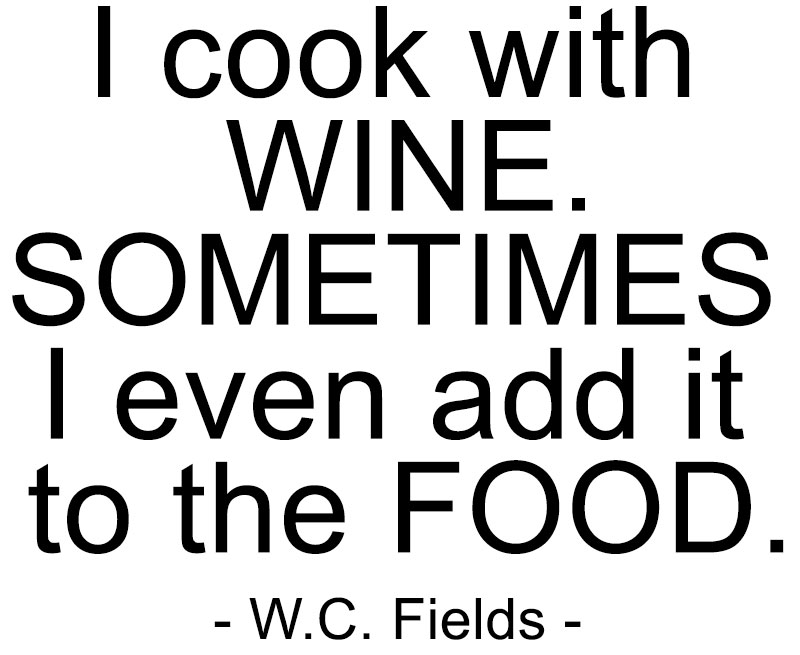
Again, BORING. And again, I’ve put my possible key words in uppercase, and the support words in lowercase, so you can see where my head's at.
We’re going to start with a square layout, pairing Wolder (the hand-drawn sans-serif) and Carissa Wellington (the script):

As a square layout, this just isn’t going to work. Carissa Wellington’s ascenders are so tall, it adds a huge, awkward amount of white space above the word food.
So what can we do? We’re going to finally break out of square layouts, that’s what we’ll do.

This is a much more fluid layout, and it still kind of fits into a rectangular shape. Kind of.
I’ve made the support words between wine and food a heck of a lot smaller, so they can all nestle into that white space created by the ascenders. Then I made the I cook with around the same size so that it wasn’t weirdly large compared to the other support words.
I placed them off-center so that the tittle of the I in wine falls between the words cook and with. I could have also moved those first three words to the right, so that the tittle was centered inside one of the Os. Lots of options!
We’re still working primarily with straight lines of text here. So let’s break up those support lines:

Now, I’m not going to say that this is the greatest layout ever made, because I’m making them at a certain speed for this blog post. But you can see what I’m going for here: by breaking up the words into shorter bits, you can stagger them, stack them, and arrange them to be more visually interesting.
Here, I’ve also changed sometimes into a key word, by putting it in the script instead of the sans-serif. And note: even though the three sets of support words tucked above food don’t all share a left margin, the eye still reads them in order because of the way they’re stacked. You don’t read add it first, even though it’s the farthest to the left, because I even is above it.
I’ve also included a swash from Boucherie Ornaments after the word wine to add a pause here, but I think a better way to add that pause would be to add a lot more space between the first half of this phrase and the second half.
How to add that space? Add another visual element! These phrases are all fairly staticin plain black on a white background, so let’s put the quote over a picture.

Ah, much better. Now we could frame this and hang it on the wall! Having something more than just the text can really up the visual interest, while still guiding the viewer’s eye to the quote. I got this image from Unsplash, which is a fantastic resource for royalty-free stock photos; you could also add an icon, or illustration, or other graphic element between parts of your text.
So there you have some very, very basic basics on laying out text. Just remember: no more than 2-3 fonts, pick your important words and put them in the hero font, and let everything else serve as support.
Oh, and – don’t use Arial too much. SNOOZE FEST.

DTF Troubleshooting Guide: How to Fix Common Problems & Get Perfect Results Every Time

Ask a Font Creator: Stitch Text Effect in Inkscape and Illustrator

Let's Judge Books by Their Covers!