
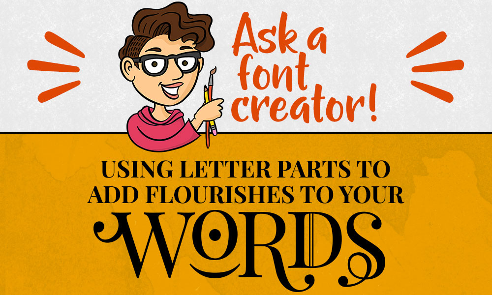
Greetings, font fans! Today I’m going to get into some fun tricks you can do in a vector-based program to really jazz up a plain font. We’re basically going to chop up some letters and stick parts of them to other letters to make Frankenletters. Though, to be technical, Frankenletter was the doctor. These will be Frankenletter’s monsters.
We’re going to use a vector program for this because once the letters in a font are turned into vector objects, you can monkey with them all you want.
My examples were created using Adobe Illustrator, but you can do everything just as easily if you’re familiar with the free Inkscape program – the commands you’d use would just be a little different.
I’m going to be creating the word “WORDS” that I used up in the main image. Here’s our starting point:

I’m using the fabulous free Playfair Display font, for a couple of reasons. First: free. Second: it has a ton of alternates available, like small caps. Third: it has really nice ball terminals.
Get your mind out of the gutter. “Ball terminals” are totally a thing. It’s where the stroke of a letter ends in a ball. Look at the top of the lowercase C in the next image.
I’ve put some thought into the elements I want to incorporate in my word, and typed out the letters I’m going to be using for my word art:
I’m using the regular uppercase W, R, and S. The O isn’t actually an O – it’s a zero. This font has what’s called Oldstyle Figures, which is where the numbers are tall and short like lowercase letters, instead of all the same height as uppercase letters.
So this is a shorty zero. I could have used the lowercase O, but this zero was a little more rounded. The D is from the small caps set: uppercase-looking letters at the height of lowercase letters.
I’m going to be using pieces of the lowercase C, the ampersand, and one of the parentheses as well.
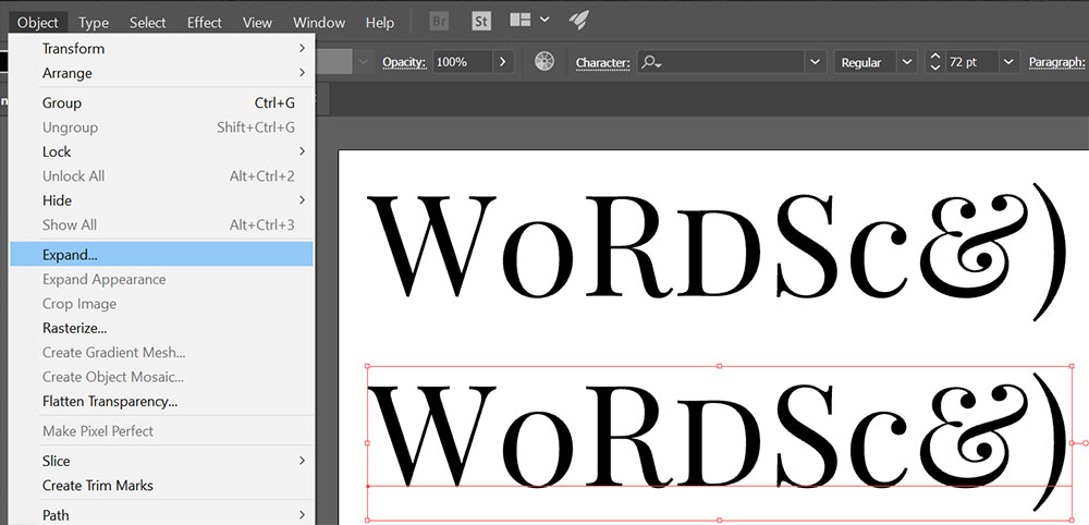
My first step is to expand these letters so that they become vector objects instead of letters in a font. In Illustrator, select your text and then go to Object—Expand.
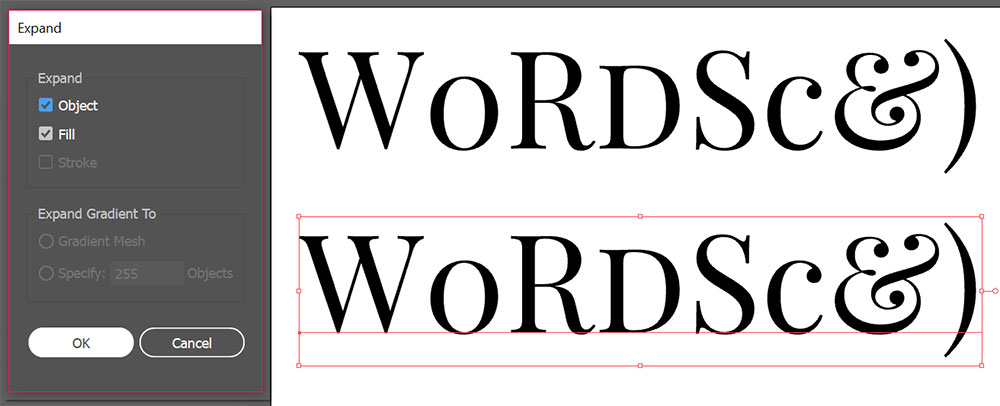
It’ll give you a pop-up box with the Expand panel. I leave both “Object” and “Fill” boxes marked, and just hit the OK button.
This transforms your font letters into vector objects, made of points and lines. Next, you’ll need to ungroup them:
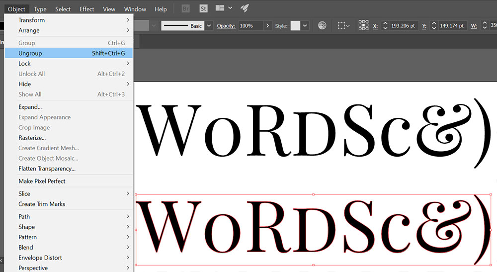
By either using the keyboard shortcut of Shift+Ctrl+G (on a PC) or going to Object—Ungroup in the menu. This frees up every letter so you can move them around independently, instead of having one big grouped mass of WORDSc&).
You might have noticed that I have two copies of the letters I’m working with here. Remember, I’m a fiend for keeping a backup copy of things I’m working with, but that goes double when you’re doing this kind of editing. Always keep a backup. Work with a copy, not the original.
All right. Now that we have our letters as vector objects, let’s make some modifications! We'll start with the R.
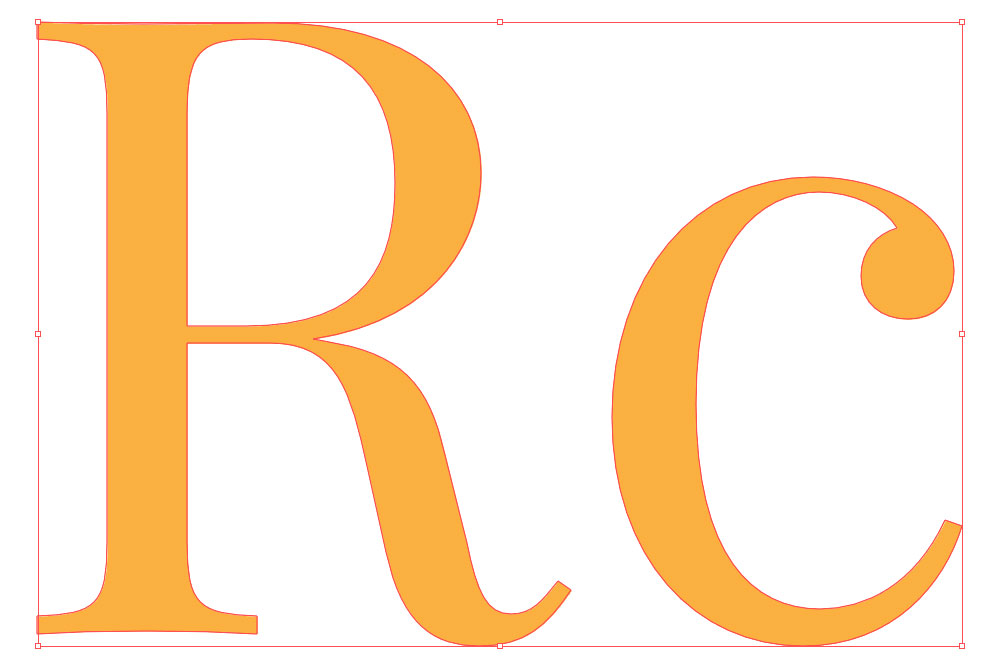
I’ve made a copy of the R and the lowercase C (which I’ll be chopping up for spare parts). I’ve also changed the color of the letters to something a little lighter – I find it’s easier for me to see my points and lines when they aren’t on harsh black.
First, I’m going to flip the C upside-down:
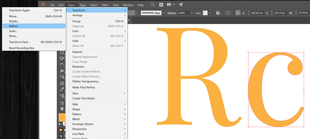
I’ll do that by going to Object—Transform—Reflect in my menu…
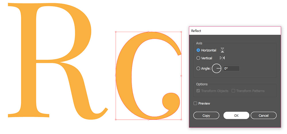
And choosing the “Horizontal” option. As you can see, this flips the C upside down, and puts that fabulous ball terminal just the way I want it, in order to graft it onto the leg of the R.
Now, let’s start chopping up that C:
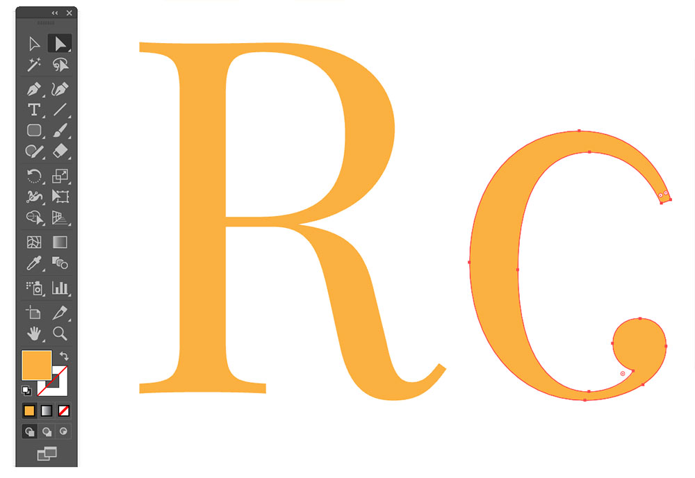
I’ve used the Direct Selection Tool (the white arrow in my toolbar, top right) to select the C, which makes all of the points show up. Now I’m going to remove some of those points:
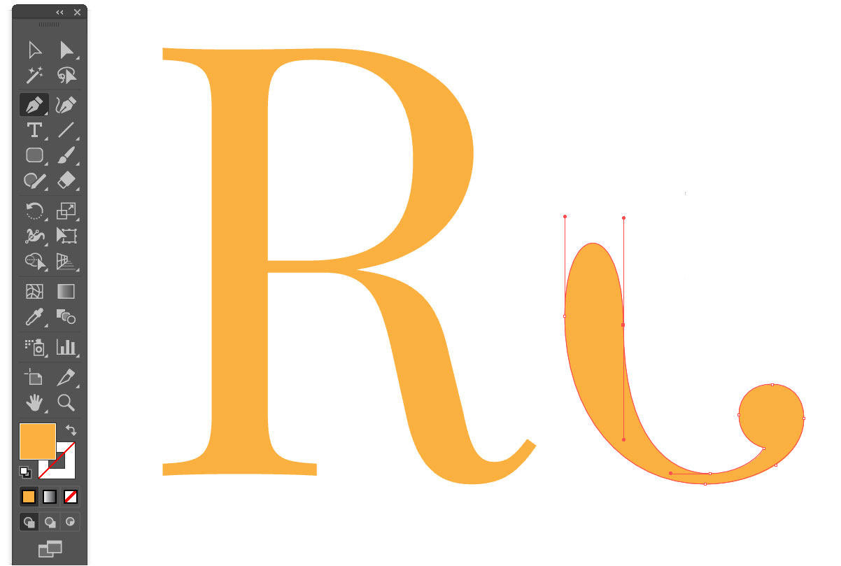
I’m doing the deleting by using the pen tool (in my menu, it’s the third icon down on the left). If you hover the pen tool over a point, you’ll see a little minus-sign appear next to the pen tool. If you click on a point with that minus-sign showing, it will delete the point.
I’ve chopped off the top half of the C, leaving only the part I need. Now I’m going to graft the letters together.

First, I rotated the bottom of that C just a little bit counter-clockwise, so it’s at roughly the same angle as the leg of the R. You can see that the overlap isn’t perfect, but that’s OK. Once these two are merged, we can get in there and do some editing.
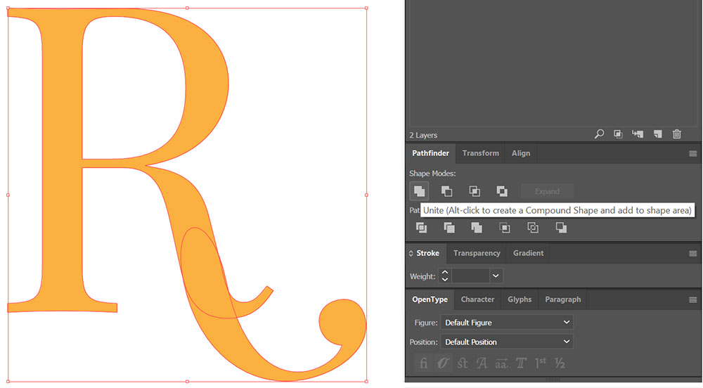
To merge the two shapes together, I’m using the Unite feature in the Pathfinder panel. To get to the Pathfinder, you can click on Window—Pathfinder in your menu, or use the shortcut Shift+Ctrl+F9 (on a PC). I use the Pathfinder panel so much, it has a permanent place in my right-hand set of always-open panels.
Now that the R and its new fancy tail are united into one shape, we can do some manipulation of the points and curves. Once again, I’ve used the Direct Selection Tool (white arrow) to select the R so that I can see all of the points.
Then I’ve used the pen tool to delete the points I don’t want. Finally, using that white arrow, I can move points and handles around to adjust the curves, so that the two shapes become one smooth unit.
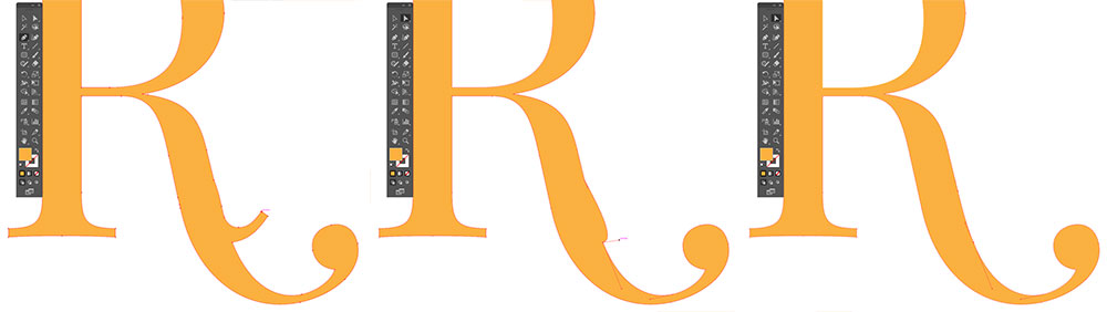
Here are some other things you can do with that very same chunk of the lowercase C:
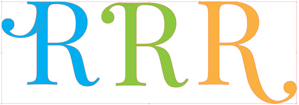
For the blue and green ones, I’ve left the pieces overlapping so you can see how much of the C got used. The blue version is exactly how I embellished the W in the final “WORDS” piece.
Next up, let’s modify the heck out of this S. I did it in two parts.
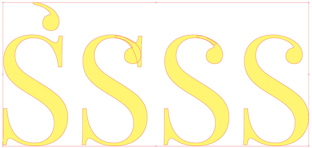
The first part was adding the ball terminal to the top of the S. Here you can see how very little of the C is left – just the ball itself and a little bit of the stroke.
I rotated it a little bit to get the curve on that little bit of stroke to match the curve along the top of the S. Then I removed the points that made up the serif on the S.
I placed them as close as I could on each other, used Unite in the Pathfinder panel to merge them, then smoothed out the curves.
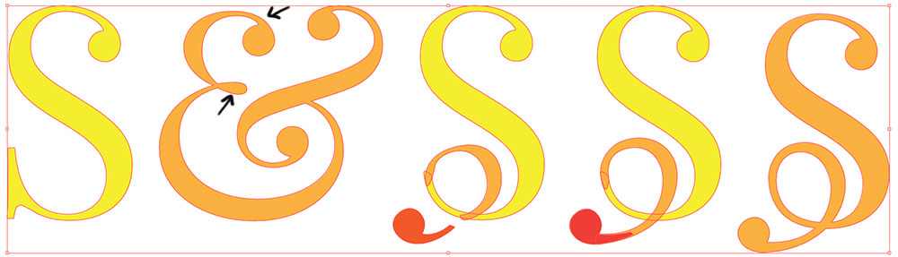
The next part was the most complicated. I chopped up the ampersand to get two pieces to add to the bottom of the S. One piece was the top curve (between the two black arrows).
I chose this piece from this character because it was just about the right size to fit down in the S. I also grabbed one of the ball terminals from the ampersand.
This one took quite a bit more adjusting and tweaking. And you could always create these extra curves by hand, but I like using parts of other letters primarily because they’re going to have similar curves and line weights.
By starting with those similar pieces, I’m a lot more likely to get a modified letter that looks like it belongs with the set.
The rest of the letters are fairly easy in the final piece. I didn’t resize the O (which is actually a zero) or the D at all.
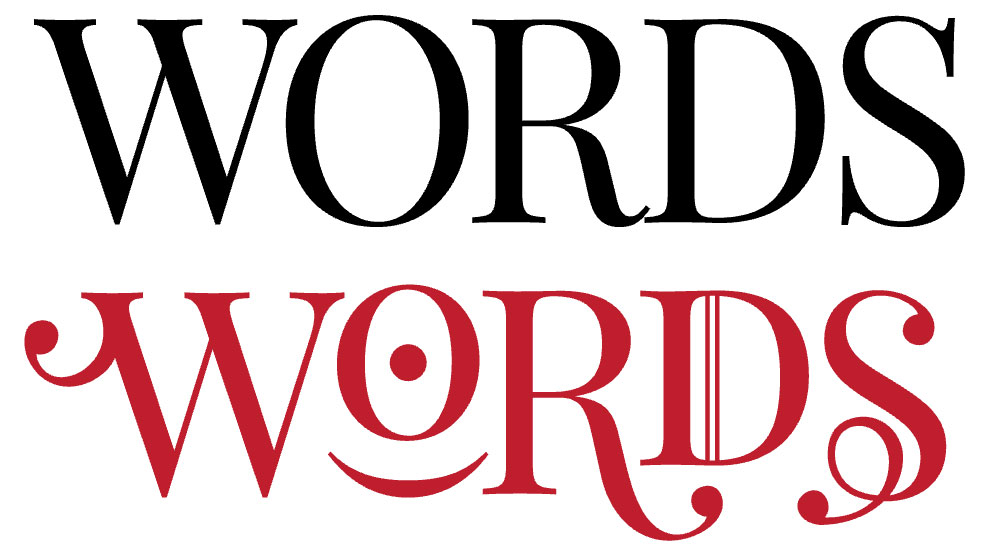
I put a period inside the O, and turned the parenthesis 90 degrees and resized it to fit underneath. It kind of looks like a smiling one-eyed monster now.
As for the D, I added a couple of lines to it, just so it wasn’t feeling left out that I didn’t make any changes to it. You could either hand-draw them, or use a built-in character. (I used the bar character, which shares a key with the backslash on your keyboard.)
So there you have it! Get out there with your vector program and modify your text to make it cool and uniquely yours. The most important advice I can give you is to start with a font that has elements you really like – it not only makes the work more pleasant, but it gives you more options for fun things you can do.

DTF Troubleshooting Guide: How to Fix Common Problems & Get Perfect Results Every Time

Ask a Font Creator: Stitch Text Effect in Inkscape and Illustrator

Let's Judge Books by Their Covers!