
Today is the first of a two-part post on vocabulary (because there’s WAY too much to cover in just one post). I’m going to go over a few basics, and then get into font categories and styles. Being specific with categories and styles helps immensely when searching for just the right font for your project, so you aren’t spending ages digging through piles of stuff you don’t want to find that one needle in the haystack. Next week we’ll get into the anatomy of the letters, as well as what the various OpenType features mean and how they change your letters on the fly.
 Font in this image: Roughland
We’re going to start very basic, with a pair of words that mean different things, but (and some designers may cringe to hear me say this) for most people, basically mean the same thing. Let’s go back to the printing press days: printers would have huge boxes full of metal letters, which they’d arrange on the press. The letters would be in a specific style (the typeface), and at a specific size and weight (the font). So Times New Roman would be the typeface, while each separate box full of metal letters (size 10 bold, or size 14 italic, or size 20 regular) would be a font.
Today, however, we don’t carry our letters around in boxes. In the digital age, the file you buy contains both the typeface and all of the fonts you could ever want, all in the same electronic package. So it’s at the same time both a typeface file (because it contains all of the letters in specific shapes) and also a font file (because it contains all of the letters in specific sizes). The age of computers makes it hard for a lot of people to know when to call something a typeface versus when to call something a font. If you really want to get down and dirty on the differences, it’s a research rabbit hole, and I could spend hours falling down it. But just know that whichever term you use, even a stickler will know what you mean.

Oooh, another deep rabbit hole here, so I’m going to oversimplify the heck out of it. And once again, I’m going to horrify designers out there by telling you that for all intents and purposes, these are pretty much the same thing. I mean, they all have their own meanings, but I could refer to an uppercase A as a letter, as a character, and as a glyph, and I’d be correct all three times. Here’s a little finer detail on the differences:
A lot of fonts will refer to “extra characters” or “extra glyphs” in their description, which could both be referring to the same things: alternate letters and numbers, or letters with swashes on them (we’ll cover some of these terms next week), or dingbats and ornaments (see below). But just like font/typeface, a lot of creators and designers alike will use the terms character and glyph interchangeably.

A lot of fonts you download will have two files included: one will end in .TTF and the other will end in .OTF. You may wonder, should you install them both? Or just one? If just one, then which one?
I’ll always advise you to install the OTF file. Both files should (hopefully, if the designer is doing their job right) contain all of the same characters, so there isn’t a difference there. The key is that OTF is a newer format, and a lot of font-using programs include ways to access the OpenType features much more easily. We’re going to go over a lot of OpenType features next week, so you can see some of the cool stuff designers are able to code straight into their font files. But for now, just know that TrueType (TTF) is like a rotary phone, while an OpenType (OTF) file is more like a cell phone. They both make calls just fine, so if that’s all you want to do, either will work just fine. OTF just has more bells and whistles under the hood, and can do extra things like let you play Candy Crush Saga. (What? I'm on level 1555. Can't stop, won't stop!)
Now we’re going to launch into some vocab words for the categories you’ll find fonts in, and some styles that will help you more easily find the kinds of things you’re looking for. In a couple of weeks, I’ll be posting about pairing fonts, and we’ll be coming back to these terms a lot to see what categories go with what other categories. (I’ll also be identifying all of the example fonts throughout, many of which are available here on FontBundles.) Also, bear in mind that a font may fall under several categories at the same time.
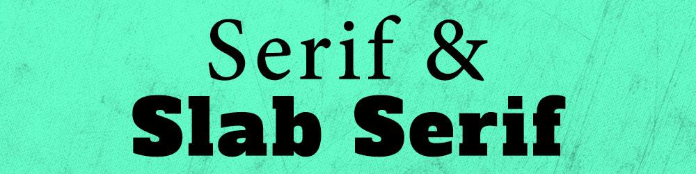 Fonts used in this image: Minion Pro, Alfa Slab One
Serif: In a serif typeface, the ends of the letters have small lines (which are called serifs) at the ends. Serif type is (generally) seen as a little more fancy, upscale, and elegant. Most designers would tell you that a serif font is the easiest kind to read (the serifs lead you from one letter to the next), which is why most books are printed in serif fonts. (The one above, Minion Pro, is the one I use in the print versions of my books.)
Slab Serif: While the serifs on regular serif fonts tend to come more to points, and are generally more delicate-looking, the ends of slab serif letters are more blocky and square. Slab serifs are generally heavier and darker than their plain serif cousins, and can be a little more fun.
 Font used in this image: Branding Medium
Sans-Serif: In French, sans means without. So it probably won'tsurprise you to hear that a sans-serif typeface is one that doesn’t have serifs at the ends of the letters. For some font families that come with both a serif and sans-serif version, literally the only difference is that the serifs have been removed; otherwise it’s exactly the same. For design purposes, sans-serif is usually a great safe choice for any project. It’s seen as a little less stuffy than serif, easy to read, and just generally nice. It's like the saltof styles: not that exciting, but good with everything.
 Fonts used: Rosaline & Brenda Script
Script: This is a huge category and covers tons of different styles, but generally, script fonts will have connecting letters. They could be thick or thin, tall or squat, elegant or messy.
Calligraphy: A subset of script, calligraphy is usually very uniform, and can look more machine-made than hand-made. (Though there are some totally elegant calligraphy fonts out there that look like someone wrote them with a fancy ink pen.) The lines in calligraphy tend to be thinner, and sometimes (but not always) the letters will be taller and narrower.
 Font used: PlainBlack Incised
Blackletter: Sometimes also called Gothic or Medieval, this category is based in the writing styles used in manuscripts back in the way olden days, from the 1100s up into the 17th century (and was used in German up into the 20th century). The letters are full of beautiful details, but can also be difficult to read.
 Font used: Courier New
Monospace: There are a ton of monospace fonts out there, but usually the first thing people think of when they see it is: typewriter. All of the characters in a monospace font take up exactly the same amount of horizontal space – you could stack them vertically and their sides would all line up perfectly. This typewriter style above is a monospace serif font, but you can find monospace fonts in almost every other style or category on this list (yes, including script).
 Font used: Blackfat
Display: Another category that encompasses tons of other styles, display fonts are ones that aren’t meant to be used for tons of text – they’re built for big, showy words. Looking at the example above, you wouldn’t want to read an entire book set in that font, but it’d make for awesome “Chapter 1” headers, as well as a cool cover.
 Font Used: Gumption
Dingbats / Ornaments: Some fonts are made up entirely of dingbats and ornaments (like the classic Wingdings, which has come with every PC I’ve owned for the last 20 years), while other fonts contain a selection of dingbats or ornaments as extra bonus glyphs in addition to the letters, numbers, and other standard characters. A sub-category of ornaments is Catchwords, where common short words like and and the are created small as separate characters. Another sub-category is Flourish—flourishes are usually not letters themselves, but are swirled, curved, or curled lines that either connect with letters or can be placed above or below your words.
Note: most of these styles fit into at least one category above; some fit into more than one. I’ll try to make notes of those for the examples.
 Font Used: Minion Pro
Regular/Roman: This is the “normal” setting for most fonts. Nothing special done to them. (Roman is an odd bird – to some designers, it means the same as Regular. To other designers, Roman means a serif typeface, while Grotesque or Grotesk refers to a sans-serif typeface.)
Italic: Many serif and sans-serif typefaces have an italic version, which is a stylized, more script-like version of the font, usually skewed around 10 to 15 degrees to the right. Some fonts also have a few slightly different versions of letters in the italic set, if a skewed version of the regular letter doesn’t quite fit or look right. (Check out that lowercase A for an example: totally different.)
Bold: Another way of emphasizing type, bold versions are also found in a lot of serif and sans-serif fonts. The lines are thicker all around. There are also less bold styles (SemiBold), super duper bold styles (Black), and some fonts will give bold their own name that implies more weight (Fat, Heavy). In contrast, some fonts will also have much thinner versions with skinnier strokes (Light, Thin, Hairline).
 Font Used: Paduka Script
Handwriting: Sometimes also referred to as Hand-Lettered, a handwriting font is (frequently) a script or calligraphy font meant to mimic handwriting (as opposed to script fonts with precise, uniform line widths). This is a hugely popular style these days, and can cover a ton of categories besides script – anything from serif to blackletter can be done in a hand-made style.
 Fonts Used: Endless Sorrow & Steelworks
Retro & Vintage: This is another area where we could fall down a rabbit hole, because there are soooo darned many different styles here. I’ve given a ’50s serif, as well as a woodcut-looking sans-serif, as examples – these are two vintage styles that are really hot right now. If you’re searching for a certain look, you can be really specific with your search terms. You can break it down by decade (’70s or ’80s, for example) or by mood (groovy, hipster, disco). You can even search for art and architecture styles (art deco, Bauhaus) to narrow down your choices.
 Fonts Used: Airpena & Black Heat
Tuscan & Western: Sometimes also called Cowboy or Circus fonts, these are styles that feature either fishtail-like serifs, triangular bump-outs along the sides, or both. These fonts run the range from plain and simple to incredibly intricate, with cutouts and decorative flourishes inside every character.
 Font Used: Mooglonk
Monoline: Sometimes also called Monoweight, the lines in these fonts are the same weight throughout. They don’t have the contrast between thicker and thinner lines in each letter. You’ll find some script fonts in monoline, like this one above. Monospace (typewriter) fonts also lend themselves to a monoline weight, although there are many monospace fonts that aren’t monoline. You can also find a ton of monoline sans-serif typefaces out there.
 Fonts Used: Hemingwar & Tingler Script
Stencil: These fonts are great for crafters, especially paper cutters and vinyl cutters. A stencil font doesn’t have any closed-in areas, like in the letters O, D, B, etc.—they all have openings so that the white space surrounding the letters and inside the letters is all connected. The majority of stencil fonts are sans-serif, but there’s a growing number of more options as creators keep their crafting friends in mind.
 Fonts Used: Scratchbook, Megiline, Asfalto
Unicase: Squeezing more than one into an image here! Unicase means that all of the letters (both uppercase and lowercase) are at the same height. In a lot of unicase fonts, they’re also all mixed in together – the uppercase E may look like a tall version of a lowercase e. These are usually fairly fun and quirky display fonts.
Comic: Most comic fonts also fall under the Handwriting style. They’re made to look fun, like the writing in a comic book or the handwriting of a child. Comic fonts can fall under several categories, but most I’ve seen are usually sans-serif. A lot of them will come in uppercase only (though some of those will put a second, slightly different set of uppercase characters in the lowercase letter spots).
Grunge: Another style that can fall under any category, these are the fonts that come pre-distressed with streaks, spots, blotches, and other errata built in. They aren’t the best option if you’re cutting a design out of vinyl, but they can look fantastic in print. Many fonts with a grunge/distressed version will also come with a clean, crisp version.
![]() Fonts Used: Bored Regular, Mad Squire
Fonts Used: Bored Regular, Mad Squire
Pixel: This can apply to any font that has an ’80s computerish vibe. They may be made up of individual squares or dots, like the example here, or they may be solid shapes with hard, pixelated edges. They're great for a video game vibe, or a throwback’80s feel.
Geometric: Another hot style right now, these characters appear to be made up of geometric shapes: circles, squares, triangles, and straight lines. Some might call them “hipster” fonts, since they seem popular with the young people (oof, I feel like an old lady writing that). I’ve seen this style used on many indie pop album covers, but also on a lot of really cool t-shirt designs.
I’ll let you catch your breath now. Next week we’ll dig into more vocabulary, including the parts of a letter, and what OpenType features mean (and the cool things they do). I’m hoping with these terms under your belt, you’ll have a much easier time finding the exact font you’re picturing for your project. And remember, you can mix and match these terms to really narrow down your results: try looking for a narrow handwritten grunge font, or a wide bold sans-serif font and you’ll find one.

DTF Troubleshooting Guide: How to Fix Common Problems & Get Perfect Results Every Time

Ask a Font Creator: Stitch Text Effect in Inkscape and Illustrator

Let's Judge Books by Their Covers!