Posted 30th November 2016 •
By Design Bundles

We’ve done a lot of looking at fonts and discussing them lately, so I figured it was time for another post about creating them. In both of my previous posts that talked about making fonts (
Creating a Font from Scratch [using only free tools] and
What’s Your Process?), the fonts that were created had disconnected letters, so there was no need to do any of the additional technical work involved in creating a script font where all of the letters connect.
So let’s remedy that! I’m going to give you a peek into the font I’m working on right now, which is a full connecting script font.
First off, there are many different techniques for creating connecting letters, and every font designer has their favorite. But generally, there are two major ways to make your letters connect. I could get all vocabulary-heavy on you with things like
terminal and
header stroke and
exit stroke, but in the interest of keeping things simpler, I’m going to refer to the two ways as:
tails and
heads/tails.

First, let’s talk about
tails. This is where the right side of the letter ends with a long tail, which then overlaps with the left side of the next letter. Here’s an example from my
Tallsy Smalls Script, converted to outlines so you can see how the letters overlap: the left sides are all flat (or flat-ish), and the right sides all have a tail. Those tails, if you look close, they all end at the same height. So when designing, you know that as long as all of your letters’ left sides match up to that height, the letters will all connect. (I used
bark as my test word here because all this talk of tails had me thinking about puppies.)
This tails technique is used in a ton of script fonts. It allows you to have varying heights of letters, varying length of those tails, and you can get some really fun bounce in there. The drawback of an all-tails script font is that the letters
r and
s can sometimes get weird, especially when they’re starting a sentence. Without a stroke leading into them, they can look wonky if the designer isn’t careful.

That’s where the
heads/tails approach comes in handy. Head/tail hybrids are usually almost the same as tails fonts, but a few specific letters may have a bit of a stroke at the head in addition to the stroke at the tail.
This example is
Aaron Script; as you can see, the lowercase r and s each have a bit of a stroke on the left side of the letter (the head) so that they not only match up with the incoming tails from other letters, but they can also stand more firmly on their own.

So now you may be wondering, “if there’s a
tails style, and a
heads/tails style, why isn’t there a
heads-only style?” Maybe there are some out there, but I’ve never seen them. They’d be kind of weird. Look at these three examples above: I drew one lowercase a, then copied it a couple of times. Put a tail on one, and a full head stroke on the other that would connect, presumably, with a letter that came before.
The problems are: [1] it just looks totally weird, and [2] more importantly, it just isn’t how people write. If you watch anyone doing calligraphy or modern lettering (or even just your own handwriting as you make a grocery list), you’ll see that we tend to write the letter, then draw out a tail.

In this post, we’re going to take the
heads/tails to the extreme: I’m putting a full, long tail on every letter, but I’m also going to put a wee head stroke on every letter, too. (As you can see above, in the test version of this work-in-progress font.) This gives me a couple of really cool features: letters like that lowercase r have their own head stroke, so they can look good starting a word; also, I can get incredibly smooth transitions between letters, like that a flowing into the m.
(The biggest reason, though, is that I very rarely see fonts with full heads and tails on every lowercase letter, and wanted to see if I could do it.)
Onward to construction!

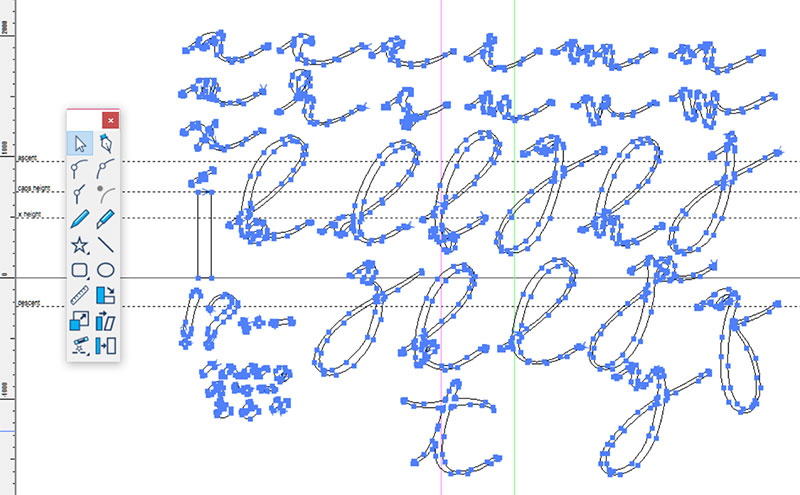
I drew my letters on the iPad (using a drawing app called Procreate, which is totes amazing). The first thing I did was create this totally freaky-looking thing to use as a template, so I could draw all of my letters on a new layer over the top.
I started with the small circle in the middle, which gave me the approximate size of the shorter lowercase letters (like a, c, e, and so forth). I drew a tail from it, then marked a spot across that tail (the purple line) that I thought would be a good place for the head and tail strokes to meet. I copied that shape a couple of times and then lined them all up, so that even when I was drawing only one letter, I’d have the shadow underneath of the letter before and the letter after, so I could make my transitions smooth and uniform.
Then I created the pink ascender, and then copied it and rotated it 180 degrees for the descender. And I put a couple more copies of the original shape off on the left side, just because some letters (like m and w) are wider than the rest, and I still wanted to be able to draw my head strokes and tail strokes consistently for those wider letters.

Here you can see the lowercase b I’ve drawn over the top of the template. You can see that having this weirdo template shape underneath allowed me to make a really smooth entry into the ascender, and a nice exit out into the tail. And even though the bowl/counter of the b isn’t exactly on top of that circle in the middle, the circle gave me a guide as to the relative size and shape of that bowl/counter. (It’s still a handwriting-style font, so I don’t want things
too precise.)

Here are all of the lowercase letters together – I just kept drawing one over the template, then grabbing it and moving it up out of the way. As you can tell, I did all of the shorty letters in a batch, then moved on and did all of the tall ones after that. If I’d done them in alphabetical order, I might not have been able to fit them all on the same page; this way, the short ones all cozy up together, as do the taller ones.
(I also drew up my accent marks and some punctuation here, because I had some room. The rest of the punctuation, as well as all of the uppercase letters, are on separate pages. We’re just going to work with the lowercase for this post, primarily because I’m still in the middle of working on the uppercase.)
If you look up just under the letter x, you’ll see a little line with an even littler line across it. I drew that over the top of my template, just where I'd decided that the tail stroke would meet the head stroke of the next letter, and it’s going to serve as a handy guide in a couple of steps.
The Procreate app doesn’t work in vector, so I saved the page of letters as a JPG, then brought it into Illustrator and used the Live Trace function on it. (This is the exact thing I did in my “What’s Your Process?” post.) Then I saved the entire lowercase alphabet as an SVG file.
I imported that SVG into my font creation program (Type 3.2 by CR8 Software) and resized it. How did I know how much to resize it? Because while I was in Illustrator, I drew a rectangle (just above the exclamation mark and question mark). Then I copied that rectangle into the other SVG files (uppercase and punctuation), so I could resize them all consistently. As you can see here, I’ve lined that rectangle up so that it sits right on the baseline, and just touches the cap height line. I’ll do that with the other files full of letters, and that way I’ll know that they’re all the same size.

From here, it’s a fun time of copying and pasting each letter into its own workspace. Since you saw the lowercase b when it was drawn over my freaky template, we’ll stick with that letter throughout the rest of these steps.
As you can see, I also grabbed that little guide I’d drawn. It’s going to give me a good idea of the length, width, and angle that my head strokes and tail strokes will sit at.

Now I’m going to create the most essential part of this font: Little caps to fit on the ends of each letter that will serve as consistent entry and exit points for all of them. I’m doing all of this construction in the letter b workspace – you can see a wee bit of the b up above.
[1] First, I drew a straight line with my pen tool. Then [2] I used the knife tool to slice that line in half. [3] A cool feature of this font software is that you can take a line, then fatten it up as big as you want. I increased the stroke size so that it transformed from skinny lines to rectangles (I’d measured my weird little guide bit, so I knew how wide the rectangle needed to be. [4] I moved the two rectangles apart (being careful to just use the up and down arrows on my keyboard, not moving them by hand), then added a couple of pen-tool points on the end so I could round off the ends.
[5] I moved the rounded rectangles back together, overlapping one with the other (again, only using the arrows on my keyboard, so they’d stay precisely in alignment). [6] Then, using the little bit I’d drawn as a guide, I selected both rounded rectangles together and rotated them to the same angle as the guide.

I copied the rectangle pair, and placed one at either end of my letter; then I copied and pasted those rectangles into every other letter’s workspace. (And once I got the first one placed, I only ever used the left and right arrows to move them, so they stayed in horizontal alignment.)
Take a look at the guidelines here: the solid horizontal line at the bottom of this image is the baseline. The upper dotted line is the x-height. And the orangey-yellow line is one I put in custom – it’s where I’m aligning my head and tail strokes. The pink vertical line on the left is the left-hand boundary of a letter, and the green line on the right is the right-hand boundary of each letter. So looking close, you can see that where the pink and orange lines cross, there’s one of the points of my rounded rectangle pair, sitting dead center. And on the other side, where the green and orange lines cross, is the exact same point on the exact same shape. That's what's going to keep these letters connecting precisely.

Before fitting the letter into the head and tail bits, I cleaned it up. Compare it to the picture up above; you can see, there were a lot of extra wonky points, curves, and corners that needed to get cleared out.
(I prefer to import my letters as vector objects, then clean them up. Font creation software will also let you import images (JPG, PNG, GIF, etc.) so that you can use them as a background guide, then use the pen tool to draw the letters from scratch over the top. In some instances, I bet that would be faster and neater. But it all depends on what method you’re more comfortable with – especially with these kind of organic-shaped handwriting fonts, neither method is superior to the other. Now if I were making a crisp serif or sans-serif font, I’d lean more toward pen-tool-from-scratch.)

I’ve moved the cleaned-up b down into place – instead of moving the head and tail caps to the letters, I’m moving the letters to the head and tail caps, so those caps stay exactly where they’re supposed to. I’ve adjusted the curves of the letter’s head and tail so that they fit neatly into the squared ends of the caps. I also deleted the tail stroke half from the left side, and the head stroke end from the right side.
Now that the letter is down where it’s supposed to be, you can see that I’ve hit the x-height almost exactly, and the baseline is pretty darned close, too. Some of the letters will bounce a little high or low, but since I used my freaky template, most of the letters should sit pretty consistently.
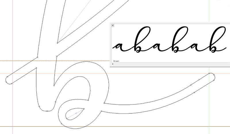
Finally, I merged the letter with its caps so that they’re all now part of the same outlined shape. (In my software, that merging is called “Remove Overlap.”) And since I did this cleanup/fitting in alphabetical order, these are the only two letters I had completed and ready when I took this image. So you get “ababab” in the preview window.
(Side note: in the preview window, if you look really close, you can see a little bit of white where the tails are overlapping with the heads of the next letters. That’s a feature of the creation software, so you can see where things cross over other things; when it’s turned into a font, those overlap spots will be solid.)
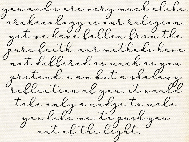
Repeat the process 25 more times, and you have a lowercase alphabet! At this point, I used my software’s preview function to look at huge blocks of text like this one; it’s an opportunity to look at the letters as they relate to the others, instead of by themselves. Sometimes a letter needs to be tilted just slightly, or (as often happens with handwriting fonts with thick/thin lines) you’ll see a stroke that stands out as much heavier or lighter than the others around it, so you need to shave a bit off or add some bulk.
I’ve ported the lowercase out as a font file just to give it a test run in Photoshop for this image. There are still many, many little adjustments that need to be made (some tails are a bit too short, some a bit too long, some are a little bit funky where they make their connections), but overall I’m very happy with where it is so far. The transitions into the tall letters are all consistent and smooth, and I love the seamless curve where a letter leads into m, n, u, v, w, and y.
(And for those of you who think this paragraph sounds familiar:
Raiders of the Lost Ark.)
I still have a pile of work ahead of me with this one: all of the uppercase letters, numbers, and punctuation need to be imported, cleaned, and adjusted. And I had the crazy thought earlier today that I'd use the same line weight and create a sans-serif that would pair with this. Because why not!


